
I’ve been experimenting a little with 3D recently – using one of my own typefaces FF Privé as the starting point. It’s interesting to see how it changes the feel of each glyph when you add depth, texture and motion to them.
Looking forward to sharing more of these soon – watch this space.
Hypnotic animations by kinetic type foundry Dia to promote the launch of Klim foundries latest typeface collection Söhne.
You can view all four families on Klim’s site here:
klim.co.nz/soehne/
and read an in depth interview with Klim Foundry on It’s Nice That here:
itsnicethat.com/klim-dia-sohne
A great new tool from Swiss Type Design agency Dinamo, designed to “test drive the truth of variable fonts”. The perfect way to find any flaws in existing or WIP variable font projects.
They describe it as:
“First practiced in Ancient Greece, the military punishment known as “running the gauntlet” forced the convicted to pass between a double row of comrades who strike out and attack them. Not always easy.
Fast forward to a digital 2018, and type designers can make their fonts run through our Gauntlet to quickly uncover their weaknesses. It provides a selection of features for testing and analysing typefaces during the design process and was specifically built with variable fonts in mind, allowing for an animated preview of all their axes combined.”
I haven’t had a chance to test it out on any of my projects, but its fun to play with all the same, and definitely one to bookmark for proper use later.
You can check it out at dinamodarkroom.com/
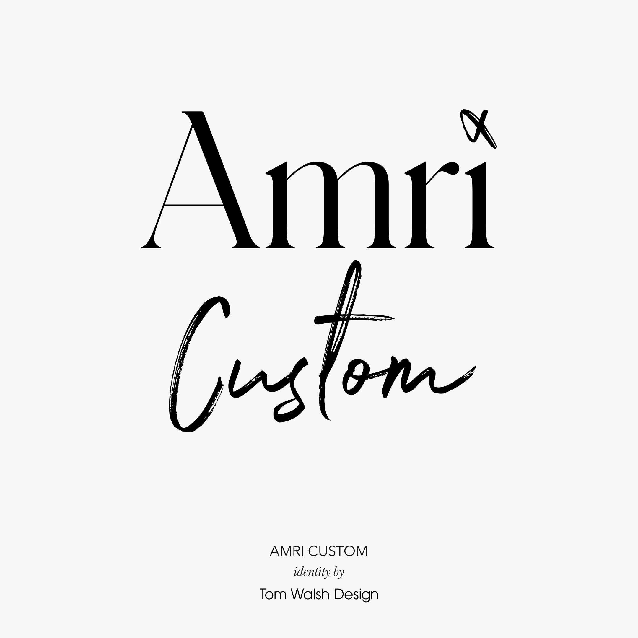
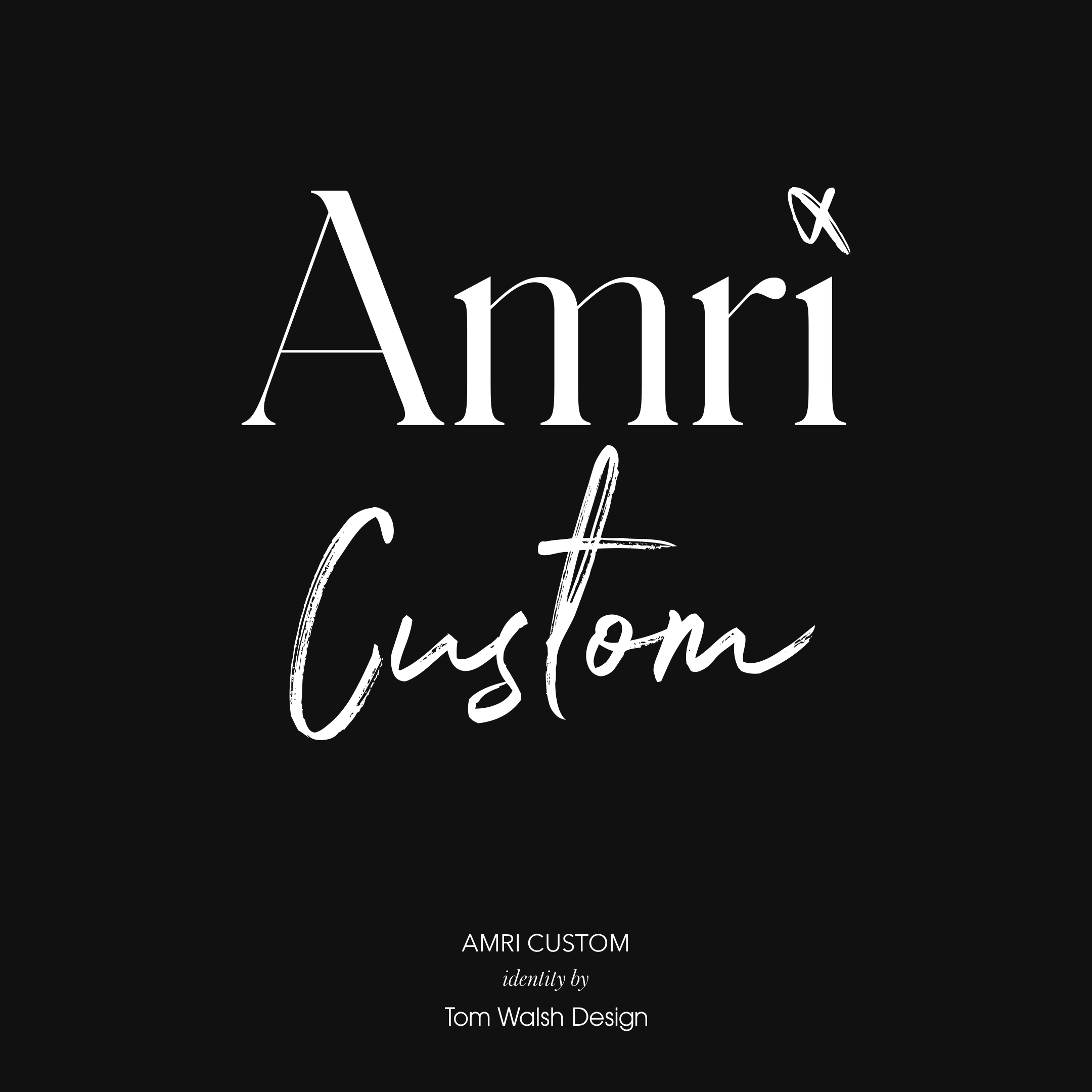


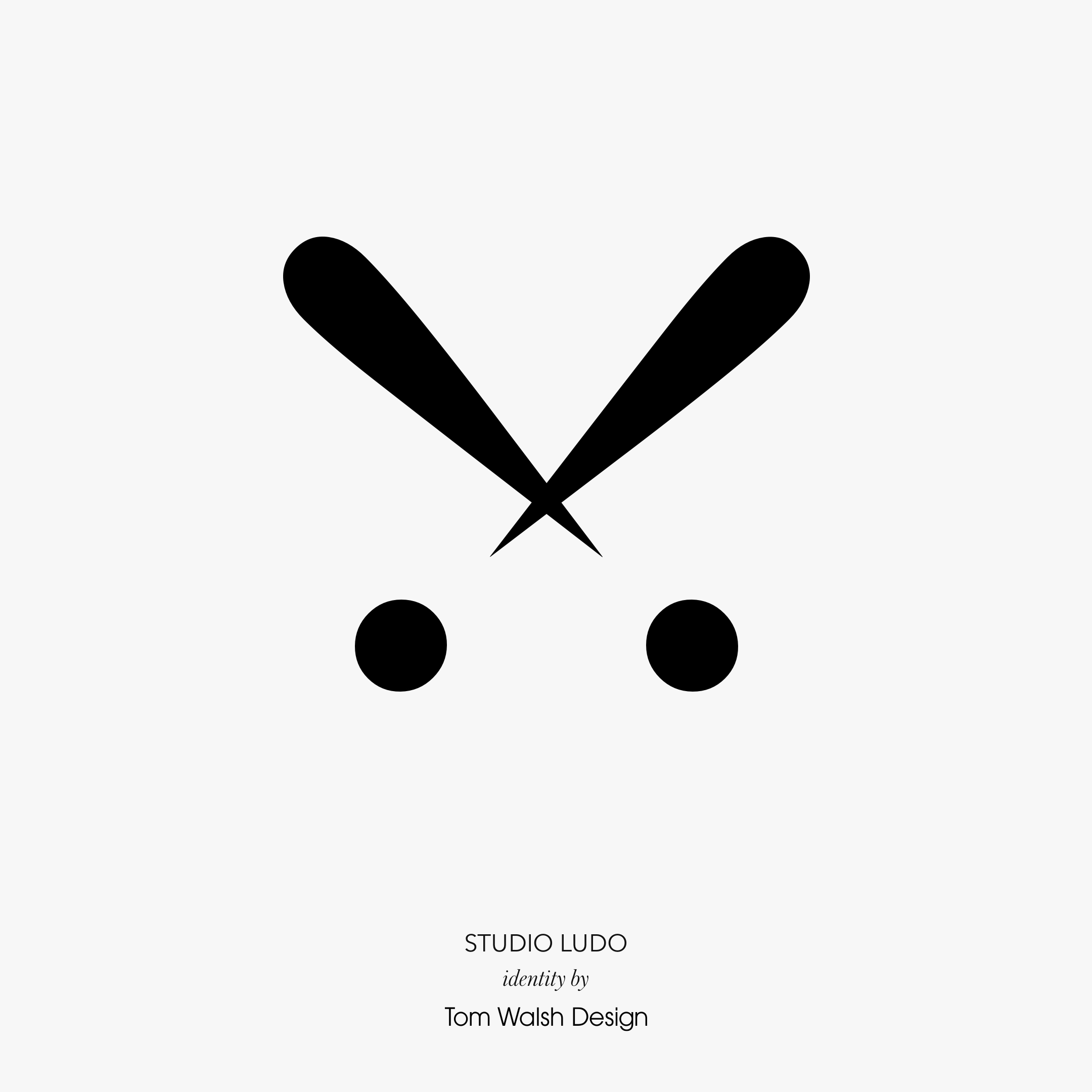
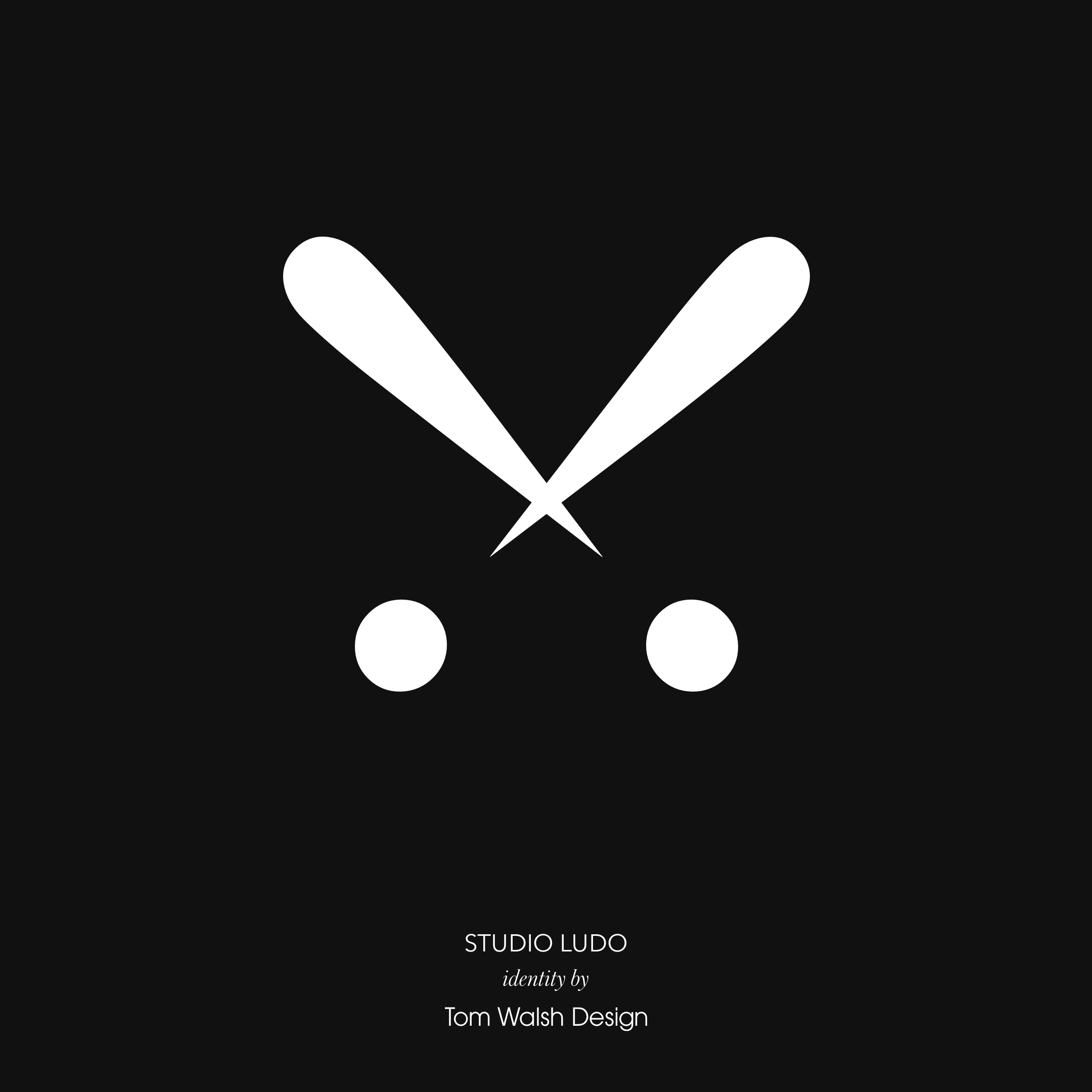
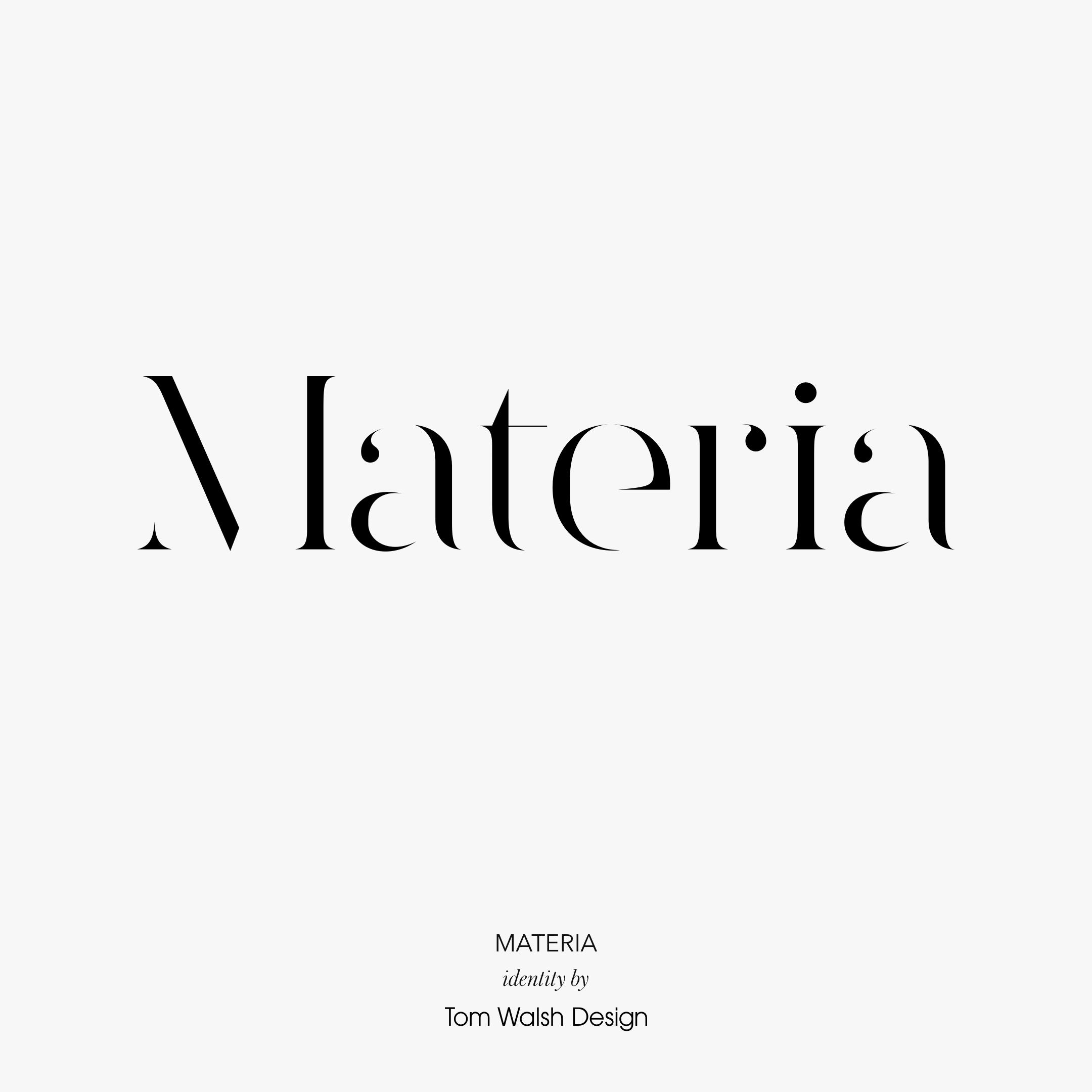
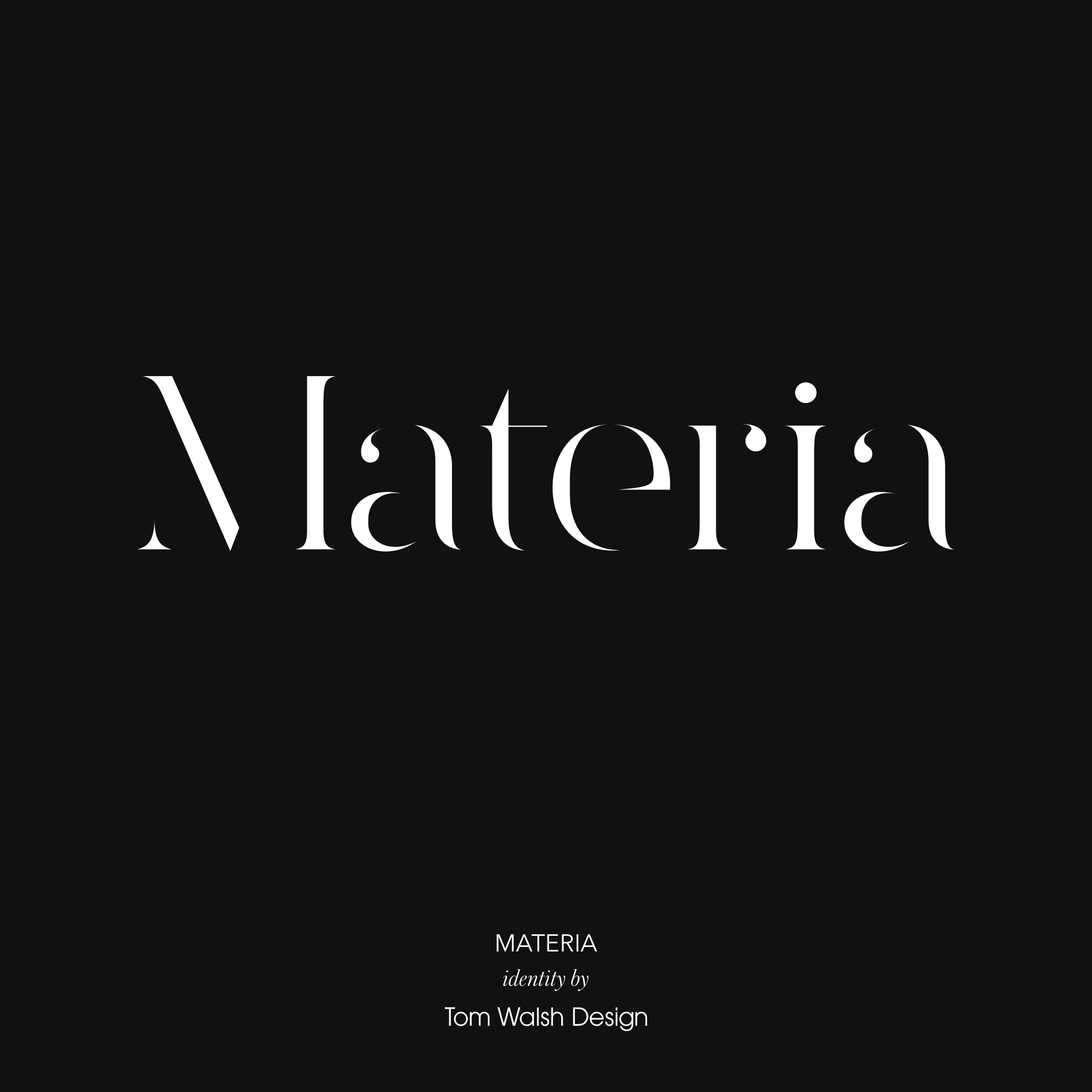
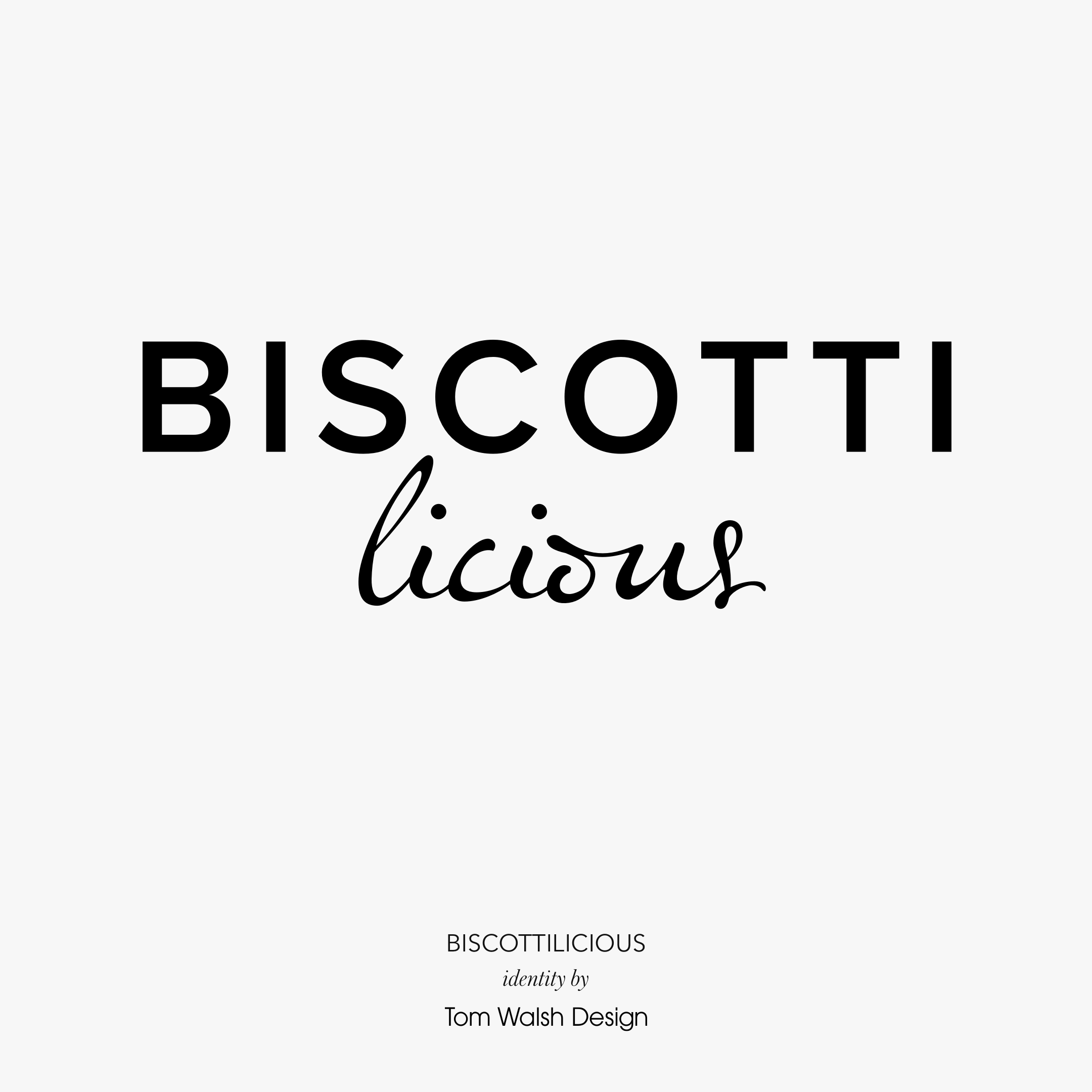
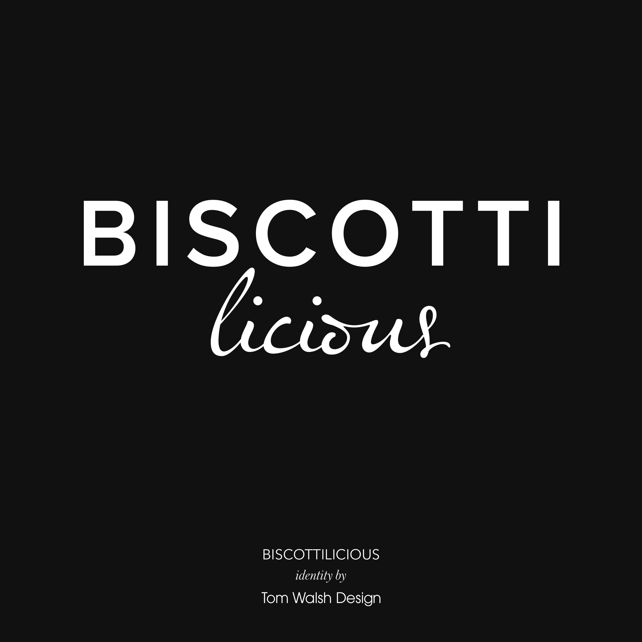
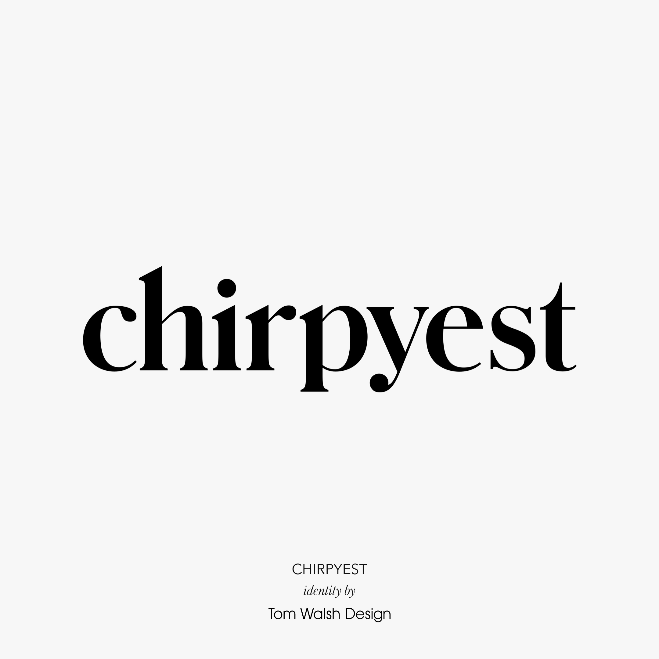
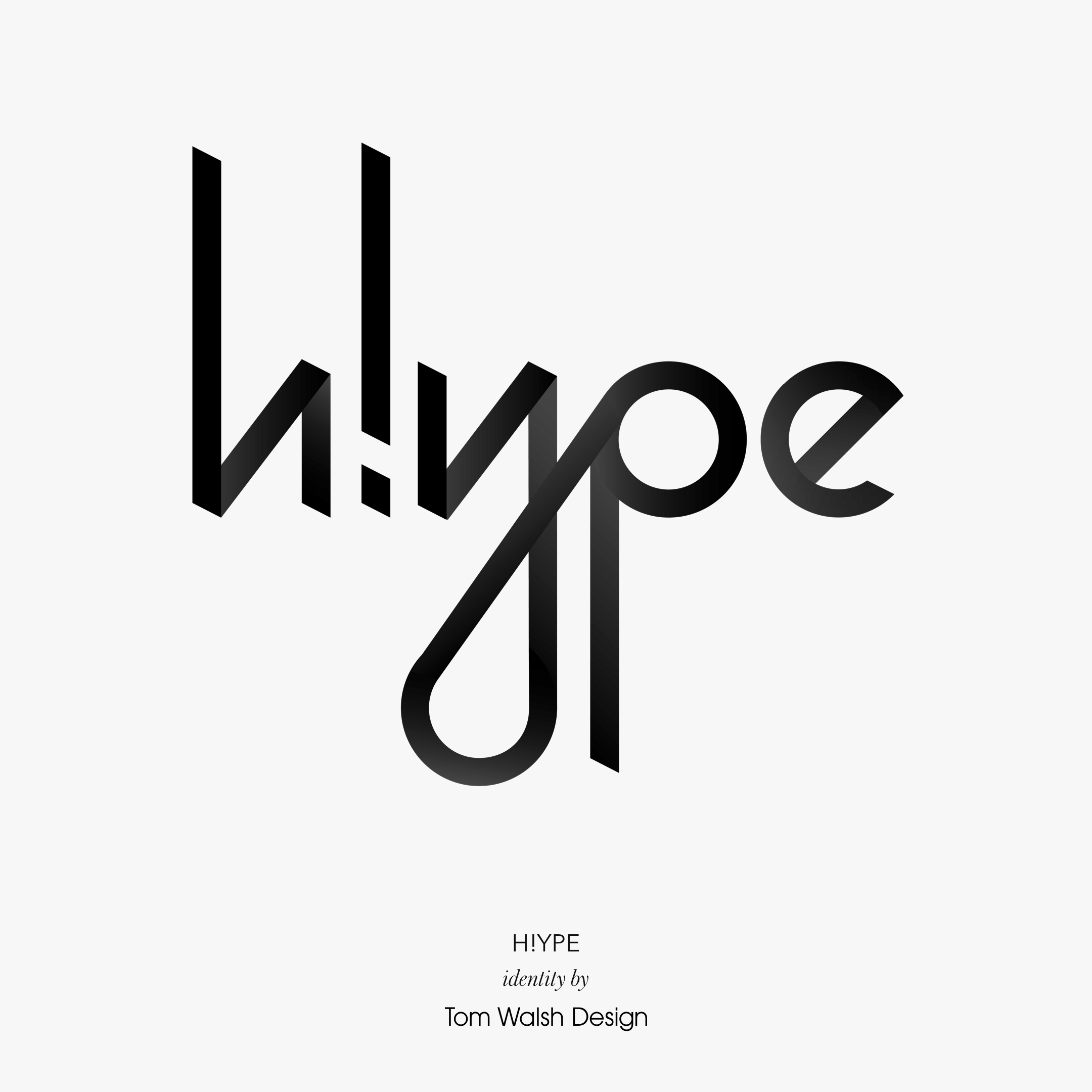
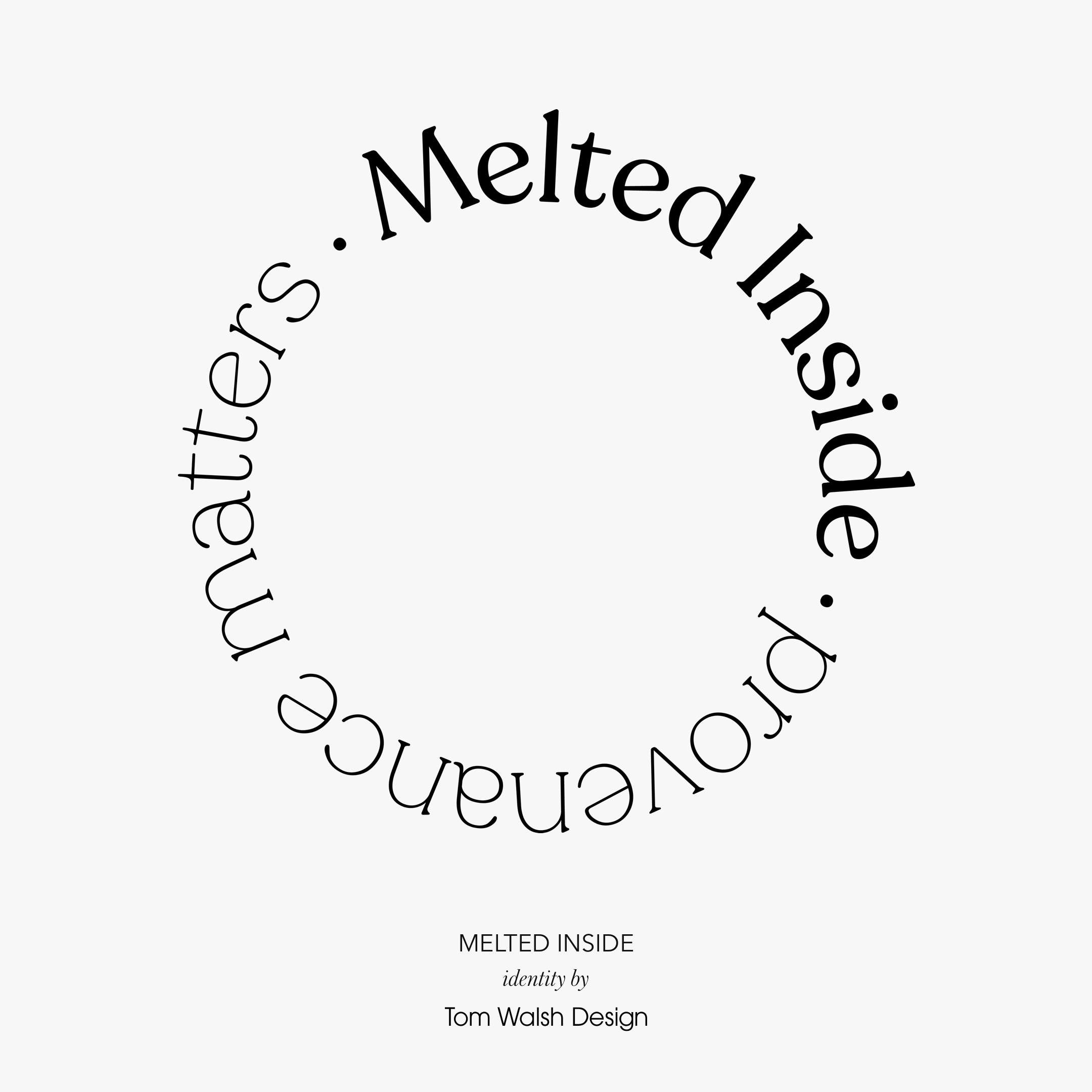
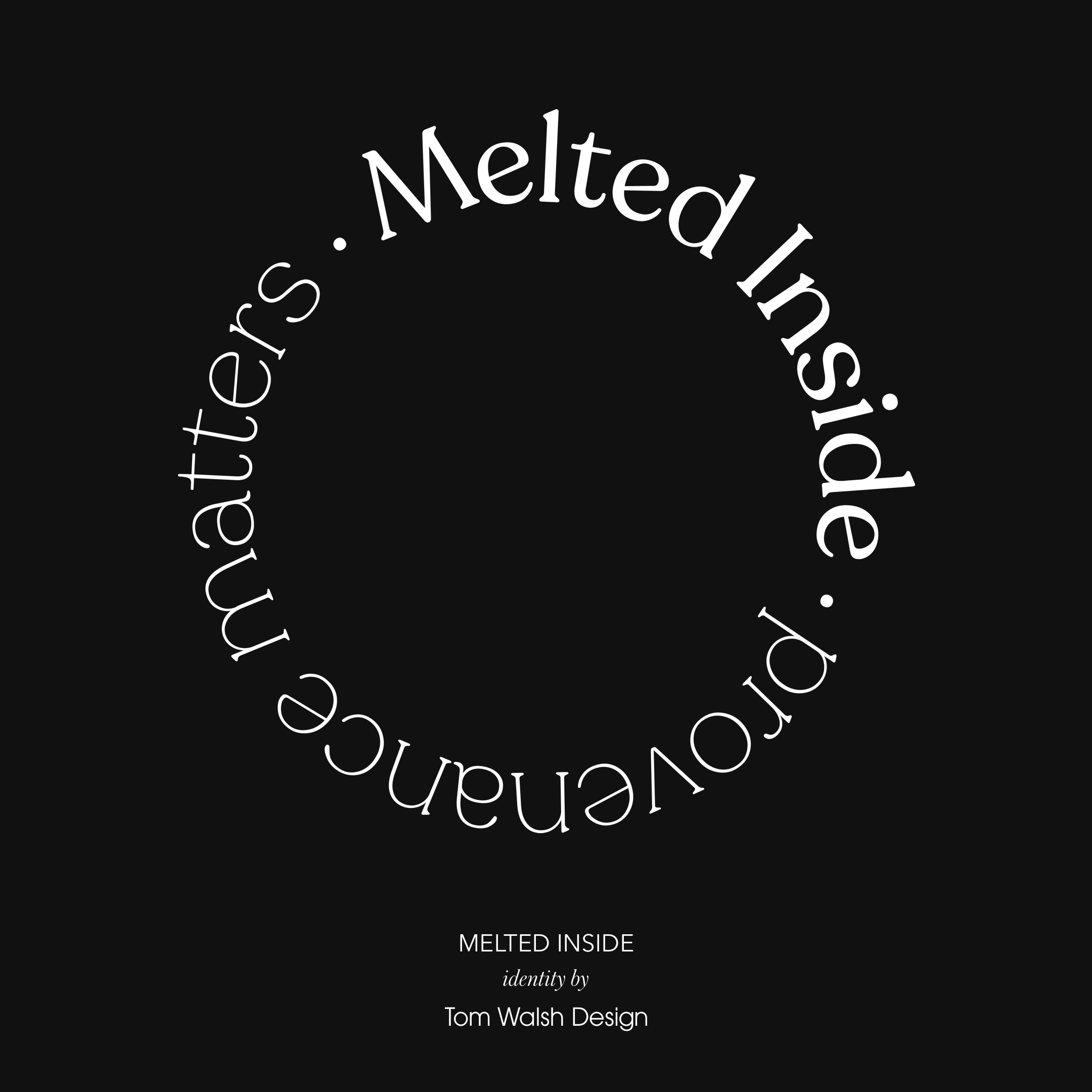
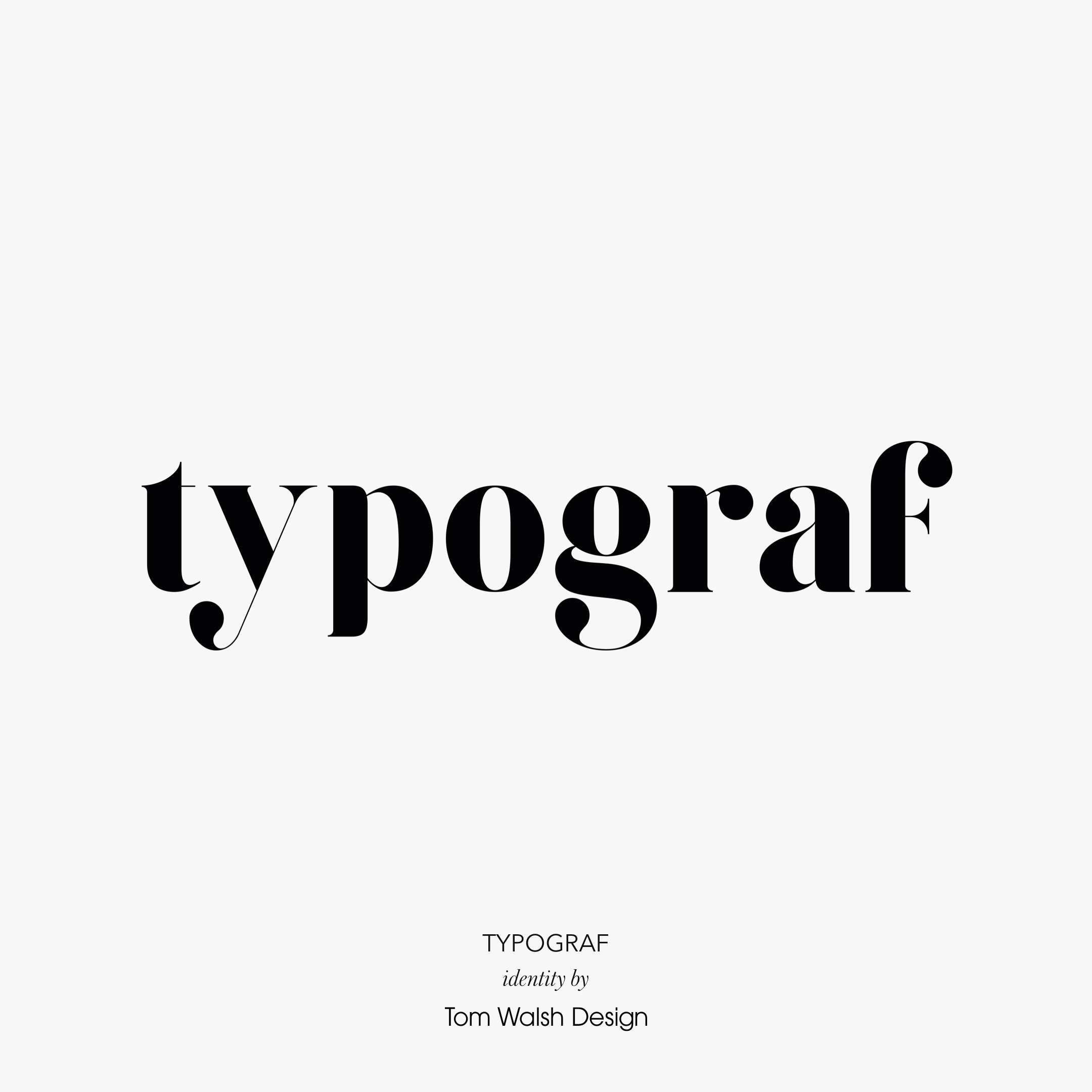
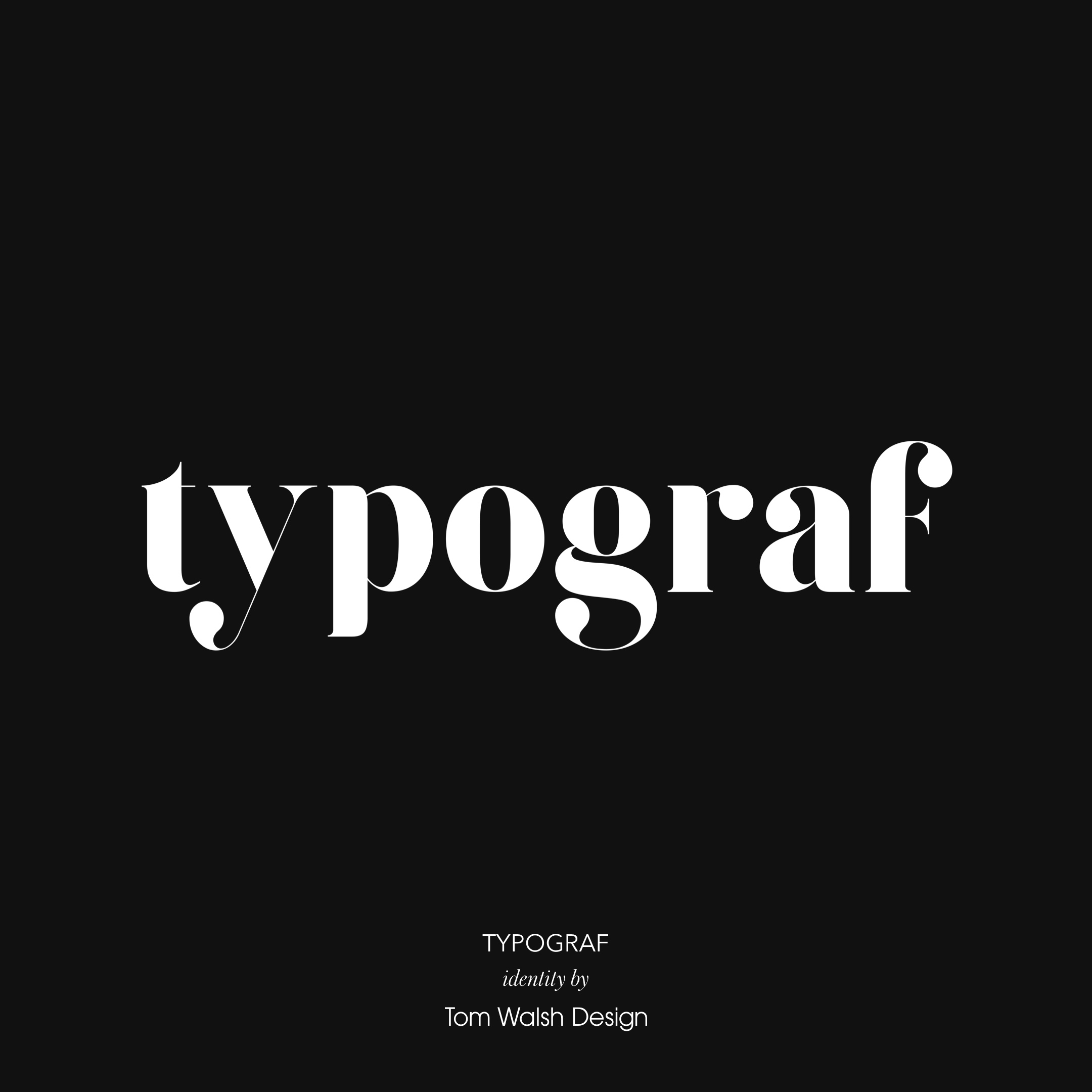
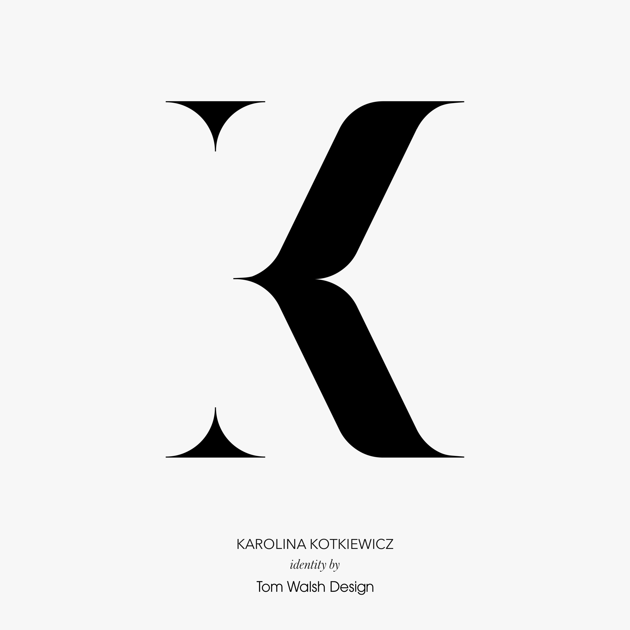
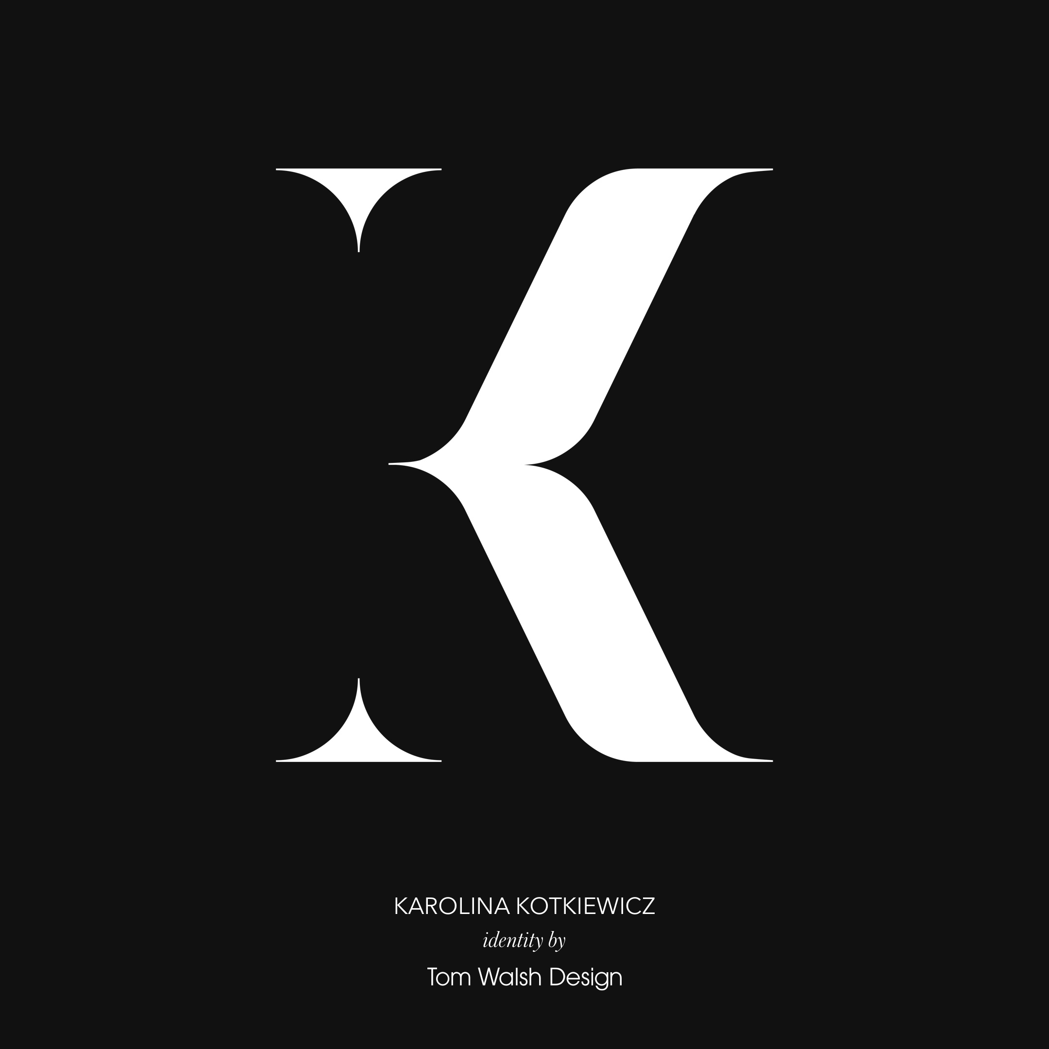
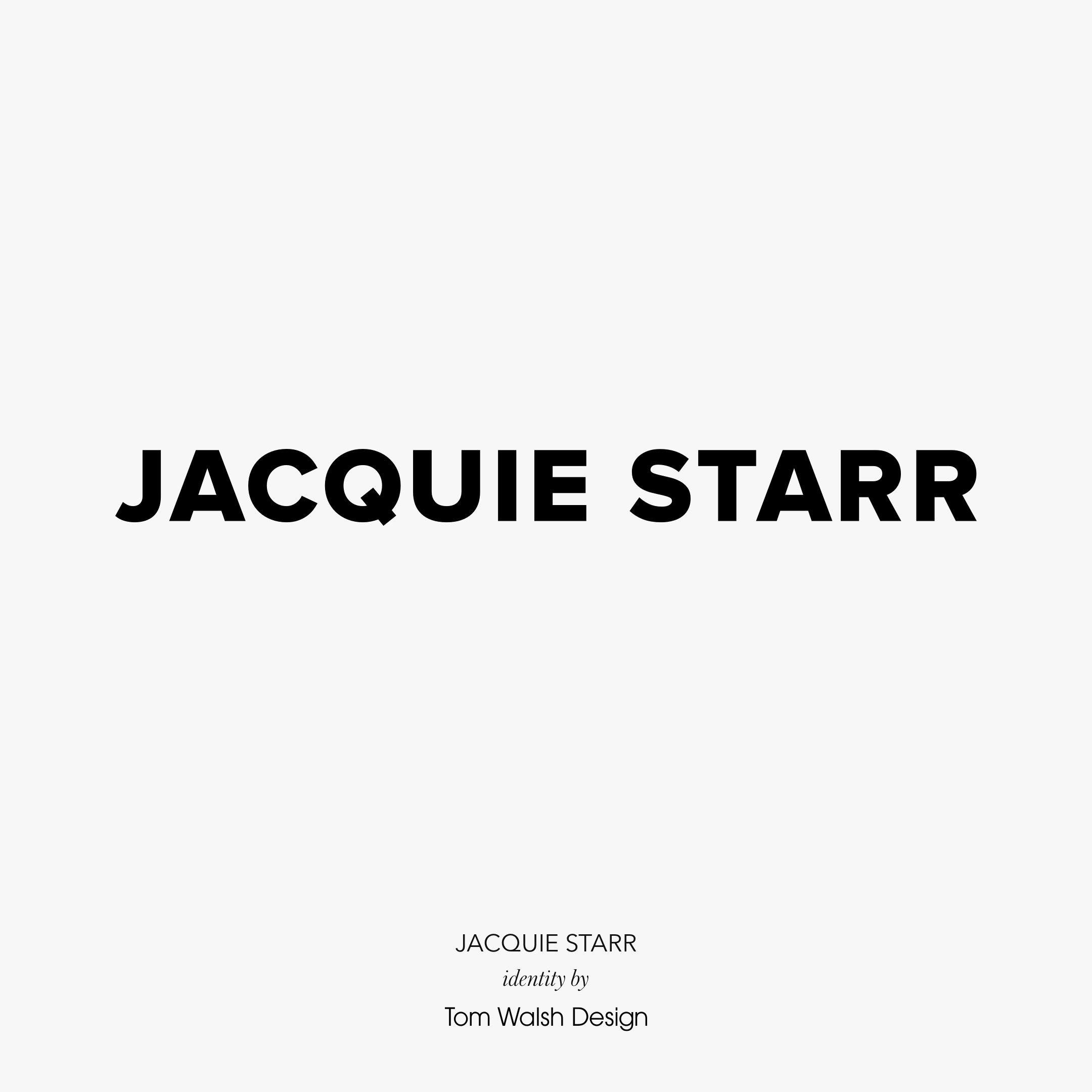
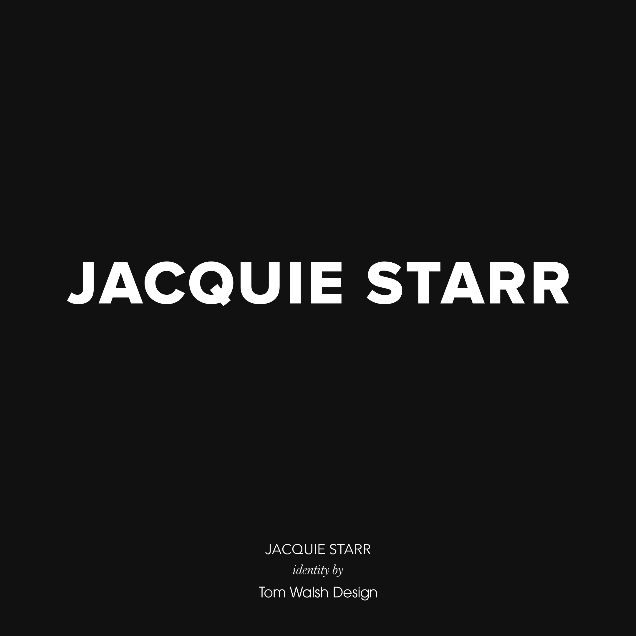
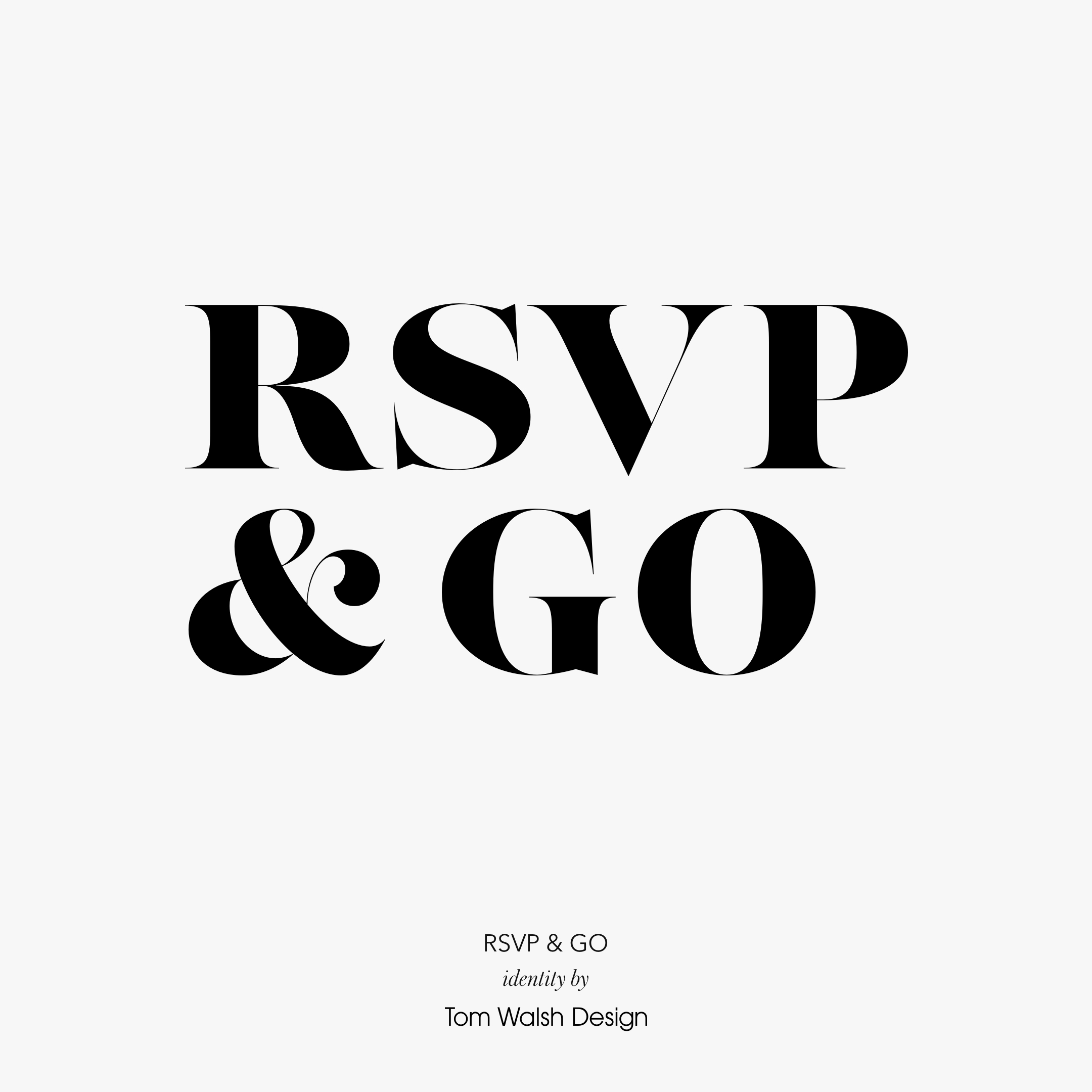
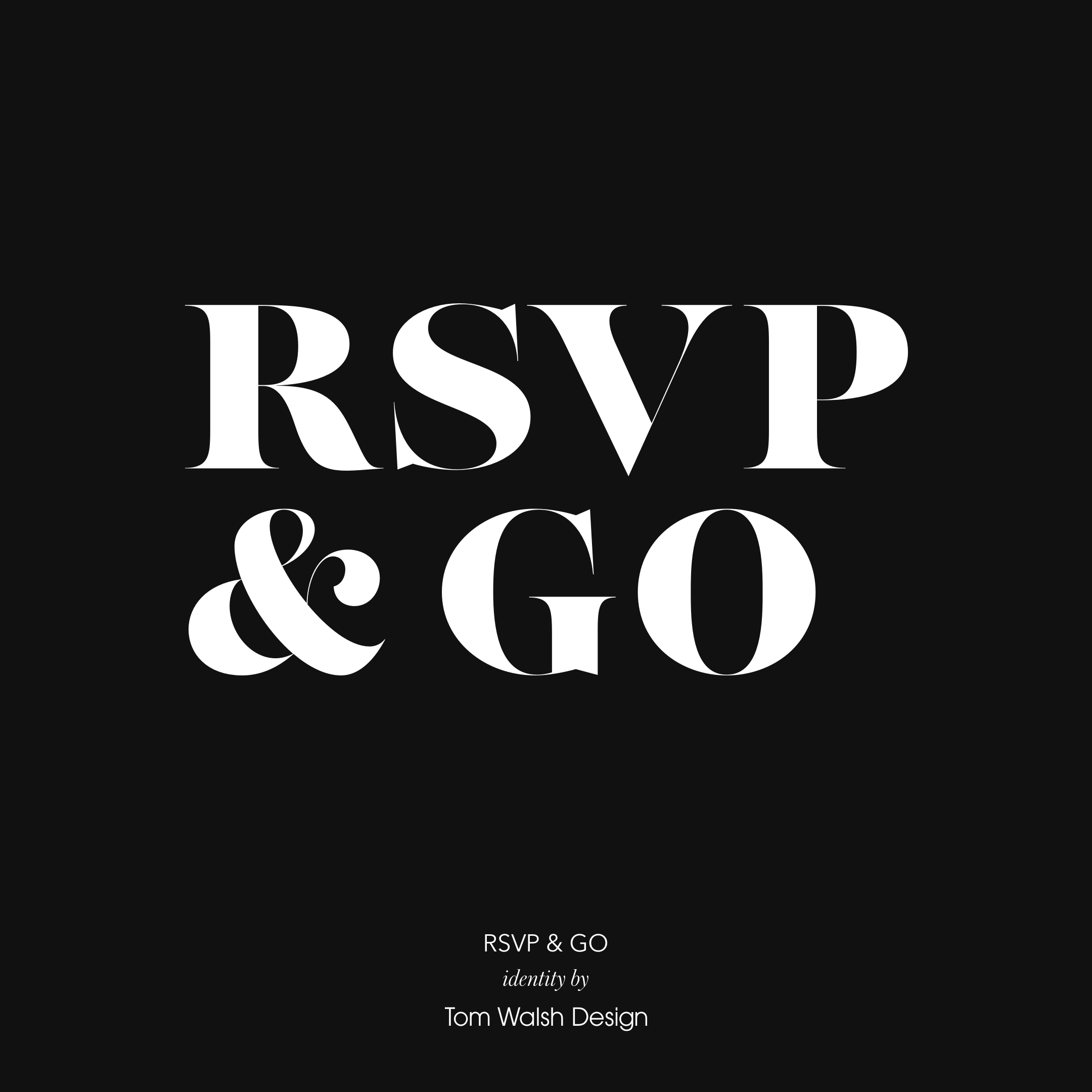
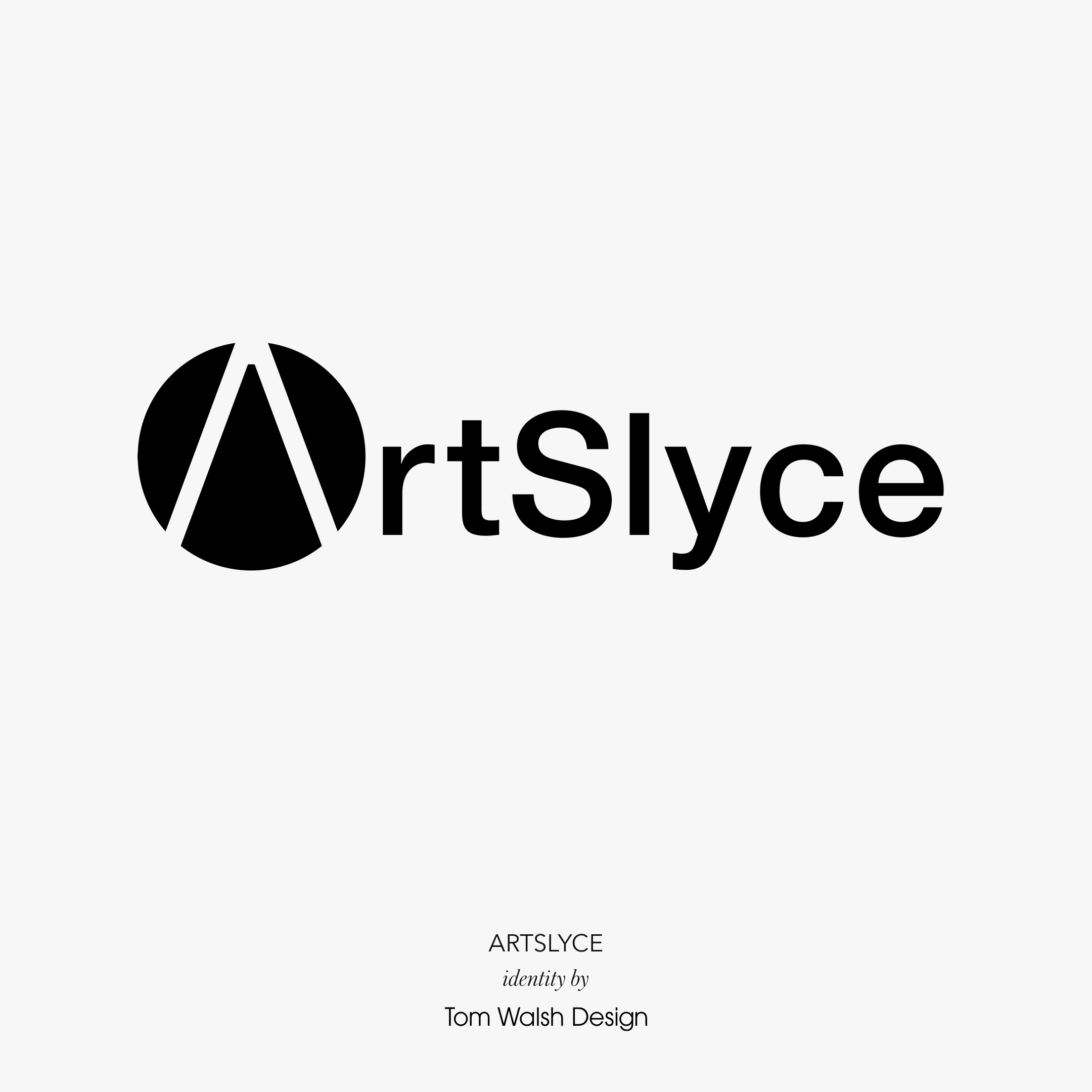
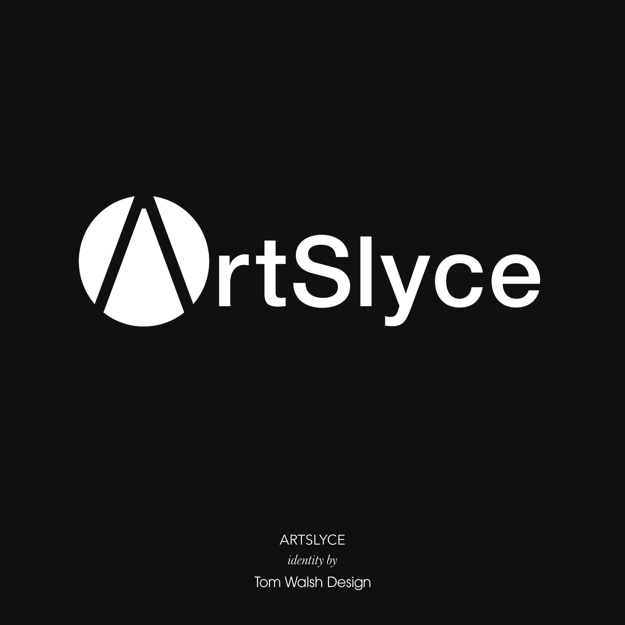
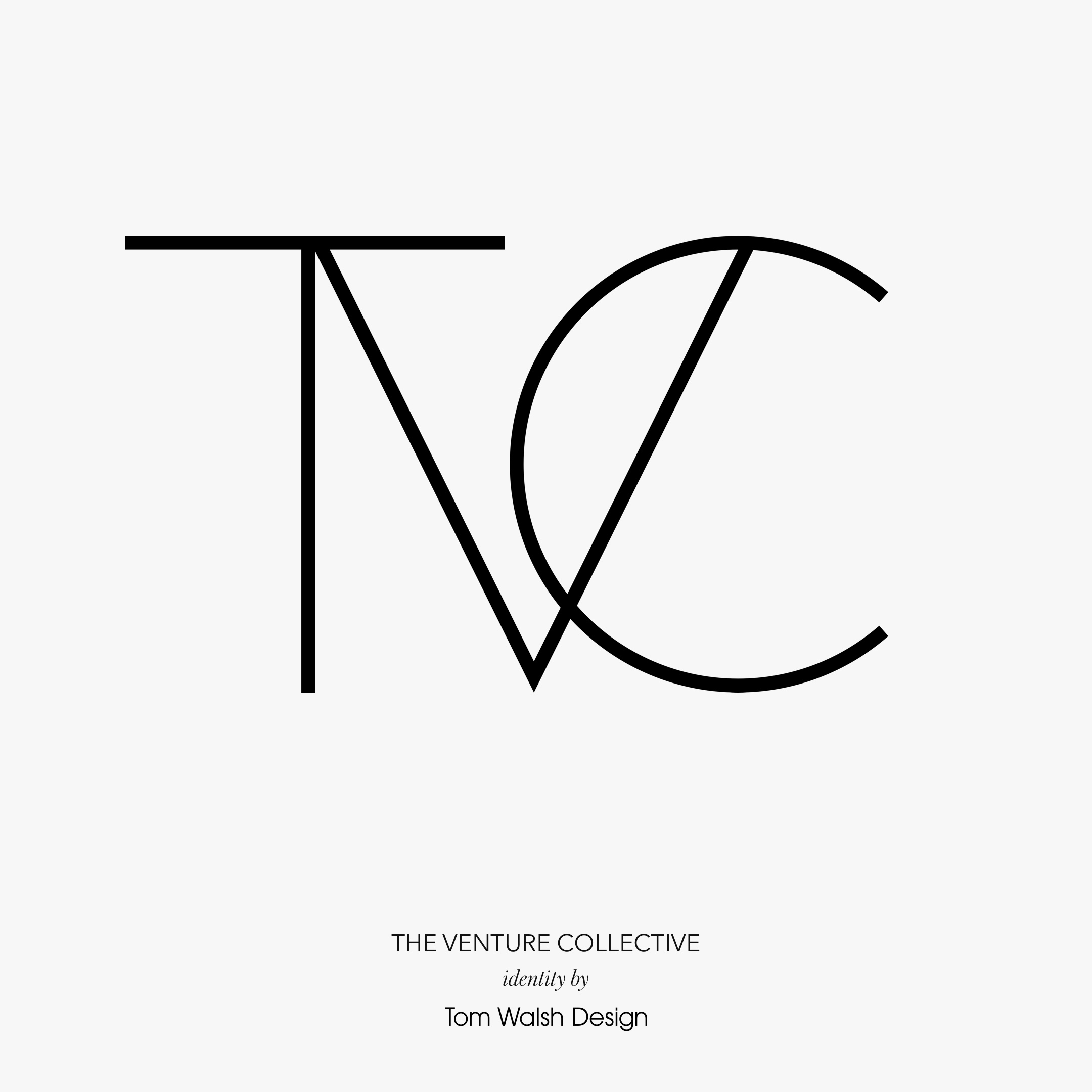
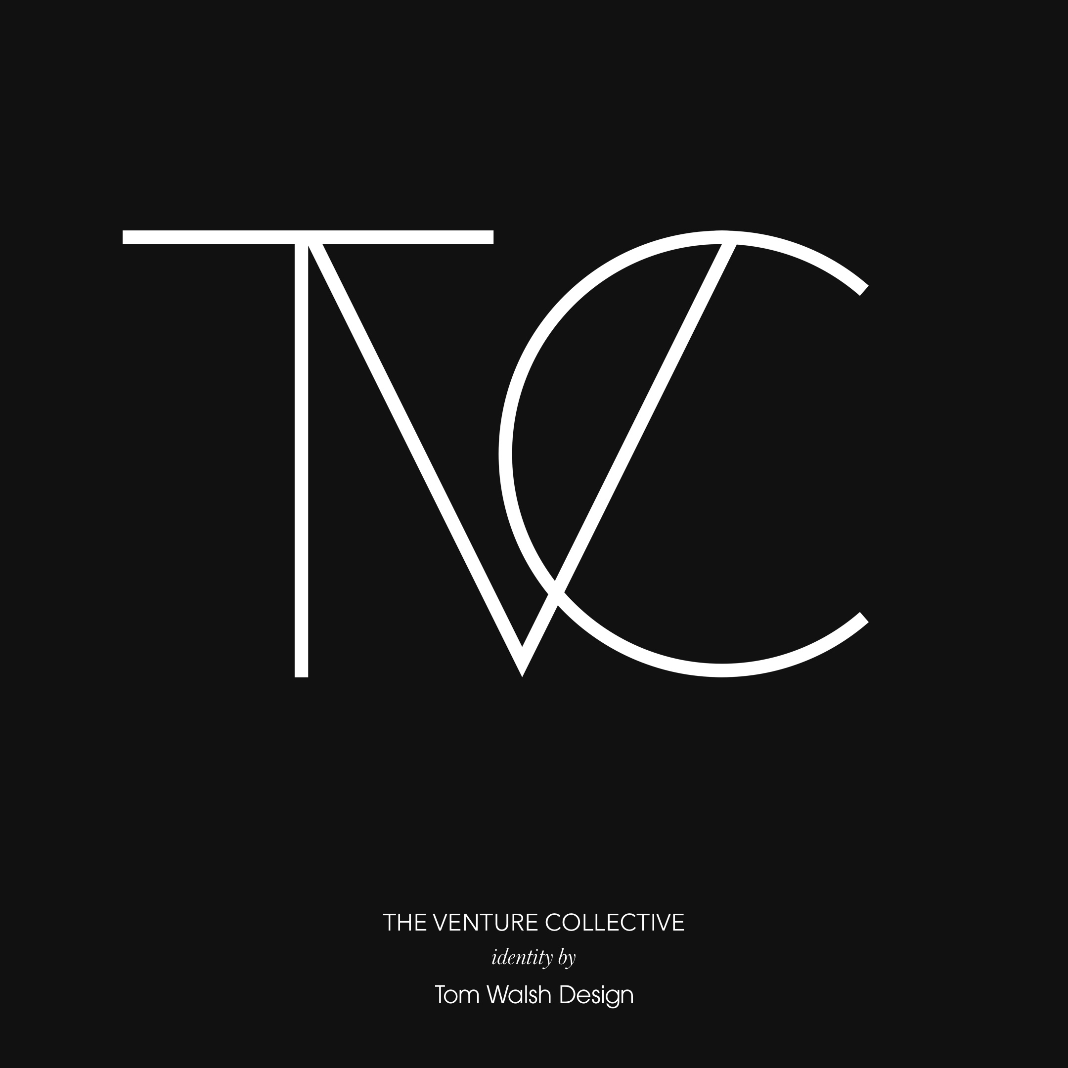
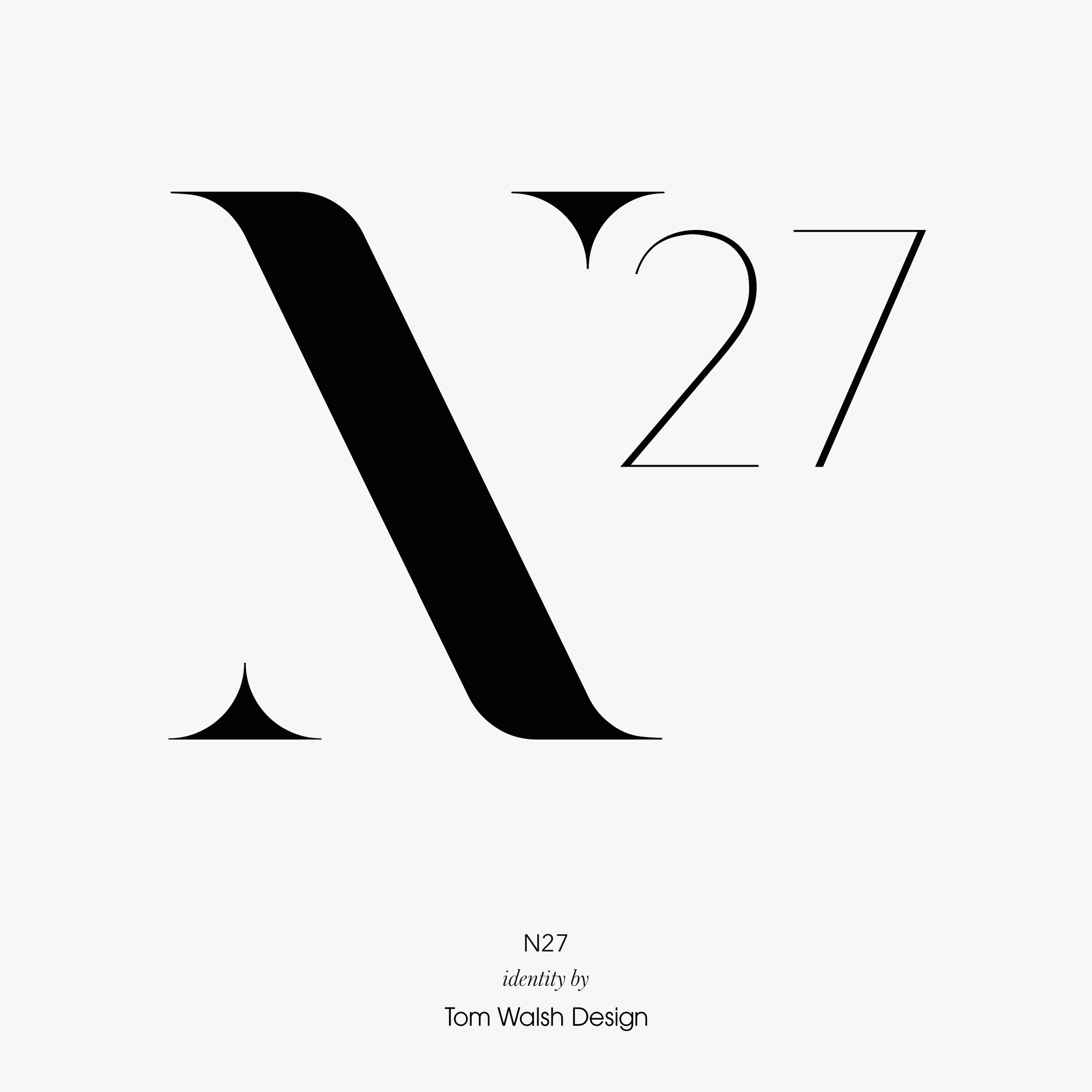
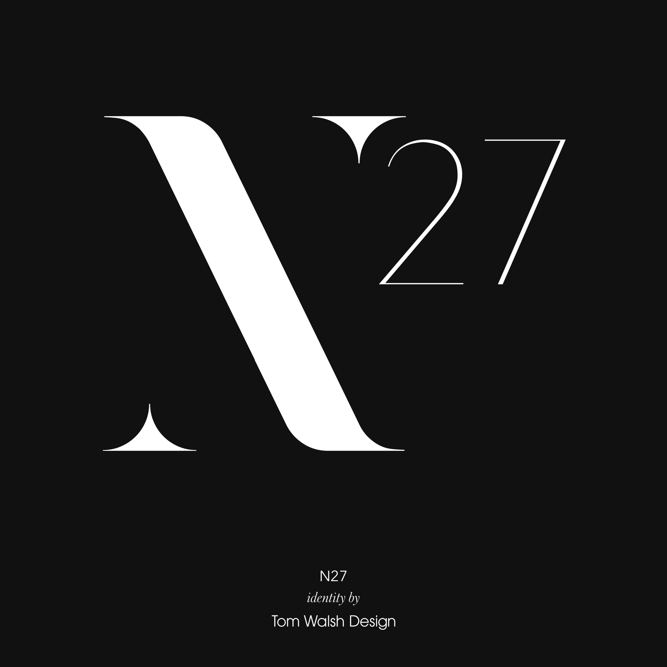
A selection of brand identities I’ve designed over the years, either as part of wider projects or as independent briefs.
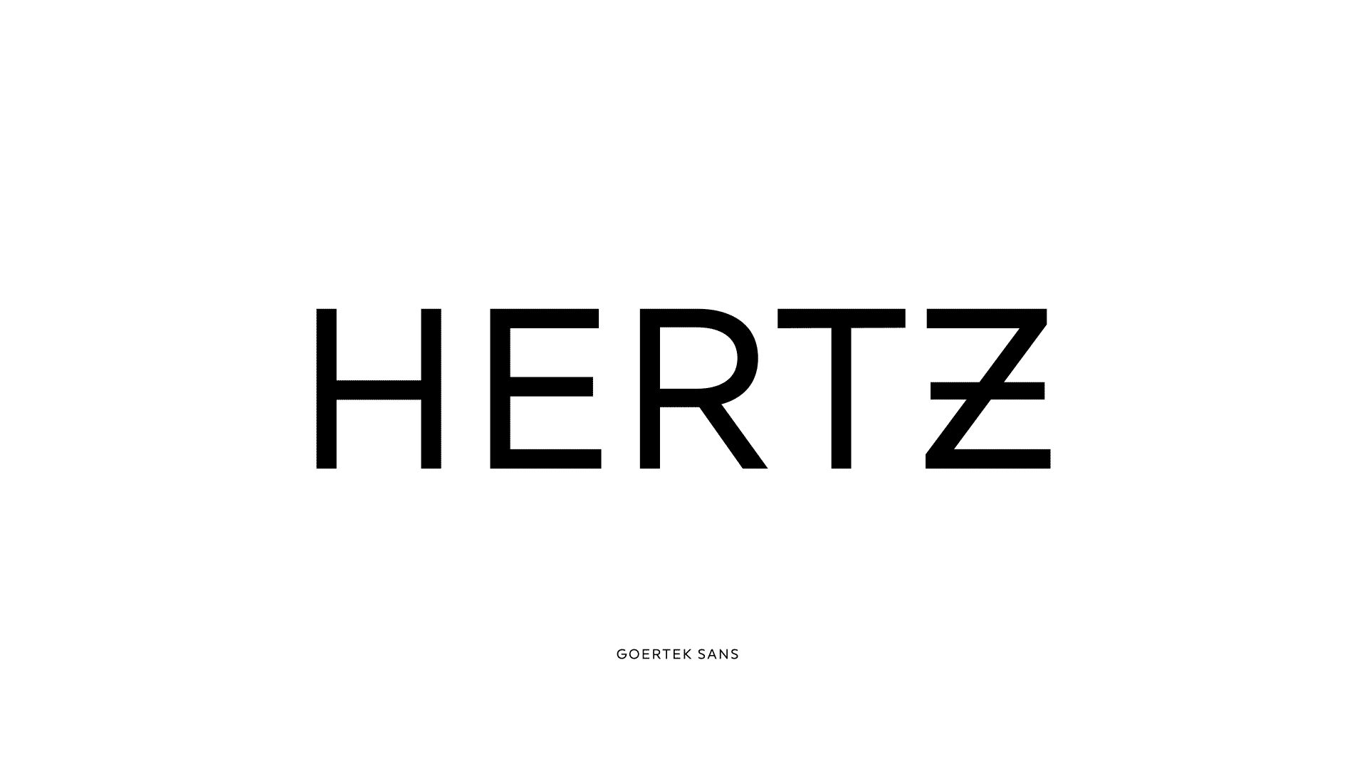
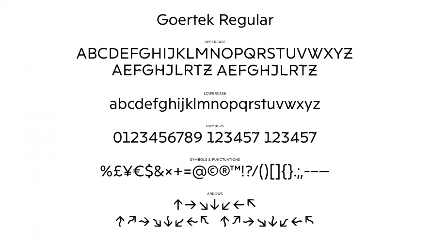
An interesting, if not traditionally aesthetic, approach to type and signage from Kontrapunkt and Nippon Design Center. The Sonic Typeface, designed for Goertek’s R&D Centre in Qinbao, China, varies it’s appearance using Opentype technologies in response to different sound wave frequencies. Meaning that throughout the R&D hub, the typeface and signage will display itself differently depending on the surrounding environment.
I’m not 100% on whether I like the result or not, but I definitely like the concept.
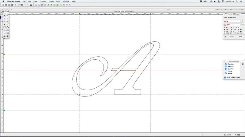
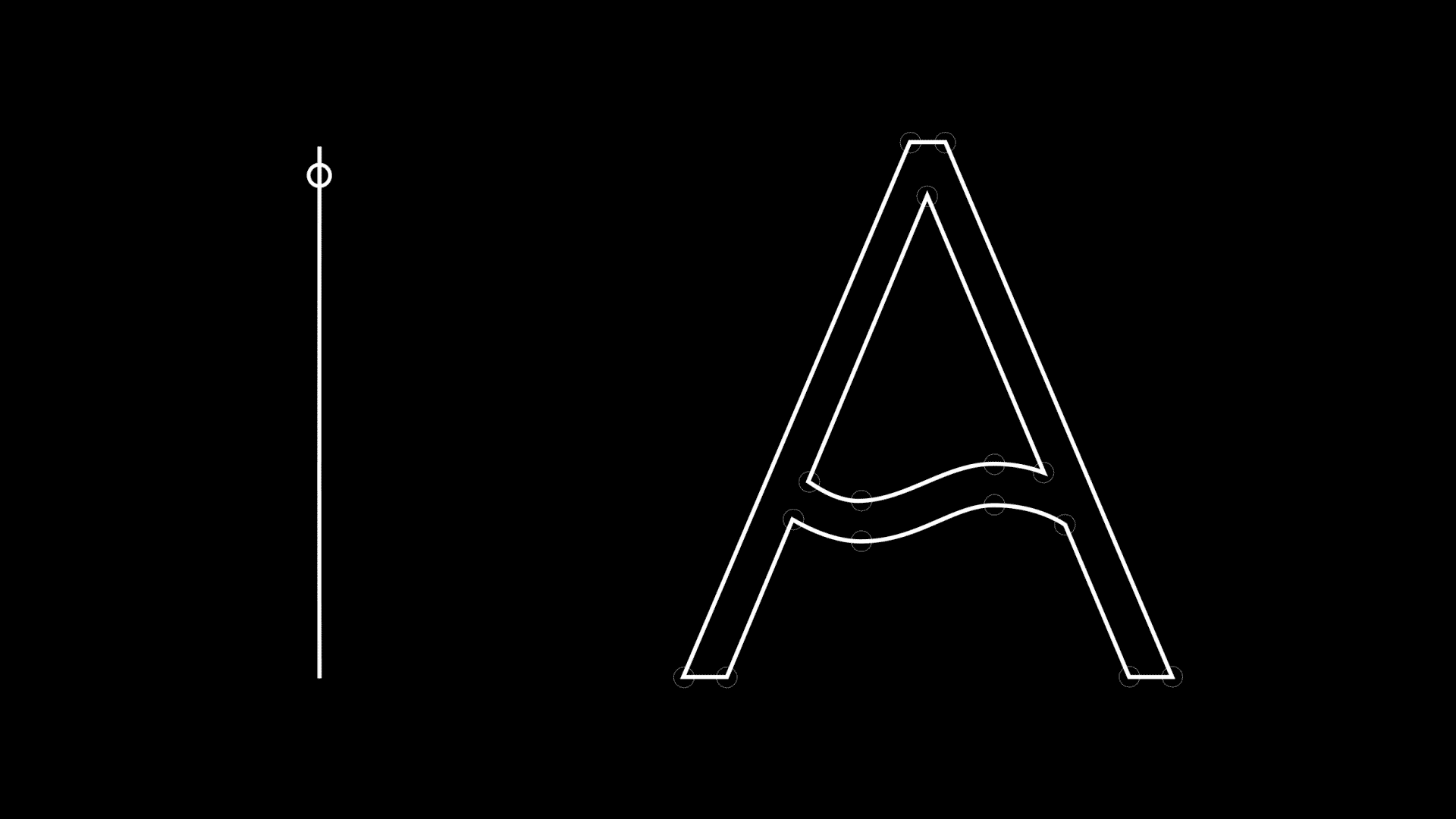
During a short stint freelancing at design studio ‘Interfield’ a brief came in to design the type for a title sequence for the BBC period drama series ‘North & South’. I was given a preview disc containing the first couple of episodes, and the synopsis of It needs to reflect the contrast of the genteel south of England and the industrial North. Typographically quite an interesting brief I thought.
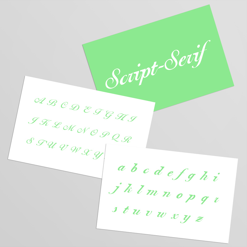
After considering drawing something from scratch (as it was a title sequence it was a limited character set with just the key cast members names), I decided instead to look at existing typographic representations of the ‘genteel’ vs the ‘industrial’, and try and make them harmonise. Genteel easily lent itself to a script font, Industrial was a bit more hit and miss in my experiments, but I decided on slab-serif as the way to go.
Once I’d decided on the premise/structure I was going to work with, my approach was to look first at script typefaces that would hold up on multiple screens, as well as support the addition of something as heavy as a slab-serif. I narrowed it down to two strong candidates, Ballentines Script and Shelley Script. On drawing in the additional slab-serifs to some of the key characters I realised that for them to balance on Shelley they would be way too subtle for on screen use, so Ballentines was chosen as the basis for the rest of the designs. A good, solid structure, but still maintaining the femininity of a Script face, and most importantly, capable of carrying the slab serifs off.
As a finished font I think it works well. The lower case characters hold the serifs better, but as they’re the less flamboyant case that’s probably to be expected. In the end the BBC thought it would be too subtle for the viewer to notice so it wasn’t used, but I still continued working on it and creating the working font. The idea was still used though, and they opted for a pairing of a script face with a slab serif face. Which although a step back from the conclusion, still worked well visually.
Font Name:
Script Serif
Credits/Designer:
Tom Walsh
Released:
2005
Font Style:
Connecting Script, Serif
Format:
Opentype
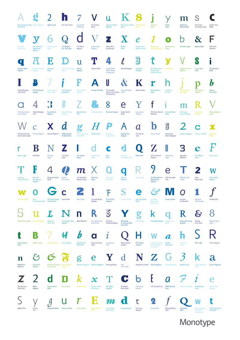
I just received this nice freebie from Monotype. A custom-designed, illustrated glyph set “highlighting dozens of the world’s best typefaces”. Its almost as interesting to see the individual glyphs from the typefaces I know as it is to discover some of the ones I don’t! The ‘4’ from ‘Ysobel Display Thin‘ is particularly nice.
You can download and print your own copy here:
monotype.com/MT_GlyphSet.pdf
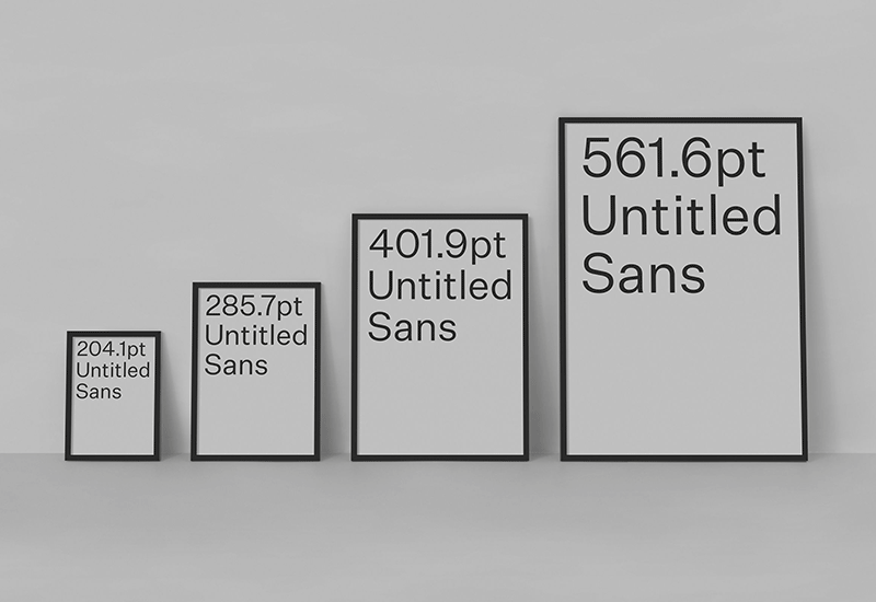
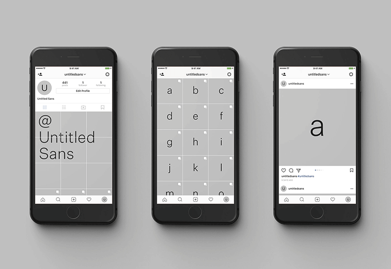
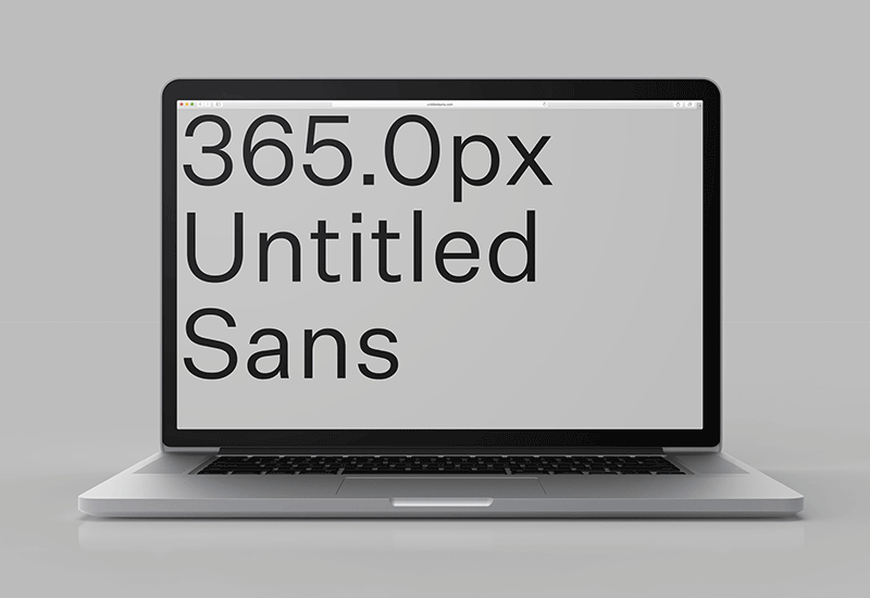
Really nice digital promo project for New Zealand type foundry Klim’s new ‘Untitled Sans’ and ‘Untitled Serif’ by Alt Group (also from NZ). I especially like their use of Instagram carousels to show each character in its varying weights and styles. So simple, but so effective.
You can check out both of their Instagram’s here:
@untitledsans
@untitledserif
and their micro sites here (click on the type to buy through Klim):
untitledsans.com
untitledserif.com
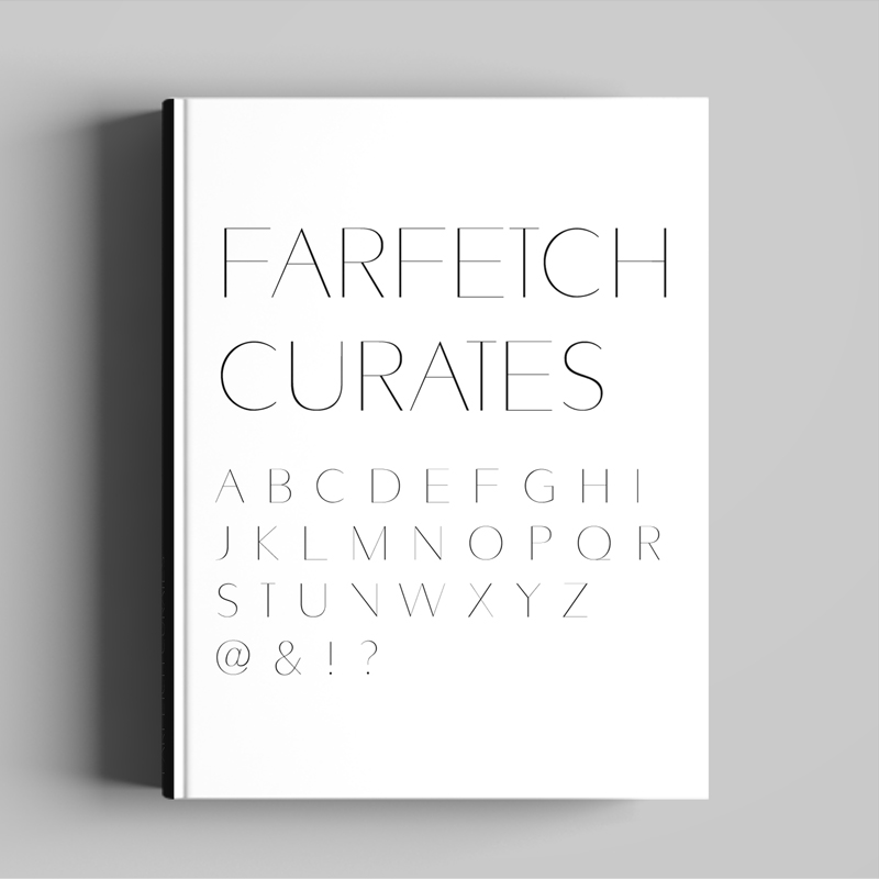
Following on from my work re-designing the Farfetch website and designing their Farfetch Discover iPhone and iPad apps, I was approached by their Art Direction team to collaborate on the design of a custom font for their printed ‘Farfetch Curates’ collection of books. Based on Avenir, but with added variety in weight across the vertical stokes, it maintains the original lightweight form, while adding contrast and structure to the characters.
Basing a font on an existing classic like Avenir may sound like a simple starting point, before you consider that you now need to improve the characters for it to be worth while. Some of the particular challenges came with the ampersand and number eight, purely as with so many curves it took a lot of tweaking to get them to feel the same weight as the simpler characters, like the ‘I’ or ‘T’. After a lot of back and forth between myself and Craig I think we got there though.
The next logical step would be working up the lower case characters, but as its only used as a display font for the time being I’ll wait and see if I get that call…
You can see examples of it in use in the Farfetch Curates series here
Font Name:
Farfetch Curates
Credits/Designer:
Tom Walsh / Craig McCarthy
Released:
2015
Font Style:
Geometric Sans-Serif
Format:
Opentype
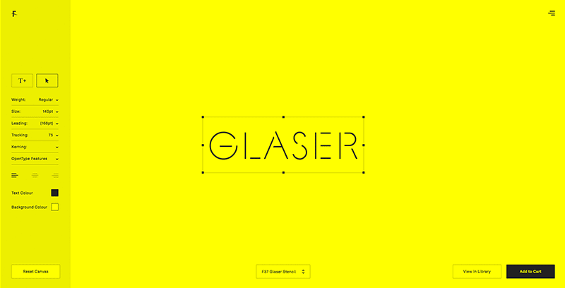
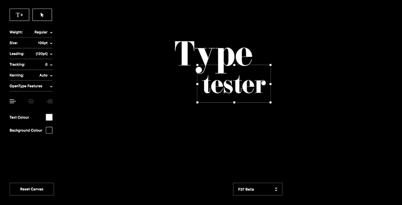
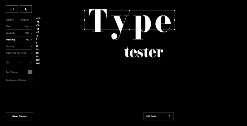
A great new ‘type tester’ tool by Face37 owner Rick Banks which brings traditional design tools into play before asking for any commitment.
Designed with digital designer Francis Smith and built by developer Tom Duncalf this sets the bar at a new height. Taking the industry standard “somewhat clunky and restrictive” options of size, colour and alignment they’ve added in a toolkit giving you the flexibility of weight, leading, tracking and kerning, with Opentype features to boot. And that’s before you start dragging and dropping multiple text boxes. From having a quick play the only thing I can see that’s missing is adding a background image, but then we need to remember, this isn’t a design tool. We have Adobe and Sketch for that.
Have a play for yourself here (performs best in Chrome):
f37foundry.com
