Hypnotic animations by kinetic type foundry Dia to promote the launch of Klim foundries latest typeface collection Söhne.
You can view all four families on Klim’s site here:
klim.co.nz/soehne/
and read an in depth interview with Klim Foundry on It’s Nice That here:
itsnicethat.com/klim-dia-sohne
A great new tool from Swiss Type Design agency Dinamo, designed to “test drive the truth of variable fonts”. The perfect way to find any flaws in existing or WIP variable font projects.
They describe it as:
“First practiced in Ancient Greece, the military punishment known as “running the gauntlet” forced the convicted to pass between a double row of comrades who strike out and attack them. Not always easy.
Fast forward to a digital 2018, and type designers can make their fonts run through our Gauntlet to quickly uncover their weaknesses. It provides a selection of features for testing and analysing typefaces during the design process and was specifically built with variable fonts in mind, allowing for an animated preview of all their axes combined.”
I haven’t had a chance to test it out on any of my projects, but its fun to play with all the same, and definitely one to bookmark for proper use later.
You can check it out at dinamodarkroom.com/
Screens of the Future is Universal Everything’s ongoing series of visionary prototypes, based on the emerging technologies of flexible displays, shape-shifting materials and context-aware functionality.
These moving image artworks highlight humanity’s increasingly integrated relationship with technology, serving as product demos of our near future.
You can see more of their project here
Following last Autumn’s collaboration with M/M (Paris) to reinterpret its iconic crocodile logo (an homage to founder René Lacoste, who was dubbed “The Crocodile” because of his tenacity on the tennis court), for the first time in the fashion brand’s history, Lacoste has replaced the famous crocodile with ten endangered species. All of which face imminent threat of extinction.
Working closely with BTEC Paris and the International Union for Conservation of Nature (IUCN) to design the limited edition logos, which are embroidered in the same style as the renowned crocodile, the French fashion brand has correlated the number of available shirts with the number of animals that remain in the wild. Ranging from 30 Vaquita porpoises to 450 Anegada Rock Iguanas. Creating a total of 1,775 shirts, of which the profits will be donated to the species’ conservation.
Unfortunately they all sold out pretty much immediately, but if you’d like to take a look in more detail and read up on the cause you can find it on their site here:
lacoste.com/saveourspecies
And you can support the cause with donations here:
saveourspecies.org
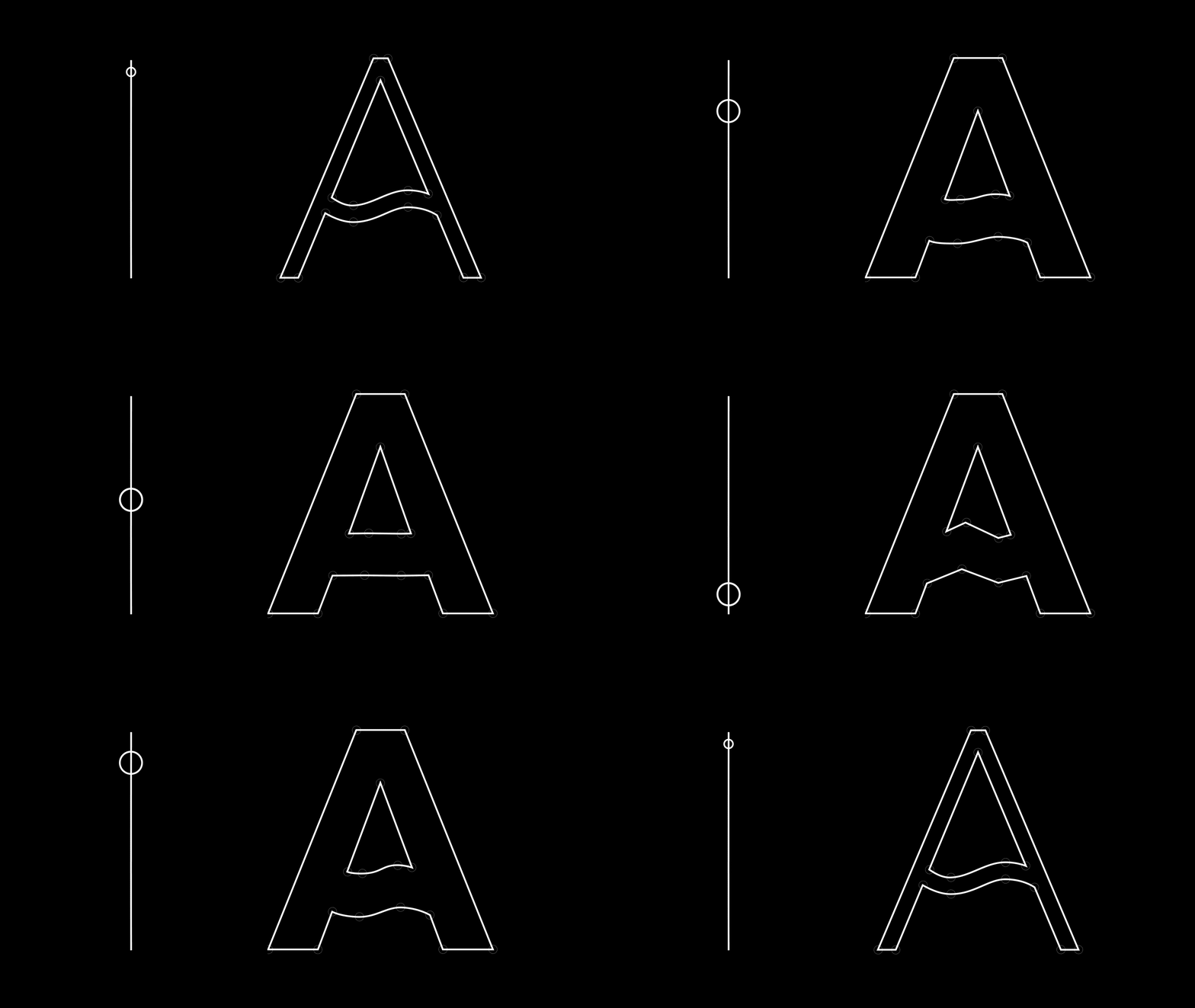
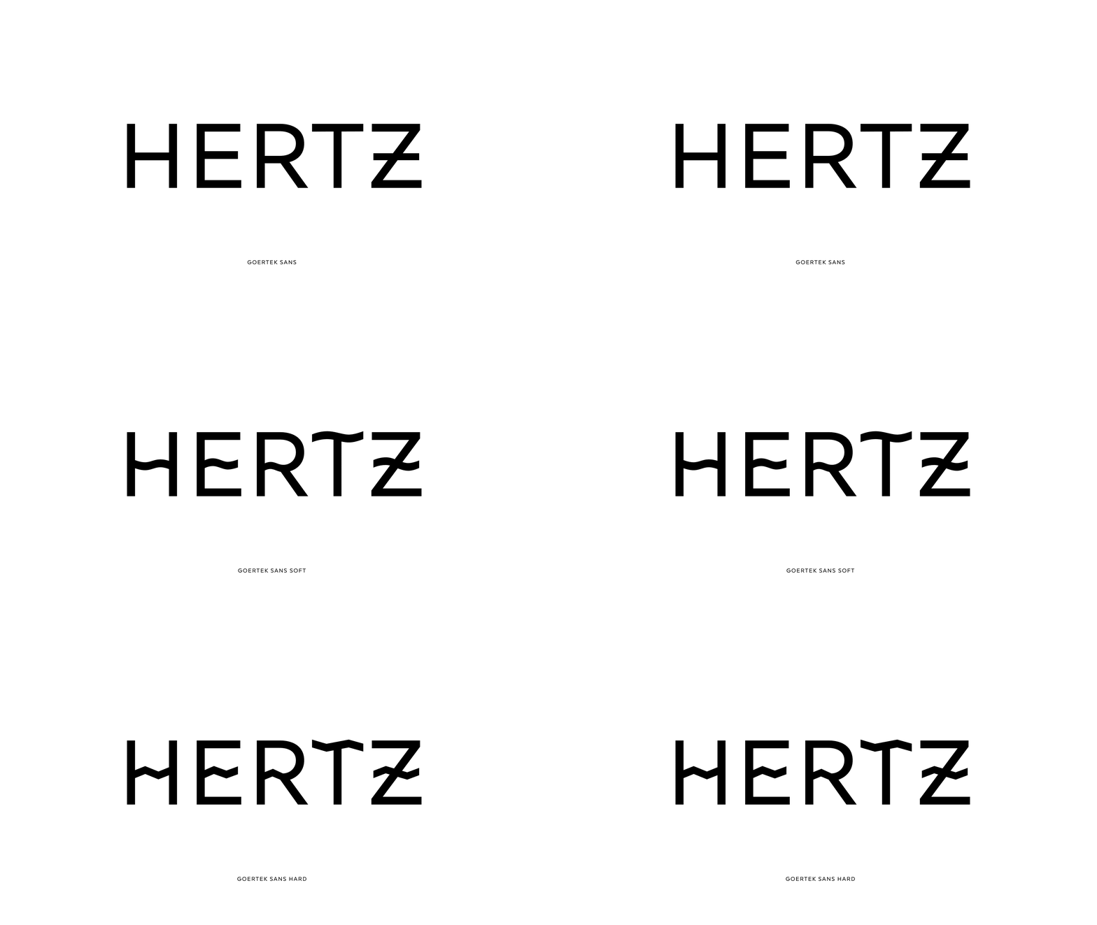
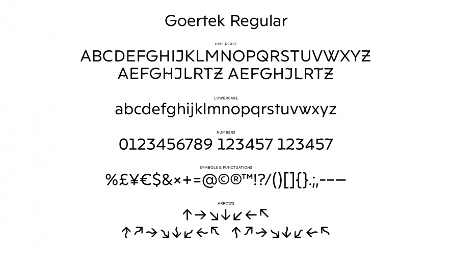
An interesting, if not traditionally aesthetic, approach to type and signage from Kontrapunkt and Nippon Design Center. The Sonic Typeface, designed for Goertek’s R&D Centre in Qinbao, China, varies it’s appearance using Opentype technologies in response to different sound wave frequencies. Meaning that throughout the R&D hub, the typeface and signage will display itself differently depending on the surrounding environment.
I’m not 100% on whether I like the result or not, but I definitely like the concept.
Experiment #2 from my new series of explorations into light and sound. This time looking at the satisfying sound of analogue camera mechanisms from 1920’s–1970’s.
There’s something quite beautiful about getting real mechanical feedback when using a camera, something I miss a little bit more every time I take a picture these days. Ironically though, I shot the footage on my phone…
All of the snippets can be seen on my Instagram here: instagram.com/tomwalshdesign
An edited down version of a 2004 personal project into light and memory that I’m thinking of revisiting. Watch this space…
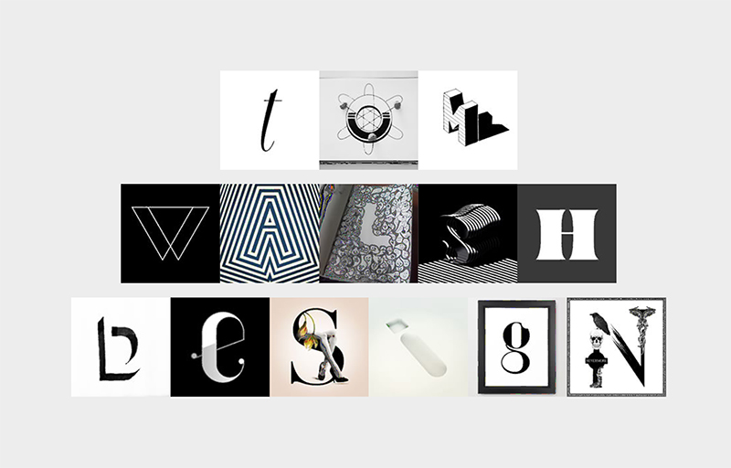
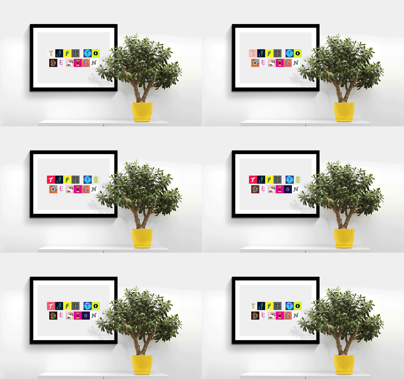
A nice new project from Barcelona based 36 Days of Type using their curated character sets to allow people to experiment and create their own playful typographic masterpiece.
For those not familiar with 36 Days of Type it’s a project by Nina Sans and Rafa Goicoechea which challenges designers, illustrators or anyone with a love of type and creativity, to design a different character every day for 36 days (thereby creating a full alphabet). The best of these are chosen and posted across their Instagram and Twitter accounts. With 99,999 submissions, filtered down to 5,380 ‘curated images’, they’re now sitting on a huge bank of lovingly created content, and what better way to say thank you than with typetodesign.com?
So, for those of you who aren’t quite ready to commit to 36 Days of Type, you can head over to typetodesign.com instead. Where you type in your chosen text, then click through each character until you’ve created your own masterpiece. As they say “Type it, design it, enjoy it.”
Have a play at typetodesign.com here
Or take a look at 36 Days of Type here
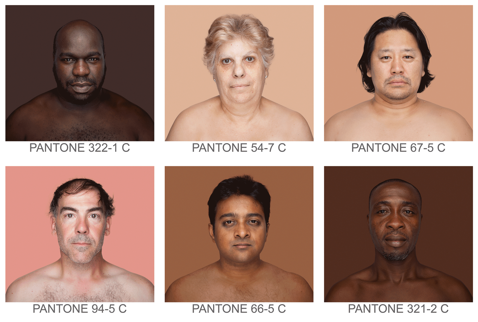
Humanæ is a permanent“work in progress” by Brazilian photographer Angélica Dass, cataloguing skin tones to Pantones. The ‘models’ used are all volunteers, with no specific requests for any nationality, age, race or gender, adding to the variety and unpredictability of the project as it progress’. As Angélica puts it it’s:
“open in all senses and it will include all those who want to be part of this colossal global mosaic. The only limit would be reached by completing all of the world’s population.”
Although it may seem a bit dystopian to catalogue each specific skin shade with a number, visually I think its pretty powerful. I’d also say it serves more to unite than to divide by creating an abstractly beautiful platform, especially when viewed en mass.
You can see more of Angélica’s projects on her site here
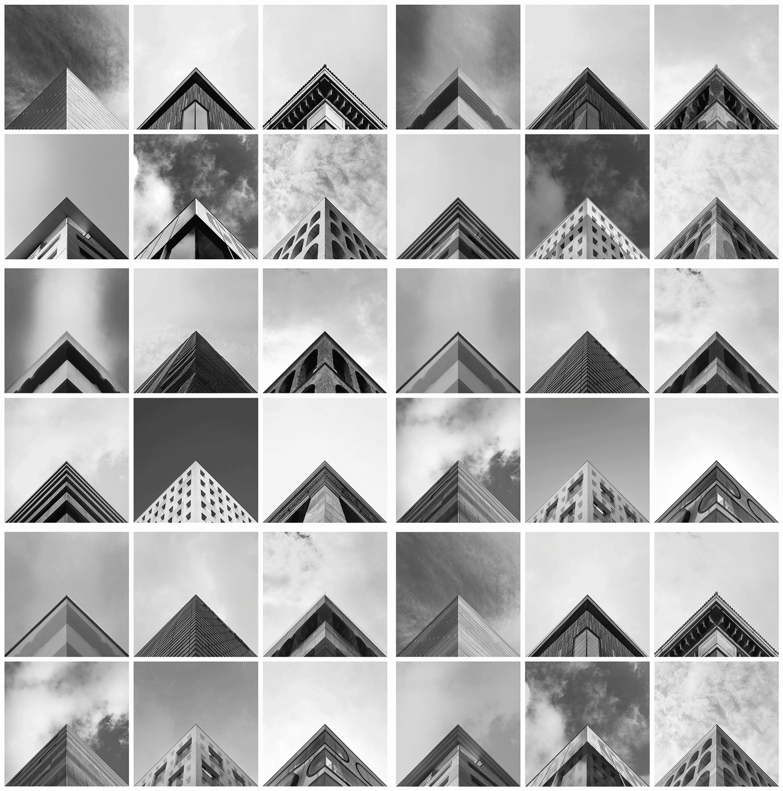
Launched in 2014 Geometry Club is a simple premise, with stunning results. There are two rules:
1) Your apex needs to be aligned centrally on both the X and Y axis
2) Edges should fall off the image at the same point, symmetrically
With over 50 approved contributors in 20 countries anyone can submit a photo to be featured, but it seems only those meeting the exacting criteria will be featured. The outcome is a mesmerisingly beautiful geometric feed of architectural precision.
Take a look at the Instagram feed here, and submit your entries via the site here

