


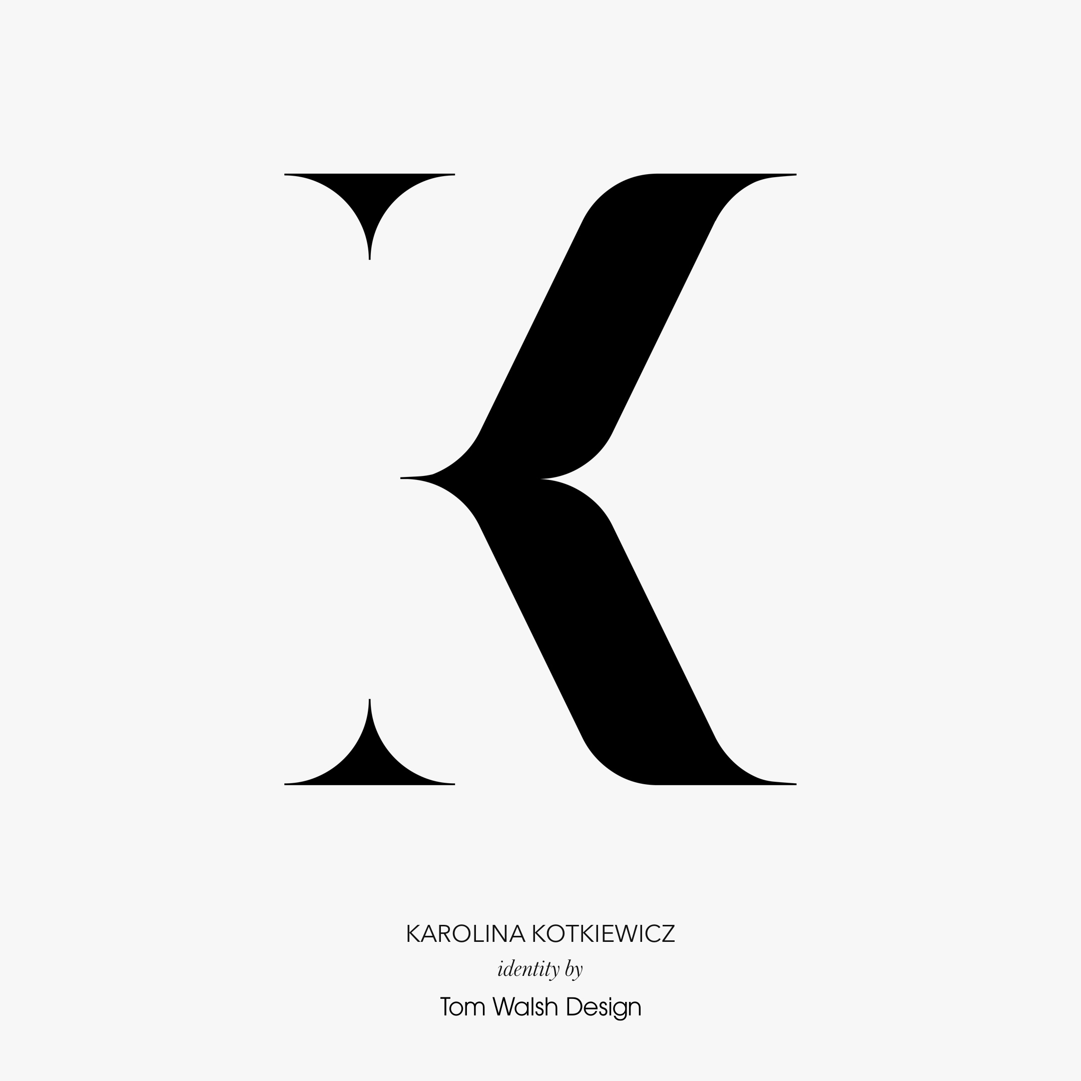
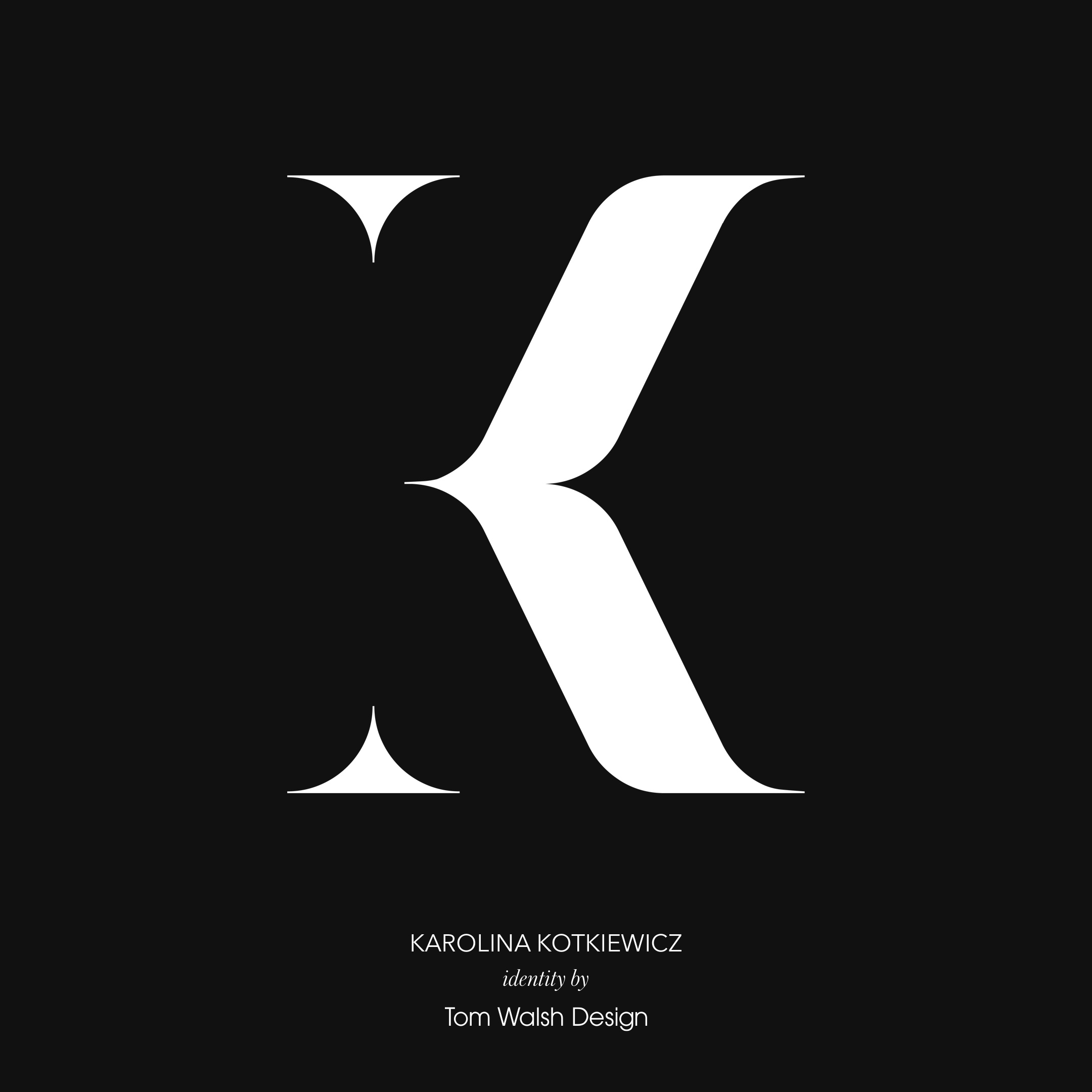
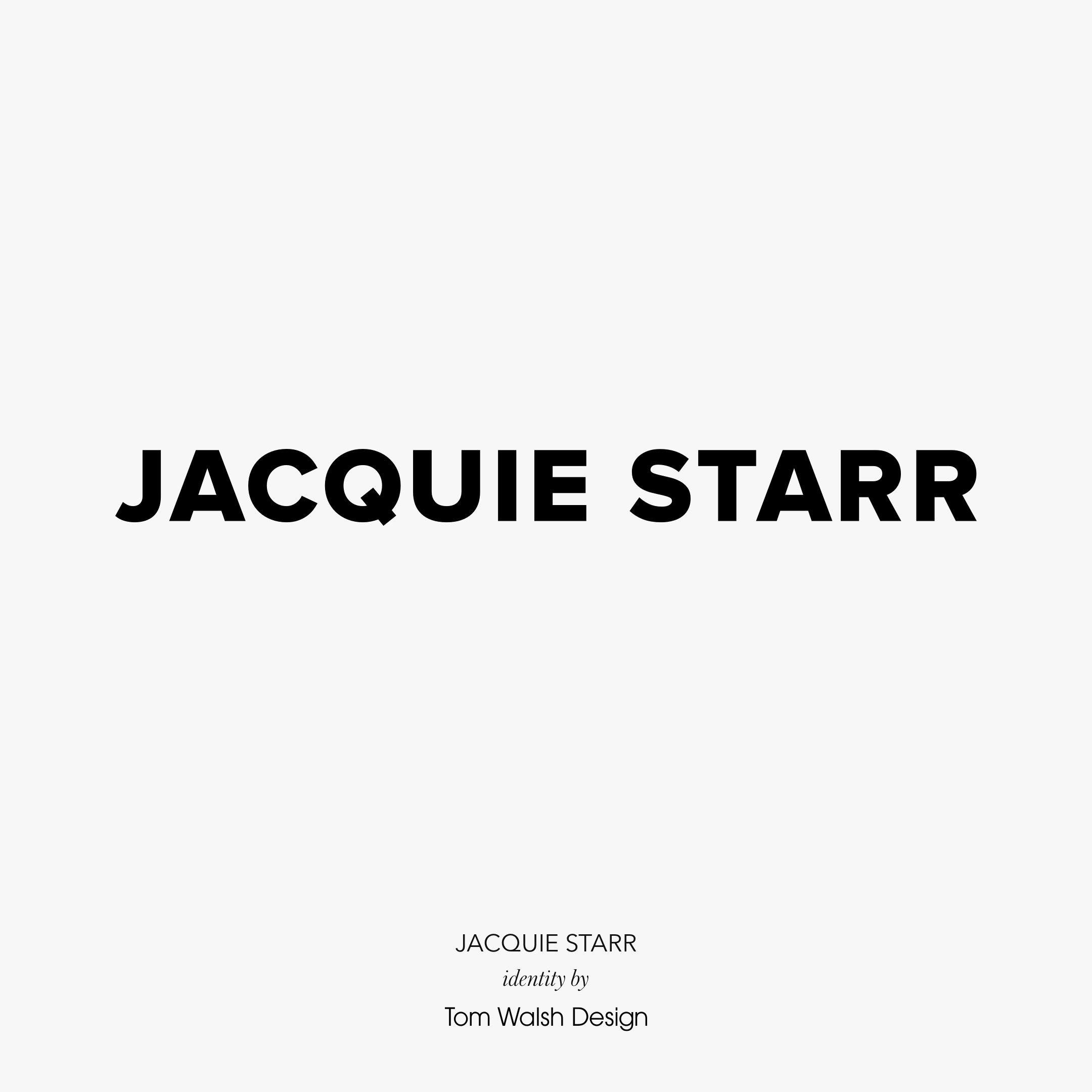
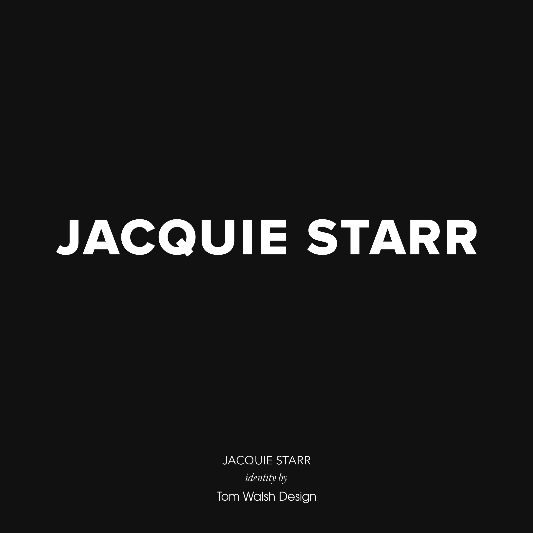
A selection of brand identities I’ve designed over the years, either as part of wider projects or as independent briefs.
Lovely work from Imaginary Forces for Netflix’s latest cult show ‘Stranger Things’. By pairing 70’s type classics Benguiat (Ed Benguiat) and Avant Garde (Herb Lubalin) they’ve managed to use two of my possible all-time favourite typefaces by two of my type design heroes, and more importantly, made them work.
Inspired by Stephen King novel covers, which the show’s creators Matt and Ross Duffer sent to Imaginary Forces as reference, the sequence fills you with intrigue and unease. Perfectly setting the tone for the show to follow.
I think what I like about it most is the abstract details from Benguiat fading and pulsing throughout the background, showing the beauty of the typeface is in all of its fine details, before effortlessly blending together at the end. This, with the contrast of Avant Garde in the foreground, makes for what can only be described as type porn. Something rarely seen in such a commercial project, but I’m glad it made it through!
You can see more of Imaginary Forces work on their site here

Really nice typographic work from Klas Ernflo, a swedish illustrator and designer who works in Barcelona. The fine lined identity is perfectly complimented by the block type graphics created for each poster.
You can see more of his work and illustrations on his site here

Designed in keeping with her printed material (the name in Helvetica Neue 45 Light) I wanted to counter balance that rigidity with something a little softer. Using italicised Baskerville MT the identity aims to reflect the industry, who have a tradition of using established serif fonts, and to draw focus to the ampersand, which was used to highlight her initials (as & is a ligature of the latin et). This mark can also be carried through into places where a full logo isn’t practical (favicons, image watermarks etc) to maintain consistency.

One of my New Years resolutions for 2011 (and probably the only one I’ll stick to…) is to buy, and read, a new design book each month. Not just anything that’s been published though, I’ve written up a list of twelve books I’ve always thought about buying but never committed to. The first in my list is the classic ‘Marks’ by Pentagram (pictured). A 400+ page catalogue of Pentagrams many marks from over the years. From their identities for Penguin (and their children’s editions Puffin) books, the V&A and D&AD to more obscure work, like their simple piece for The Athenium hotel (shown below) it’s essential reading for any designer.


I’ve just finished working on the L.K.Bennett Ebay Outlet pages! It was a challenge to maintain brand identity while also having it made clear that it was separate from the main brand, but I think the end product achieved that quite well. With the reversed version of the logo, and black overlaid navigation it has a slightly less airy feel than the usual designs I produce for them, but still feels clean and in keeping with other elements of the brand. With limits on which photography I could use (they didn’t want to show products that weren’t being sold on Ebay as it could be misleading, and some ex campaign usage rights issues) we decided to instead use tight crops of the L.K.Bennett logo as it appears on the products. Some of the most pleasing results came from cutting in extra close to the logo embossed on the hardware of handbags or zips on boots, but all have a certain quality I think.

You can click here to see all of my work for L.K.Bennett

We’ve just started work on the L.K.Bennett iPhone App, and as the existing logo is quite wide I thought I’d design a slimmer version that would be better suited to the screens aspect. It started with efforts at slimming characters and kerning, but after a while of playing I realised that wasn’t going to work. So I decided to cut it down to just the L.K.B, but as far as App branding goes it was a little too obscure.. Following a few chats it was agreed that ‘fashion’ would be added, and after a bit of thinking/playing with it I realised that positioned correctly, and with a few tweaks, the top curl of the ‘f’ and the dot of the ‘i’ could make up the dots from L.K.B, and the logo (which in the end wasn’t used, but I still like..) turned out quite well.
You can also see it being used in earlier versions of the intro animation in my post on the ones that didn’t make the cut here.

I was approached by Silent Whispers to design their identity and web site. I have to admit I don’t really know much about Remote Viewing, but its always quite refreshing to design for a different style of client! The identity, set in an adapted version of Baskerville, aims to give both space and a feeling of openness, as well as a solid grounding from the expanded foot on the ‘p’. It was also designed with consideration for how it could be used both across all printed material and for web.
You can click here to see all of my work for Silent Whispers

This project came as a pleasant surprise after being recommended by Alexandra Leavey (see the site I designed for her here). Visit Eritrea was a site and blog design and build, as well as identity (also once the database has grown this could involve an HTML email template being set up). The idea behind the design was to have a clear and digestible layout of information, while keeping in mind the tone of the content I was working with. In the end I was pretty pleased with how the project turned out, and I hope it goes to help their cause a little. You can view the site here.

Or click here to see all of my work for Visit Eritrea
