
An insightful and engaging new project from Getty Images, showing their predictions for trends in the coming year. We see quite a few of these being shared around in January each year, but this one is particularly nice. My favourite element being the colour sampling rollover in the ‘Boys, Boys, Boys’ page. A nice touch that surprised me and made me look for more little details throughout.
Take a look for yourself at visualtrends.gettyimages.com
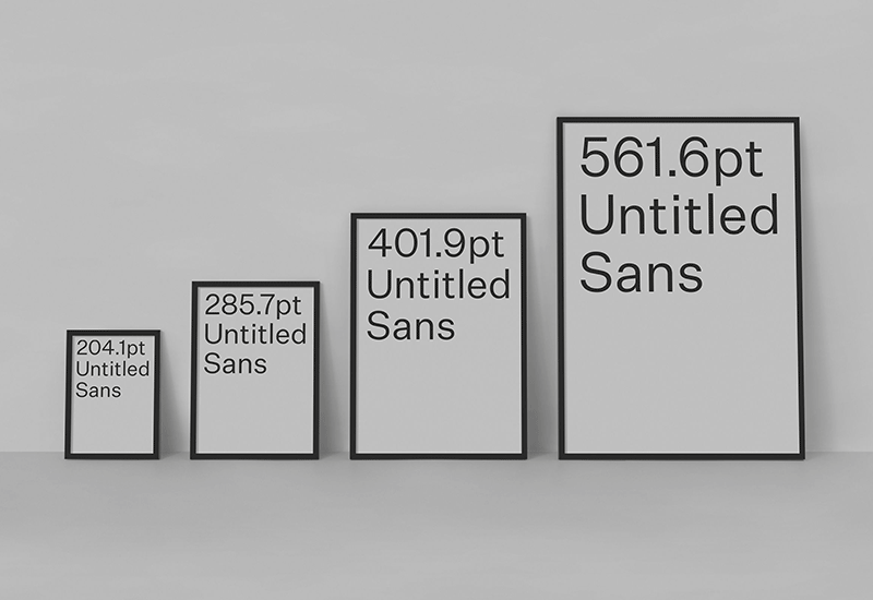
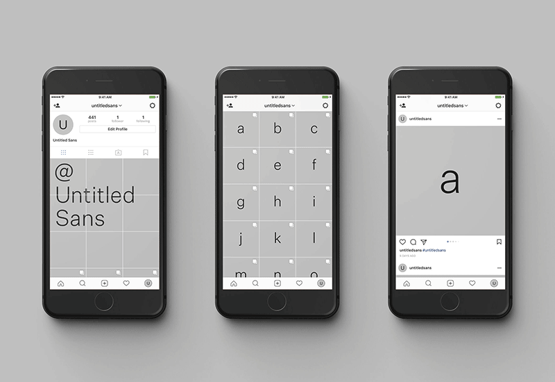
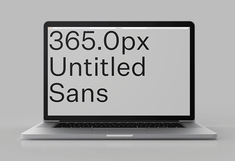
Really nice digital promo project for New Zealand type foundry Klim’s new ‘Untitled Sans’ and ‘Untitled Serif’ by Alt Group (also from NZ). I especially like their use of Instagram carousels to show each character in its varying weights and styles. So simple, but so effective.
You can check out both of their Instagram’s here:
@untitledsans
@untitledserif
and their micro sites here (click on the type to buy through Klim):
untitledsans.com
untitledserif.com
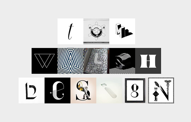
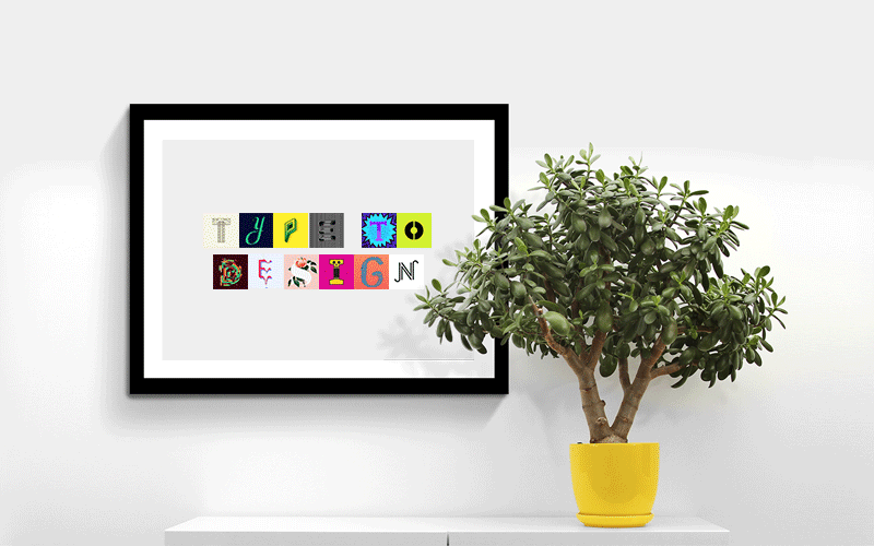
A nice new project from Barcelona based 36 Days of Type using their curated character sets to allow people to experiment and create their own playful typographic masterpiece.
For those not familiar with 36 Days of Type it’s a project by Nina Sans and Rafa Goicoechea which challenges designers, illustrators or anyone with a love of type and creativity, to design a different character every day for 36 days (thereby creating a full alphabet). The best of these are chosen and posted across their Instagram and Twitter accounts. With 99,999 submissions, filtered down to 5,380 ‘curated images’, they’re now sitting on a huge bank of lovingly created content, and what better way to say thank you than with typetodesign.com?
So, for those of you who aren’t quite ready to commit to 36 Days of Type, you can head over to typetodesign.com instead. Where you type in your chosen text, then click through each character until you’ve created your own masterpiece. As they say “Type it, design it, enjoy it.”
Have a play at typetodesign.com here
Or take a look at 36 Days of Type here
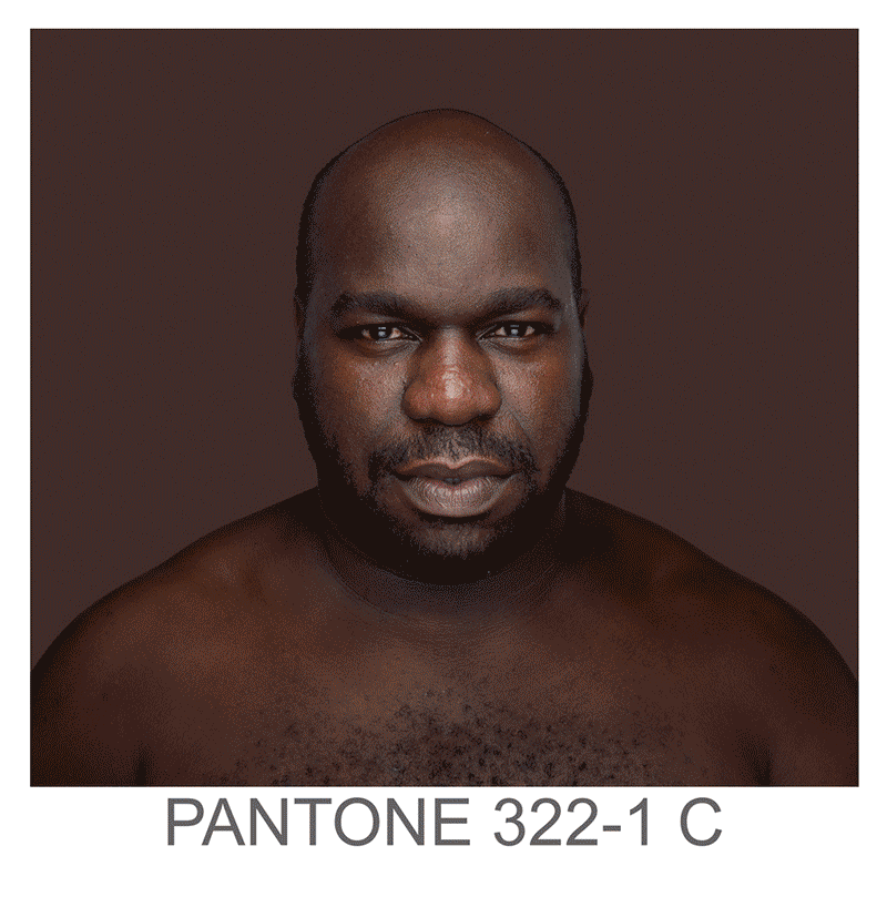
Humanæ is a permanent“work in progress” by Brazilian photographer Angélica Dass, cataloguing skin tones to Pantones. The ‘models’ used are all volunteers, with no specific requests for any nationality, age, race or gender, adding to the variety and unpredictability of the project as it progress’. As Angélica puts it it’s:
“open in all senses and it will include all those who want to be part of this colossal global mosaic. The only limit would be reached by completing all of the world’s population.”
Although it may seem a bit dystopian to catalogue each specific skin shade with a number, visually I think its pretty powerful. I’d also say it serves more to unite than to divide by creating an abstractly beautiful platform, especially when viewed en mass.
You can see more of Angélica’s projects on her site here
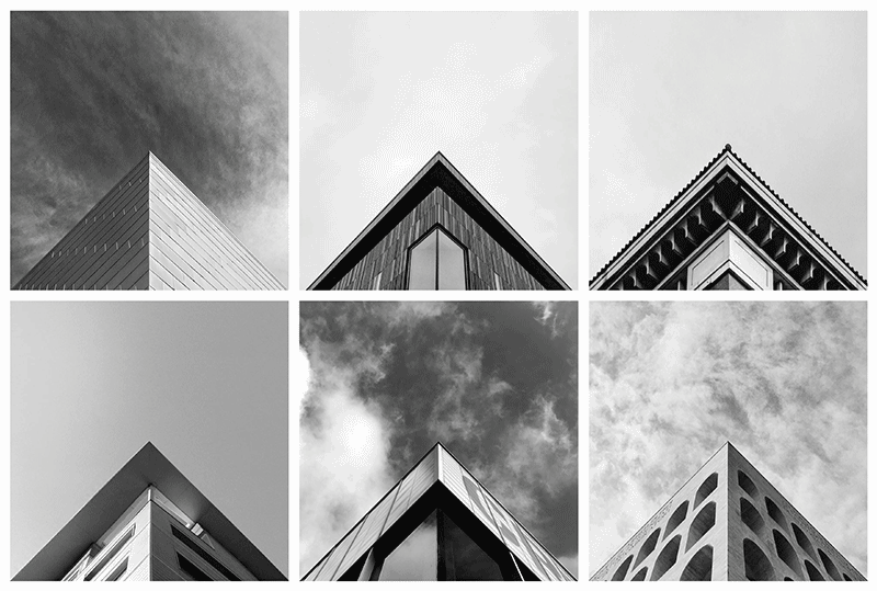
Launched in 2014 Geometry Club is a simple premise, with stunning results. There are two rules:
1) Your apex needs to be aligned centrally on both the X and Y axis
2) Edges should fall off the image at the same point, symmetrically
With over 50 approved contributors in 20 countries anyone can submit a photo to be featured, but it seems only those meeting the exacting criteria will be featured. The outcome is a mesmerisingly beautiful geometric feed of architectural precision.
Take a look at the Instagram feed here, and submit your entries via the site here
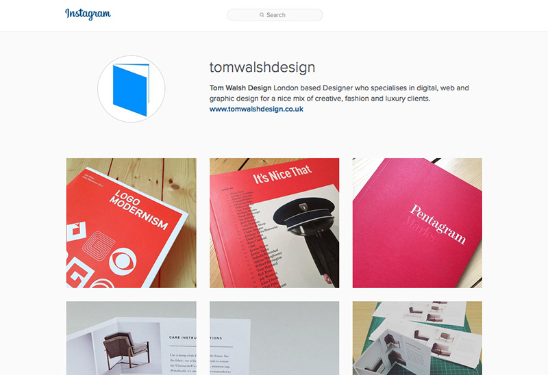
After a while of weighing it up, I finally decided to set up an Instagram for the business side of my life. Primarily as I wasn’t sure where to put the print work that I often create when I’m working on digital contracts, but also as a kind of middle ground for inspiration. Somewhere to put those little nuggets that don’t quite warrant a post.
If you’d like to take a look, or follow, you can find me at instagram.com/tomwalshdesign/
Nice social media campaign for Swedish homecare brand Åhléns by agency Forsman & Bodenfors
Agency: Forsman & Bodenfors
Copywriter: Pontus Levahn
Art director: Silla Levin
Designer: Ellinor Bjarnolf
Production company: Snask


Dubble, the new iPhone app which explores and experiments with double exposure. With a nice, clean and friendly interface Dubble is about as straight forward to get started with as you can get (which makes me wonder why they spent so much time on infographics to explain it… I won’t knock them for that though, they’ve been nicely done and add to the feel of the app as a whole). How it works, in a nutshell, is you take a photo and upload it. Seconds later that photo is ‘double exposed’ (overlaid/blended) with another Dubble user’s photo from anywhere in the world.
Double exposing isn’t a new idea, not even in terms of apps, or even apps this year (see my earlier post on the Goldfrapp app here), but what I like about this one is the random possibilities of the collaborations. It brings back the feel and excitement of taking a film in to be processed. Waiting/wondering/worrying how/if they’ll turn out. At least with this app you don’t have to worry about wasting your money on out of focus or overexposed prints though, as its free!
Interface wise its clean and simple. Fairly familiar in design to quite a few apps, but still nice to look at. Some of the icons seem a little chunky, but as a whole that’s a pretty minor criticism.
If you want to have a play for yourself you can download Dubble from the App Store here
(it’s not available on Android, yet)
Nice (but not so new) campaign promoting Issey Miyake’s last perfume by enabling users to post messages using Google Street View. The experience gets its full power with the app that allows other users to discover messages directly where they have been posted via augmented reality. They don’t look too bad either!
You can take a look on the site here

To launch issue #86 ‘Making the News’ COLORS magazine have created a ‘News Machine’, which you tweet your headline to and it replicates the modern media’s mangling of information and spits out its own interpretation. COLORS explain the process on their site as –
“Twitter is the largest and least verifiable wire agency in the world. Tweet your story to @colorsmachine and watch the message change as it echoes through different media and into print.
A megaphone will read your tweet out loud. Its tape recorder listens, converting what it hears into text so that the television can show it onscreen. A camera watching the television converts what it sees into a signal to the radio antenna, which broadcasts the tweet. And the waiting microphone interprets this radio address as text again for printing.
Pick up your receipt. Compare the original tweet with the final report. Accuracy of reproduction varies according to the clarity of your writing and to chance.”
Unfortunately, as I’m writing this post the machine is offline (I think it’s being re-located) so I can’t send a test tweet to it, but I’ll keep my eye out for when it’s back up and add the results!
If you’d like to read more, or have a play with the News Machine you can visit COLORS’ website here
