
Ever wonder what life would be like if all our apps suddenly disappeared? Enter the App-ocalypse.
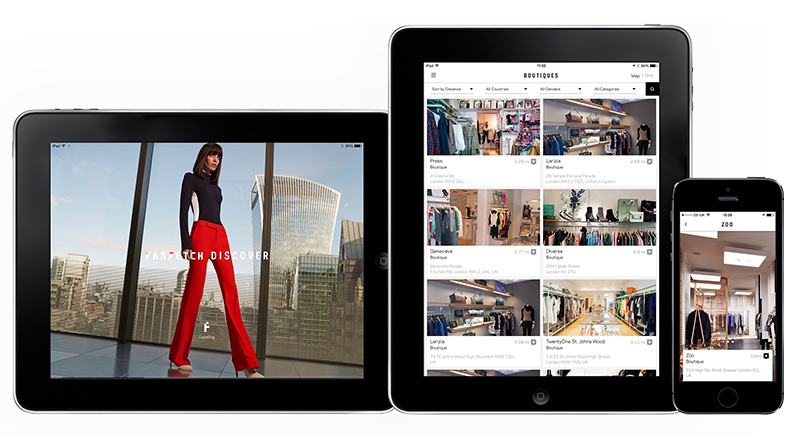
The iPad version of the Farfetch Discover app I designed while in house at Farfetch has launched. So now users can enjoy it on tablets as well as mobile, there’s no excuse not to download it!
They describe it as –
“Farfetch Discover takes a fashion insider’s view on cities around the world, with unrivalled access to a treasure trove of local knowledge direct from our network of over 300 independent boutiques. From gourmet eateries in Dallas, to charming markets hidden away on Dubrovnik’s Adriatic coast, get tips that only a local could know.
Browse boutique recommendations on where to eat, drink, stay or explore. Read personal itineraries from some of the city’s coolest natives or create your own to have handy when you’re offline in the city. And of course you’ve got over 1,500 designers and 120,000 products to shop from, right at your fingertips.”
And if you’d like to have a play you can download it from the app store here
Or read more about this project here


The fashion ‘Portfolio’ I designed for Milan Style is now live! Designed to be a clean, responsive experience the site pulls in editorial content from a selection of major fashion sites (including Gucci, Oki Ni, Matches, Mr Porter and many more) and creates a central hub to view the upcoming trends and styles in the Male fashion world. With content ranging from Catwalk shots to editorial it works as a curated overview of what the top end of fashion are producing from season to season. It was designed to be responsive to cater for more detailed browsing on a desktop, or for a quick bit of mobile eye candy if you’re on the go, and has a couple of nice little features thrown in too (like the Pinterest style colour matching on load, and the animation of content on window re-size).
You can see more of this project on my site here
Or you can take a look at the full site here


Dubble, the new iPhone app which explores and experiments with double exposure. With a nice, clean and friendly interface Dubble is about as straight forward to get started with as you can get (which makes me wonder why they spent so much time on infographics to explain it… I won’t knock them for that though, they’ve been nicely done and add to the feel of the app as a whole). How it works, in a nutshell, is you take a photo and upload it. Seconds later that photo is ‘double exposed’ (overlaid/blended) with another Dubble user’s photo from anywhere in the world.
Double exposing isn’t a new idea, not even in terms of apps, or even apps this year (see my earlier post on the Goldfrapp app here), but what I like about this one is the random possibilities of the collaborations. It brings back the feel and excitement of taking a film in to be processed. Waiting/wondering/worrying how/if they’ll turn out. At least with this app you don’t have to worry about wasting your money on out of focus or overexposed prints though, as its free!
Interface wise its clean and simple. Fairly familiar in design to quite a few apps, but still nice to look at. Some of the icons seem a little chunky, but as a whole that’s a pretty minor criticism.
If you want to have a play for yourself you can download Dubble from the App Store here
(it’s not available on Android, yet)


If you liked Clear, the designers to-do app, you’ll love Tick. Designed from the ground up for iOS7 it makes organising your life far more enjoyable than endless post-it notes…
I’m a list person. I have shopping lists on my phone, post-its stacked next to my computer (work and home), and scribbles all over various sketchbooks and envelopes scattered around the place. This may give me the feeling of being organised, but if I’m honest I quite often find lists long after I was supposed to have finished them. That’s how I stumbled across Tick. With its simple icon centred design, and the ability to customise colours to your preference it couldn’t be more straight forward. For the more experimental users they even chucked in a few swipey short cuts. The main thing I like about this app is, however, something that pretty much boils down to a design feature, of course. Its what the makers Taphive describe as ‘Ambient aware’. Which means that it detects the lighting in the room you’re in and switches itself to night mode if there’s low light. A lovely, simple touch that made it stand out for me.
If you’d like to organise yourself a bit more too, you can download it here
Taphive also have a pretty nifty app called Blur Studio. I’m yet to play with that one, but you can take a look at it here.


Lovely experimental experience from Goldfrapp, which allows the user to create discs which form ‘soundscapes’. Using any of the four supplied templates you can create ‘discs’ which represent sounds, the more discs you create the more multi-layered the soundscape becomes. A nice way to engage fans on it’s own, but it also comes with an accompanying ‘Tales of Us’ photo app. Through the app you can either take new photos, choose photos from your library, or have the app pick two at random. It then layers the photos as a ‘double exposure’ (see what they did there?), giving a selection of filters and adjustments that lets you create something quite similar to an Instagram filter, but with a more abstract depth. All round worth checking out.


Although it takes a while to load (which might have more to do with work being quiet today than the development…) if you liked their previous offerings, like Sprawl 2, then this is well worth a look. You can either use your webcam or your mouse to interact with the video, similar to the Sprawl one, but this time your movements don’t just pause/skip/loop the video, they directly interact with it creating kaleidoscopes and bursts of light wherever you connect. Here’s how they explain it –
“We’re not just dealing with technology, we’re dealing with unique environments. A big part of the data is our engagement and gesture. We developed a HTML5 video player where we control real-time WebGL shader effects. We pair camera vision with the gyroscope and accelerometer data from the mobile device that we send to the computer through WebSockets. It’s by far the most complex thing I’ve ever worked on.”
“For me it’s always been an obsession to combine these things, to make something rich and nuanced, so you forget the technology.”
Clever stuff eh.
Watch the video and have a play (best viewed on Google Chrome) here
Written, Directed & Produced by: Vincent Morisset
Creative Direction by: Vincent Morisset and Aaron Koblin
Produced by: AATOAA, Unit9, Google Creative Lab, Antler Films
Nice (but not so new) campaign promoting Issey Miyake’s last perfume by enabling users to post messages using Google Street View. The experience gets its full power with the app that allows other users to discover messages directly where they have been posted via augmented reality. They don’t look too bad either!
You can take a look on the site here

Another nice, well thought out app from the BBC. Their new offering is one that a lot of people have been expecting to appear for a little while now, since the re-design of their desktop weather experience (if you haven’t seen it, you can read more about that in my previous post here), and it doesn’t disappoint. As usual their UX and interface keeps it intuitive and pretty nice to use, while presenting everything in a clean and easy to digest format.
For those who have been pointing out the similarities to the upcoming iOS7 weather app, I’ve had a play with both, and I know which one I’ll be sticking with…
If you haven’t already, download it and have a play here.
It’s free after all (unless you count your TV license as payment…)!

The updated (and much upgraded) version of fashion, advertising and editorial prop/set designer Alexandra Leavey’s site is now live. Built to work perfectly on desktop, tablet and mobile it can now be viewed wherever her clients are, and on their device of choice. Comprising of swipe, keyboard and mouse controlled navigation I built it to be as accessible as possible, while keeping the design and interface minimal so her images are the focus.
If you’re curious, you can take a look here – www.alexandraleavey.com
