
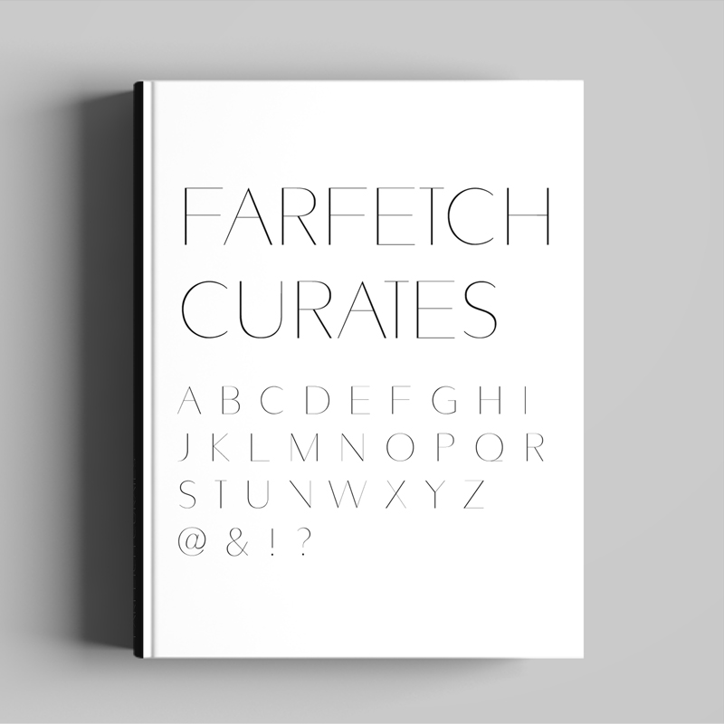
Following on from my work re-designing the Farfetch website and designing their Farfetch Discover iPhone and iPad apps, I was approached by their Art Direction team to collaborate on the design of a custom font for their printed ‘Farfetch Curates’ collection of books. Based on Avenir, but with added variety in weight across the vertical stokes, it maintains the original lightweight form, while adding contrast and structure to the characters.
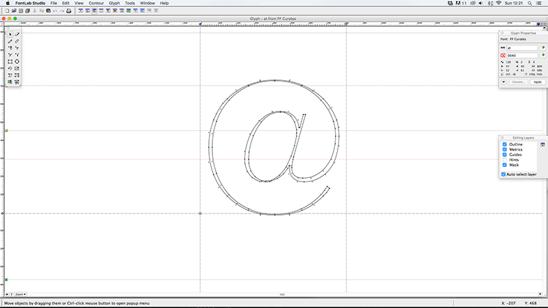
Basing a font on an existing classic like Avenir may sound like a simple starting point, before you consider that you now need to improve the characters for it to be worth while. Some of the particular challenges came with the ampersand and number eight, purely as with so many curves it took a lot of tweaking to get them to feel the same weight as the simpler characters, like the ‘I’ or ‘T’. After a lot of back and forth between myself and Craig I think we got there though.
The next logical step would be working up the lower case characters, but as its only used as a display font for the time being I’ll wait and see if I get that call…
You can see examples of it in use in the Farfetch Curates series here
Font Name:
Farfetch Curates
Credits/Designer:
Tom Walsh / Craig McCarthy
Released:
2015
Font Style:
Geometric Sans-Serif
Format:
Opentype
