
The first of a series of audio-reactive experiments I’m working on. Beat created in Ableton, audio-reactive visuals created in TouchDesigner. More to come, watch this space!
I’ve been experimenting a little with 3D recently – using one of my own typefaces FF Privé as the starting point. It’s interesting to see how it changes the feel of each glyph when you add depth, texture and motion to them.
Looking forward to sharing more of these soon – watch this space.
A time-lapse mushroom video loop I created to be used as a projection for the DIRTEA pop-up at Selfridges – ‘SUPERMARKET’. A four-week retail experiment that imagined an earth-conscious shop of the future
Experiments in sound and animation, coming soon…
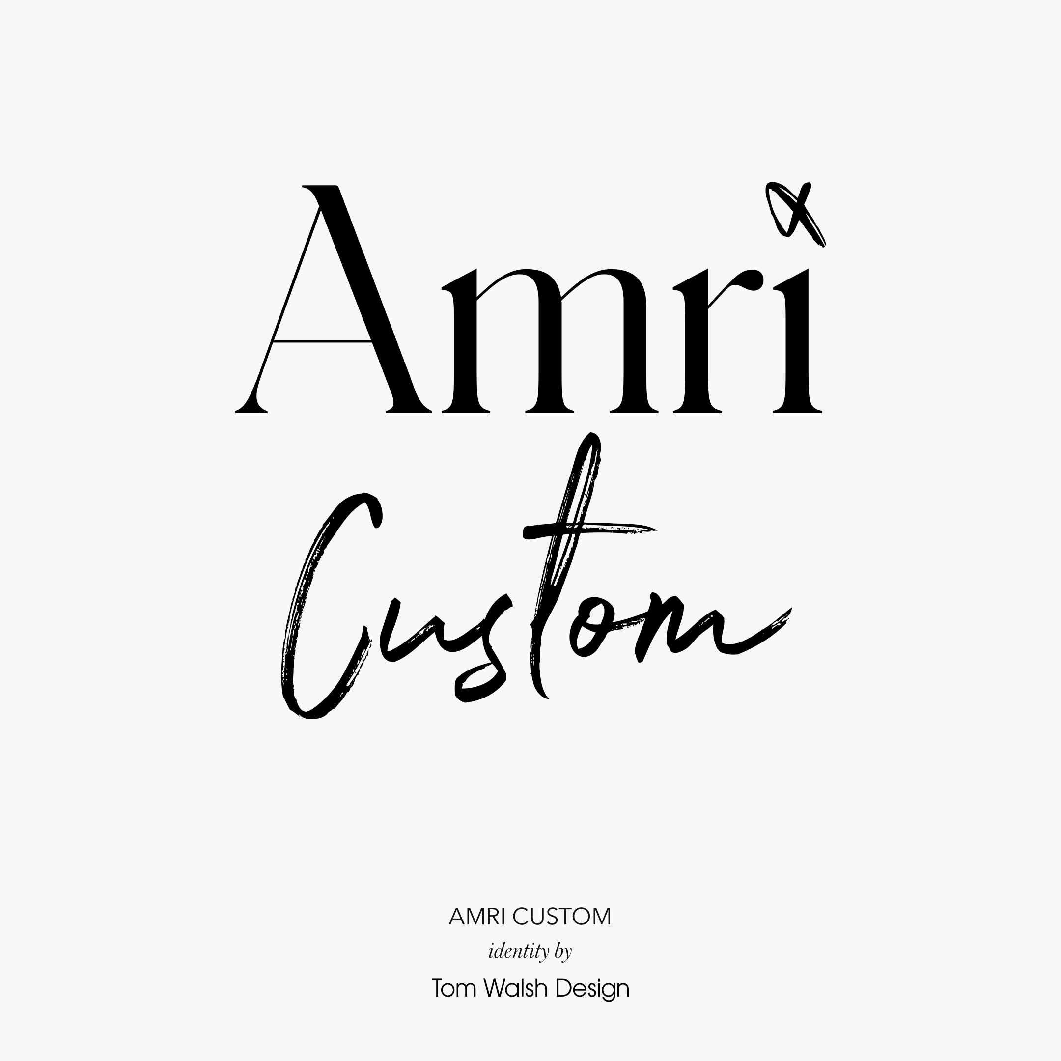
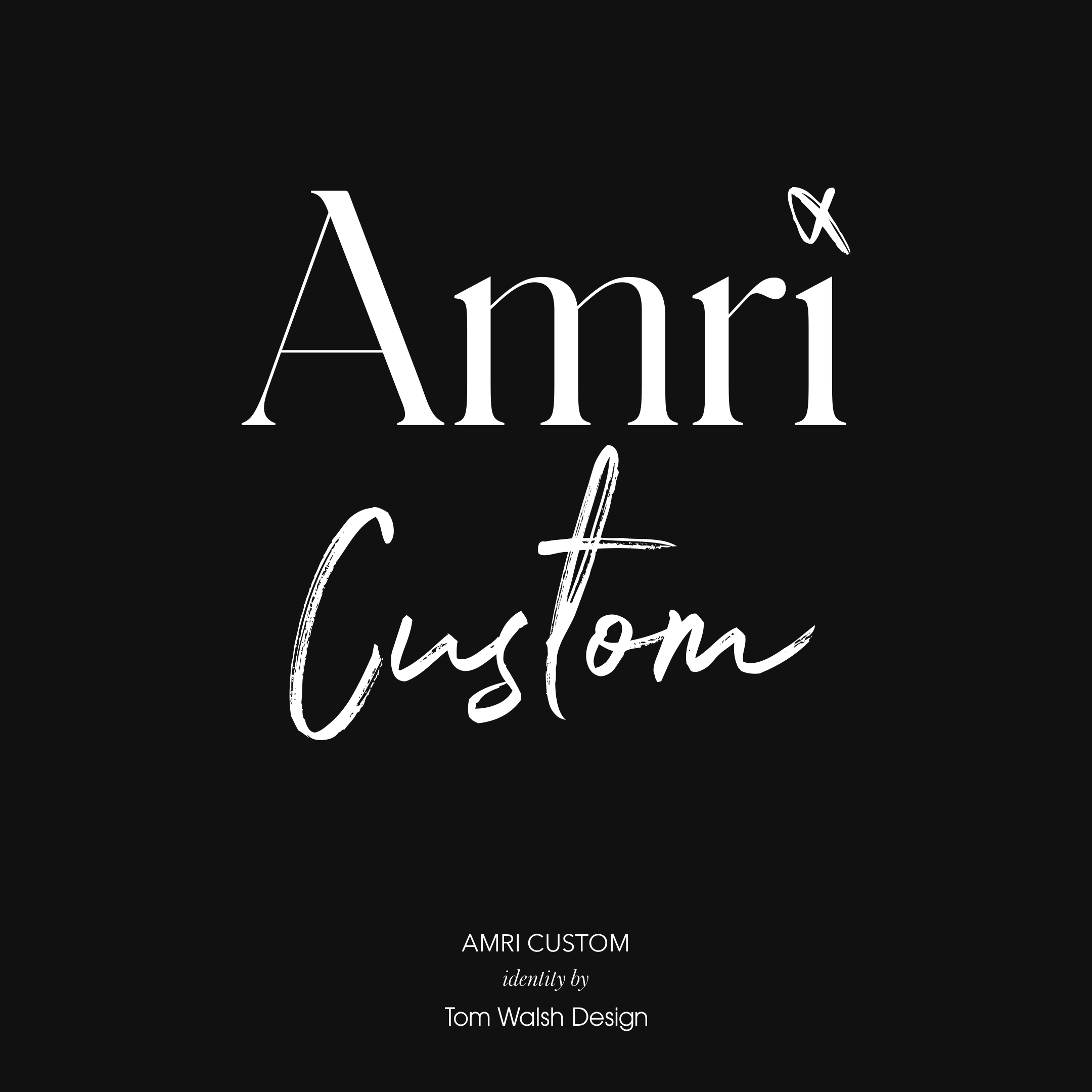


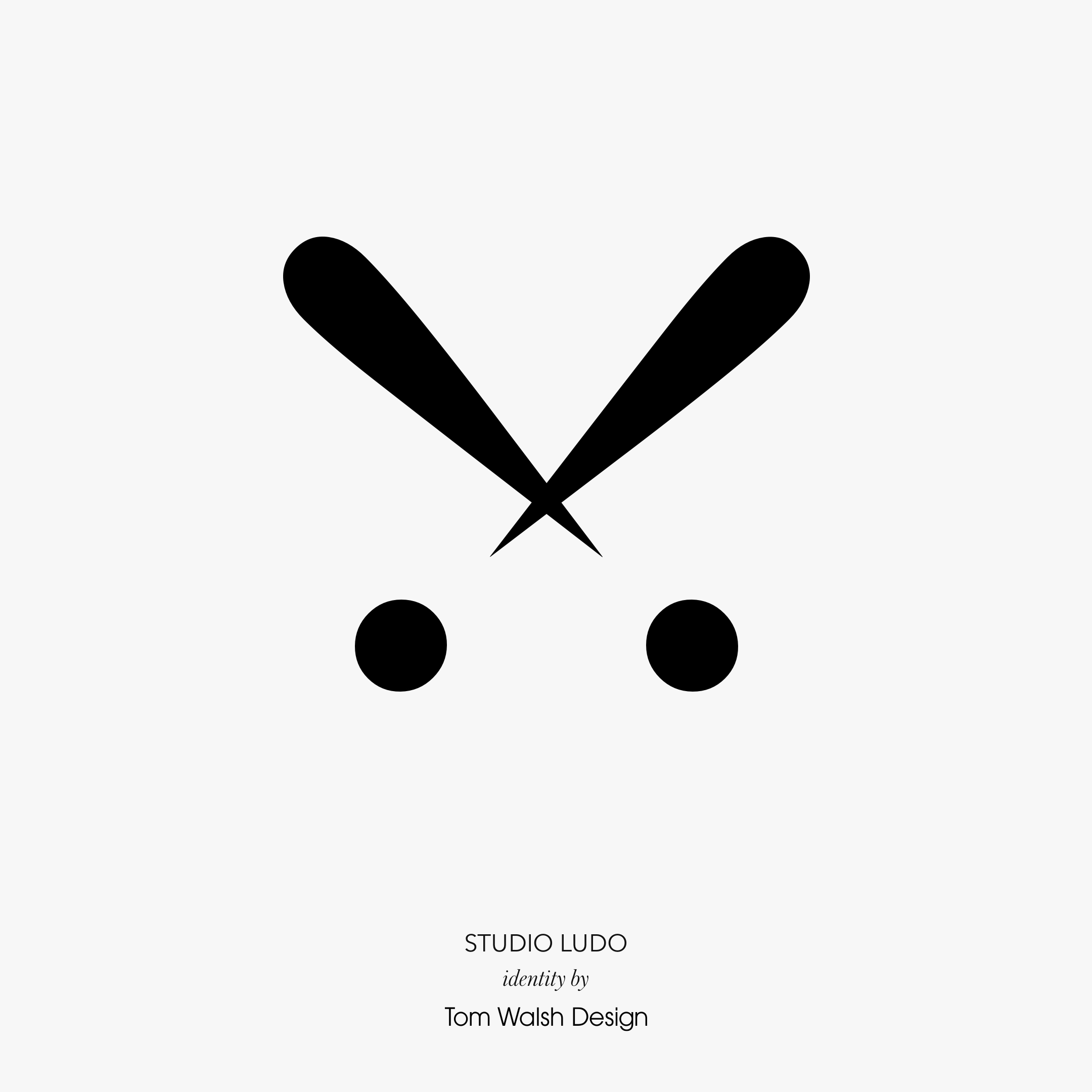
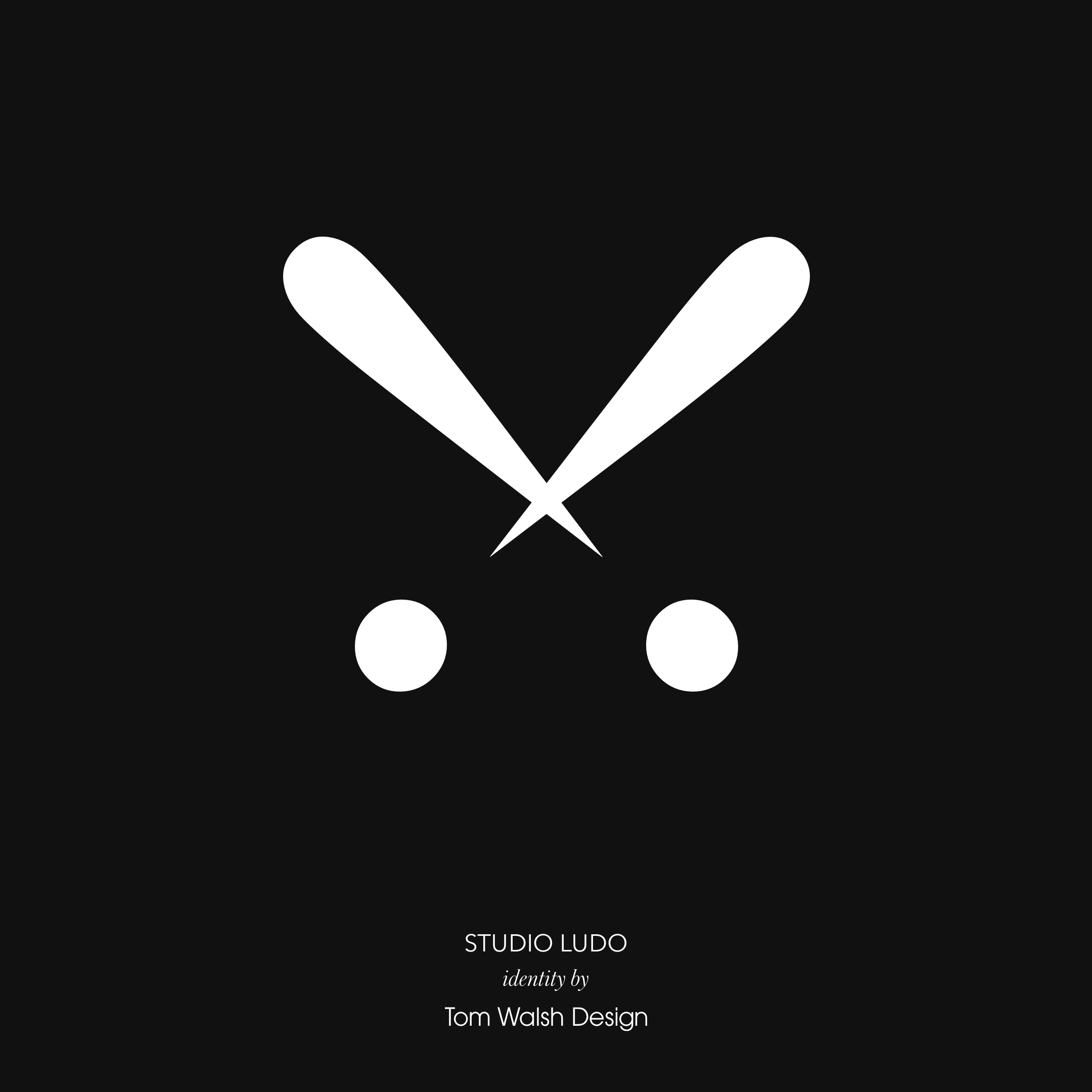
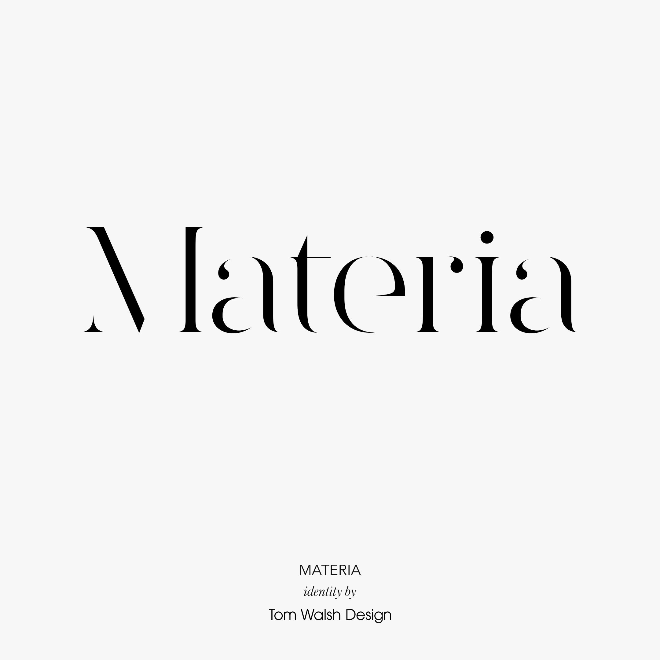
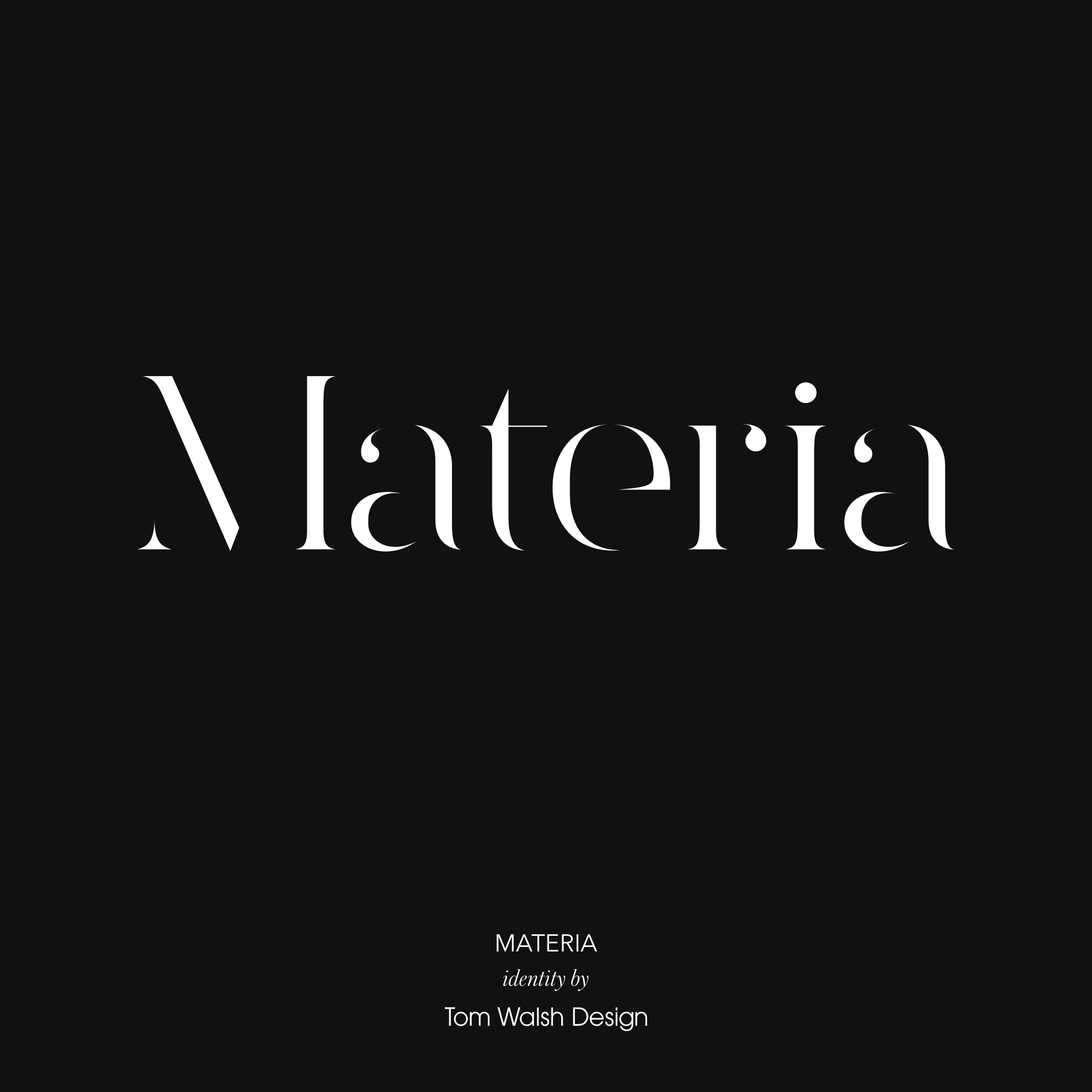
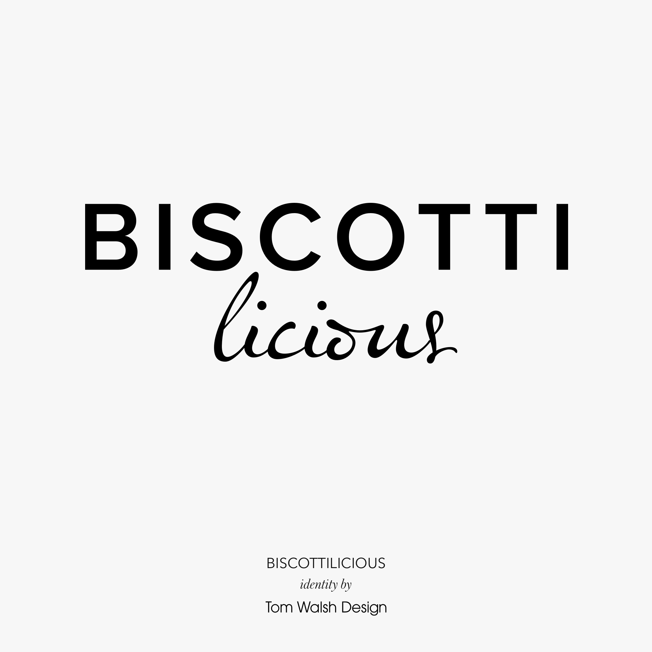
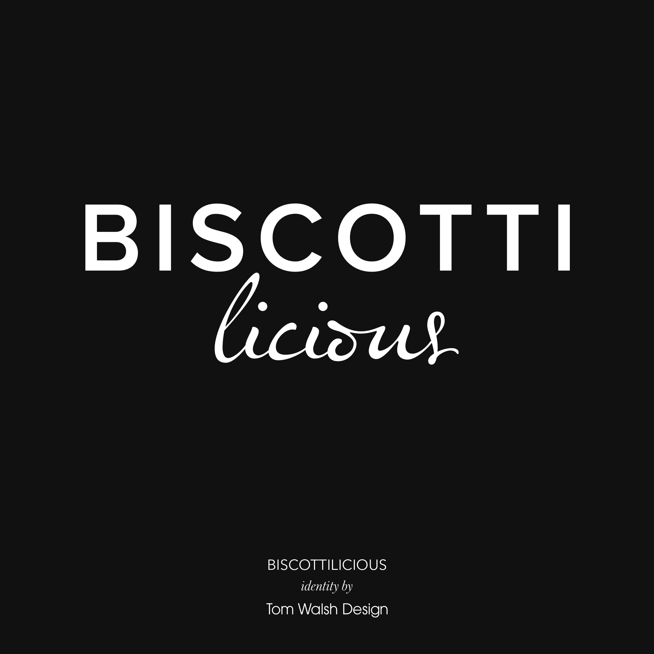
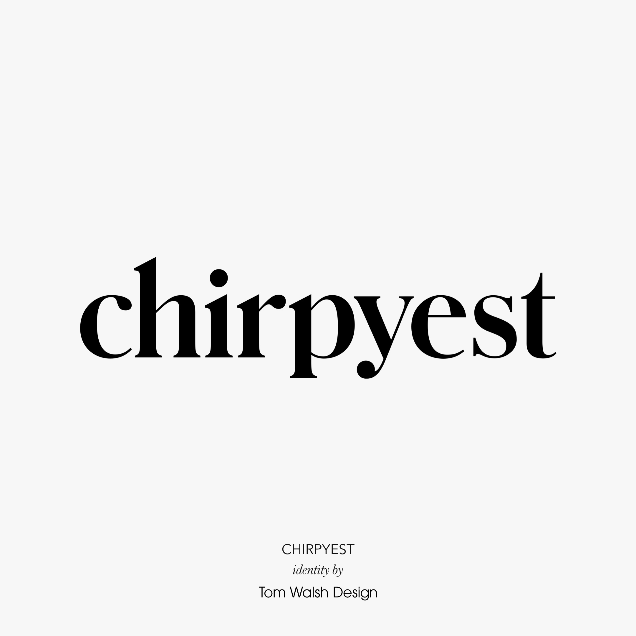
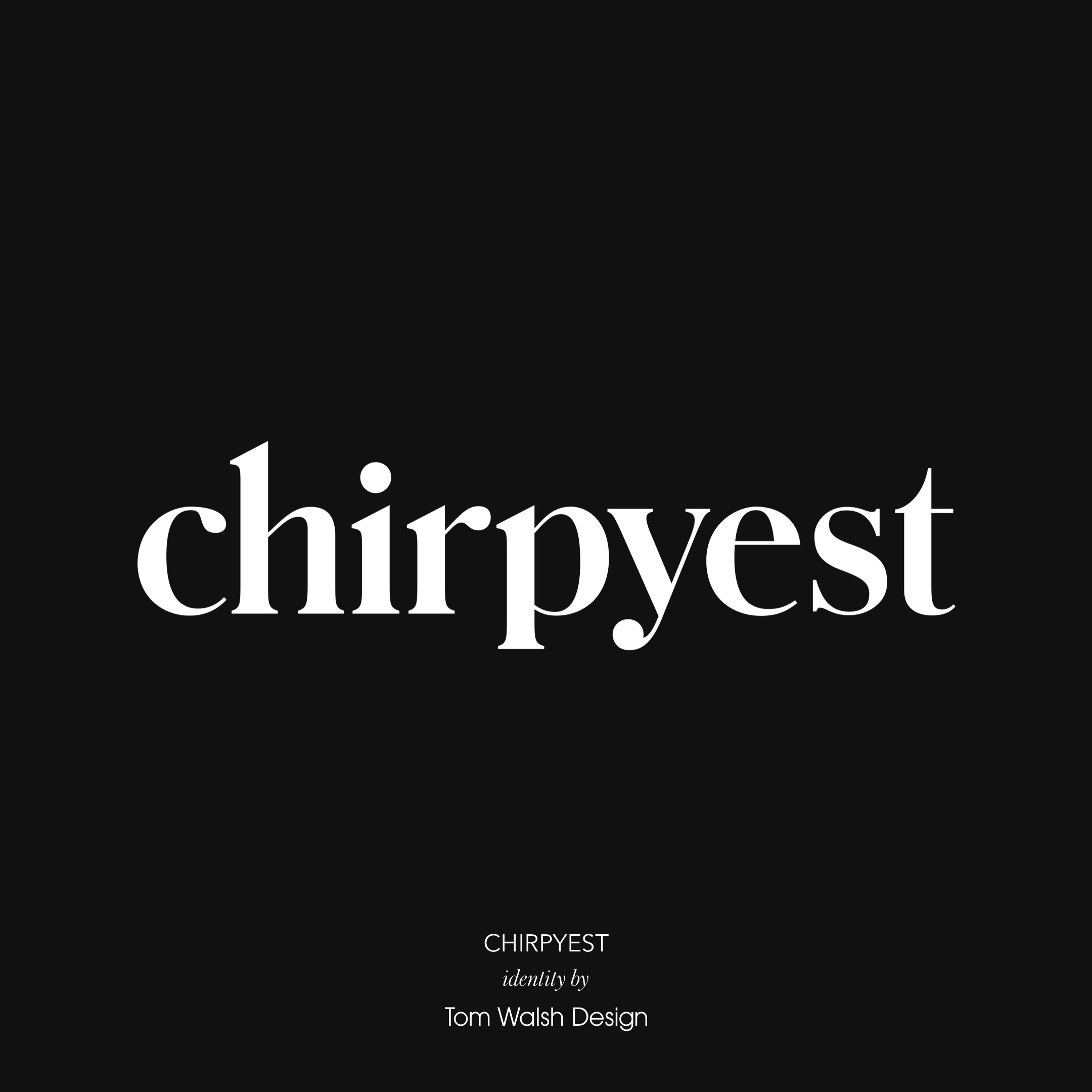
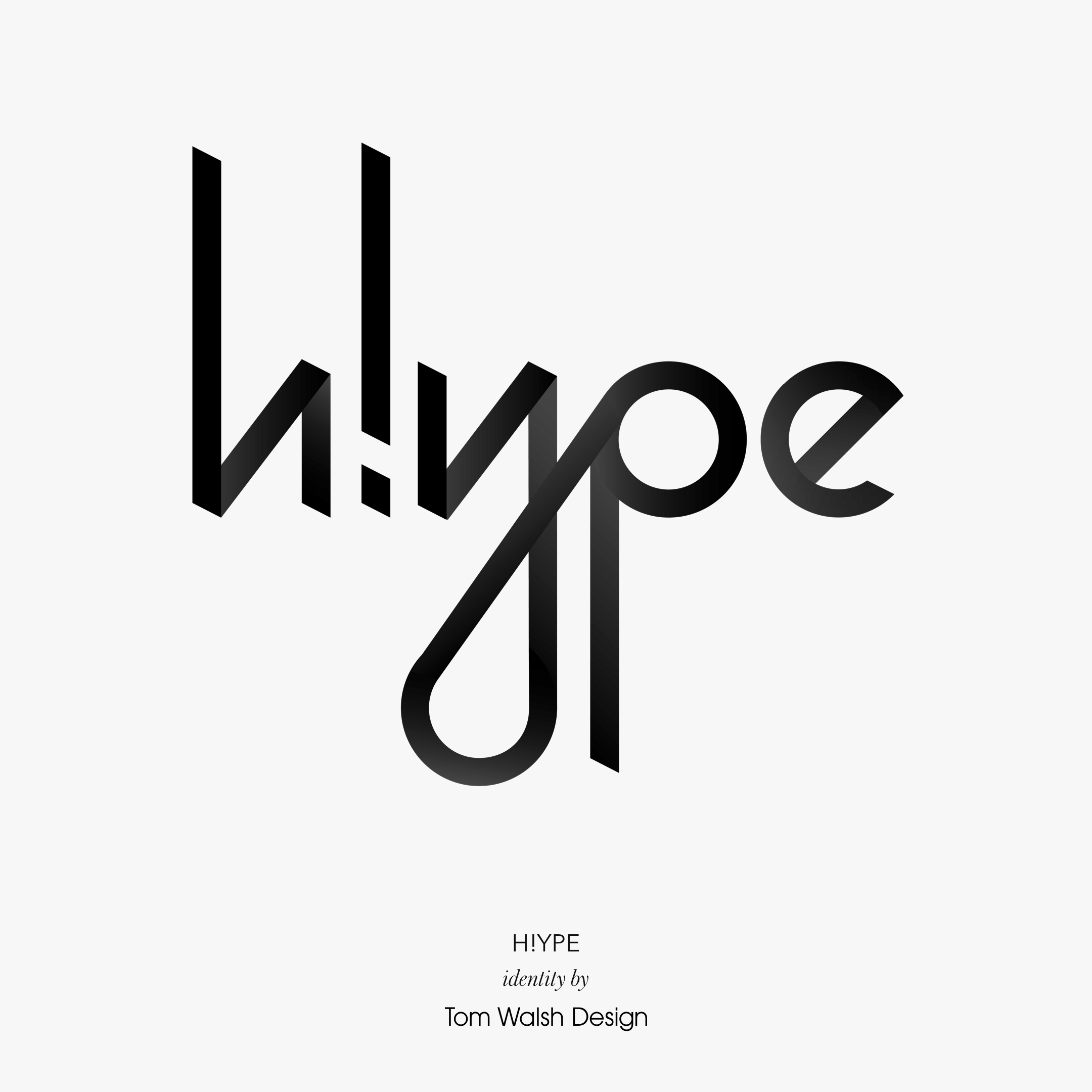
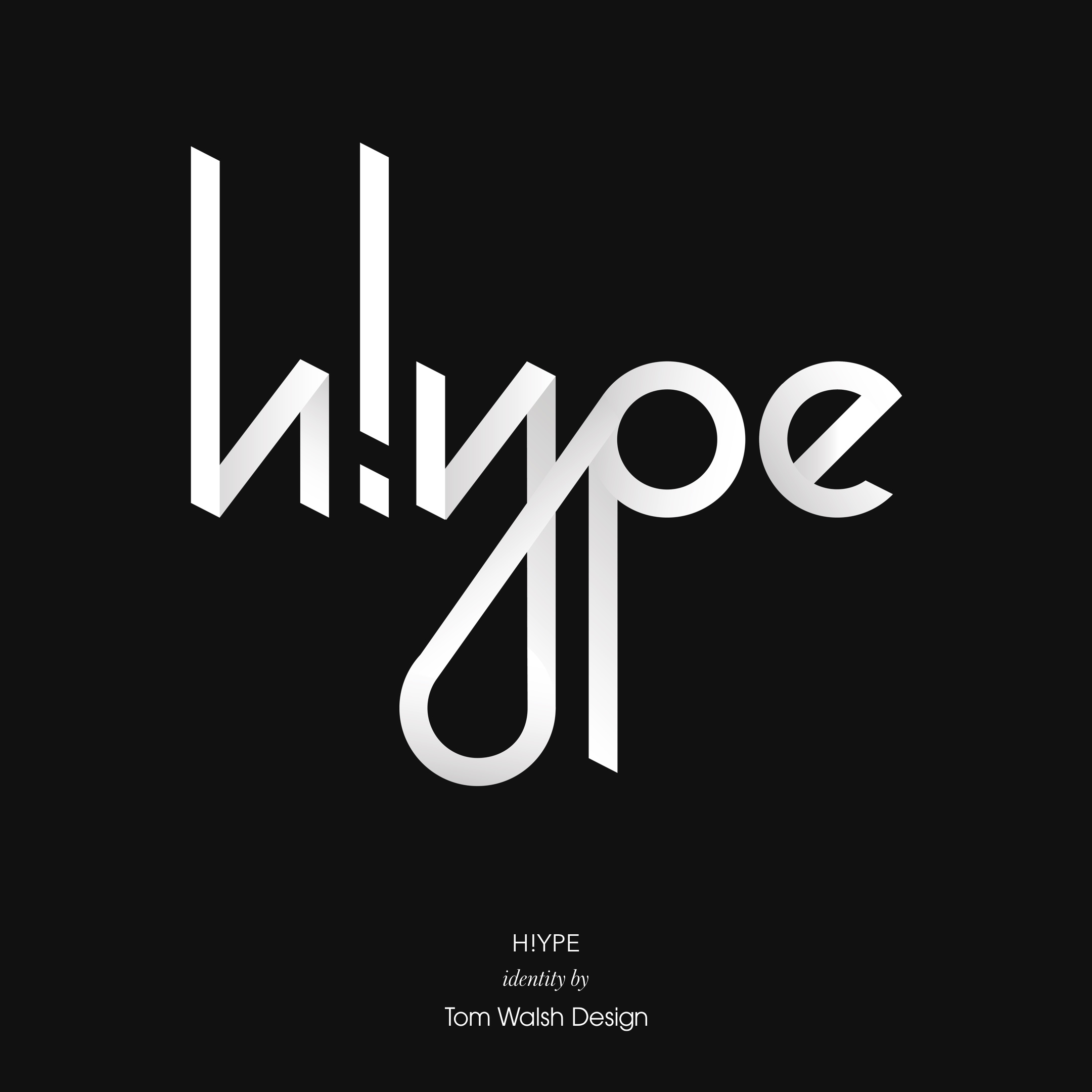
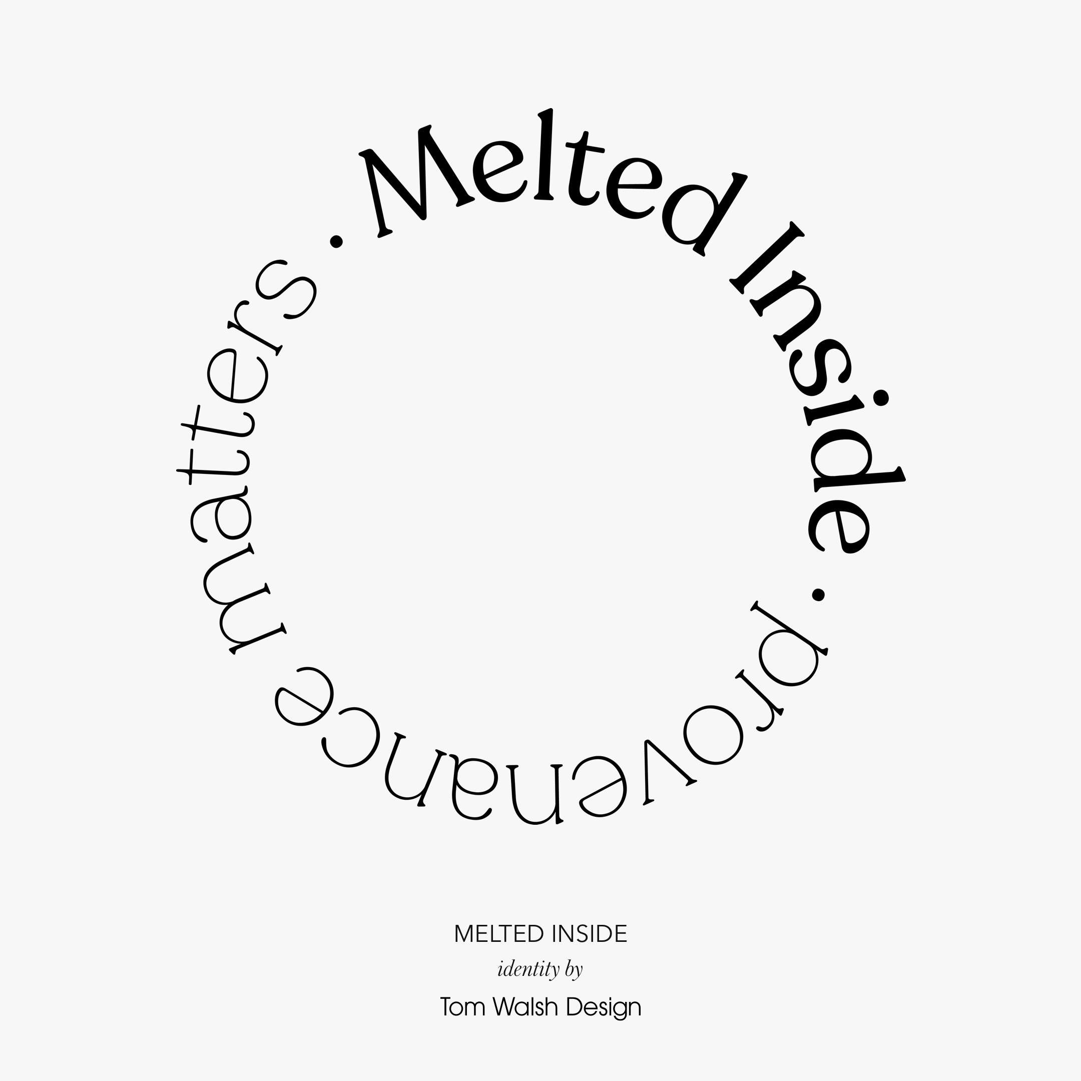
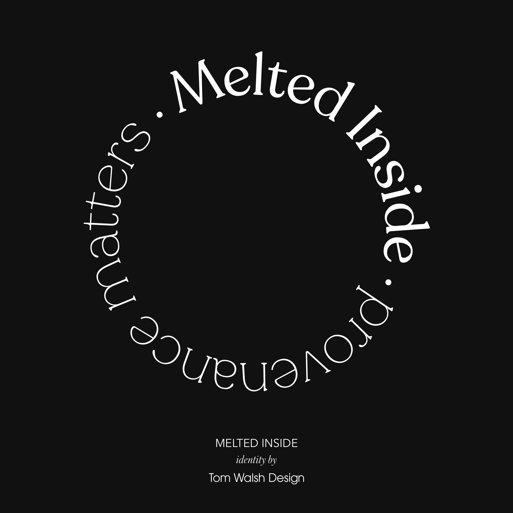
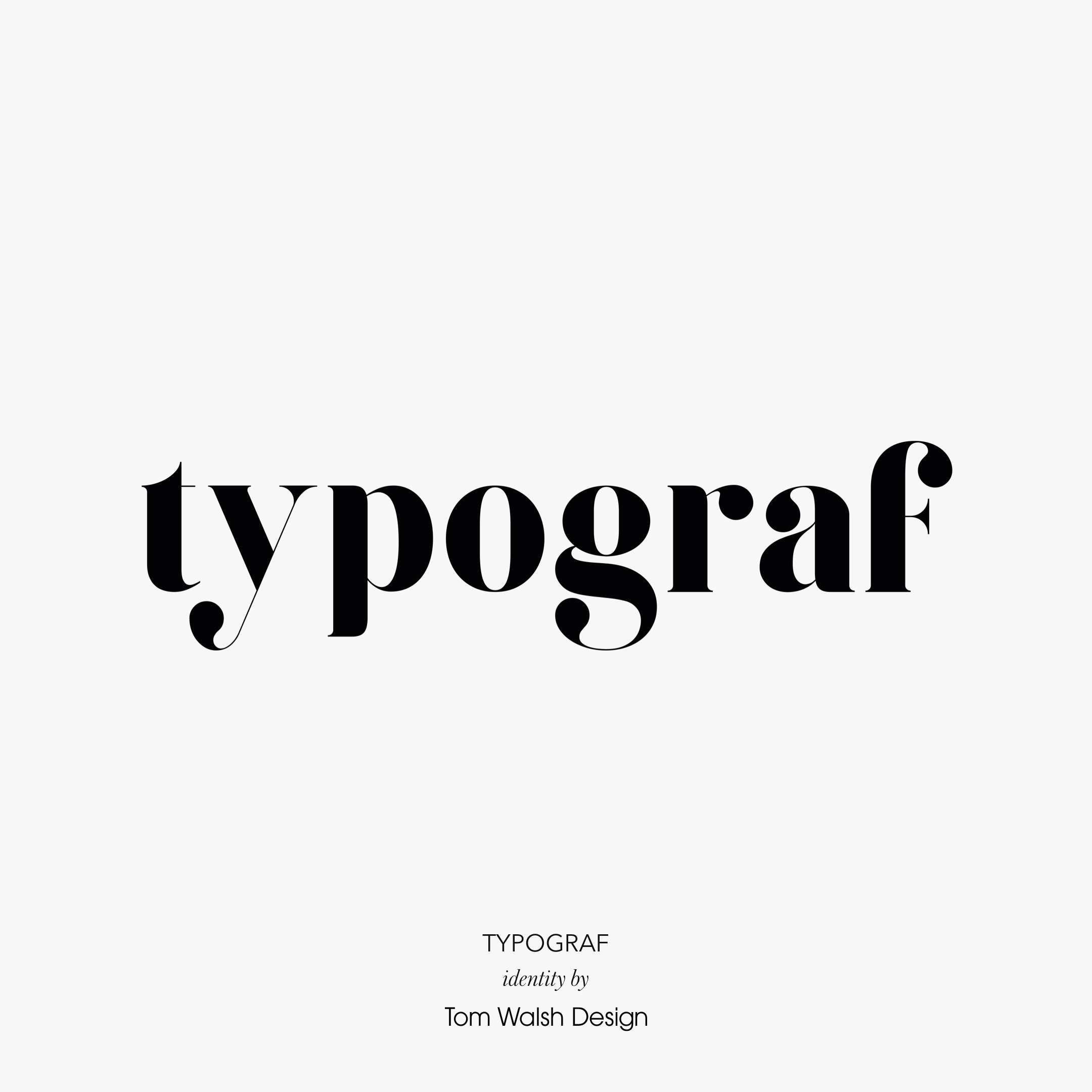
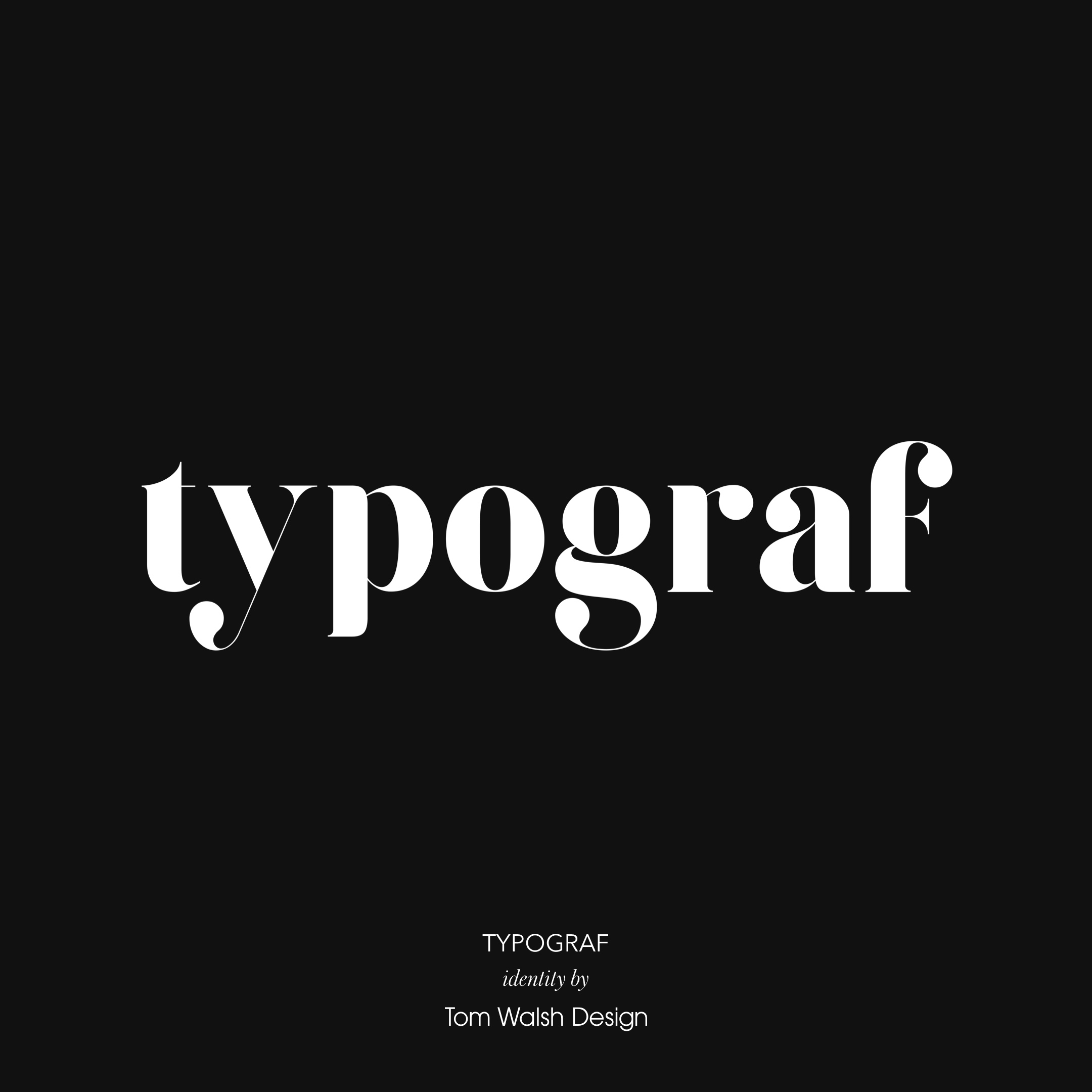
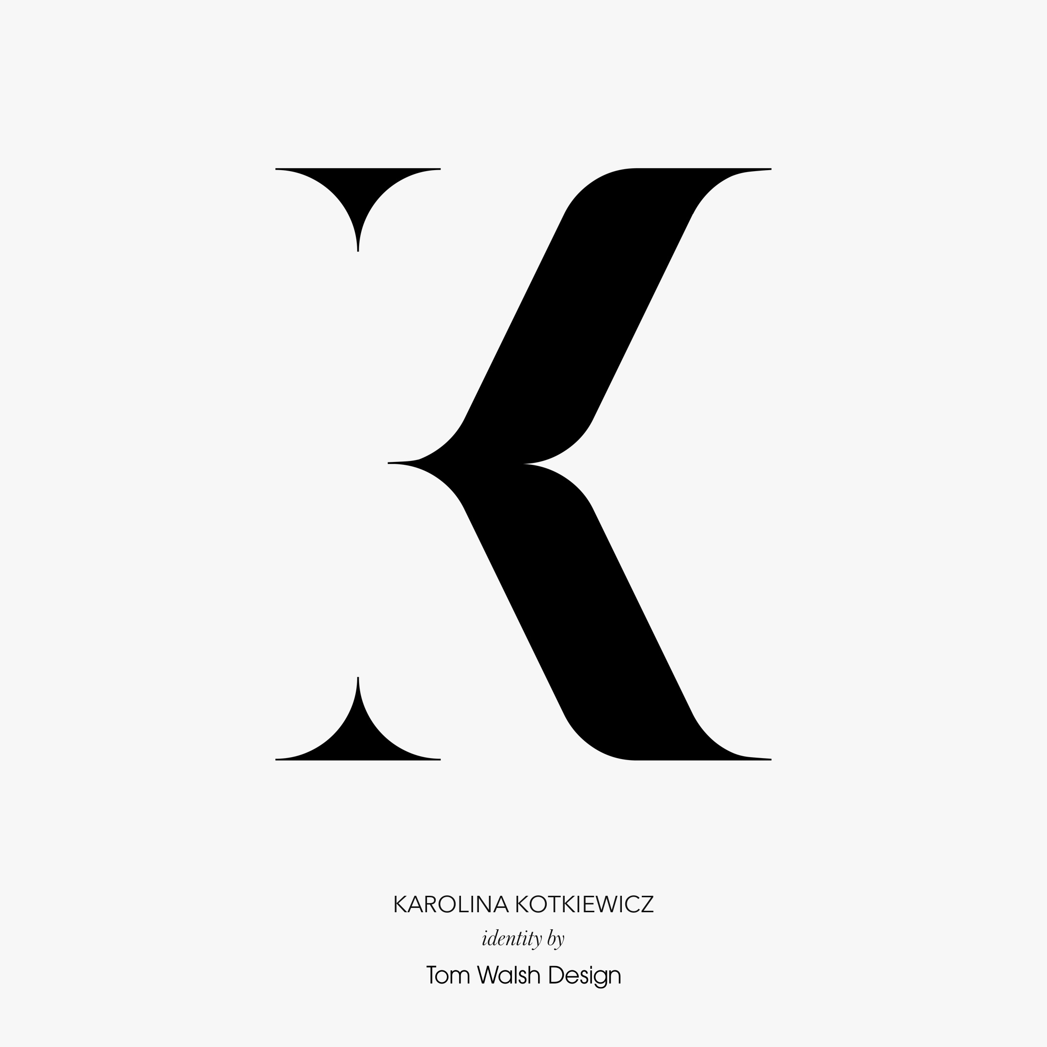
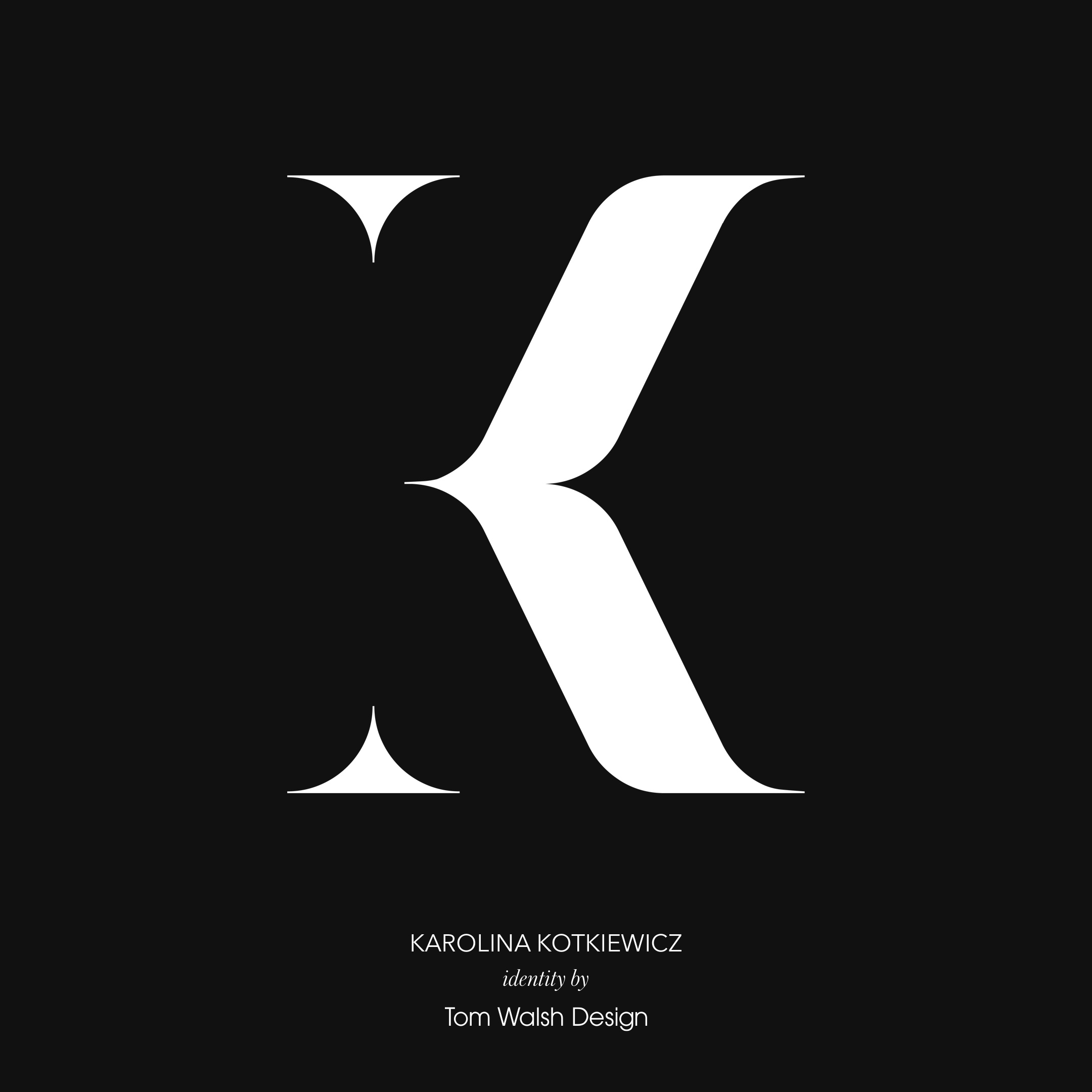
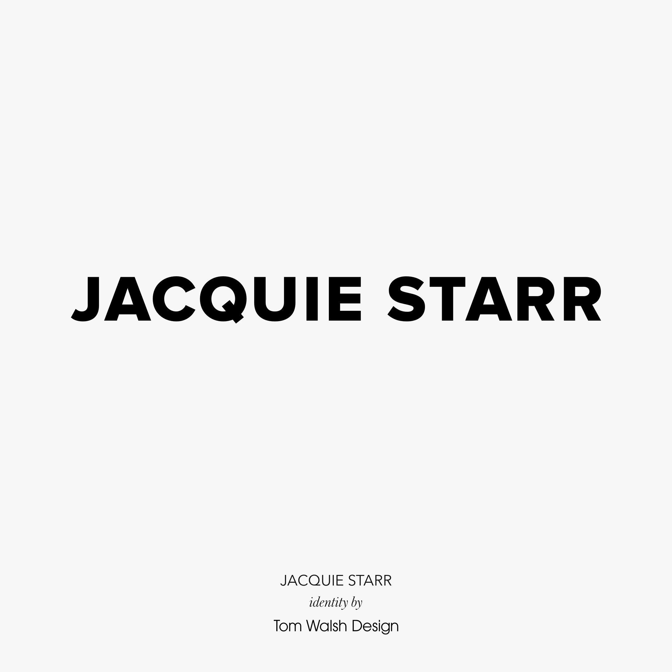
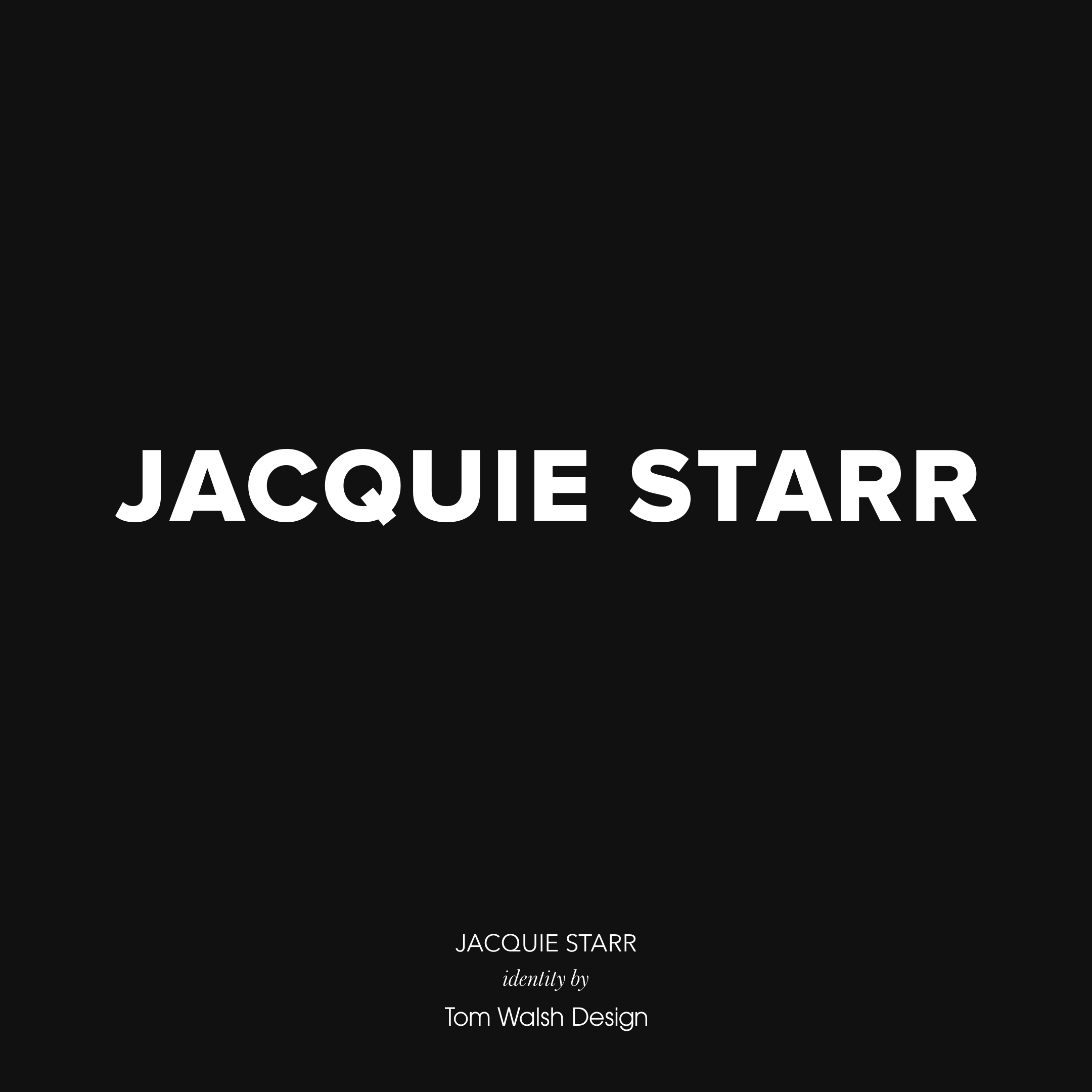
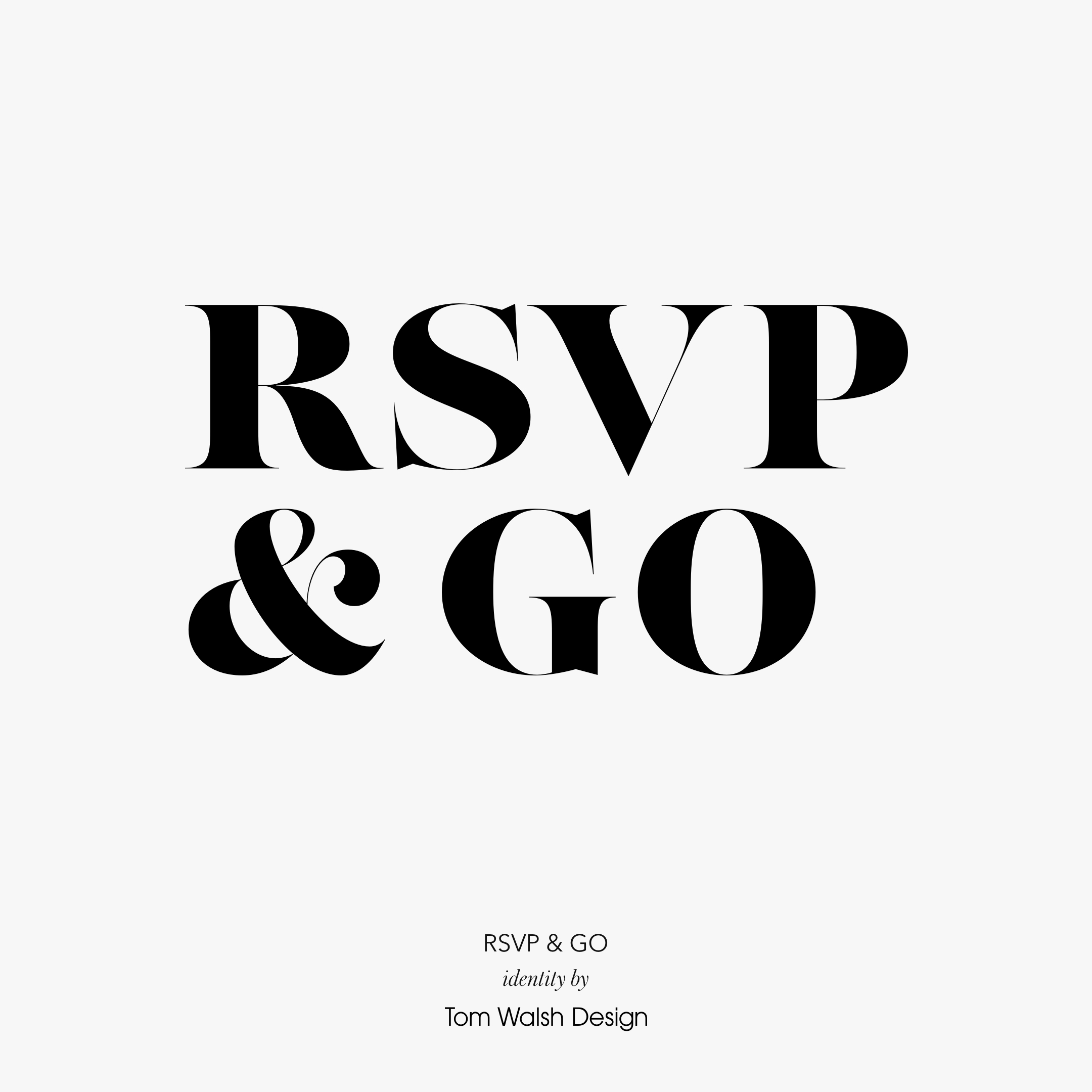
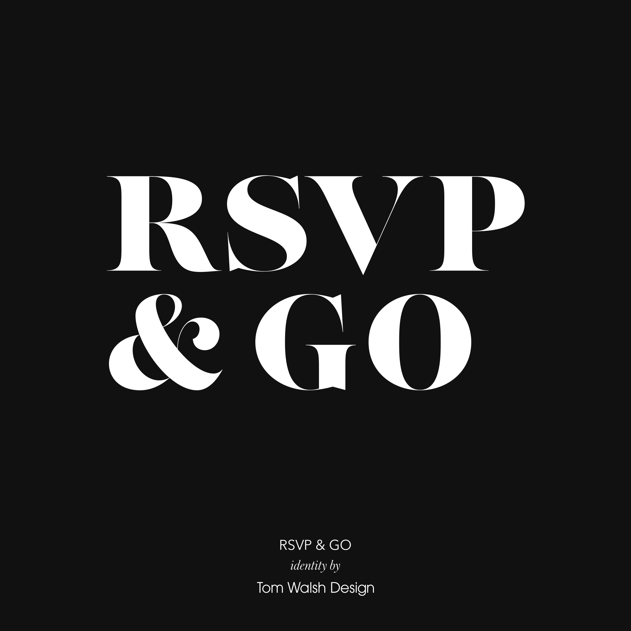
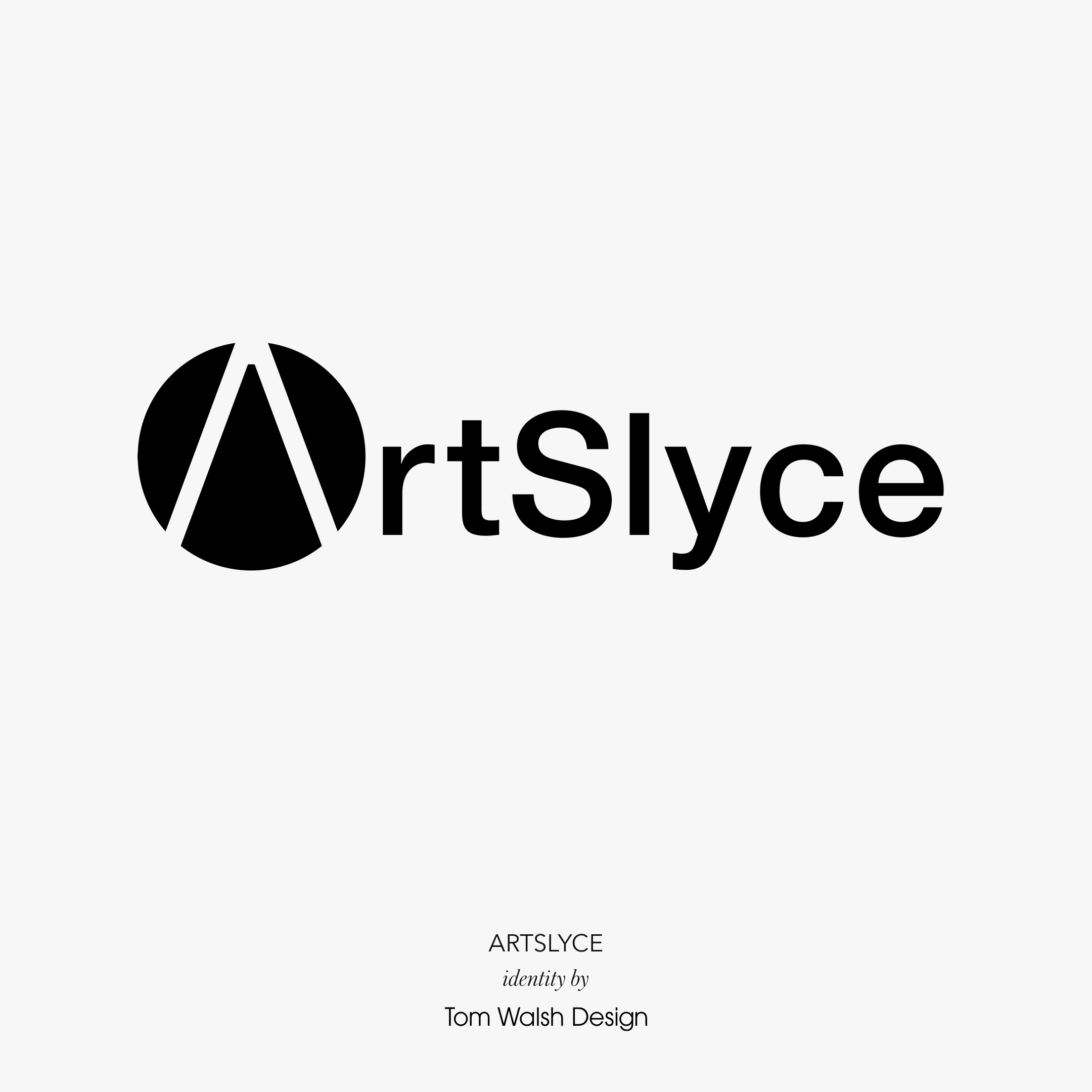
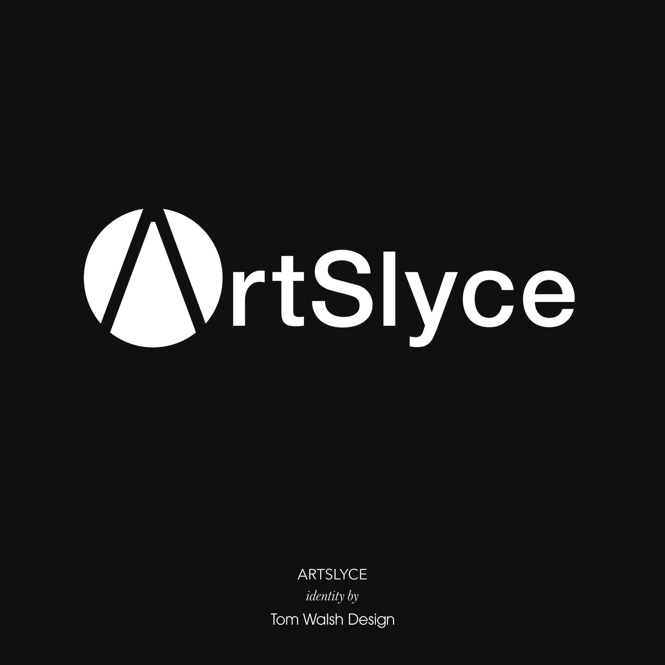
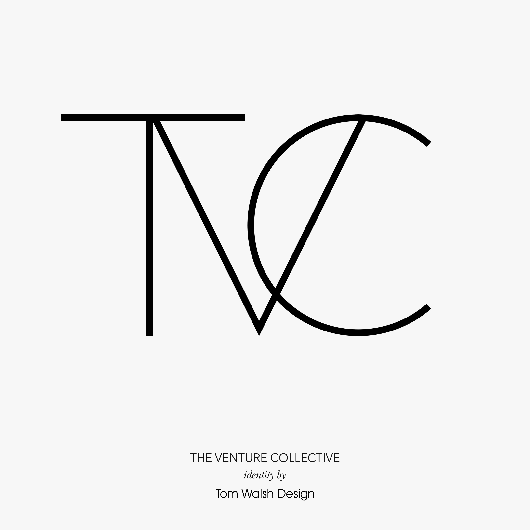
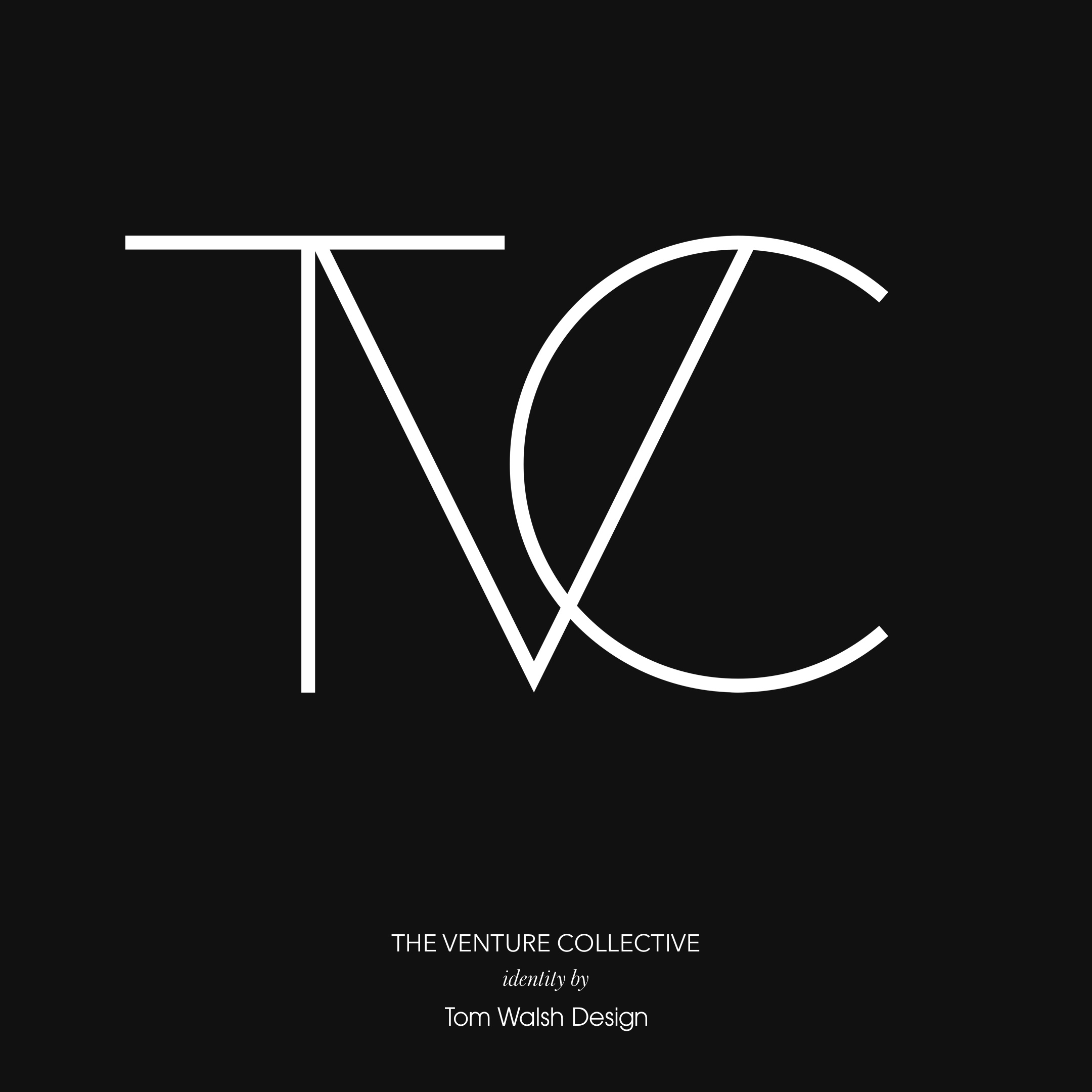
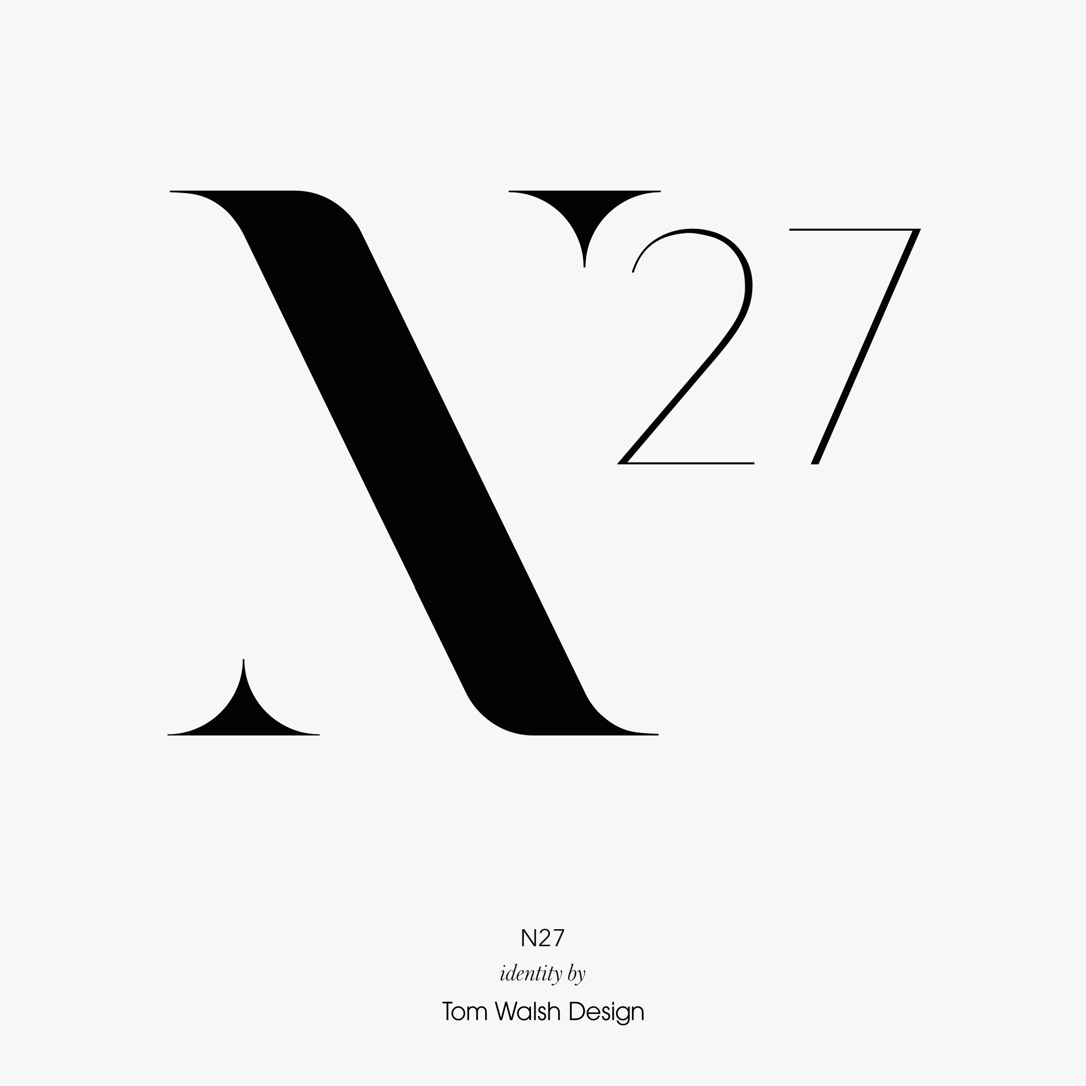
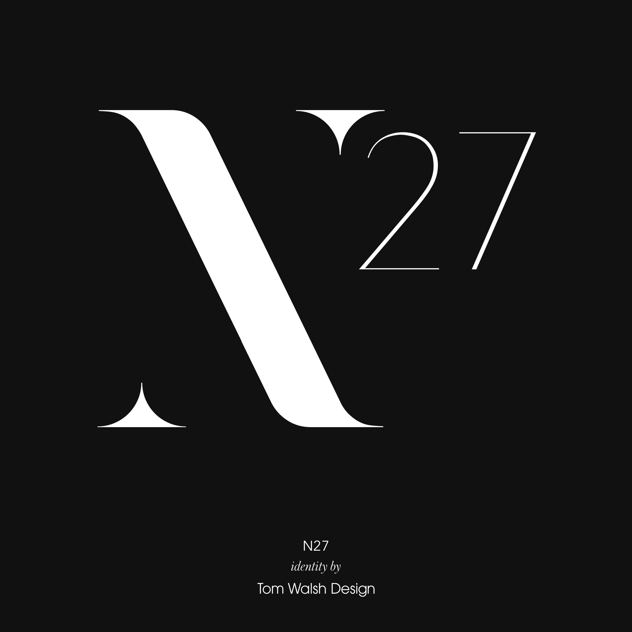
A selection of brand identities I’ve designed over the years, either as part of wider projects or as independent briefs.
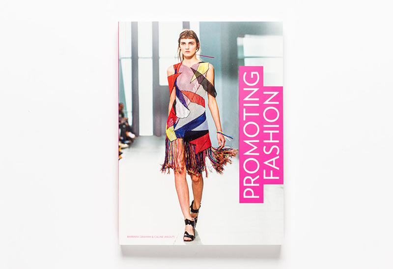
The new book ‘Promoting Fashion’, published by Laurence King, has used my work as an example in their section discussing the importance of best practise design for responsive fashion e-commerce sites. And to top that, they also used my work on their back cover!
You can read more on the book here
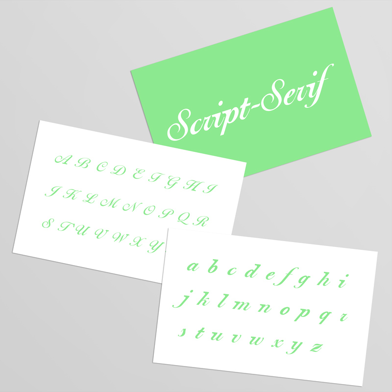
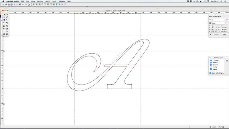
During a short stint freelancing at design studio ‘Interfield’ a brief came in to design the type for a title sequence for the BBC period drama series ‘North & South’. I was given a preview disc containing the first couple of episodes, and the synopsis of It needs to reflect the contrast of the genteel south of England and the industrial North. Typographically quite an interesting brief I thought.
After considering drawing something from scratch (as it was a title sequence it was a limited character set with just the key cast members names), I decided instead to look at existing typographic representations of the ‘genteel’ vs the ‘industrial’, and try and make them harmonise. Genteel easily lent itself to a script font, Industrial was a bit more hit and miss in my experiments, but I decided on slab-serif as the way to go.
Once I’d decided on the premise/structure I was going to work with, my approach was to look first at script typefaces that would hold up on multiple screens, as well as support the addition of something as heavy as a slab-serif. I narrowed it down to two strong candidates, Ballentines Script and Shelley Script. On drawing in the additional slab-serifs to some of the key characters I realised that for them to balance on Shelley they would be way too subtle for on screen use, so Ballentines was chosen as the basis for the rest of the designs. A good, solid structure, but still maintaining the femininity of a Script face, and most importantly, capable of carrying the slab serifs off.
As a finished font I think it works well. The lower case characters hold the serifs better, but as they’re the less flamboyant case that’s probably to be expected. In the end the BBC thought it would be too subtle for the viewer to notice so it wasn’t used, but I still continued working on it and creating the working font. The idea was still used though, and they opted for a pairing of a script face with a slab serif face. Which although a step back from the conclusion, still worked well visually.
Font Name:
Script Serif
Credits/Designer:
Tom Walsh
Released:
2005
Font Style:
Connecting Script, Serif
Format:
Opentype
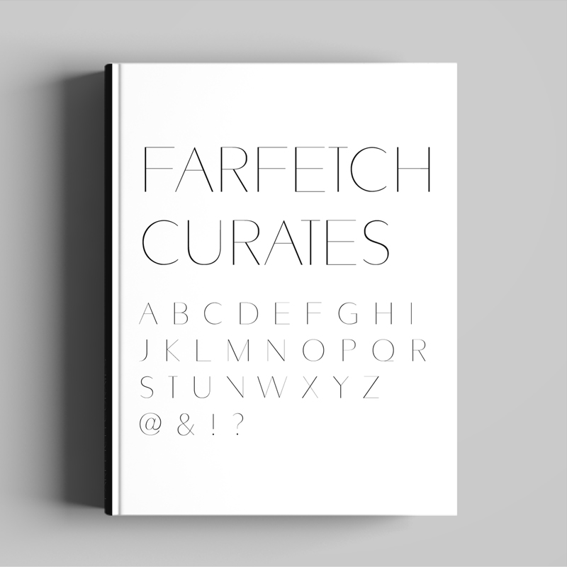
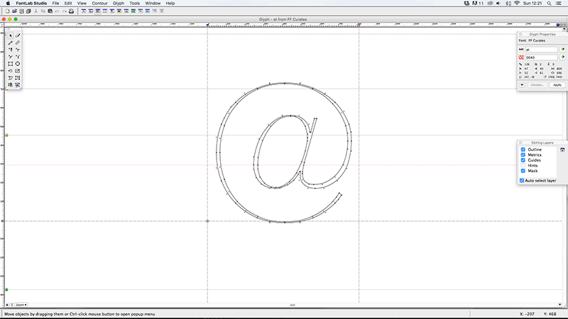
Following on from my work re-designing the Farfetch website and designing their Farfetch Discover iPhone and iPad apps, I was approached by their Art Direction team to collaborate on the design of a custom font for their printed ‘Farfetch Curates’ collection of books. Based on Avenir, but with added variety in weight across the vertical stokes, it maintains the original lightweight form, while adding contrast and structure to the characters.
Basing a font on an existing classic like Avenir may sound like a simple starting point, before you consider that you now need to improve the characters for it to be worth while. Some of the particular challenges came with the ampersand and number eight, purely as with so many curves it took a lot of tweaking to get them to feel the same weight as the simpler characters, like the ‘I’ or ‘T’. After a lot of back and forth between myself and Craig I think we got there though.
The next logical step would be working up the lower case characters, but as its only used as a display font for the time being I’ll wait and see if I get that call…
You can see examples of it in use in the Farfetch Curates series here
Font Name:
Farfetch Curates
Credits/Designer:
Tom Walsh / Craig McCarthy
Released:
2015
Font Style:
Geometric Sans-Serif
Format:
Opentype
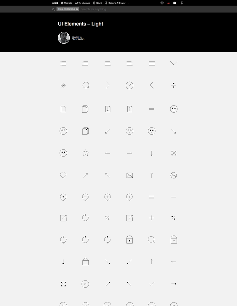
I’ve just uploaded two new sets with almost 100 characters each. One, the ‘UI Elements Light’ for the more subtly inclined, and a ‘UI Elements Heavy’ version when your interface needs a bit more weight to its icons.
UI Elements Light: thenounproject.com/tomwalshdesign/ui-elements-light/
UI Elements Heavy: thenounproject.com/tomwalshdesign/ui-elements-heavy/
Or, you can buy the full sets on Iconfinder.com here: iconfinder.com/tomwalshdesign
Enjoy!
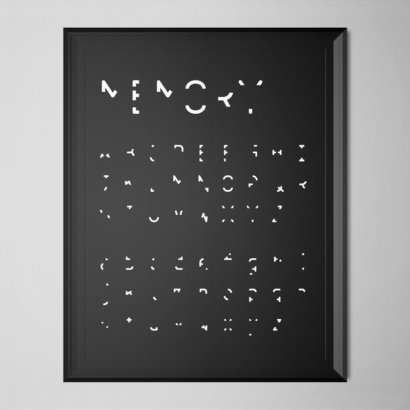
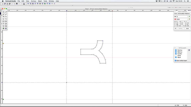
As the first font I’d ever designed from scratch ‘Memory’ came as a steep, but invaluable learning process. Not only in the design stage, but also in how you take all those Illustrator files you’ve lovingly drawn out and make them work as a fully functioning font (something I definitely wasn’t prepared for). Of course, now days there are a lot of tools both on and offline that make this process a lot easier, but back in the days where Fontographer seemed to be the only option it was pretty intimidating opening it for the first time.
So, the concept, and reason for wanting to design ‘Memory’, came out of a brief I’d set myself whilst studying at Camberwell Art College (now University of the Arts, but what was then The London Institute of Art). I wanted to explore the notion of memory, in particular ‘visual’ memory, and needed a typeface to use for a title sequence introducing and crediting a video I’d made as the main piece. A main theme of the video was how through repetition (i.e. recalling memories over the years) sections of detail are gradually lost until you’re left with something hardly recognisable, and usually not wholly accurate, but essentially the core information needed for one final recall before the memory is lost.
My process started out by looking through which characteristics of each character, upper, lower and numeric, were needed for people to identify them. I removed small sections of each, a little at a time and tested if people I knew could still tell what each character was (on their own, to avoid any influence from anyone surrounding them). Once I’d taken each to a point where they were no longer recognisable I went back a step and made more subtle amends until I’d reached their tipping points of recognisability.
After going through the long process of creating, generating, kerning, re-generating, re-kerning (you get the idea…), the font as a whole took on quite a hieroglyphic feel. I later learned that there was a similar font out there (Dear John), which may have saved me a lot of time, but I’m still happy I created my own version. I learned a lot about the physical process’ involved in creating a fully functioning font, as well as what it is people need to recognise one character from the next. Which by highlighting every characters essential elements, I’m hoping has helped inform my subsequent type design projects.
Font Name:
Memory
Credits/Designer:
Tom Walsh
Released:
2004
Font Style:
Experimental Sans-Serif
Format:
Opentype
