
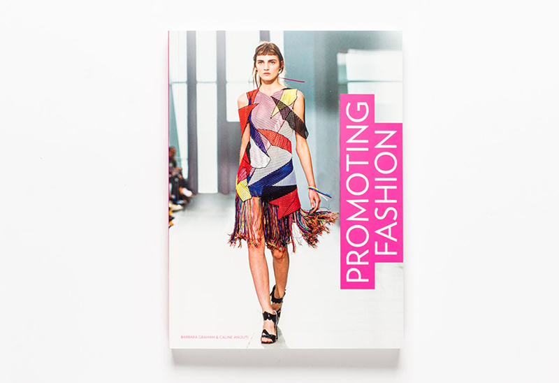
The new book ‘Promoting Fashion’, published by Laurence King, has used my work as an example in their section discussing the importance of best practise design for responsive fashion e-commerce sites. And to top that, they also used my work on their back cover!
You can read more on the book here
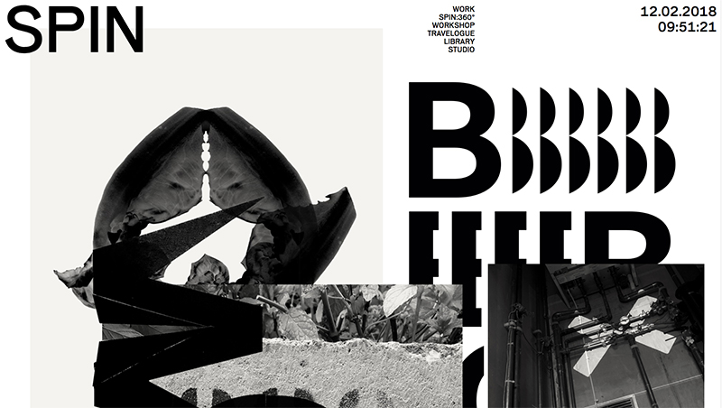
Spin studio’s new site has arrived, and what a site it is.
A great showcase of their output, pairing less commercial projects like ‘Lettuce Letters’ with their best known work. What makes the site so appealing though is the attention to detail and abundance of engaging animations to maximise the playful personality of each piece. Clearly it helps that their work is in itself intelligently crafted enough to stand on its own, but it’s great to see this amount of thought and effort put into a studio’s own site. Quite often the project that gets most neglected in the creative industries (and I’m as guilty of this as the next…).
Take a look for yourself at spin.co.uk
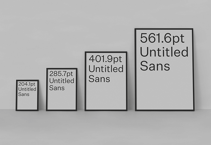
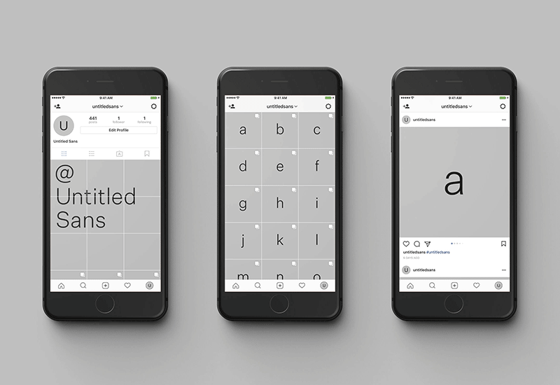
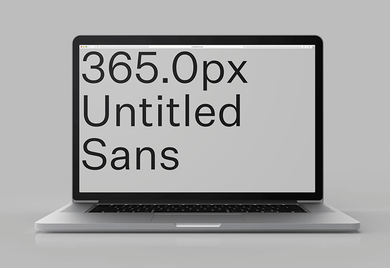
Really nice digital promo project for New Zealand type foundry Klim’s new ‘Untitled Sans’ and ‘Untitled Serif’ by Alt Group (also from NZ). I especially like their use of Instagram carousels to show each character in its varying weights and styles. So simple, but so effective.
You can check out both of their Instagram’s here:
@untitledsans
@untitledserif
and their micro sites here (click on the type to buy through Klim):
untitledsans.com
untitledserif.com
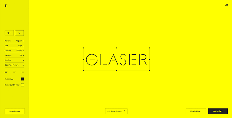
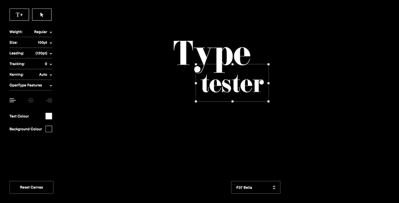
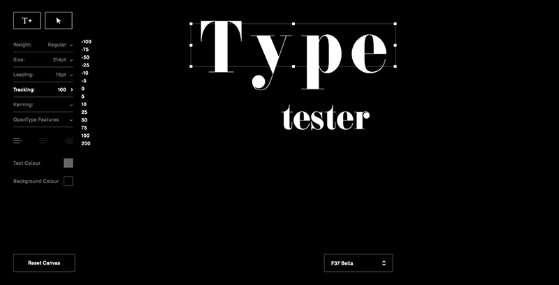
A great new ‘type tester’ tool by Face37 owner Rick Banks which brings traditional design tools into play before asking for any commitment.
Designed with digital designer Francis Smith and built by developer Tom Duncalf this sets the bar at a new height. Taking the industry standard “somewhat clunky and restrictive” options of size, colour and alignment they’ve added in a toolkit giving you the flexibility of weight, leading, tracking and kerning, with Opentype features to boot. And that’s before you start dragging and dropping multiple text boxes. From having a quick play the only thing I can see that’s missing is adding a background image, but then we need to remember, this isn’t a design tool. We have Adobe and Sketch for that.
Have a play for yourself here (performs best in Chrome):
f37foundry.com
Nice new micro-site site, and another great type specimen (see full PDF here) by Grilli Type, this time to promote GT Haptik.
I wrote a post a little while ago on their promotion of GT Walsheim (you can read that here), and this is another example of how to sell a font to a designer. I may not go out and buy it right away, but through their micro-sites and specimens they’ve ensured that if I want a similar font, their site will be my first stop.
It’s not just their attention to detail in promoting their fonts that I like though, its that this attention is paid right through from the typeface concept stage. In recent years, especially with the rise of popularity in free web fonts from Google and the likes, it seems people have forgotten that typefaces used to have a reason to be created. GT Haptik is a great example of this, a typeface designed to solve a problem. It helps that it’s an accessibility problem it aims to overcome too (maximising legibility when ‘read’ through touch), as it brings it back to the core purpose of typography, better communication.
They describe Haptik as:
“…a monolinear geometric grotesque typeface. Its uppercase letters and numbers were optimized to be read blindfolded and by touching them. It is now available in seven weights with accompanying Oblique and Rotalic styles. Included with each style come alternate characters as well as proportional and tabular figures.”
They have other great typefaces on their site, and I look forward to seeing what they come up with in future releases. Definitely a site to keep an eye on.
GT Haptik Design:
Reto Moser
Tobias Rechsteiner
Take a look at the micro-site here – www.gt-haptik.com
And the GT Haptik page on Grilli Type here – grillitype.com/typefaces/gt-haptik
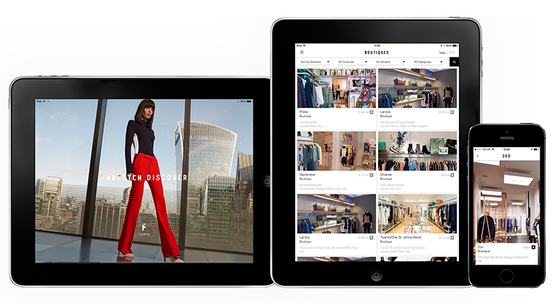
The iPad version of the Farfetch Discover app I designed while in house at Farfetch has launched. So now users can enjoy it on tablets as well as mobile, there’s no excuse not to download it!
They describe it as –
“Farfetch Discover takes a fashion insider’s view on cities around the world, with unrivalled access to a treasure trove of local knowledge direct from our network of over 300 independent boutiques. From gourmet eateries in Dallas, to charming markets hidden away on Dubrovnik’s Adriatic coast, get tips that only a local could know.
Browse boutique recommendations on where to eat, drink, stay or explore. Read personal itineraries from some of the city’s coolest natives or create your own to have handy when you’re offline in the city. And of course you’ve got over 1,500 designers and 120,000 products to shop from, right at your fingertips.”
And if you’d like to have a play you can download it from the app store here
Or read more about this project here
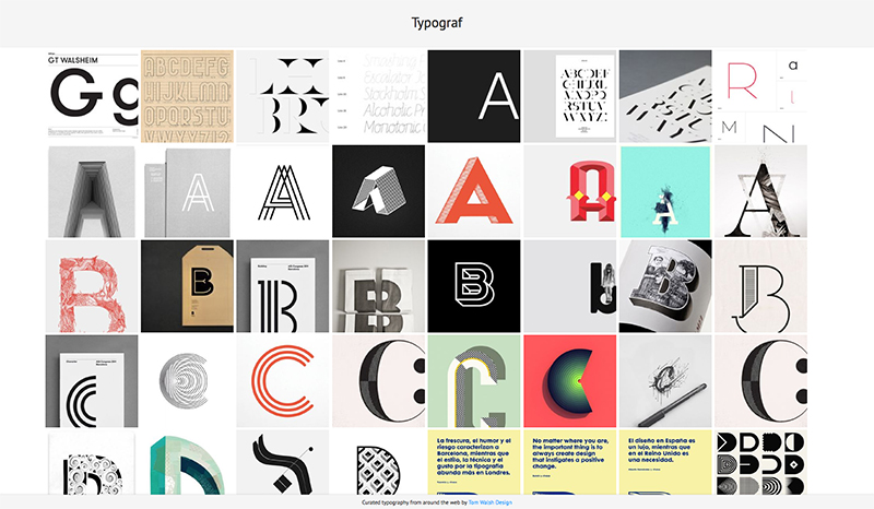
After years of planning, designing and procrastinating over my side-project Typograf, I decided that at the very least it should be more than an empty page with ‘coming soon’ (which also isn’t strictly true, as its been there for almost a decade…). And so Typograf mark II was born. Essentially it’s an aggregator for my typography related Pinterest pins, pulling in anything I add to those boards and displaying them all in one place. Making it easy for me, and anyone else on the web who stumbles across it, to see it all in one place. It’s still effectively a holding page, but at least its now a page with some use, to me anyway.
The next step will be working out how to randomise a selection of web fonts for use in the header and footer, but that’s Mark III. Expect that in another decade then.
You can take a look at typograf.co.uk/
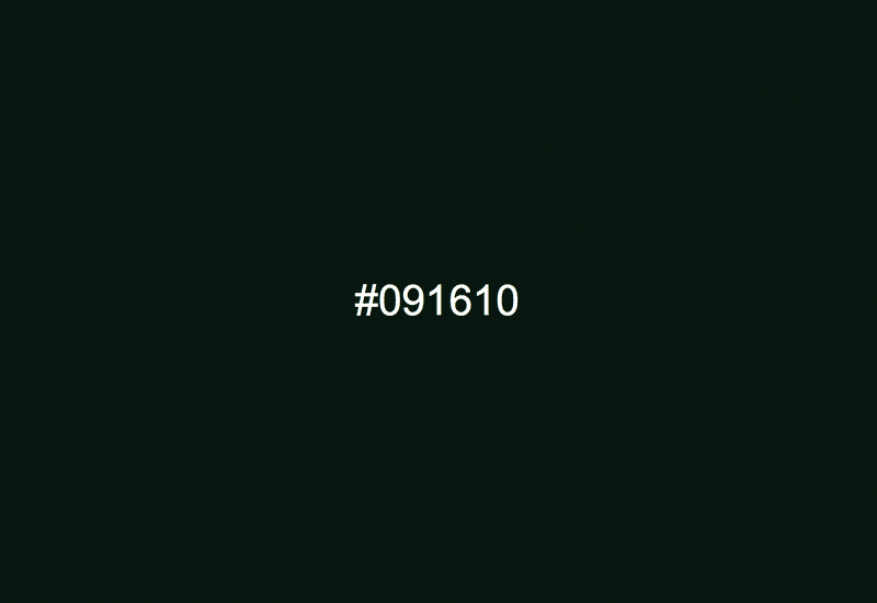
Nice project by Jacopo Colo. Hex Clock is a precise hexadecimal color clock which goes the whole 24 hours color range, from #000000 to #235959. Generally it’s pretty dark, but at least its accurate! The only improvement I would make would be to have a dynamic favicon which updates alongside the screen background, but maybe simple is better…
Take a look here –


The fashion ‘Portfolio’ I designed for Milan Style is now live! Designed to be a clean, responsive experience the site pulls in editorial content from a selection of major fashion sites (including Gucci, Oki Ni, Matches, Mr Porter and many more) and creates a central hub to view the upcoming trends and styles in the Male fashion world. With content ranging from Catwalk shots to editorial it works as a curated overview of what the top end of fashion are producing from season to season. It was designed to be responsive to cater for more detailed browsing on a desktop, or for a quick bit of mobile eye candy if you’re on the go, and has a couple of nice little features thrown in too (like the Pinterest style colour matching on load, and the animation of content on window re-size).
You can see more of this project on my site here
Or you can take a look at the full site here


The customised WordPress I set up for fashion writer Hannah Nixon is now live! A re-worked version of the Imbalance theme, it showcases her writing through a visually engaging home page which invites the user to delve deeper. Another element of the theme that made it a particularly appropriate choice is how you navigate using categories, allowing Hannah to group her work by publication/website. Doesn’t look too bad either!
You can take a look at the live site here
