
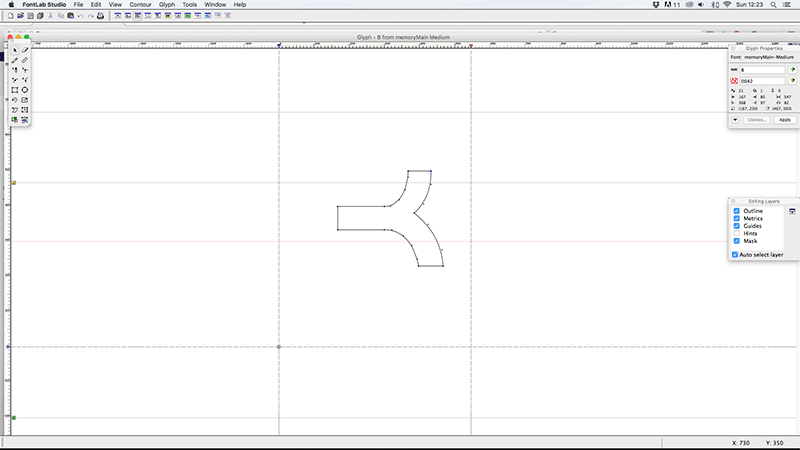
As the first font I’d ever designed from scratch ‘Memory’ came as a steep, but invaluable learning process. Not only in the design stage, but also in how you take all those Illustrator files you’ve lovingly drawn out and make them work as a fully functioning font (something I definitely wasn’t prepared for). Of course, now days there are a lot of tools both on and offline that make this process a lot easier, but back in the days where Fontographer seemed to be the only option it was pretty intimidating opening it for the first time.
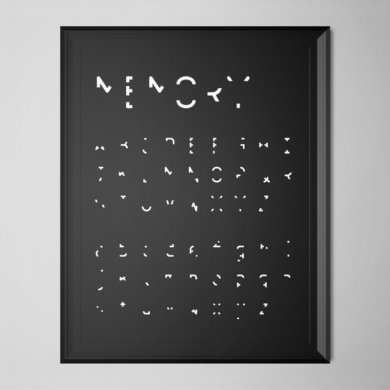
So, the concept, and reason for wanting to design ‘Memory’, came out of a brief I’d set myself whilst studying at Camberwell Art College (now University of the Arts, but what was then The London Institute of Art). I wanted to explore the notion of memory, in particular ‘visual’ memory, and needed a typeface to use for a title sequence introducing and crediting a video I’d made as the main piece. A main theme of the video was how through repetition (i.e. recalling memories over the years) sections of detail are gradually lost until you’re left with something hardly recognisable, and usually not wholly accurate, but essentially the core information needed for one final recall before the memory is lost.
My process started out by looking through which characteristics of each character, upper, lower and numeric, were needed for people to identify them. I removed small sections of each, a little at a time and tested if people I knew could still tell what each character was (on their own, to avoid any influence from anyone surrounding them). Once I’d taken each to a point where they were no longer recognisable I went back a step and made more subtle amends until I’d reached their tipping points of recognisability.
After going through the long process of creating, generating, kerning, re-generating, re-kerning (you get the idea…), the font as a whole took on quite a hieroglyphic feel. I later learned that there was a similar font out there (Dear John), which may have saved me a lot of time, but I’m still happy I created my own version. I learned a lot about the physical process’ involved in creating a fully functioning font, as well as what it is people need to recognise one character from the next. Which by highlighting every characters essential elements, I’m hoping has helped inform my subsequent type design projects.
Font Name:
Memory
Credits/Designer:
Tom Walsh
Released:
2004
Font Style:
Experimental Sans-Serif
Format:
Opentype
