
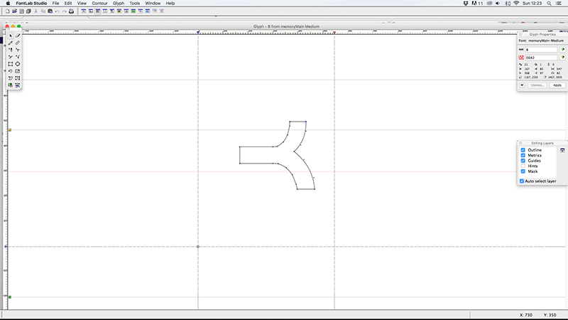
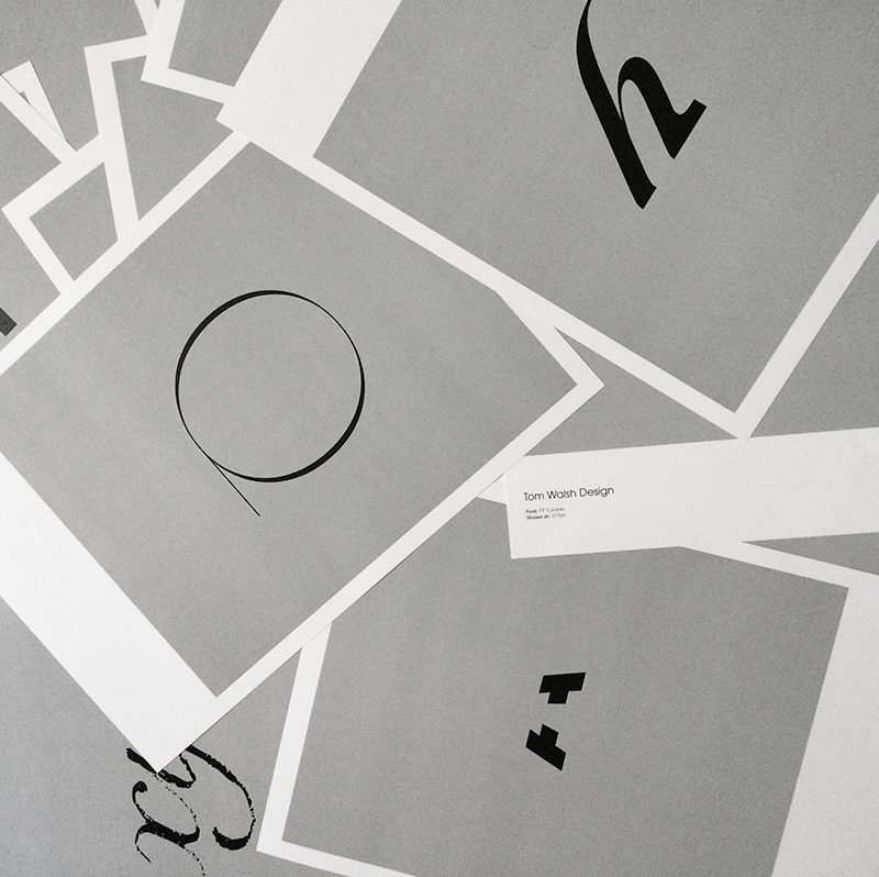
As the first font I’d ever designed from scratch ‘Memory’ came as a steep, but invaluable learning process. Not only in the design stage, but also in how you take all those Illustrator files you’ve lovingly drawn out and make them work as a fully functioning font (something I definitely wasn’t prepared for). Of course, now days there are a lot of tools both on and offline that make this process a lot easier, but back in the days where Fontographer seemed to be the only option it was pretty intimidating opening it for the first time.
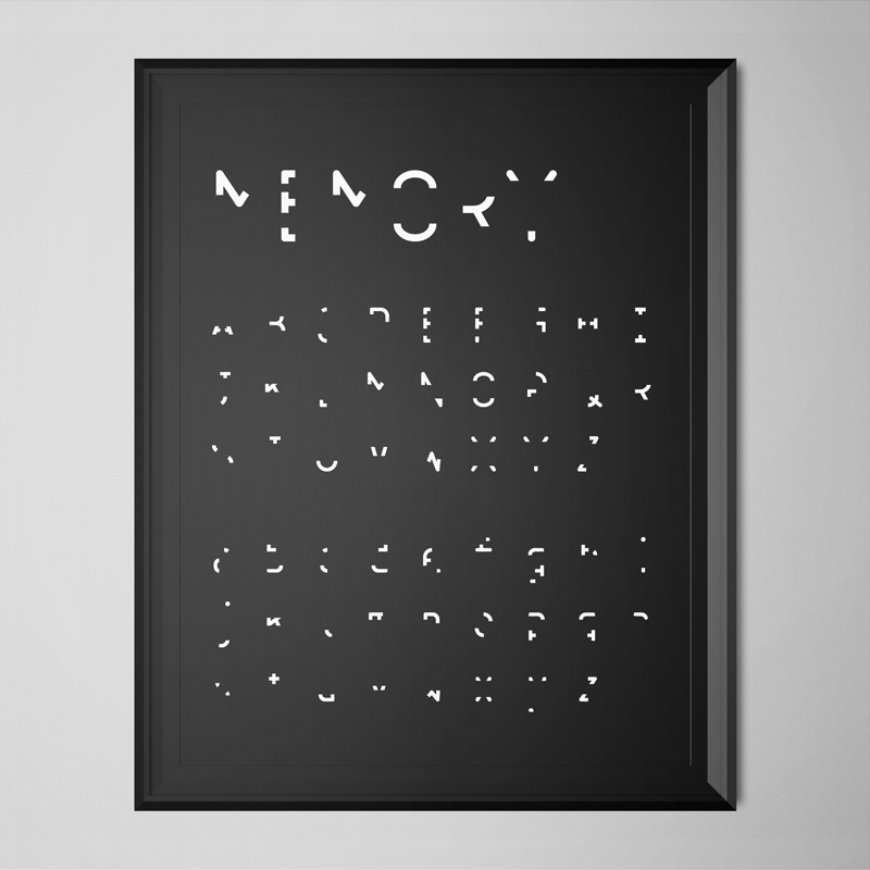
So, the concept, and reason for wanting to design ‘Memory’, came out of a brief I’d set myself whilst studying at Camberwell Art College (now University of the Arts, but what was then The London Institute of Art). I wanted to explore the notion of memory, in particular ‘visual’ memory, and needed a typeface to use for a title sequence introducing and crediting a video I’d made as the main piece. A main theme of the video was how through repetition (i.e. recalling memories over the years) sections of detail are gradually lost until you’re left with something hardly recognisable, and usually not wholly accurate, but essentially the core information needed for one final recall before the memory is lost.
My process started out by looking through which characteristics of each character, upper, lower and numeric, were needed for people to identify them. I removed small sections of each, a little at a time and tested if people I knew could still tell what each character was (on their own, to avoid any influence from anyone surrounding them). Once I’d taken each to a point where they were no longer recognisable I went back a step and made more subtle amends until I’d reached their tipping points of recognisability.
After going through the long process of creating, generating, kerning, re-generating, re-kerning (you get the idea…), the font as a whole took on quite a hieroglyphic feel. I later learned that there was a similar font out there (Dear John), which may have saved me a lot of time, but I’m still happy I created my own version. I learned a lot about the physical process’ involved in creating a fully functioning font, as well as what it is people need to recognise one character from the next. Which by highlighting every characters essential elements, I’m hoping has helped inform my subsequent type design projects.
Font Name:
Memory
Credits/Designer:
Tom Walsh
Released:
2004
Font Style:
Experimental Sans-Serif
Format:
Opentype
Lovely work from Imaginary Forces for Netflix’s latest cult show ‘Stranger Things’. By pairing 70’s type classics Benguiat (Ed Benguiat) and Avant Garde (Herb Lubalin) they’ve managed to use two of my possible all-time favourite typefaces by two of my type design heroes, and more importantly, made them work.
Inspired by Stephen King novel covers, which the show’s creators Matt and Ross Duffer sent to Imaginary Forces as reference, the sequence fills you with intrigue and unease. Perfectly setting the tone for the show to follow.
I think what I like about it most is the abstract details from Benguiat fading and pulsing throughout the background, showing the beauty of the typeface is in all of its fine details, before effortlessly blending together at the end. This, with the contrast of Avant Garde in the foreground, makes for what can only be described as type porn. Something rarely seen in such a commercial project, but I’m glad it made it through!
You can see more of Imaginary Forces work on their site here
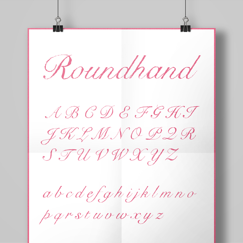
Snell Roundhand-hand came out of a project quite early in my career while working with a design studio called Container on spreads for Super magazine. With a very hand drawn, pencil style to their designs we spent a fair bit of time tracing and scanning suitable fonts for layouts title by title. And so the ‘hand-drawn’ project began. A long term challenge to convert a selection of fonts into a ‘pencil drawn’ equivalent that I could share with studios who were fond of that aesthetic.
First on the list (due to demand) was a hand drawn version of Snell Roundhand. Originally developed in 1965 by Matthew Carter, and based on the roundhand script of Charles Snell (hence the name), it’s an expressive but structured font. A good one to start with too, due to the amount of detail in its flourishes and its variety in weight it was a nice example of all the things that might raise issues in whichever approach I decided to take.
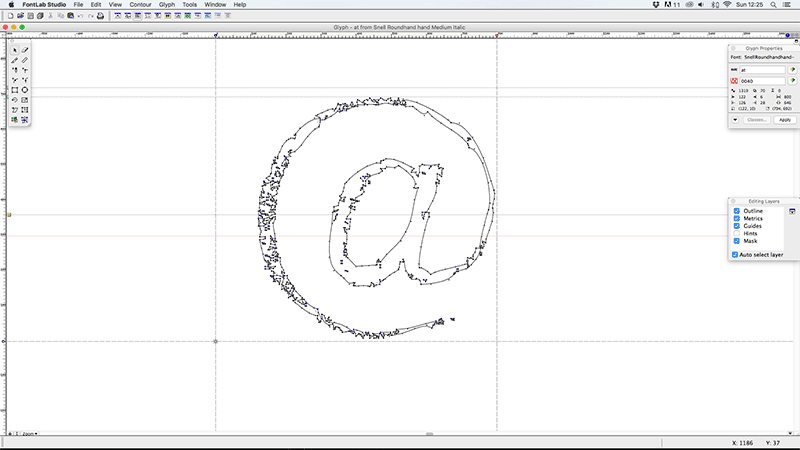
The first thing I had to test out when I started was which type of pencil and tracing paper combination would work best for this. So I went about buying a selection of weights and transparencies and trying them out. The second part to test was the correct size to print out the original characters for tracing, so that in the completed font the texture would be visible enough at smaller sizes, but not so grainy as to distort the font too drastically. After a fair bit of scribbling and scanning I opted for printing out the characters at 48pt, and tracing onto 60gsm for the right balance of transparency and texture.
When it came to converting the pencil-traced characters into vectors it was a little simpler. Thankfully Illustrator had a (more accurate in 2004 than it is now, in my opinion) Live Trace tool built in which meant that after a little amending to ensure the contrast was right in Photoshop it was fairly quick to get the starting vectors. Tweaks to these took a little longer, especially ensuring a consistent feel from character to character with a few test-words (handgloves etc). Once I had all the vectors ready it was time to jump back into Fontographer, but luckily this time as I was basing the font on an existing one a lot of the information for kerning, leading and hinting already existed, so as long as I ensured I didn’t stray too far from that I didn’t have as many rounds of tweaking as I’d anticipated.
All in all I’m pretty pleased with the ‘hand-drawn’ set of fonts that came out of the project. As well as Snell I produced versions of Baskerville (both filled and an outlined version), Foundry Gridnik and Helvetica using the same process’. I would say that the two sans fonts benefitted less from the effect, but it certainly was an interesting experiment, and I’ve used all of them in projects since.
Font Name:
Snell Roundhand Hand
Credits/Designer:
Tom Walsh
Released:
2004
Font Style:
Connecting Script
Format:
Opentype
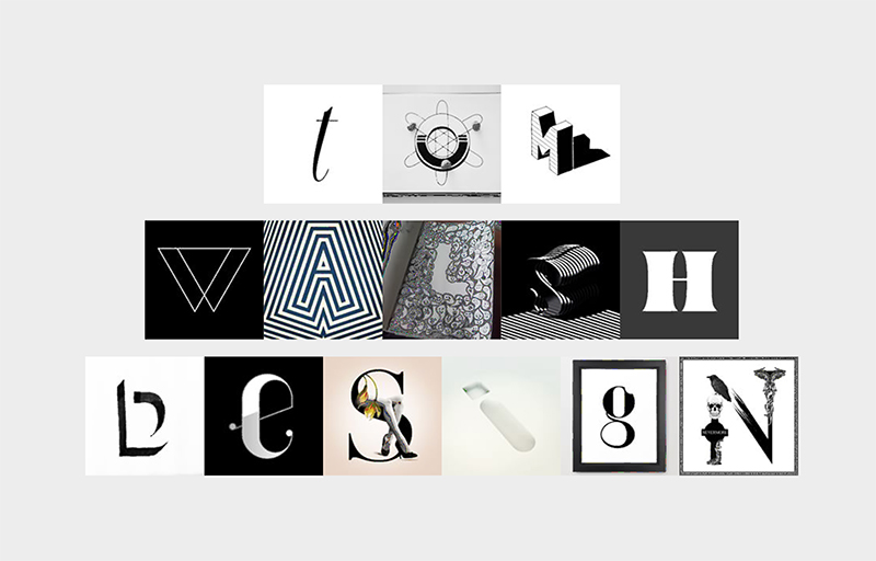
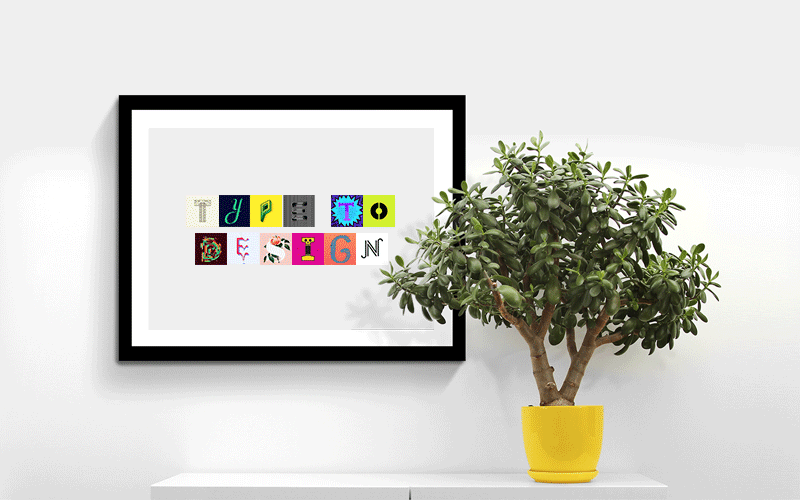
A nice new project from Barcelona based 36 Days of Type using their curated character sets to allow people to experiment and create their own playful typographic masterpiece.
For those not familiar with 36 Days of Type it’s a project by Nina Sans and Rafa Goicoechea which challenges designers, illustrators or anyone with a love of type and creativity, to design a different character every day for 36 days (thereby creating a full alphabet). The best of these are chosen and posted across their Instagram and Twitter accounts. With 99,999 submissions, filtered down to 5,380 ‘curated images’, they’re now sitting on a huge bank of lovingly created content, and what better way to say thank you than with typetodesign.com?
So, for those of you who aren’t quite ready to commit to 36 Days of Type, you can head over to typetodesign.com instead. Where you type in your chosen text, then click through each character until you’ve created your own masterpiece. As they say “Type it, design it, enjoy it.”
Have a play at typetodesign.com here
Or take a look at 36 Days of Type here
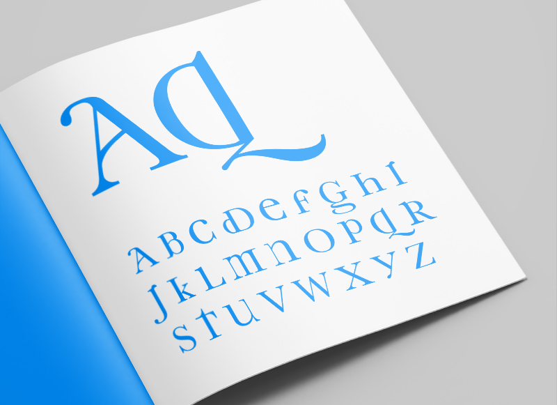
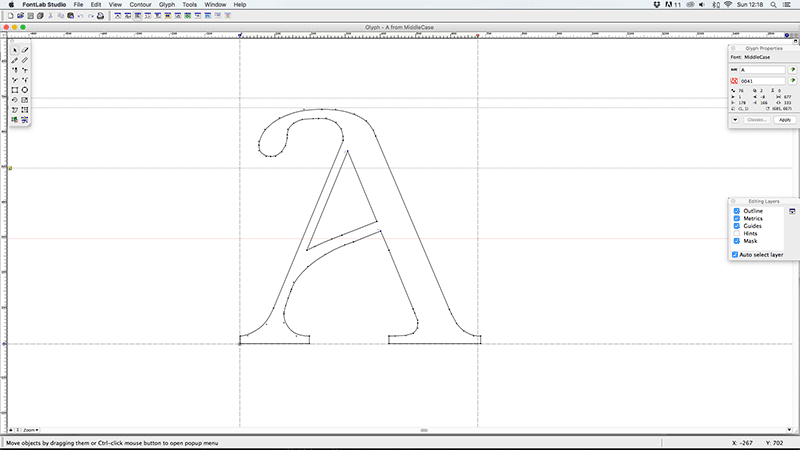
As part of my early exploratory work into type design I began looking at the characteristics that defined upper and lower case letters independently, and from one another. One particular trend I’d noticed was for a lot of the personality and flair to be included in the lower case characters, but omitted in the upper case versions of those characters. From this starting point I began working on Middlecase, a way of bringing some of the charm of lower case into an upper case font.
Some of the characters produced quite subtle, but still pleasing, results (like the K, Y and V). Others had more dramatic, but also more interesting results (like the A, D, G & Q) and others were a little trickier (less said about those the better). All in all I think it worked well as an experiment in type, and could possibly be used as a display font, but I would say I probably got more from undertaking the project and the process than I will from using the physical font.
Font Name:
Middlecase
Credits/Designer:
Tom Walsh
Released:
2008
Font Style:
Decorative Serif
Format:
Opentype
I’m excited to announce a new series of posts are on their way. A retrospective of typeface design projects from over the years which I will be sharing on Instagram and right here. Giving an insight into why they were designed, who they were designed for and the nuances of each typeface. Spanning from University projects while at Camberwell, up to my most recent commercial type design project last year. I’m hoping these will work as a living archive, as well as provide some understanding of the process’ involved in both the designing and the creation of a working typeface.
Oh, and for the aficionados out there, I know ‘Font Focus’ isn’t entirely accurate (as I’ll be covering typefaces), but it had a nicer ring to it!
To see the updates on Instagram you can take a look here – instagram.com/tomwalshdesign/
Lovely animated typography piece by DJA to launch Karen Walker’s first set of fragrances. Embodying Karen’s signature eccentric energy the film brings the neon titles of each of the three fragrances to life. DJA describe it as:
“Channeling the upbeat, irreverent spirit of the Op Art movement, a bold, graphic approach to packaging for Karen Walker’s fragrance debut ABC.”
Nice new micro-site site, and another great type specimen (see full PDF here) by Grilli Type, this time to promote GT Haptik.
I wrote a post a little while ago on their promotion of GT Walsheim (you can read that here), and this is another example of how to sell a font to a designer. I may not go out and buy it right away, but through their micro-sites and specimens they’ve ensured that if I want a similar font, their site will be my first stop.
It’s not just their attention to detail in promoting their fonts that I like though, its that this attention is paid right through from the typeface concept stage. In recent years, especially with the rise of popularity in free web fonts from Google and the likes, it seems people have forgotten that typefaces used to have a reason to be created. GT Haptik is a great example of this, a typeface designed to solve a problem. It helps that it’s an accessibility problem it aims to overcome too (maximising legibility when ‘read’ through touch), as it brings it back to the core purpose of typography, better communication.
They describe Haptik as:
“…a monolinear geometric grotesque typeface. Its uppercase letters and numbers were optimized to be read blindfolded and by touching them. It is now available in seven weights with accompanying Oblique and Rotalic styles. Included with each style come alternate characters as well as proportional and tabular figures.”
They have other great typefaces on their site, and I look forward to seeing what they come up with in future releases. Definitely a site to keep an eye on.
GT Haptik Design:
Reto Moser
Tobias Rechsteiner
Take a look at the micro-site here – www.gt-haptik.com
And the GT Haptik page on Grilli Type here – grillitype.com/typefaces/gt-haptik
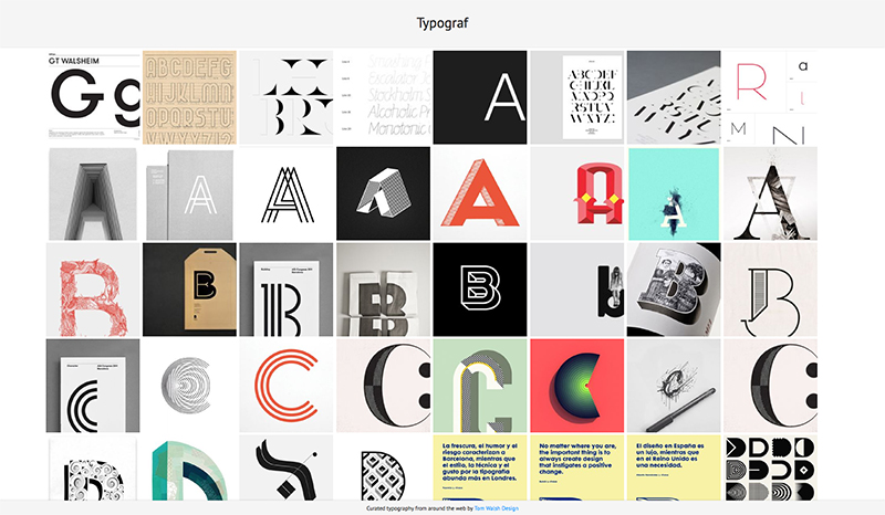
After years of planning, designing and procrastinating over my side-project Typograf, I decided that at the very least it should be more than an empty page with ‘coming soon’ (which also isn’t strictly true, as its been there for almost a decade…). And so Typograf mark II was born. Essentially it’s an aggregator for my typography related Pinterest pins, pulling in anything I add to those boards and displaying them all in one place. Making it easy for me, and anyone else on the web who stumbles across it, to see it all in one place. It’s still effectively a holding page, but at least its now a page with some use, to me anyway.
The next step will be working out how to randomise a selection of web fonts for use in the header and footer, but that’s Mark III. Expect that in another decade then.
You can take a look at typograf.co.uk/
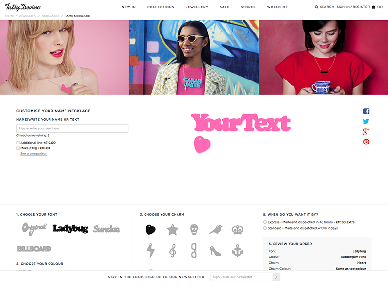
I don’t often get the chance to open up FontLab Studio, especially for paid jobs, so when Tatty Devine approached me to digitise their ‘name necklace’ fonts it was the perfect opportunity to get my hand back in.
Tatty Devine, who describe themselves as an “…independent British company designing and micro-manufacturing original jewellery in the UK”, have been designing and hand making these perspex necklaces in East London for as long as I can remember. At one time I’m pretty sure almost every girl I knew owned one…
The project consisted of converting the four ‘fonts’ they previously had as rough vectors, that would be hand placed together for the designs, into working, usable fonts. This had two main goals. The first being they would no longer need to copy each character into an Illustrator file and manually align them, and the second that they would be able to show users a preview of their necklaces on their new site.
Building fonts from existing vectors may sound like a fairly straight forward task, until you consider how these will need to work. Each necklace needs its characters to overlap so that they can be cut into a single piece, and as three of the fonts are based on existing fonts that weren’t designed to do this, it was going to mean almost every character combination would need to be manually kerned, with a fair few ligatures added in to boot. Ladybug (based on Cooper Black by Oswald Cooper), Sundae (based on Futura Script by Edwin W Shaar) and Billboard (based on Whoop Ass by Blambot Fonts were the three that had to be man-handled into place. Which although it was an arduous process, with a lot of back and forth, ended up working quite well. The final font ‘Original’ was a little easier though, as its based on co-founder Harriet Vine’s handwriting there was a natural flow to it that meant the joins were easier to find…
You can take a look and have a play with the finished product at tattydevine.com/name-necklace
