
During a short stint freelancing at design studio ‘Interfield’ a brief came in to design the type for a title sequence for the BBC period drama series ‘North & South’. I was given a preview disc containing the first couple of episodes, and the synopsis of It needs to reflect the contrast of the genteel south of England and the industrial North. Typographically quite an interesting brief I thought.
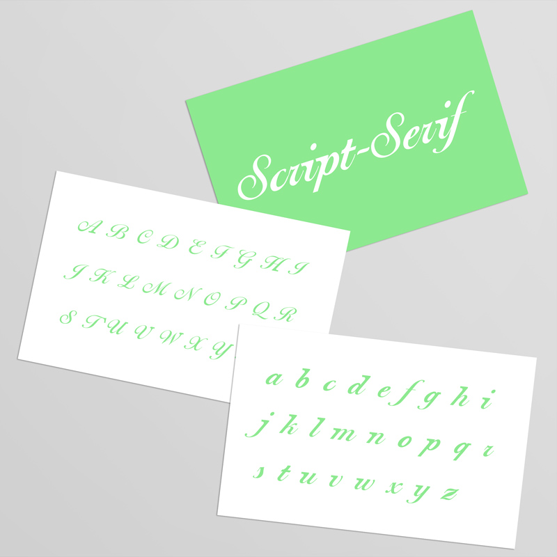
After considering drawing something from scratch (as it was a title sequence it was a limited character set with just the key cast members names), I decided instead to look at existing typographic representations of the ‘genteel’ vs the ‘industrial’, and try and make them harmonise. Genteel easily lent itself to a script font, Industrial was a bit more hit and miss in my experiments, but I decided on slab-serif as the way to go.
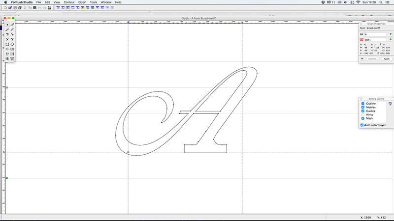
Once I’d decided on the premise/structure I was going to work with, my approach was to look first at script typefaces that would hold up on multiple screens, as well as support the addition of something as heavy as a slab-serif. I narrowed it down to two strong candidates, Ballentines Script and Shelley Script. On drawing in the additional slab-serifs to some of the key characters I realised that for them to balance on Shelley they would be way too subtle for on screen use, so Ballentines was chosen as the basis for the rest of the designs. A good, solid structure, but still maintaining the femininity of a Script face, and most importantly, capable of carrying the slab serifs off.
As a finished font I think it works well. The lower case characters hold the serifs better, but as they’re the less flamboyant case that’s probably to be expected. In the end the BBC thought it would be too subtle for the viewer to notice so it wasn’t used, but I still continued working on it and creating the working font. The idea was still used though, and they opted for a pairing of a script face with a slab serif face. Which although a step back from the conclusion, still worked well visually.
Font Name:
Script Serif
Credits/Designer:
Tom Walsh
Released:
2005
Font Style:
Connecting Script, Serif
Format:
Opentype
