
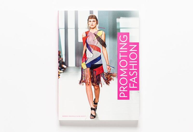
The new book ‘Promoting Fashion’, published by Laurence King, has used my work as an example in their section discussing the importance of best practise design for responsive fashion e-commerce sites. And to top that, they also used my work on their back cover!
You can read more on the book here
Following last Autumn’s collaboration with M/M (Paris) to reinterpret its iconic crocodile logo (an homage to founder René Lacoste, who was dubbed “The Crocodile” because of his tenacity on the tennis court), for the first time in the fashion brand’s history, Lacoste has replaced the famous crocodile with ten endangered species. All of which face imminent threat of extinction.
Working closely with BTEC Paris and the International Union for Conservation of Nature (IUCN) to design the limited edition logos, which are embroidered in the same style as the renowned crocodile, the French fashion brand has correlated the number of available shirts with the number of animals that remain in the wild. Ranging from 30 Vaquita porpoises to 450 Anegada Rock Iguanas. Creating a total of 1,775 shirts, of which the profits will be donated to the species’ conservation.
Unfortunately they all sold out pretty much immediately, but if you’d like to take a look in more detail and read up on the cause you can find it on their site here:
lacoste.com/saveourspecies
And you can support the cause with donations here:
saveourspecies.org
An insightful and engaging new project from Getty Images, showing their predictions for trends in the coming year. We see quite a few of these being shared around in January each year, but this one is particularly nice. My favourite element being the colour sampling rollover in the ‘Boys, Boys, Boys’ page. A nice touch that surprised me and made me look for more little details throughout.
Take a look for yourself at visualtrends.gettyimages.com
Lovely animated typography piece by DJA to launch Karen Walker’s first set of fragrances. Embodying Karen’s signature eccentric energy the film brings the neon titles of each of the three fragrances to life. DJA describe it as:
“Channeling the upbeat, irreverent spirit of the Op Art movement, a bold, graphic approach to packaging for Karen Walker’s fragrance debut ABC.”
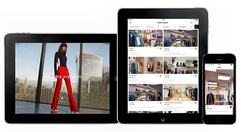
The iPad version of the Farfetch Discover app I designed while in house at Farfetch has launched. So now users can enjoy it on tablets as well as mobile, there’s no excuse not to download it!
They describe it as –
“Farfetch Discover takes a fashion insider’s view on cities around the world, with unrivalled access to a treasure trove of local knowledge direct from our network of over 300 independent boutiques. From gourmet eateries in Dallas, to charming markets hidden away on Dubrovnik’s Adriatic coast, get tips that only a local could know.
Browse boutique recommendations on where to eat, drink, stay or explore. Read personal itineraries from some of the city’s coolest natives or create your own to have handy when you’re offline in the city. And of course you’ve got over 1,500 designers and 120,000 products to shop from, right at your fingertips.”
And if you’d like to have a play you can download it from the app store here
Or read more about this project here
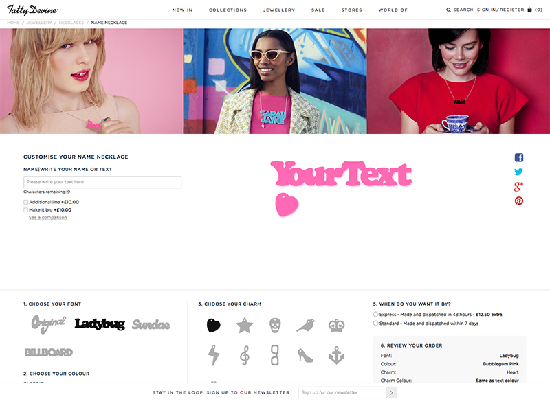
I don’t often get the chance to open up FontLab Studio, especially for paid jobs, so when Tatty Devine approached me to digitise their ‘name necklace’ fonts it was the perfect opportunity to get my hand back in.
Tatty Devine, who describe themselves as an “…independent British company designing and micro-manufacturing original jewellery in the UK”, have been designing and hand making these perspex necklaces in East London for as long as I can remember. At one time I’m pretty sure almost every girl I knew owned one…
The project consisted of converting the four ‘fonts’ they previously had as rough vectors, that would be hand placed together for the designs, into working, usable fonts. This had two main goals. The first being they would no longer need to copy each character into an Illustrator file and manually align them, and the second that they would be able to show users a preview of their necklaces on their new site.
Building fonts from existing vectors may sound like a fairly straight forward task, until you consider how these will need to work. Each necklace needs its characters to overlap so that they can be cut into a single piece, and as three of the fonts are based on existing fonts that weren’t designed to do this, it was going to mean almost every character combination would need to be manually kerned, with a fair few ligatures added in to boot. Ladybug (based on Cooper Black by Oswald Cooper), Sundae (based on Futura Script by Edwin W Shaar) and Billboard (based on Whoop Ass by Blambot Fonts were the three that had to be man-handled into place. Which although it was an arduous process, with a lot of back and forth, ended up working quite well. The final font ‘Original’ was a little easier though, as its based on co-founder Harriet Vine’s handwriting there was a natural flow to it that meant the joins were easier to find…
You can take a look and have a play with the finished product at tattydevine.com/name-necklace
To celebrate ten years of his work as creative director of AnOther magazine Creative Director David James has launched www.everythingthatmatters.com, a digital exhibition celebrating his time there. Displayed as a chronological timeline it’s interesting to carousel through and see how trends have affected the layouts. A lot of the changes feel quite graded as you progress, so wouldn’t be noticeable to the average reader, but when laid out in this format of editorial snapshots you can see photographic and typographic styles coming and going, sometimes with a gradual introduction period of overlaps.
As a magazine known for being at the forefront of trends its quite striking to see, in particular in the typography, how they were pushing their layouts over the years. For instance, if you scroll through the slides from the early years circa 2005, and jump to 2014/15 the difference makes it look like two separate magazines. Some of the early typographic styles have even been around long enough to have had a resurgence since first appearing in their magazines.
My personal preference is the latest type style, 8.5pt throughout, but maybe that’s because it’s ‘current’. I still wouldn’t turn my nose up at a lot of the older styles though.
Have a scroll through here and make up your own mind:
www.everythingthatmatters.com


The fashion ‘Portfolio’ I designed for Milan Style is now live! Designed to be a clean, responsive experience the site pulls in editorial content from a selection of major fashion sites (including Gucci, Oki Ni, Matches, Mr Porter and many more) and creates a central hub to view the upcoming trends and styles in the Male fashion world. With content ranging from Catwalk shots to editorial it works as a curated overview of what the top end of fashion are producing from season to season. It was designed to be responsive to cater for more detailed browsing on a desktop, or for a quick bit of mobile eye candy if you’re on the go, and has a couple of nice little features thrown in too (like the Pinterest style colour matching on load, and the animation of content on window re-size).
You can see more of this project on my site here
Or you can take a look at the full site here


The customised WordPress I set up for fashion writer Hannah Nixon is now live! A re-worked version of the Imbalance theme, it showcases her writing through a visually engaging home page which invites the user to delve deeper. Another element of the theme that made it a particularly appropriate choice is how you navigate using categories, allowing Hannah to group her work by publication/website. Doesn’t look too bad either!
You can take a look at the live site here
Nice (but not so new) campaign promoting Issey Miyake’s last perfume by enabling users to post messages using Google Street View. The experience gets its full power with the app that allows other users to discover messages directly where they have been posted via augmented reality. They don’t look too bad either!
You can take a look on the site here
