
Snell Roundhand-hand came out of a project quite early in my career while working with a design studio called Container on spreads for Super magazine. With a very hand drawn, pencil style to their designs we spent a fair bit of time tracing and scanning suitable fonts for layouts title by title. And so the ‘hand-drawn’ project began. A long term challenge to convert a selection of fonts into a ‘pencil drawn’ equivalent that I could share with studios who were fond of that aesthetic.
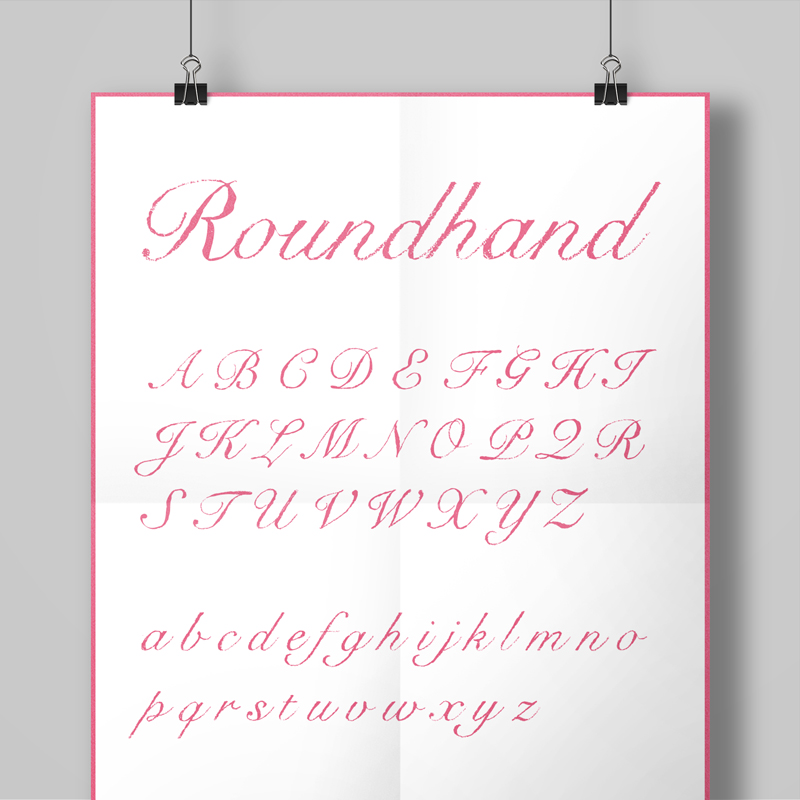
First on the list (due to demand) was a hand drawn version of Snell Roundhand. Originally developed in 1965 by Matthew Carter, and based on the roundhand script of Charles Snell (hence the name), it’s an expressive but structured font. A good one to start with too, due to the amount of detail in its flourishes and its variety in weight it was a nice example of all the things that might raise issues in whichever approach I decided to take.
The first thing I had to test out when I started was which type of pencil and tracing paper combination would work best for this. So I went about buying a selection of weights and transparencies and trying them out. The second part to test was the correct size to print out the original characters for tracing, so that in the completed font the texture would be visible enough at smaller sizes, but not so grainy as to distort the font too drastically. After a fair bit of scribbling and scanning I opted for printing out the characters at 48pt, and tracing onto 60gsm for the right balance of transparency and texture.
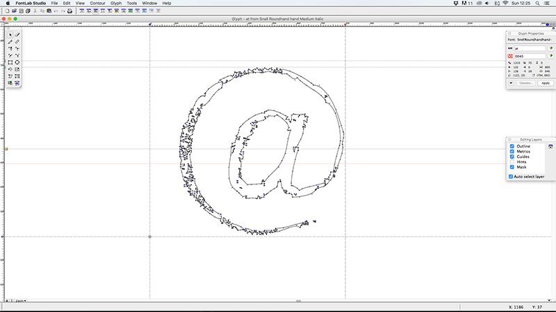
When it came to converting the pencil-traced characters into vectors it was a little simpler. Thankfully Illustrator had a (more accurate in 2004 than it is now, in my opinion) Live Trace tool built in which meant that after a little amending to ensure the contrast was right in Photoshop it was fairly quick to get the starting vectors. Tweaks to these took a little longer, especially ensuring a consistent feel from character to character with a few test-words (handgloves etc). Once I had all the vectors ready it was time to jump back into Fontographer, but luckily this time as I was basing the font on an existing one a lot of the information for kerning, leading and hinting already existed, so as long as I ensured I didn’t stray too far from that I didn’t have as many rounds of tweaking as I’d anticipated.
All in all I’m pretty pleased with the ‘hand-drawn’ set of fonts that came out of the project. As well as Snell I produced versions of Baskerville (both filled and an outlined version), Foundry Gridnik and Helvetica using the same process’. I would say that the two sans fonts benefitted less from the effect, but it certainly was an interesting experiment, and I’ve used all of them in projects since.
Font Name:
Snell Roundhand Hand
Credits/Designer:
Tom Walsh
Released:
2004
Font Style:
Connecting Script
Format:
Opentype
