
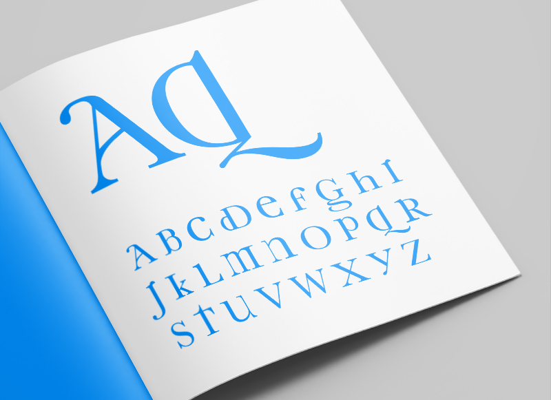
As part of my early exploratory work into type design I began looking at the characteristics that defined upper and lower case letters independently, and from one another. One particular trend I’d noticed was for a lot of the personality and flair to be included in the lower case characters, but omitted in the upper case versions of those characters. From this starting point I began working on Middlecase, a way of bringing some of the charm of lower case into an upper case font.
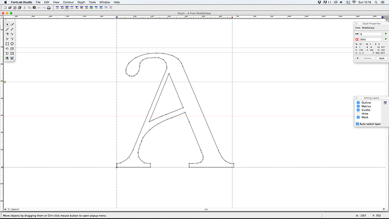
Some of the characters produced quite subtle, but still pleasing, results (like the K, Y and V). Others had more dramatic, but also more interesting results (like the A, D, G & Q) and others were a little trickier (less said about those the better). All in all I think it worked well as an experiment in type, and could possibly be used as a display font, but I would say I probably got more from undertaking the project and the process than I will from using the physical font.
Font Name:
Middlecase
Credits/Designer:
Tom Walsh
Released:
2008
Font Style:
Decorative Serif
Format:
Opentype
