
Experiment #2 from my new series of explorations into light and sound. This time looking at the satisfying sound of analogue camera mechanisms from 1920’s–1970’s.
There’s something quite beautiful about getting real mechanical feedback when using a camera, something I miss a little bit more every time I take a picture these days. Ironically though, I shot the footage on my phone…
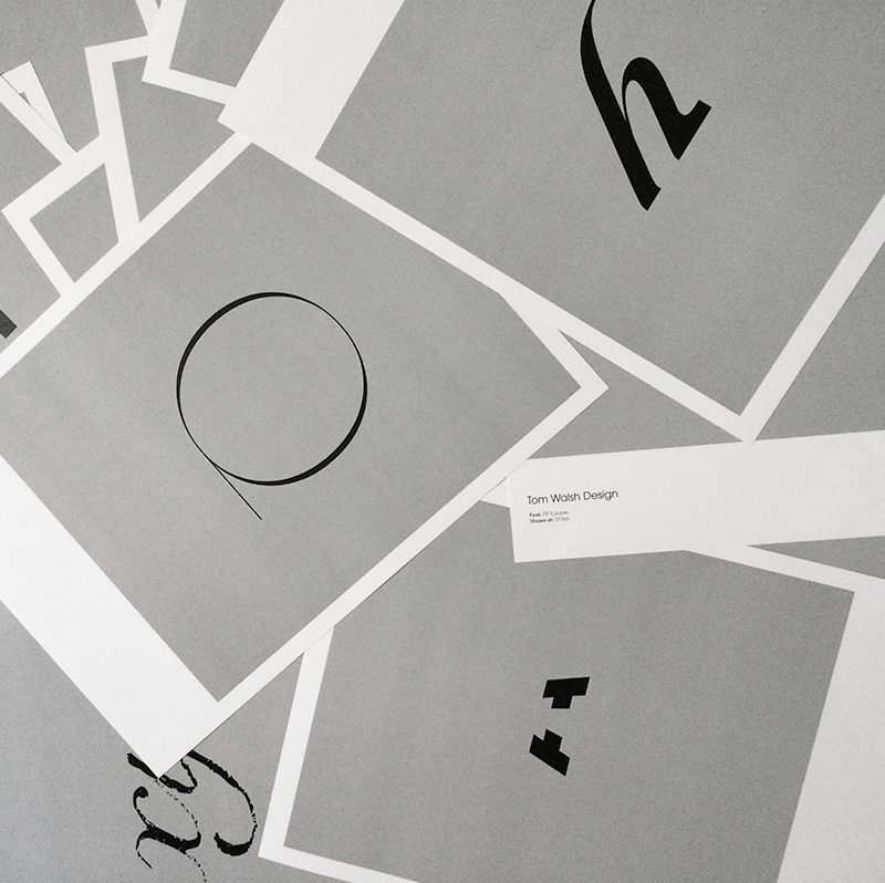
All of the snippets can be seen on my Instagram here: instagram.com/tomwalshdesign
An edited down version of a 2004 personal project into light and memory that I’m thinking of revisiting. Watch this space…
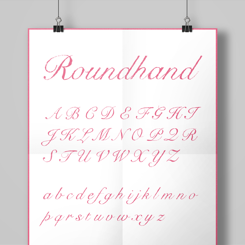
Snell Roundhand-hand came out of a project quite early in my career while working with a design studio called Container on spreads for Super magazine. With a very hand drawn, pencil style to their designs we spent a fair bit of time tracing and scanning suitable fonts for layouts title by title. And so the ‘hand-drawn’ project began. A long term challenge to convert a selection of fonts into a ‘pencil drawn’ equivalent that I could share with studios who were fond of that aesthetic.
First on the list (due to demand) was a hand drawn version of Snell Roundhand. Originally developed in 1965 by Matthew Carter, and based on the roundhand script of Charles Snell (hence the name), it’s an expressive but structured font. A good one to start with too, due to the amount of detail in its flourishes and its variety in weight it was a nice example of all the things that might raise issues in whichever approach I decided to take.
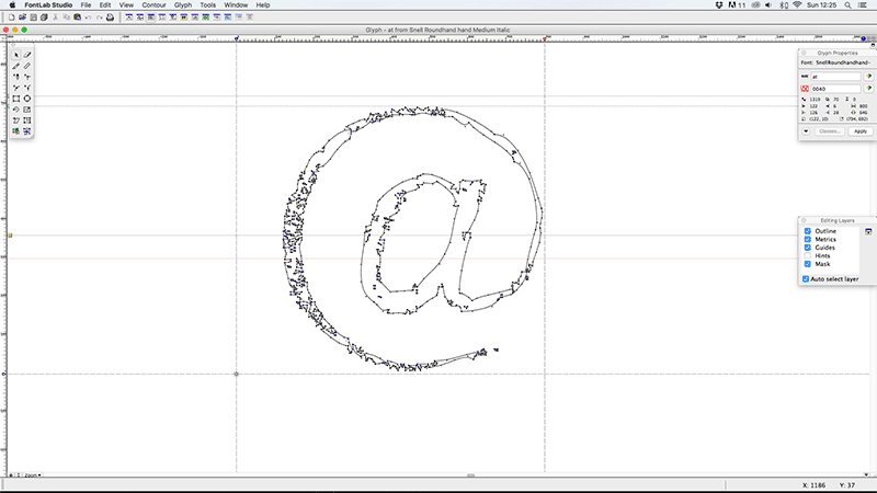
The first thing I had to test out when I started was which type of pencil and tracing paper combination would work best for this. So I went about buying a selection of weights and transparencies and trying them out. The second part to test was the correct size to print out the original characters for tracing, so that in the completed font the texture would be visible enough at smaller sizes, but not so grainy as to distort the font too drastically. After a fair bit of scribbling and scanning I opted for printing out the characters at 48pt, and tracing onto 60gsm for the right balance of transparency and texture.
When it came to converting the pencil-traced characters into vectors it was a little simpler. Thankfully Illustrator had a (more accurate in 2004 than it is now, in my opinion) Live Trace tool built in which meant that after a little amending to ensure the contrast was right in Photoshop it was fairly quick to get the starting vectors. Tweaks to these took a little longer, especially ensuring a consistent feel from character to character with a few test-words (handgloves etc). Once I had all the vectors ready it was time to jump back into Fontographer, but luckily this time as I was basing the font on an existing one a lot of the information for kerning, leading and hinting already existed, so as long as I ensured I didn’t stray too far from that I didn’t have as many rounds of tweaking as I’d anticipated.
All in all I’m pretty pleased with the ‘hand-drawn’ set of fonts that came out of the project. As well as Snell I produced versions of Baskerville (both filled and an outlined version), Foundry Gridnik and Helvetica using the same process’. I would say that the two sans fonts benefitted less from the effect, but it certainly was an interesting experiment, and I’ve used all of them in projects since.
Font Name:
Snell Roundhand Hand
Credits/Designer:
Tom Walsh
Released:
2004
Font Style:
Connecting Script
Format:
Opentype
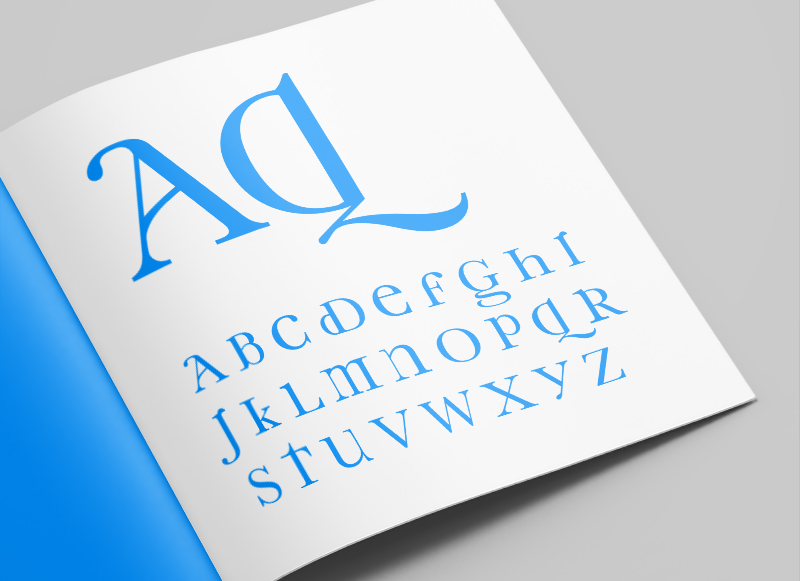
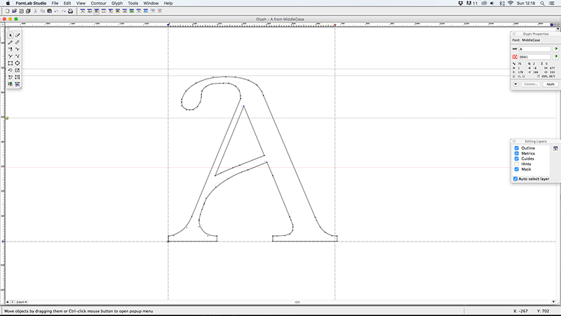
As part of my early exploratory work into type design I began looking at the characteristics that defined upper and lower case letters independently, and from one another. One particular trend I’d noticed was for a lot of the personality and flair to be included in the lower case characters, but omitted in the upper case versions of those characters. From this starting point I began working on Middlecase, a way of bringing some of the charm of lower case into an upper case font.
Some of the characters produced quite subtle, but still pleasing, results (like the K, Y and V). Others had more dramatic, but also more interesting results (like the A, D, G & Q) and others were a little trickier (less said about those the better). All in all I think it worked well as an experiment in type, and could possibly be used as a display font, but I would say I probably got more from undertaking the project and the process than I will from using the physical font.
Font Name:
Middlecase
Credits/Designer:
Tom Walsh
Released:
2008
Font Style:
Decorative Serif
Format:
Opentype
Discover the LuxDeco Style Guide – a 92-page complimentary, interactive publication created to give you all the inspiration, tips and pieces you need to transform your home. Request your copy to access key spring/summer looks, exclusive pieces, inspiring tastemakers and practical style notes.
Read more about this project here
And order your free copy here
I’m excited to announce a new series of posts are on their way. A retrospective of typeface design projects from over the years which I will be sharing on Instagram and right here. Giving an insight into why they were designed, who they were designed for and the nuances of each typeface. Spanning from University projects while at Camberwell, up to my most recent commercial type design project last year. I’m hoping these will work as a living archive, as well as provide some understanding of the process’ involved in both the designing and the creation of a working typeface.
Oh, and for the aficionados out there, I know ‘Font Focus’ isn’t entirely accurate (as I’ll be covering typefaces), but it had a nicer ring to it!
To see the updates on Instagram you can take a look here – instagram.com/tomwalshdesign/
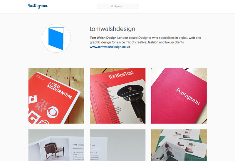
After a while of weighing it up, I finally decided to set up an Instagram for the business side of my life. Primarily as I wasn’t sure where to put the print work that I often create when I’m working on digital contracts, but also as a kind of middle ground for inspiration. Somewhere to put those little nuggets that don’t quite warrant a post.
If you’d like to take a look, or follow, you can find me at instagram.com/tomwalshdesign/
If you’re not already aware of The Noun Project, you should be. It’s one of those sites you think should have always existed, and wonder why it took so long to arrive. Launched in 2010 by husband-and-wife team of Edward Boatman and Sofya Polyakov, along with designer Scott Thomas, the site allows members to upload icons for others to download. They describe it as –
Creating, Sharing and Celebrating the World’s Visual Language
Its a simple concept, but one with multiple uses. From my own experience I’ve been uploading icons on and off for the last two–three years (and being paid monthly for downloads), but from digging a little deeper into their blog there’s a whole other aspect to it. The ‘Nouns’ on their site have also been used for education and signage systems, like their ‘Iconathons’ where they aim to “add to the public domain a set of graphic symbols that can be used to easily communicate concepts frequently needed in civic design.
If you fancy having a look around, or even uploading/downloading some icons, you can take a look at thenounproject.com
Or if you’d like to take a look at my icon collection you can see them on my page at thenounproject.com/tomwalshdesign
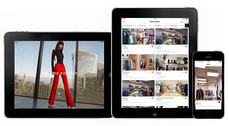
The iPad version of the Farfetch Discover app I designed while in house at Farfetch has launched. So now users can enjoy it on tablets as well as mobile, there’s no excuse not to download it!
They describe it as –
“Farfetch Discover takes a fashion insider’s view on cities around the world, with unrivalled access to a treasure trove of local knowledge direct from our network of over 300 independent boutiques. From gourmet eateries in Dallas, to charming markets hidden away on Dubrovnik’s Adriatic coast, get tips that only a local could know.
Browse boutique recommendations on where to eat, drink, stay or explore. Read personal itineraries from some of the city’s coolest natives or create your own to have handy when you’re offline in the city. And of course you’ve got over 1,500 designers and 120,000 products to shop from, right at your fingertips.”
And if you’d like to have a play you can download it from the app store here
Or read more about this project here
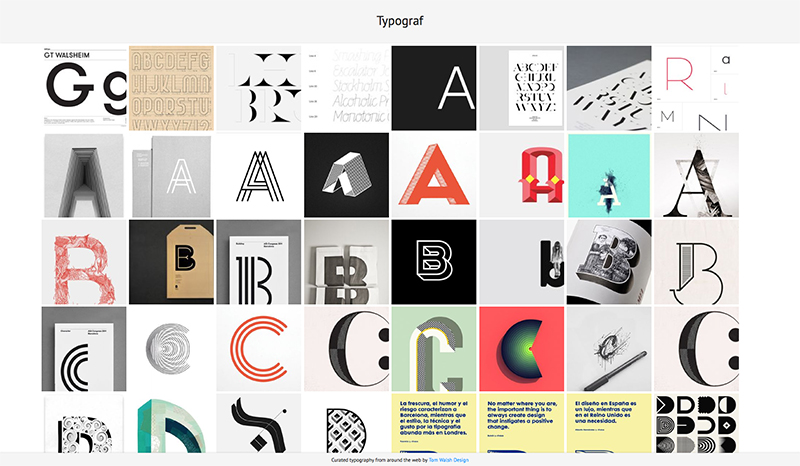
After years of planning, designing and procrastinating over my side-project Typograf, I decided that at the very least it should be more than an empty page with ‘coming soon’ (which also isn’t strictly true, as its been there for almost a decade…). And so Typograf mark II was born. Essentially it’s an aggregator for my typography related Pinterest pins, pulling in anything I add to those boards and displaying them all in one place. Making it easy for me, and anyone else on the web who stumbles across it, to see it all in one place. It’s still effectively a holding page, but at least its now a page with some use, to me anyway.
The next step will be working out how to randomise a selection of web fonts for use in the header and footer, but that’s Mark III. Expect that in another decade then.
You can take a look at typograf.co.uk/
