
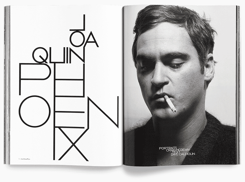
To celebrate ten years of his work as creative director of AnOther magazine Creative Director David James has launched www.everythingthatmatters.com, a digital exhibition celebrating his time there. Displayed as a chronological timeline it’s interesting to carousel through and see how trends have affected the layouts. A lot of the changes feel quite graded as you progress, so wouldn’t be noticeable to the average reader, but when laid out in this format of editorial snapshots you can see photographic and typographic styles coming and going, sometimes with a gradual introduction period of overlaps.
As a magazine known for being at the forefront of trends its quite striking to see, in particular in the typography, how they were pushing their layouts over the years. For instance, if you scroll through the slides from the early years circa 2005, and jump to 2014/15 the difference makes it look like two separate magazines. Some of the early typographic styles have even been around long enough to have had a resurgence since first appearing in their magazines.
My personal preference is the latest type style, 8.5pt throughout, but maybe that’s because it’s ‘current’. I still wouldn’t turn my nose up at a lot of the older styles though.
Have a scroll through here and make up your own mind:
www.everythingthatmatters.com
Unit Editions, an independent publishing collaboration between Tony Brook (Spin) and Adrian Shaughnessy, have released two new videos showcasing spreads from Type Plus and Type Only. Featuring a range of contemporary typographic work by a host of international designers. If you don’t get a chance to flick through them yourself this is a nice little sneak peak into their contents.
Both are available from Unit Editions here:
uniteditions.com
And you can watch all of their videos on Vimeo here:
vimeo.com/uniteditions
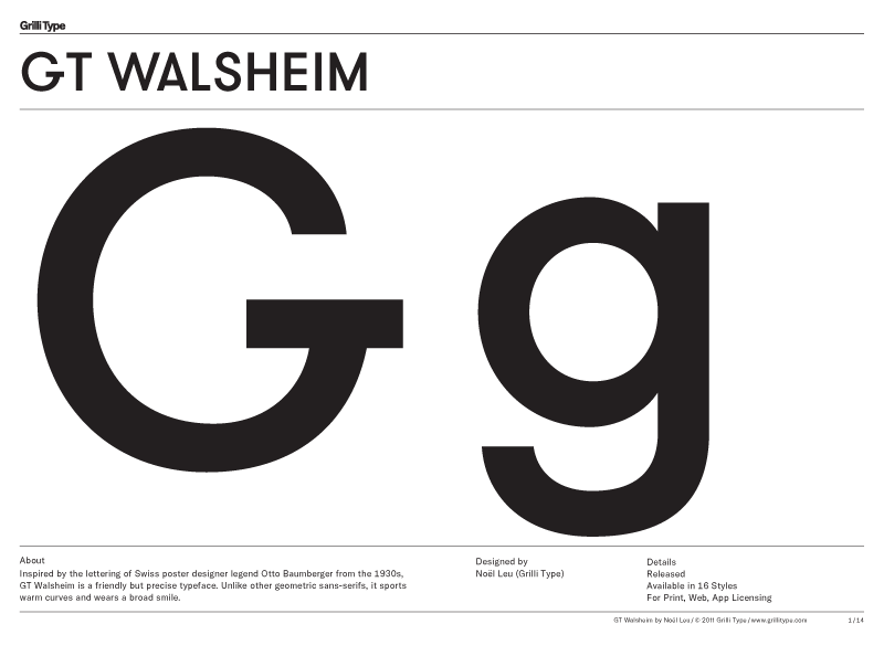
Very thorough type specimen from Grilli Type (see full PDF here ) to show off their updated version of GT Walsheim, now with Cyrillic support and renamed GT Walsheim Pro. I particularly like the tittle (or dot) on the lowercase i, j and accents in the lighter weights.
They describe it as:
“Inspired by the lettering of Swiss poster designer legend Otto Baumberger from the 1930s, GT Walsheim is a friendly but precise typeface. Unlike other geometric sans-serifs, it sports warm curves and wears a broad smile.”
Design:
Latin by Noël Leu (Grilli Type)
Cyrillic by Noël Leu with Mirco Schiavone
Take a look here –
grillitype.com/typefaces/gt-walsheim
Nice promo for Font Font’s new Open Type features by Stark Films. Based on the pangram ‘The Quick Brown Fox Jumps Over the Lazy Dog the film playfully highlights each of the new features introduced by Font Font through various contrasting mediums.
For more information on the new features introduced you can take a look here –
fontfont.com/ot-feature-sample/
Directors: Rob Blake and Zu Kalinowska
Producer: Brian Papish


Described by Fontbook as –
“If typography were a religion, this would be the Bible. FontBook is the world’s most comprehensive typographic reference tool, containing 110 type foundries and featuring over 620,000 typeface specimens.”
A bold statement, but one their iPad app doesn’t fall short on. Its a great (and lovely looking) app that delivers on design, usability and content. If you’re just looking for inspiration you can browse by style, alphabetically, foundry, year and more. Meaning however vague an idea you may have of the font you’re looking for you’ve got plenty of angles to approach from to narrow it down. The most useful tool I’ve found, however, is the ‘Compare’ function. Perfect for when you (or a client) can’t decide between a selection of fonts. You can test them out using different copy, and glide between them to make your decision. Much easier than running up a comparison sheet in Illustrator, and a bit more fun too…
You can read more reviews, and download the app from the iTunes store here
As I missed this exhibition (by nearly a year…) it’s nice that they took the time to film themselves flicking through the work shown. I think it’ll be a while before I come across a showcase of such intricate print work, and it’s especially nice to see some of it being constructed & deconstructed. So here you have it, a permanent digital version you can peruse whenever you have a spare 30mins, lovely!
Combining the latest in 3-dimensional prototyping technology with sublime typographic art, johnson banks have created Arkitypo: 26 letters, or 26 typographic sculptures, each exploring the character and history of an individual font.
The Arkitypo project developed as a collaboration with digital media and design college Ravensbourne, and acts as a showcase for the college’s prototyping skills and technology. The result is sheer visual delirium, from the “fractalised” Akzidenz Grotesk via the lace-like pipework of Johnston to the Vorticist collision of Zig Zag. Arkitypo took over six months to complete, and was the product of considerable research and practical experiment. And when examined in complete rotation, the results are all the more surprising and inspiring.
You can read more about this project on the johnson banks website here

 Selfridges new store wide initiative is an homage to Words! With the likes of Faber Publishing and The Idler Academy providing talks and poetry readings, as well as handwriting analysis (which I’m especially interested in, as mines terrible) it looks like they’ve got it pretty well covered. As always though, what I’m most interested in is the window displays, this time provided by the clever people at It’s Nice That. I have to say that I’m not as keen on the supporting windows, but I think the main display is a really nice idea. Shown above, it brings a playfulness to what could otherwise be seen as quite a boring subject by many. It’s Nice That explain it like this:
“For the showpiece corner window of Oxford Street and Orchard Street, we have collaborated with interactive designer Stewdio to create ‘The Word-A-Coaster’ a playful fortune telling machine. The 14 foot high hand-built wooden rollercoaster (constructed by model makers Atom) is surrounded by a sea of 30,000 brightly coloured balls filled with 30,000 unique fortunes that can be picked up in store for free.
Inside the balls, shoppers will find a small card emblazoned with a uniquely numbered adjective, generated by a clever computer programme that leaves each individual with their own personal, playful prediction for 2012.”
For a full itinerary of talks and events take a look on the Selfridges site here


Beautifully intricate pop-up calendar by Johann Volkmer. Unfortunately all of the information I’ve managed to find on this project is in German (which I don’t speak) so I can’t tell you much as far as the concept goes, but just in case anyone reading this does, here’s his description of the project –
“Faltjahr 2010, kein Jahresplaner und auch kein Kalender im üblichen Sinne, vielmehr zwölf DIN-A4-formatige, im aufgeklappten Zustand DIN-A3-große, aufwändig als Wandskulpturen gefertigte, Pop-up-Objekte.
Jedes Monatsmotiv -als Einzelstück aufgehängt- ein ungewöhnlicher Hingucker zur anspruchs-
vollen Raumgestaltung.
Monochrom weißes Papier in schlichter Eleganz bringt Monatsthemen in reduzierter Form zum Ausdruck. Das Faltjahr 2010 zeigt, wozu Papier fähig ist.”
You can view the full project’s website here (also in German…) – faltjahr2010.de
Lovely animated idents for Audi by Why Not Associates as shown on the Creative Review blog, where they explain them as –
“…a message relating to function and form which appear etched or embossed into materials used in Audi’s new Q3 model – tyre rubber, a brake disc, galvanised steel, interior leather, and plastic.”
Shown are just a selection of my favourites, but you can visit Why Not Associates Vimeo page here to see the full set.
Engine Cover Plastic 1
Tyre rubber 1
Galvanised Steel 2
Tyre rubber 2
