
Nice new micro-site site, and another great type specimen (see full PDF here) by Grilli Type, this time to promote GT Haptik.
I wrote a post a little while ago on their promotion of GT Walsheim (you can read that here), and this is another example of how to sell a font to a designer. I may not go out and buy it right away, but through their micro-sites and specimens they’ve ensured that if I want a similar font, their site will be my first stop.
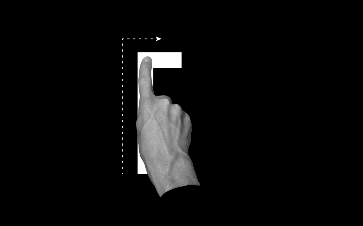
It’s not just their attention to detail in promoting their fonts that I like though, its that this attention is paid right through from the typeface concept stage. In recent years, especially with the rise of popularity in free web fonts from Google and the likes, it seems people have forgotten that typefaces used to have a reason to be created. GT Haptik is a great example of this, a typeface designed to solve a problem. It helps that it’s an accessibility problem it aims to overcome too (maximising legibility when ‘read’ through touch), as it brings it back to the core purpose of typography, better communication.
They describe Haptik as:
“…a monolinear geometric grotesque typeface. Its uppercase letters and numbers were optimized to be read blindfolded and by touching them. It is now available in seven weights with accompanying Oblique and Rotalic styles. Included with each style come alternate characters as well as proportional and tabular figures.”
They have other great typefaces on their site, and I look forward to seeing what they come up with in future releases. Definitely a site to keep an eye on.
GT Haptik Design:
Reto Moser
Tobias Rechsteiner
Take a look at the micro-site here – www.gt-haptik.com
And the GT Haptik page on Grilli Type here – grillitype.com/typefaces/gt-haptik
