
A lovely, and darkly comedic stop-frame animation from Dutch Director Nina Gantz telling the tale of ‘Edmond’. Having won awards including a BAFTA for short animation, and the Short Film Jury Award at this year’s Sundance film festival its clear I’m not the only one to appreciate it. The soft, friendly aesthetic, coupled with the dark story of love and cannibalism make it both mesmerising and beautiful.
Directed by Nina Gantz
Produced by Emilie Jouffroy
Discover the LuxDeco Style Guide – a 92-page complimentary, interactive publication created to give you all the inspiration, tips and pieces you need to transform your home. Request your copy to access key spring/summer looks, exclusive pieces, inspiring tastemakers and practical style notes.
Read more about this project here
And order your free copy here
Nice promo for Font Font’s new Open Type features by Stark Films. Based on the pangram ‘The Quick Brown Fox Jumps Over the Lazy Dog the film playfully highlights each of the new features introduced by Font Font through various contrasting mediums.
For more information on the new features introduced you can take a look here –
fontfont.com/ot-feature-sample/
Directors: Rob Blake and Zu Kalinowska
Producer: Brian Papish
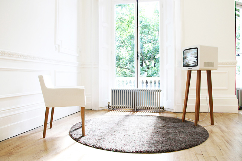
Lovely idea from RCA graduate David Hedberg. ‘Smile TV’ displays a scrambled ‘no signal’ message (remember those, before the digital switch?), unless the person in front of the screen smiles. The longer the viewer smiles, the longer they have a fuzz-free signal.
Here he explains the thinking behind the project to CreativeApplications.net:
“I thought about content and how we, in the old days, used to get it delivered into our household via antennas installed on our individual rooftops. When the reception failed, somebody had to climb up there and fix the antenna to pick up the signal again. Today, with information widely accessible, often at the palm of our hands, the question is no longer if we can receive, but whether we are receptive. In the economy of ‘liking’ things we have very much taken on the role of antennas ourselves – transmitting content on to each other.”
You can read the full article on Creative Applications here
creativeapplications.net
And you can see more of David Hedberg’s work on his site here
davidhedberg.info
Nice social media campaign for Swedish homecare brand Åhléns by agency Forsman & Bodenfors
Agency: Forsman & Bodenfors
Copywriter: Pontus Levahn
Art director: Silla Levin
Designer: Ellinor Bjarnolf
Production company: Snask


Lovely experimental experience from Goldfrapp, which allows the user to create discs which form ‘soundscapes’. Using any of the four supplied templates you can create ‘discs’ which represent sounds, the more discs you create the more multi-layered the soundscape becomes. A nice way to engage fans on it’s own, but it also comes with an accompanying ‘Tales of Us’ photo app. Through the app you can either take new photos, choose photos from your library, or have the app pick two at random. It then layers the photos as a ‘double exposure’ (see what they did there?), giving a selection of filters and adjustments that lets you create something quite similar to an Instagram filter, but with a more abstract depth. All round worth checking out.


Although it takes a while to load (which might have more to do with work being quiet today than the development…) if you liked their previous offerings, like Sprawl 2, then this is well worth a look. You can either use your webcam or your mouse to interact with the video, similar to the Sprawl one, but this time your movements don’t just pause/skip/loop the video, they directly interact with it creating kaleidoscopes and bursts of light wherever you connect. Here’s how they explain it –
“We’re not just dealing with technology, we’re dealing with unique environments. A big part of the data is our engagement and gesture. We developed a HTML5 video player where we control real-time WebGL shader effects. We pair camera vision with the gyroscope and accelerometer data from the mobile device that we send to the computer through WebSockets. It’s by far the most complex thing I’ve ever worked on.”
“For me it’s always been an obsession to combine these things, to make something rich and nuanced, so you forget the technology.”
Clever stuff eh.
Watch the video and have a play (best viewed on Google Chrome) here
Written, Directed & Produced by: Vincent Morisset
Creative Direction by: Vincent Morisset and Aaron Koblin
Produced by: AATOAA, Unit9, Google Creative Lab, Antler Films
A lovely short film exploring the different ways people interpret the same piece of music, all shot from the perspective of a vinyl spinning on a record player. The film was created for “Hello, Again,” an initiative by The Lincoln Motor Company that asks filmmakers to re-imagine the familiar into something fresh and new, and I think it does that pretty well. Its the mundaneness of some of the shots that makes it especially beautiful, accompanied by a nice edit to keep the momentum ticking over.
Watch the “Record” behind-the-scenes film here
Or visit the “Hello, Again” micro-site here
Directors: Wriggles & Robins
Music: ‘Be Happy’ by Amateur Best


I stumbled upon Movies In Colour recently and keep finding myself wanting to re-visit it. Not only is it a lovely concept, but it also looks pretty good too (header aside…). The basic premise of the site is to take films, usually themed over each week (so one week may be Pixar, another Female Directors), and then break up the colour spectrum used within the film into ‘Light’, ‘Medium’, ‘Dark’ and ‘General Spectrum’. The process seems fairly manual, but personally I think the result is worth it.
This is how they explain it on their site –
“The idea started when I was watching Skyfall. I was taken with the cinematography and use of color more-so than the story itself. I wanted to find out what colors made up certain stills and after making a few color palettes for Skyfall, took it a step further by extending it to all films and starting a blog.
So far, the blog has not only been an aesthetic pursuit but also an educational pursuit that showcases the relationship between color, cinematography, set design, and production design. Overall, it is a study of color in films, but has other uses and applications. One of the goals is to give artists color palettes they can use in paintings, films, videos, graphic design, and other pursuits.
The Process
Research is first. I search for stills that are compositionally interesting as well as rich in color. I use the help of a color generator to get a very basic range of swatches. Then I piece together the general palette from that and other colors I think are prominent or worth including from the still. It’s all done in Photoshop to keep layout and swatch sizes consistent and to facilitate color sampling from the image.”
If you’d like to see more you can take a look at the full site here
Nice, if sometimes a little nauseating to watch, tool by Teehan+Lax Labs which allows you to create instant timelapse (or ‘hyperlapse’) films from Google Street View. To use it you just drop a pin for your start, ‘A’, and finish, ‘B’ points and then create your very own Hyperlapse video! Here’s how the studio explain it –
“Hyper-lapse photography – a technique combining time-lapse and sweeping camera movements typically focused on a point-of-interest – has been a growing trend on video sites. Creating them requires precision and many hours stitching together photos taken from carefully mapped locations. We aimed at making the process simpler by using Google Street View as an aid, but quickly discovered that it could be used as the source material.”
To really see what it’s like you need to go and have a play yourself though (best viewed in Chrome) – http://hyperlapse.tllabs.io/
