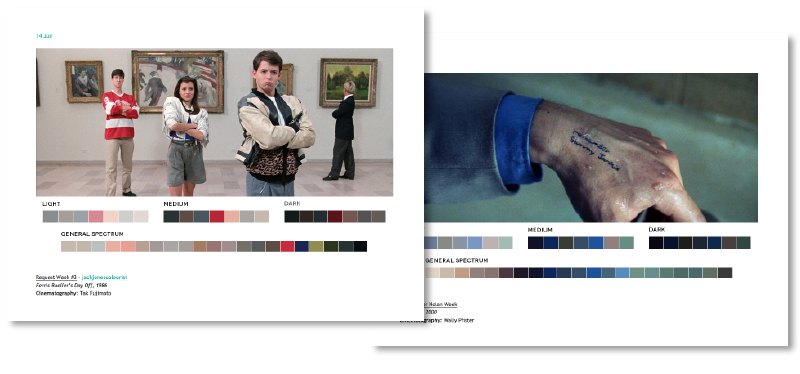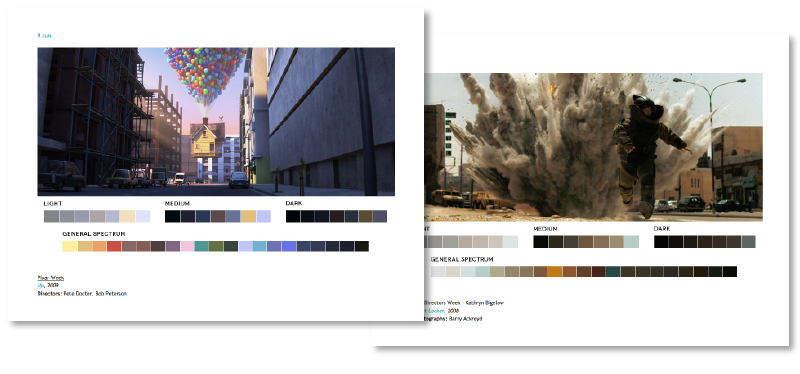

I stumbled upon Movies In Colour recently and keep finding myself wanting to re-visit it. Not only is it a lovely concept, but it also looks pretty good too (header aside…). The basic premise of the site is to take films, usually themed over each week (so one week may be Pixar, another Female Directors), and then break up the colour spectrum used within the film into ‘Light’, ‘Medium’, ‘Dark’ and ‘General Spectrum’. The process seems fairly manual, but personally I think the result is worth it.
This is how they explain it on their site –
“The idea started when I was watching Skyfall. I was taken with the cinematography and use of color more-so than the story itself. I wanted to find out what colors made up certain stills and after making a few color palettes for Skyfall, took it a step further by extending it to all films and starting a blog.
So far, the blog has not only been an aesthetic pursuit but also an educational pursuit that showcases the relationship between color, cinematography, set design, and production design. Overall, it is a study of color in films, but has other uses and applications. One of the goals is to give artists color palettes they can use in paintings, films, videos, graphic design, and other pursuits.
The Process
Research is first. I search for stills that are compositionally interesting as well as rich in color. I use the help of a color generator to get a very basic range of swatches. Then I piece together the general palette from that and other colors I think are prominent or worth including from the still. It’s all done in Photoshop to keep layout and swatch sizes consistent and to facilitate color sampling from the image.”
If you’d like to see more you can take a look at the full site here

