
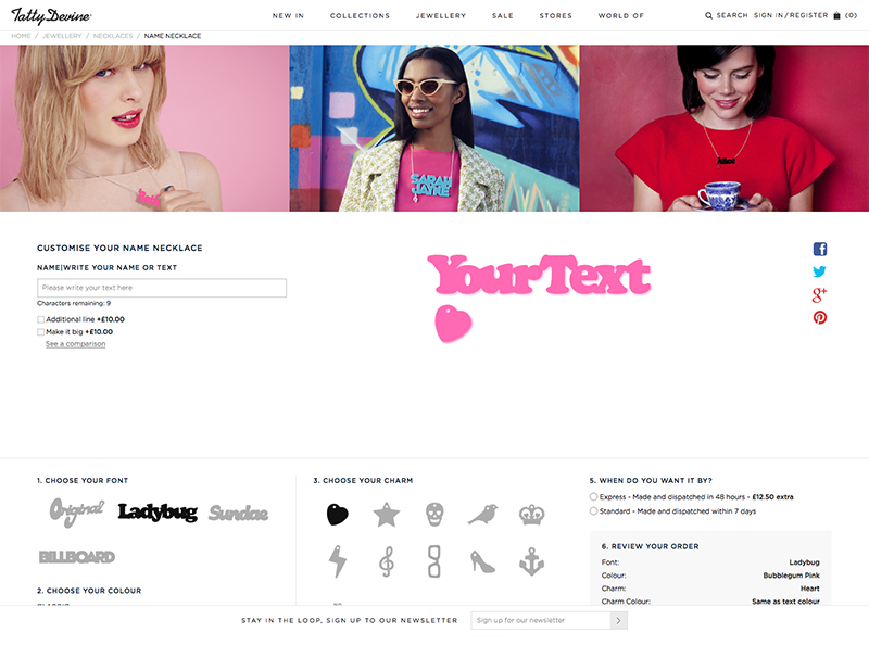
I don’t often get the chance to open up FontLab Studio, especially for paid jobs, so when Tatty Devine approached me to digitise their ‘name necklace’ fonts it was the perfect opportunity to get my hand back in.
Tatty Devine, who describe themselves as an “…independent British company designing and micro-manufacturing original jewellery in the UK”, have been designing and hand making these perspex necklaces in East London for as long as I can remember. At one time I’m pretty sure almost every girl I knew owned one…
The project consisted of converting the four ‘fonts’ they previously had as rough vectors, that would be hand placed together for the designs, into working, usable fonts. This had two main goals. The first being they would no longer need to copy each character into an Illustrator file and manually align them, and the second that they would be able to show users a preview of their necklaces on their new site.
Building fonts from existing vectors may sound like a fairly straight forward task, until you consider how these will need to work. Each necklace needs its characters to overlap so that they can be cut into a single piece, and as three of the fonts are based on existing fonts that weren’t designed to do this, it was going to mean almost every character combination would need to be manually kerned, with a fair few ligatures added in to boot. Ladybug (based on Cooper Black by Oswald Cooper), Sundae (based on Futura Script by Edwin W Shaar) and Billboard (based on Whoop Ass by Blambot Fonts were the three that had to be man-handled into place. Which although it was an arduous process, with a lot of back and forth, ended up working quite well. The final font ‘Original’ was a little easier though, as its based on co-founder Harriet Vine’s handwriting there was a natural flow to it that meant the joins were easier to find…
You can take a look and have a play with the finished product at tattydevine.com/name-necklace
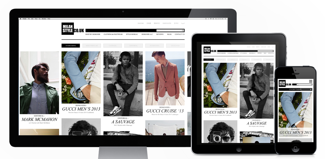
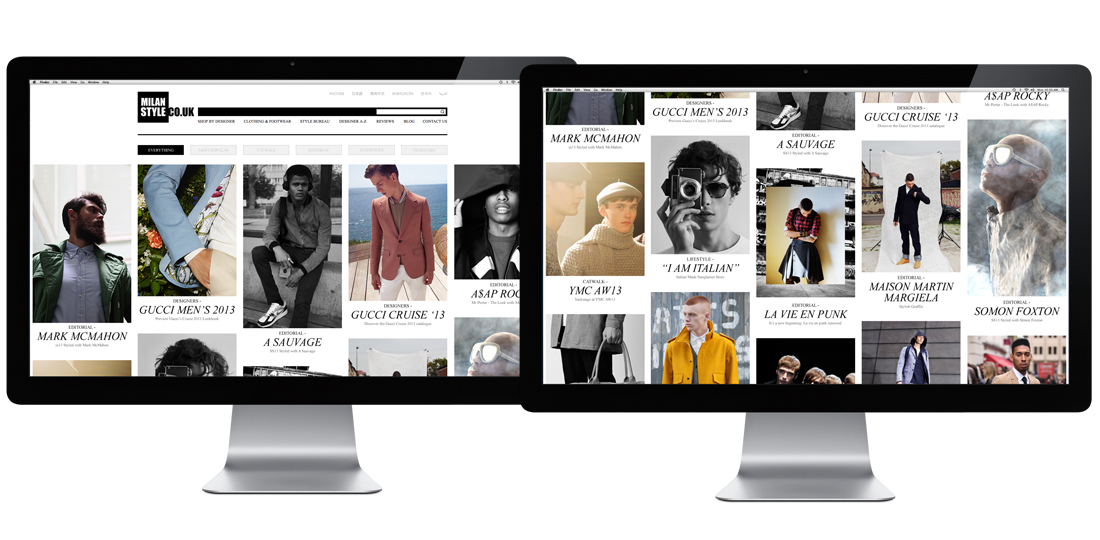
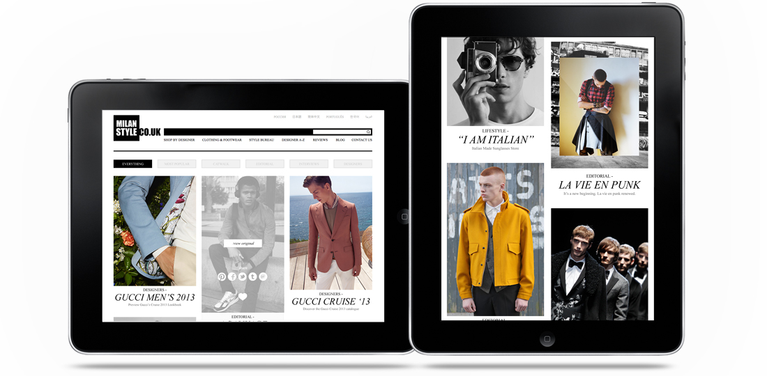
The fashion ‘Portfolio’ I designed for Milan Style is now live! Designed to be a clean, responsive experience the site pulls in editorial content from a selection of major fashion sites (including Gucci, Oki Ni, Matches, Mr Porter and many more) and creates a central hub to view the upcoming trends and styles in the Male fashion world. With content ranging from Catwalk shots to editorial it works as a curated overview of what the top end of fashion are producing from season to season. It was designed to be responsive to cater for more detailed browsing on a desktop, or for a quick bit of mobile eye candy if you’re on the go, and has a couple of nice little features thrown in too (like the Pinterest style colour matching on load, and the animation of content on window re-size).
You can see more of this project on my site here
Or you can take a look at the full site here
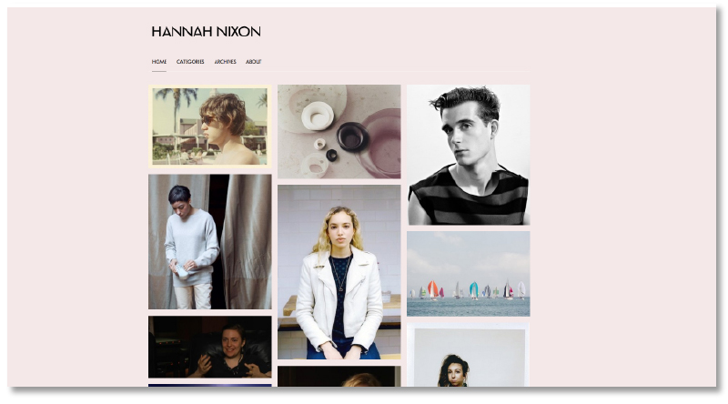
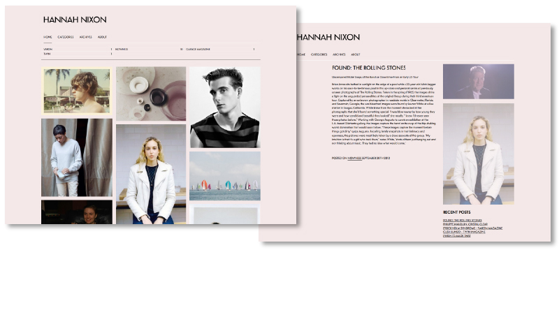
The customised WordPress I set up for fashion writer Hannah Nixon is now live! A re-worked version of the Imbalance theme, it showcases her writing through a visually engaging home page which invites the user to delve deeper. Another element of the theme that made it a particularly appropriate choice is how you navigate using categories, allowing Hannah to group her work by publication/website. Doesn’t look too bad either!
You can take a look at the live site here
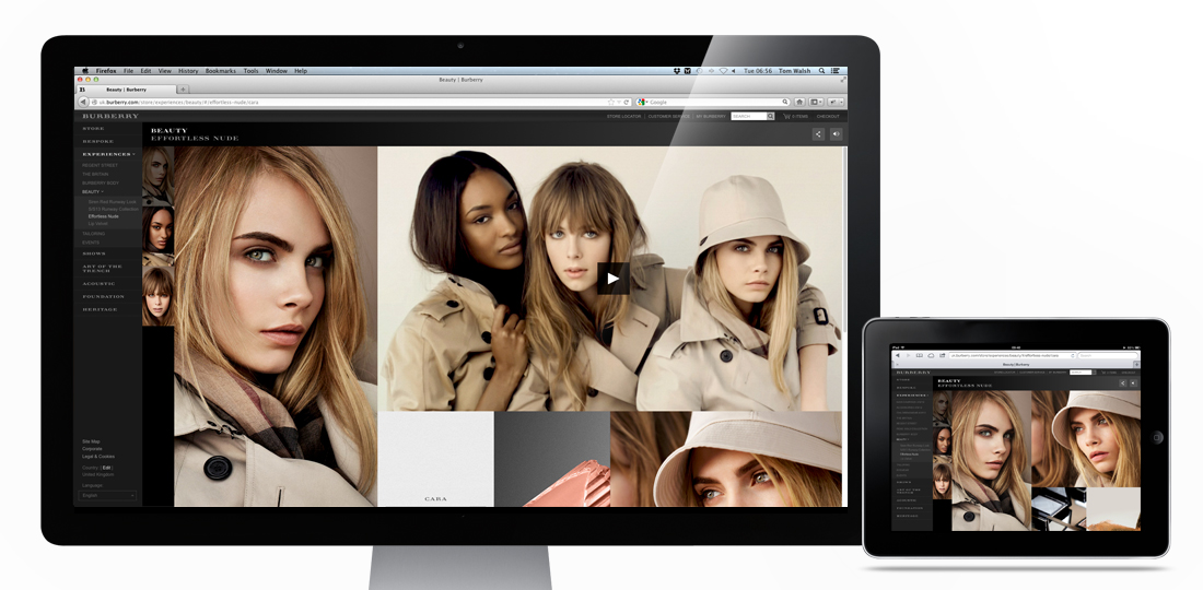
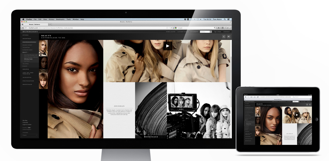
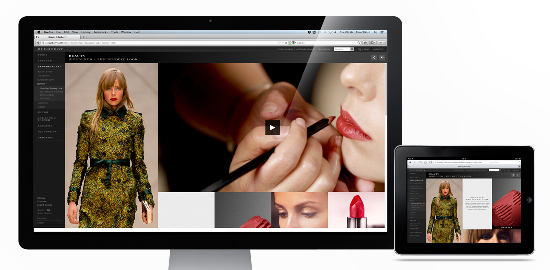
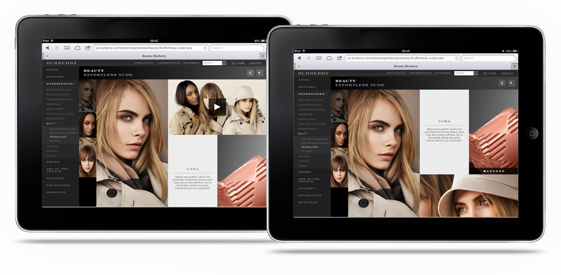
The Burberry Beauty experiences I designed while freelancing for them have gone live! Designed to showcase the hero image on the left hand side by keeping it fixed to the device height, while allowing different amounts of supporting content through the scrollable, flexible grid on the right it caters for product, stills and video. The flexible grid section makes it adaptable for iPad to super-wide screen, while also giving the content a structured but editorial feel.
Take a look here if you want to have a play – Burberry’s SS13 Beauty campaigns
Designed while working for: Burberry
Creative direction: Marga Arrom Bibiloni & Chester Chipperfield
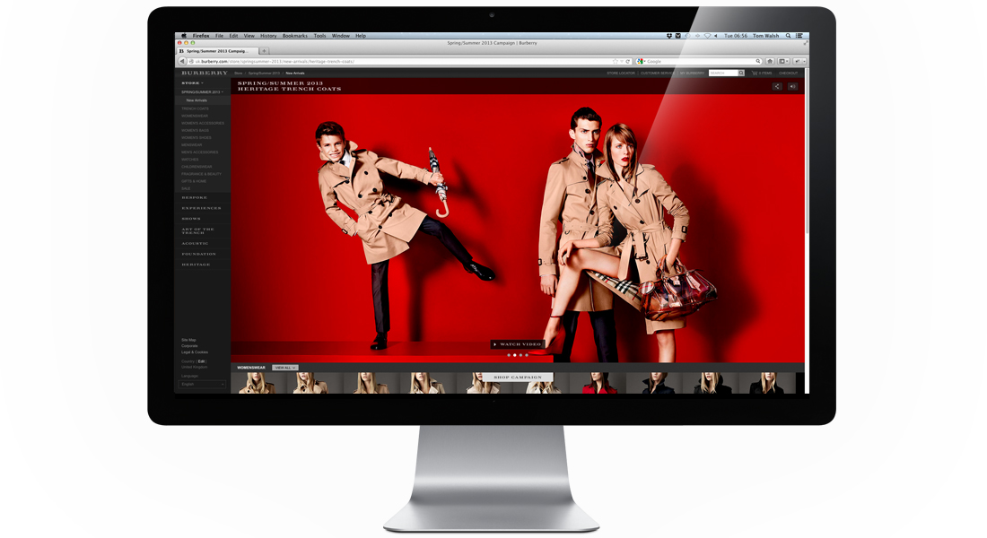
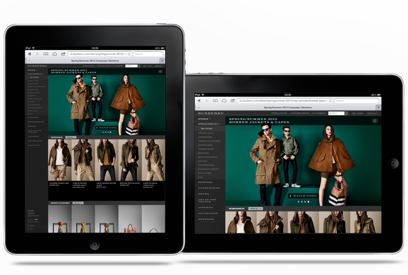
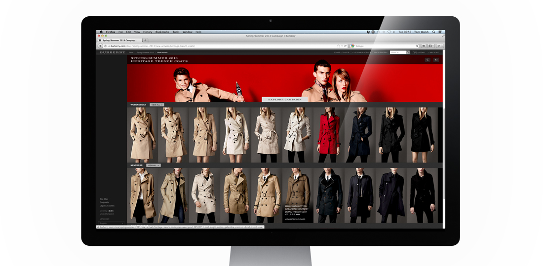
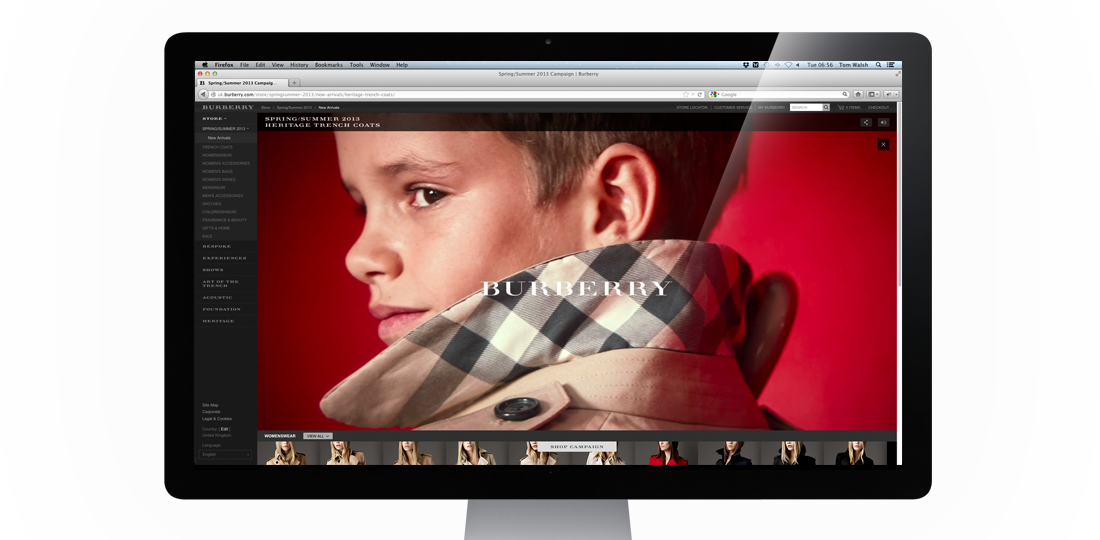
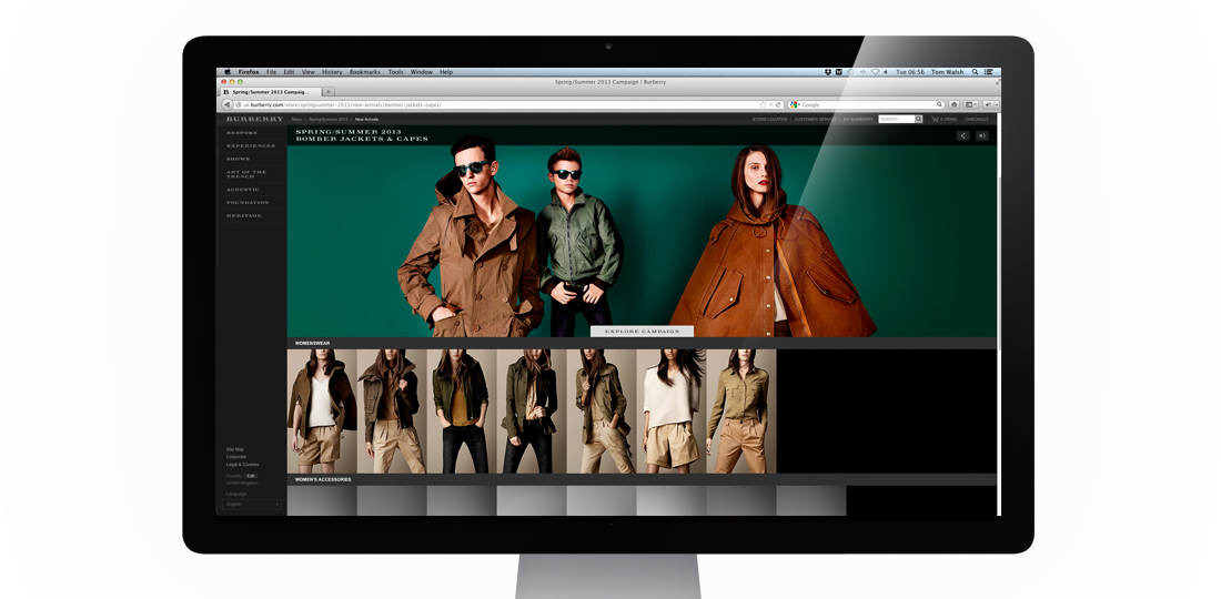
The first Main Campaign I’ve worked on while freelancing for Burberry, their Spring Summer 2013 campaign is now live! Shot by Mario Testino, and featuring Romeo Beckham in his ad campaign debut, alongside Burberry staples Edie Campbell and Cara Delevingne, it’s a much brighter campaign than they’ve opted for in recent years. Because of this we wanted to keep the design of how the campaign would sit within Burberry.com as clean as possible, while including the necessary functionality.
The two main areas that needed to be considered were how to make this campaign more overtly shoppable, and how to display the videos that accompany some of the still shots. Following on from the Festive campaign it was decided that this would also sit inside a store page. The main addition here was adding in a sliding ‘Shop Campaign’/’Explore Campaign’ button which allows you to switch the pages focus from browsing the campaign stills and videos or browsing related product. For the video display options, to avoid duplicating content within the carousel (as each video supports an image), we decided to have a ‘watch video’ button instead which fades the image down to its accompanying video, and returns to the carousel at the end. Resulting in a much cleaner experience than an overlay or other similar options.
Overall I think the experience does what it set out to pretty well, which is allow the imagery to take precedence over the interface.
Take a look for yourself here – burberry.com
Designed while working for: Burberry
Creative direction: Marga Arrom Bibiloni & Chester Chipperfield
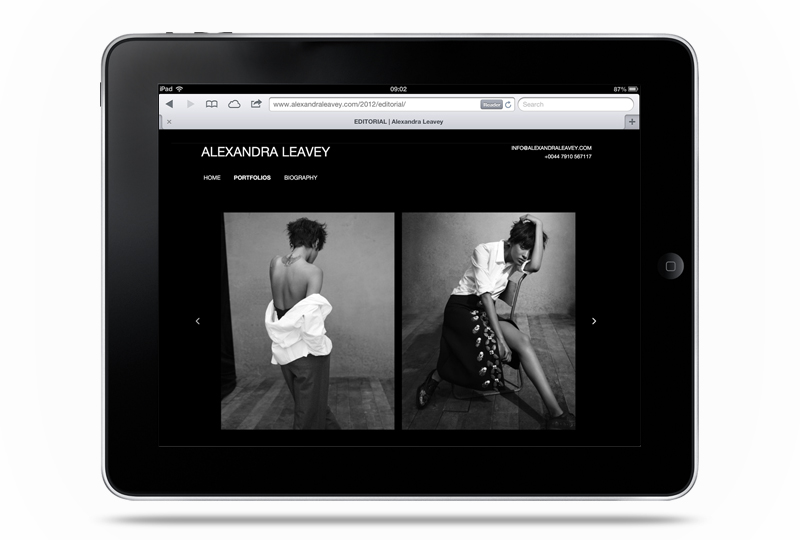
The updated (and much upgraded) version of fashion, advertising and editorial prop/set designer Alexandra Leavey’s site is now live. Built to work perfectly on desktop, tablet and mobile it can now be viewed wherever her clients are, and on their device of choice. Comprising of swipe, keyboard and mouse controlled navigation I built it to be as accessible as possible, while keeping the design and interface minimal so her images are the focus.
If you’re curious, you can take a look here – www.alexandraleavey.com
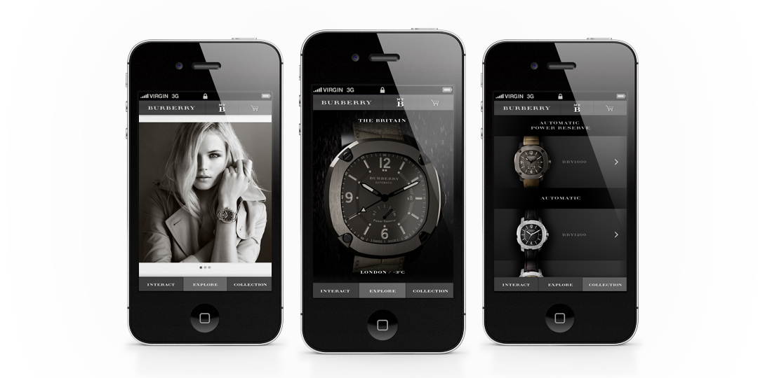
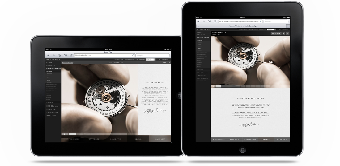
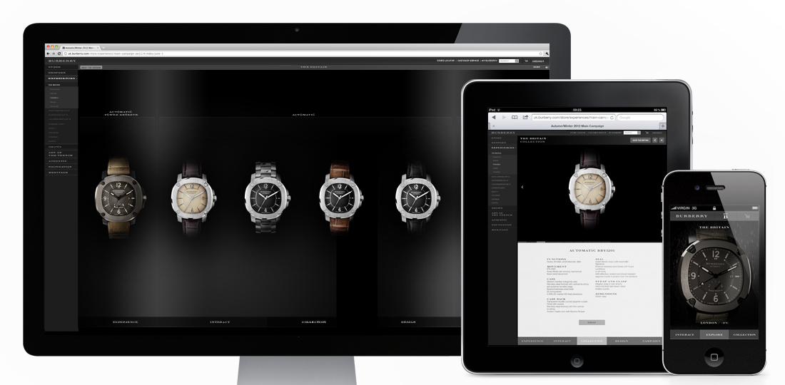
Introducing The Britain (to quote the campaign..), the first multi-platform ‘experience’ I’ve designed while freelancing at Burberry! Designed as a form of micro-site within the main Burberry.com site, it’s purpose is to promote their new range of watches. With mobile and tablet visitors to the site increasing daily it was a necessity for it to work across all devices, and I think the result does that pretty well! It has a separate mobile version, with a crystallisation of content (as well as some nice mobile specific features), and a responsive version for desktop and both tablet aspects. Some nifty (or “whizzy”, as The Guardian called them…) features include a real time and real weather watch on mobile, and 360 rotatable and exploding 3D versions of the hero watch on desktop/tablet.
You can take a look and have a play here – uk.burberry.com
Designed while working for: Burberry
Creative direction: Marga Arrom Bibiloni & Chester Chipperfield
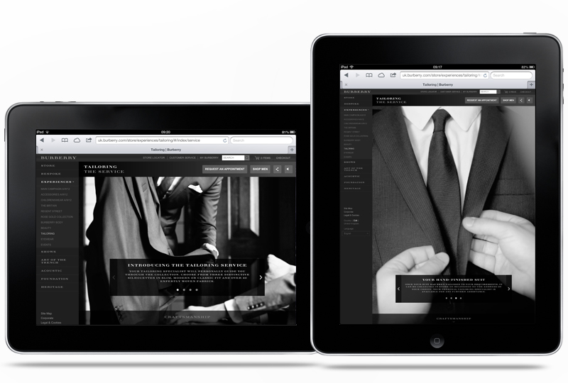
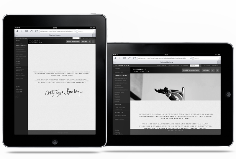
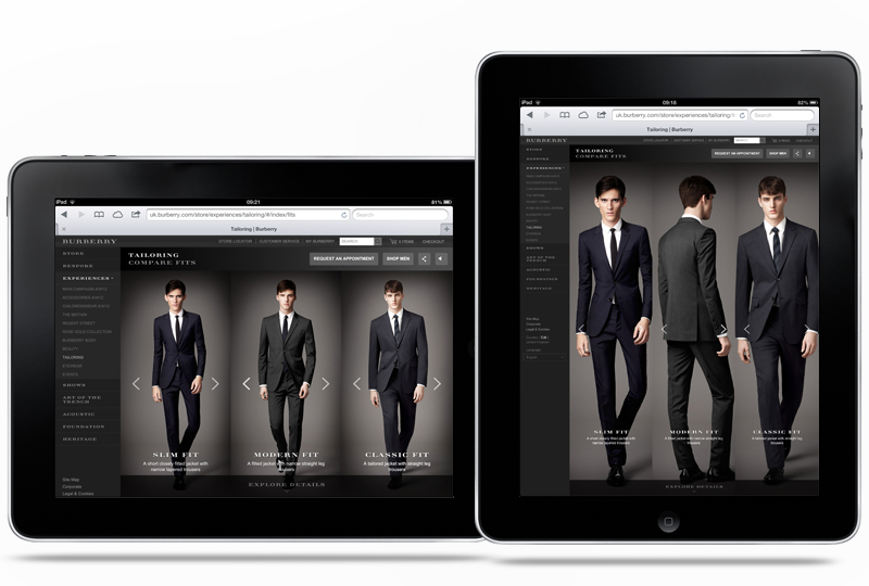
A simple update to the Burberry Tailoring experience. Comprising of a nice parallax to transition between modules and a selection of carousels to provide additional detail in the areas Burberry wanted to highlight. Designed to work on touch devices and desktop it’s a fluid, interactive experience that hopefully packs in all of the information while still looking uncluttered.
You can take a look for yourself here – uk.burberry.com/tailoring/
Designed while working for: Burberry
Creative direction: Marga Arrom Bibiloni & Chester Chipperfield
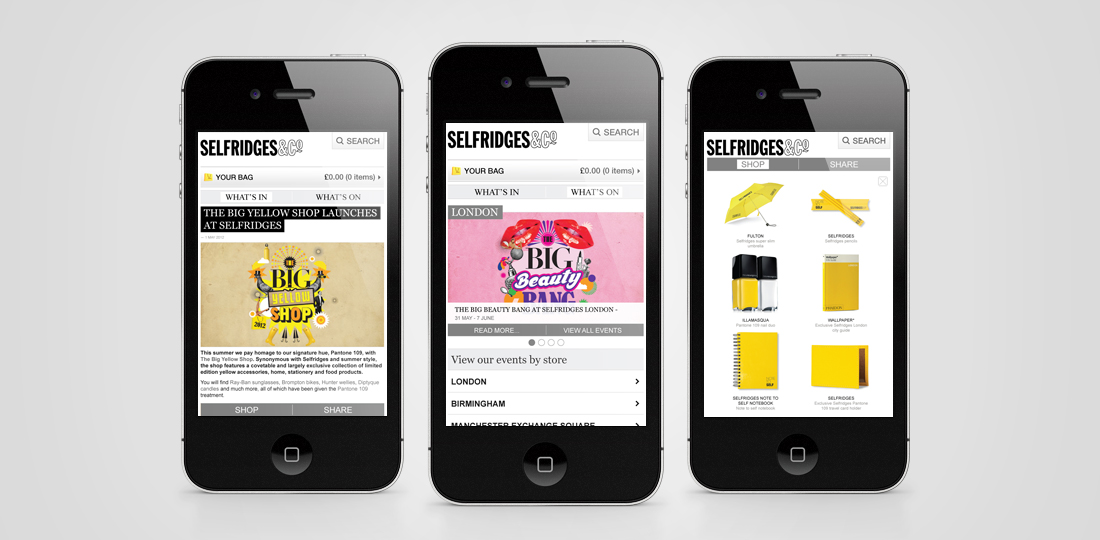
I’m pleased to say my first project for Selfridges has gone live! With the brief of finding a way to integrate their growing editorial and events based content into their mobile experience it was an interesting one too. Designed to proxy the content from their ‘What’s On’ and ‘What’s In’ sections on the main Selfridges site it takes a live feed from each section and re-styles it to be a little more mobile friendly. With a simple second level navigation separating the two sections, full width imagery as a preview for the articles and a handy filtering system it makes the process of finding an event or article much less frustrating. As additional features I also added in a geo-locate to find events near you and a nifty Shop/Share footer, just in case the user quite likes anything featured.
You can check it out on the Selfridges mobile site here (if you’re on a mobile that is…) –
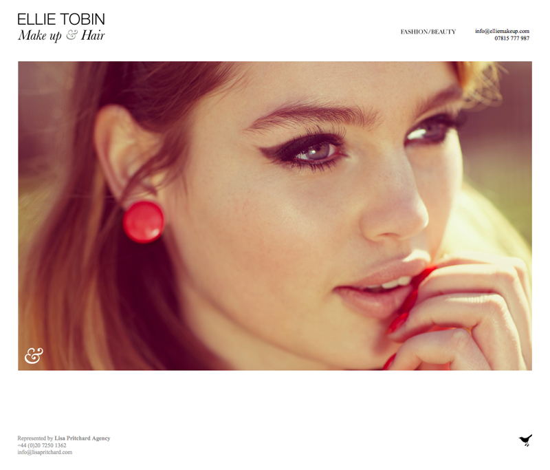
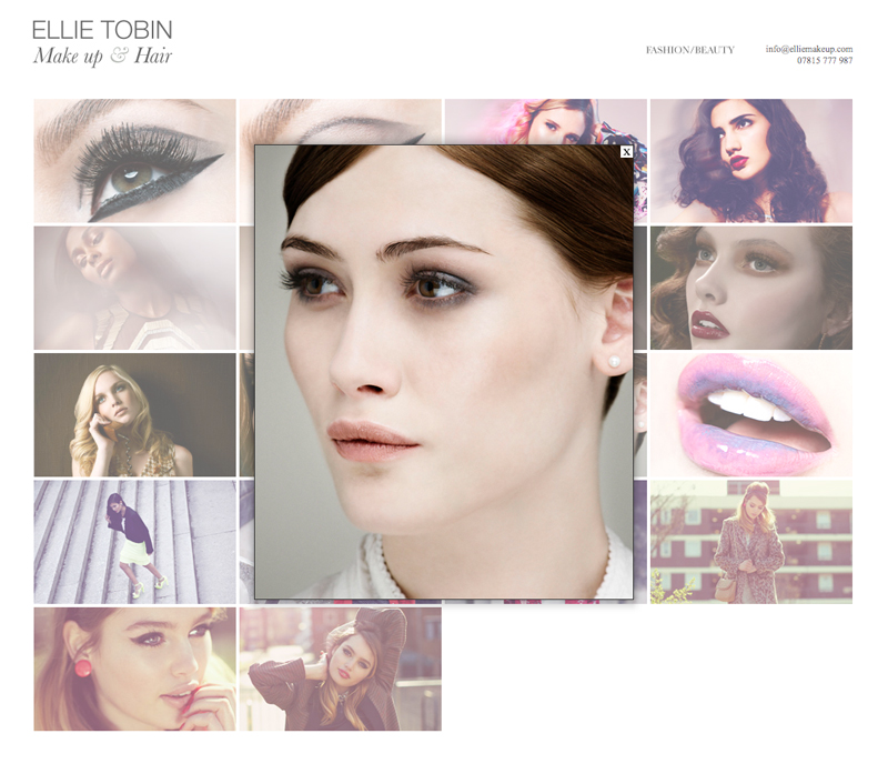
A quick update to the Ellie Make up site I designed and built last year, including a new home page and an edit to the navigation. All brought together with the lovely photography from Ellie Tobin.
Take a look at the site here
