
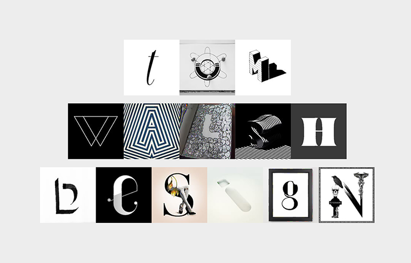
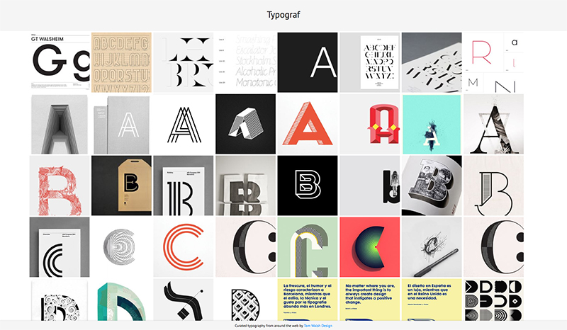
A nice new project from Barcelona based 36 Days of Type using their curated character sets to allow people to experiment and create their own playful typographic masterpiece.
For those not familiar with 36 Days of Type it’s a project by Nina Sans and Rafa Goicoechea which challenges designers, illustrators or anyone with a love of type and creativity, to design a different character every day for 36 days (thereby creating a full alphabet). The best of these are chosen and posted across their Instagram and Twitter accounts. With 99,999 submissions, filtered down to 5,380 ‘curated images’, they’re now sitting on a huge bank of lovingly created content, and what better way to say thank you than with typetodesign.com?
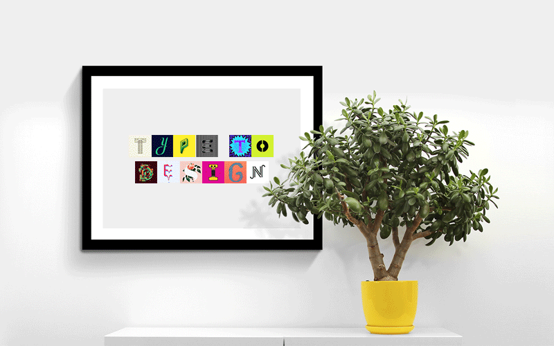
So, for those of you who aren’t quite ready to commit to 36 Days of Type, you can head over to typetodesign.com instead. Where you type in your chosen text, then click through each character until you’ve created your own masterpiece. As they say “Type it, design it, enjoy it.”
Have a play at typetodesign.com here
Or take a look at 36 Days of Type here
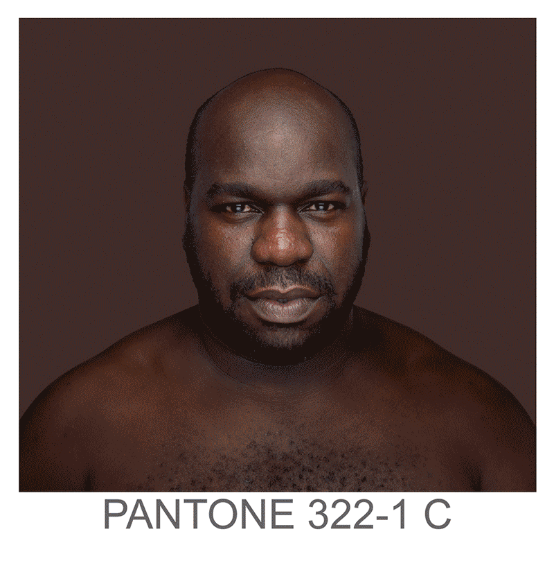
Humanæ is a permanent“work in progress” by Brazilian photographer Angélica Dass, cataloguing skin tones to Pantones. The ‘models’ used are all volunteers, with no specific requests for any nationality, age, race or gender, adding to the variety and unpredictability of the project as it progress’. As Angélica puts it it’s:
“open in all senses and it will include all those who want to be part of this colossal global mosaic. The only limit would be reached by completing all of the world’s population.”
Although it may seem a bit dystopian to catalogue each specific skin shade with a number, visually I think its pretty powerful. I’d also say it serves more to unite than to divide by creating an abstractly beautiful platform, especially when viewed en mass.
You can see more of Angélica’s projects on her site here
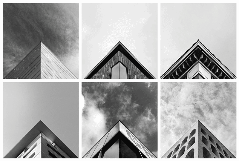
Launched in 2014 Geometry Club is a simple premise, with stunning results. There are two rules:
1) Your apex needs to be aligned centrally on both the X and Y axis
2) Edges should fall off the image at the same point, symmetrically
With over 50 approved contributors in 20 countries anyone can submit a photo to be featured, but it seems only those meeting the exacting criteria will be featured. The outcome is a mesmerisingly beautiful geometric feed of architectural precision.
Take a look at the Instagram feed here, and submit your entries via the site here
An amazing book/sculpture piece from American visual artist Tauba Auerbach. Created in collaboration with New York-based independent bookstore Printed Matter, its made up of six die cut paper ‘pop-up book’ style sculptures, creating a truly interactive experience for the ‘reader’.
Video shot by director Sam Fleischner.
See more of Tauba Auerbach’s projects here
If you’re not already aware of The Noun Project, you should be. It’s one of those sites you think should have always existed, and wonder why it took so long to arrive. Launched in 2010 by husband-and-wife team of Edward Boatman and Sofya Polyakov, along with designer Scott Thomas, the site allows members to upload icons for others to download. They describe it as –
Creating, Sharing and Celebrating the World’s Visual Language
Its a simple concept, but one with multiple uses. From my own experience I’ve been uploading icons on and off for the last two–three years (and being paid monthly for downloads), but from digging a little deeper into their blog there’s a whole other aspect to it. The ‘Nouns’ on their site have also been used for education and signage systems, like their ‘Iconathons’ where they aim to “add to the public domain a set of graphic symbols that can be used to easily communicate concepts frequently needed in civic design.
If you fancy having a look around, or even uploading/downloading some icons, you can take a look at thenounproject.com
Or if you’d like to take a look at my icon collection you can see them on my page at thenounproject.com/tomwalshdesign
After years of planning, designing and procrastinating over my side-project Typograf, I decided that at the very least it should be more than an empty page with ‘coming soon’ (which also isn’t strictly true, as its been there for almost a decade…). And so Typograf mark II was born. Essentially it’s an aggregator for my typography related Pinterest pins, pulling in anything I add to those boards and displaying them all in one place. Making it easy for me, and anyone else on the web who stumbles across it, to see it all in one place. It’s still effectively a holding page, but at least its now a page with some use, to me anyway.
The next step will be working out how to randomise a selection of web fonts for use in the header and footer, but that’s Mark III. Expect that in another decade then.
You can take a look at typograf.co.uk/
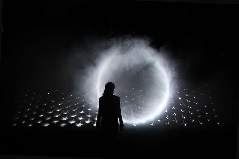
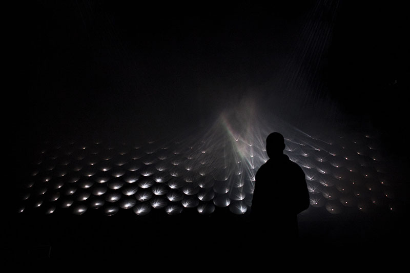
Stunning new light installation by Seoul based Kimchi & Chips (AKA Elliot Woods and Mimi Son), which creates three dimensional ‘phantoms of light’ in the air by crossing millions of calibrated light beams in smoke.
You can see more of their work here –
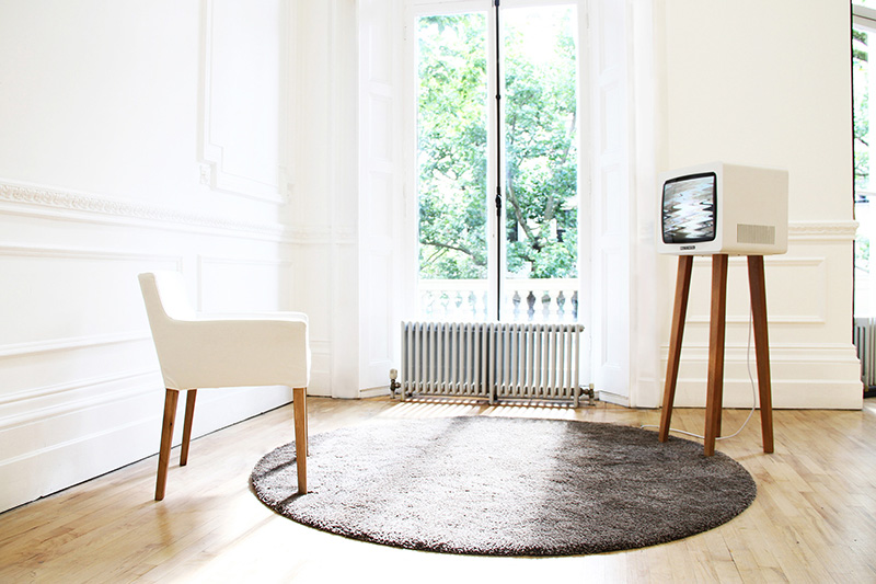
Lovely idea from RCA graduate David Hedberg. ‘Smile TV’ displays a scrambled ‘no signal’ message (remember those, before the digital switch?), unless the person in front of the screen smiles. The longer the viewer smiles, the longer they have a fuzz-free signal.
Here he explains the thinking behind the project to CreativeApplications.net:
“I thought about content and how we, in the old days, used to get it delivered into our household via antennas installed on our individual rooftops. When the reception failed, somebody had to climb up there and fix the antenna to pick up the signal again. Today, with information widely accessible, often at the palm of our hands, the question is no longer if we can receive, but whether we are receptive. In the economy of ‘liking’ things we have very much taken on the role of antennas ourselves – transmitting content on to each other.”
You can read the full article on Creative Applications here
creativeapplications.net
And you can see more of David Hedberg’s work on his site here
davidhedberg.info
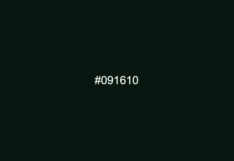
Nice project by Jacopo Colo. Hex Clock is a precise hexadecimal color clock which goes the whole 24 hours color range, from #000000 to #235959. Generally it’s pretty dark, but at least its accurate! The only improvement I would make would be to have a dynamic favicon which updates alongside the screen background, but maybe simple is better…
Take a look here –
Ever wondered if your interpretation of a book was accurate? Wonder no more. With e-books taking over printed book sales it was only a matter of time before we made them more ‘interactive’. Effectively less book-like… And that’s exactly what Researchers at MIT’s Media Lab have created with their project ‘Sensory Fiction’. A wearable, augmented book that attempts to make the reader ‘feel’ the story page by page. With clever use of vibration, lighting, heat and air bags it induces physical sensations from the reader that align with what’s happening on each page of the book. Clever stuff eh.
For a slightly more technical explanation of the project, take a look on the MIT site here
