An amazing book/sculpture piece from American visual artist Tauba Auerbach. Created in collaboration with New York-based independent bookstore Printed Matter, its made up of six die cut paper ‘pop-up book’ style sculptures, creating a truly interactive experience for the ‘reader’.
Video shot by director Sam Fleischner.
See more of Tauba Auerbach’s projects here
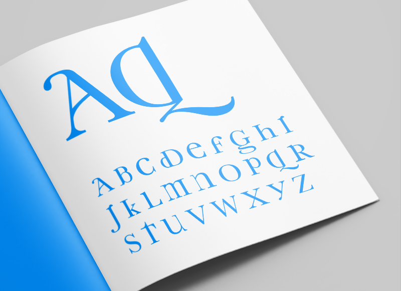
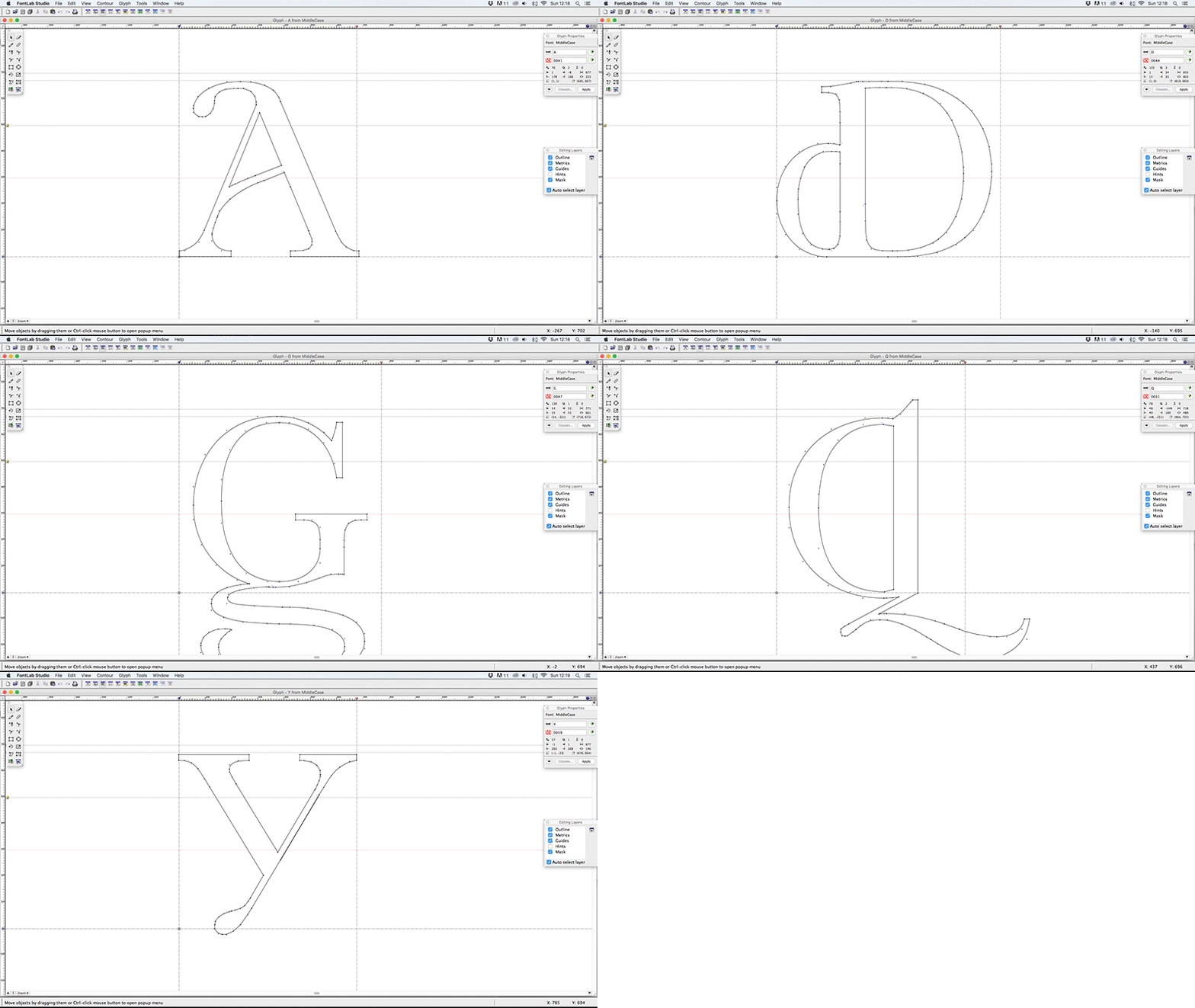
As part of my early exploratory work into type design I began looking at the characteristics that defined upper and lower case letters independently, and from one another. One particular trend I’d noticed was for a lot of the personality and flair to be included in the lower case characters, but omitted in the upper case versions of those characters. From this starting point I began working on Middlecase, a way of bringing some of the charm of lower case into an upper case font.
Some of the characters produced quite subtle, but still pleasing, results (like the K, Y and V). Others had more dramatic, but also more interesting results (like the A, D, G & Q) and others were a little trickier (less said about those the better). All in all I think it worked well as an experiment in type, and could possibly be used as a display font, but I would say I probably got more from undertaking the project and the process than I will from using the physical font.
Font Name:
Middlecase
Credits/Designer:
Tom Walsh
Released:
2008
Font Style:
Decorative Serif
Format:
Opentype
Discover the LuxDeco Style Guide – a 92-page complimentary, interactive publication created to give you all the inspiration, tips and pieces you need to transform your home. Request your copy to access key spring/summer looks, exclusive pieces, inspiring tastemakers and practical style notes.
Read more about this project here
And order your free copy here
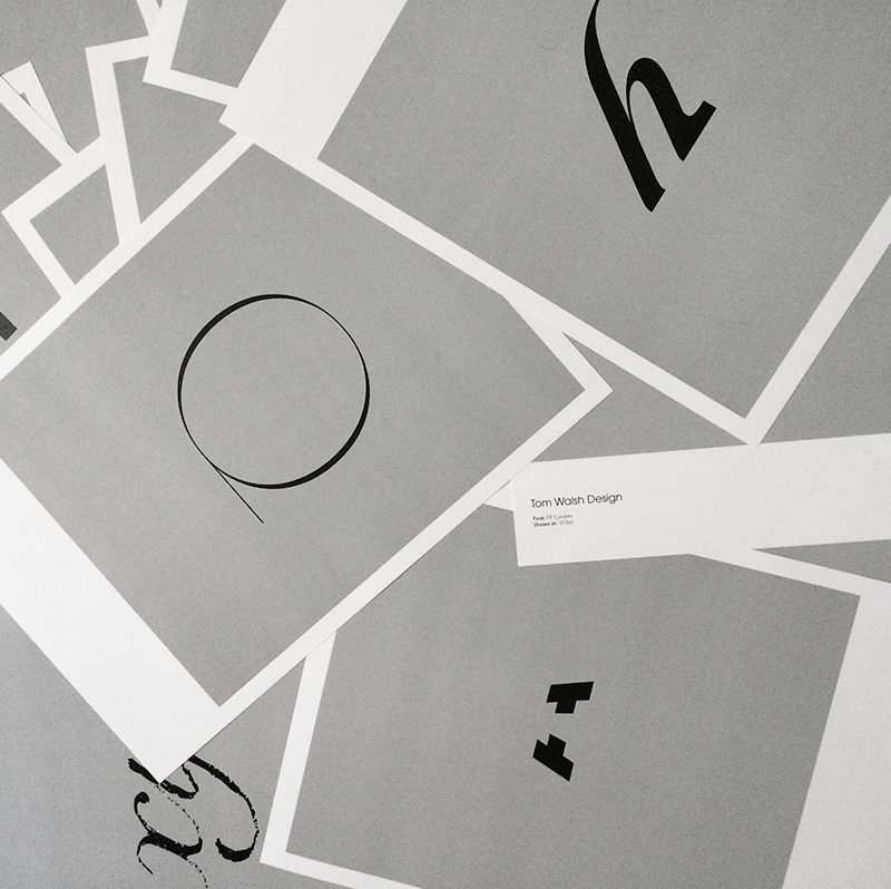
I’m excited to announce a new series of posts are on their way. A retrospective of typeface design projects from over the years which I will be sharing on Instagram and right here. Giving an insight into why they were designed, who they were designed for and the nuances of each typeface. Spanning from University projects while at Camberwell, up to my most recent commercial type design project last year. I’m hoping these will work as a living archive, as well as provide some understanding of the process’ involved in both the designing and the creation of a working typeface.
Oh, and for the aficionados out there, I know ‘Font Focus’ isn’t entirely accurate (as I’ll be covering typefaces), but it had a nicer ring to it!
To see the updates on Instagram you can take a look here – instagram.com/tomwalshdesign/
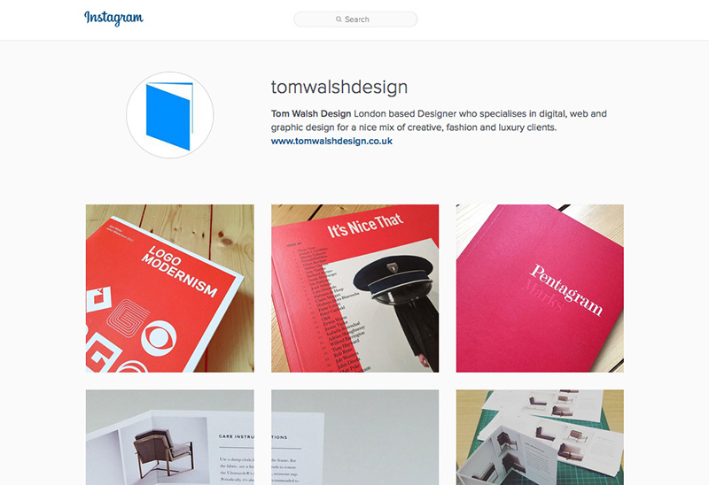
After a while of weighing it up, I finally decided to set up an Instagram for the business side of my life. Primarily as I wasn’t sure where to put the print work that I often create when I’m working on digital contracts, but also as a kind of middle ground for inspiration. Somewhere to put those little nuggets that don’t quite warrant a post.
If you’d like to take a look, or follow, you can find me at instagram.com/tomwalshdesign/
Lovely animated typography piece by DJA to launch Karen Walker’s first set of fragrances. Embodying Karen’s signature eccentric energy the film brings the neon titles of each of the three fragrances to life. DJA describe it as:
“Channeling the upbeat, irreverent spirit of the Op Art movement, a bold, graphic approach to packaging for Karen Walker’s fragrance debut ABC.”
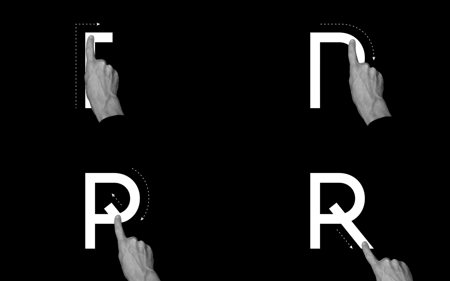
Nice new micro-site site, and another great type specimen (see full PDF here) by Grilli Type, this time to promote GT Haptik.
I wrote a post a little while ago on their promotion of GT Walsheim (you can read that here), and this is another example of how to sell a font to a designer. I may not go out and buy it right away, but through their micro-sites and specimens they’ve ensured that if I want a similar font, their site will be my first stop.
It’s not just their attention to detail in promoting their fonts that I like though, its that this attention is paid right through from the typeface concept stage. In recent years, especially with the rise of popularity in free web fonts from Google and the likes, it seems people have forgotten that typefaces used to have a reason to be created. GT Haptik is a great example of this, a typeface designed to solve a problem. It helps that it’s an accessibility problem it aims to overcome too (maximising legibility when ‘read’ through touch), as it brings it back to the core purpose of typography, better communication.
They describe Haptik as:
“…a monolinear geometric grotesque typeface. Its uppercase letters and numbers were optimized to be read blindfolded and by touching them. It is now available in seven weights with accompanying Oblique and Rotalic styles. Included with each style come alternate characters as well as proportional and tabular figures.”
They have other great typefaces on their site, and I look forward to seeing what they come up with in future releases. Definitely a site to keep an eye on.
GT Haptik Design:
Reto Moser
Tobias Rechsteiner
Take a look at the micro-site here – www.gt-haptik.com
And the GT Haptik page on Grilli Type here – grillitype.com/typefaces/gt-haptik
If you’re not already aware of The Noun Project, you should be. It’s one of those sites you think should have always existed, and wonder why it took so long to arrive. Launched in 2010 by husband-and-wife team of Edward Boatman and Sofya Polyakov, along with designer Scott Thomas, the site allows members to upload icons for others to download. They describe it as –
Creating, Sharing and Celebrating the World’s Visual Language
Its a simple concept, but one with multiple uses. From my own experience I’ve been uploading icons on and off for the last two–three years (and being paid monthly for downloads), but from digging a little deeper into their blog there’s a whole other aspect to it. The ‘Nouns’ on their site have also been used for education and signage systems, like their ‘Iconathons’ where they aim to “add to the public domain a set of graphic symbols that can be used to easily communicate concepts frequently needed in civic design.
If you fancy having a look around, or even uploading/downloading some icons, you can take a look at thenounproject.com
Or if you’d like to take a look at my icon collection you can see them on my page at thenounproject.com/tomwalshdesign
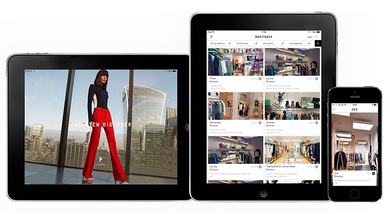
The iPad version of the Farfetch Discover app I designed while in house at Farfetch has launched. So now users can enjoy it on tablets as well as mobile, there’s no excuse not to download it!
They describe it as –
“Farfetch Discover takes a fashion insider’s view on cities around the world, with unrivalled access to a treasure trove of local knowledge direct from our network of over 300 independent boutiques. From gourmet eateries in Dallas, to charming markets hidden away on Dubrovnik’s Adriatic coast, get tips that only a local could know.
Browse boutique recommendations on where to eat, drink, stay or explore. Read personal itineraries from some of the city’s coolest natives or create your own to have handy when you’re offline in the city. And of course you’ve got over 1,500 designers and 120,000 products to shop from, right at your fingertips.”
And if you’d like to have a play you can download it from the app store here
Or read more about this project here
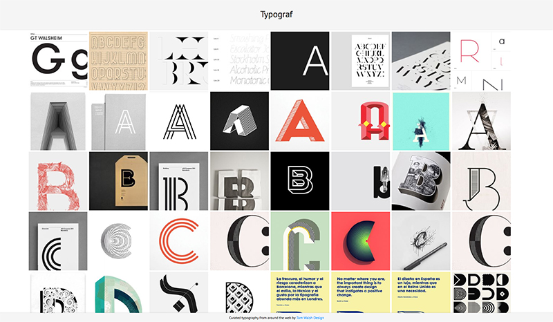
After years of planning, designing and procrastinating over my side-project Typograf, I decided that at the very least it should be more than an empty page with ‘coming soon’ (which also isn’t strictly true, as its been there for almost a decade…). And so Typograf mark II was born. Essentially it’s an aggregator for my typography related Pinterest pins, pulling in anything I add to those boards and displaying them all in one place. Making it easy for me, and anyone else on the web who stumbles across it, to see it all in one place. It’s still effectively a holding page, but at least its now a page with some use, to me anyway.
The next step will be working out how to randomise a selection of web fonts for use in the header and footer, but that’s Mark III. Expect that in another decade then.
You can take a look at typograf.co.uk/

