
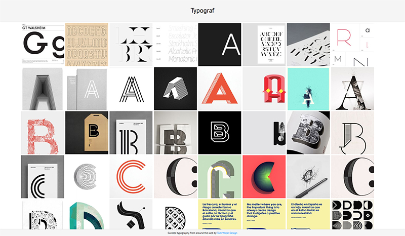
After years of planning, designing and procrastinating over my side-project Typograf, I decided that at the very least it should be more than an empty page with ‘coming soon’ (which also isn’t strictly true, as its been there for almost a decade…). And so Typograf mark II was born. Essentially it’s an aggregator for my typography related Pinterest pins, pulling in anything I add to those boards and displaying them all in one place. Making it easy for me, and anyone else on the web who stumbles across it, to see it all in one place. It’s still effectively a holding page, but at least its now a page with some use, to me anyway.
The next step will be working out how to randomise a selection of web fonts for use in the header and footer, but that’s Mark III. Expect that in another decade then.
You can take a look at typograf.co.uk/
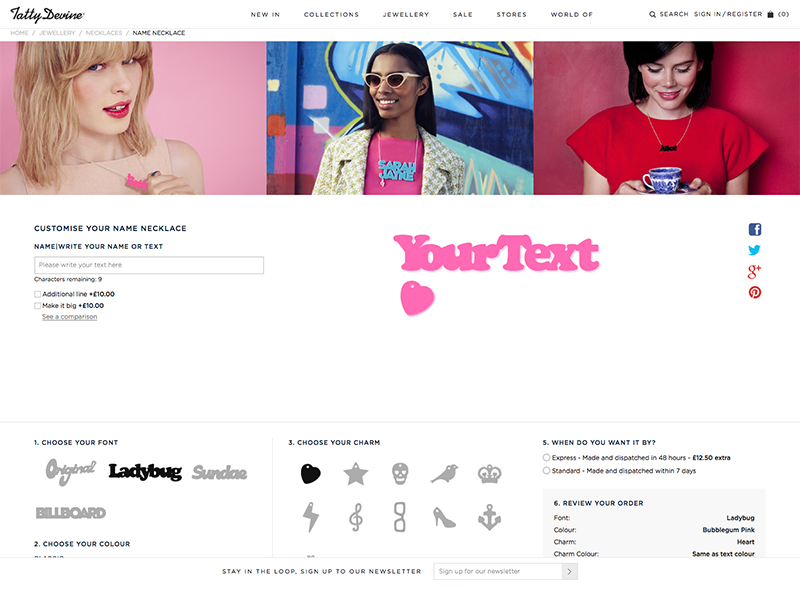
I don’t often get the chance to open up FontLab Studio, especially for paid jobs, so when Tatty Devine approached me to digitise their ‘name necklace’ fonts it was the perfect opportunity to get my hand back in.
Tatty Devine, who describe themselves as an “…independent British company designing and micro-manufacturing original jewellery in the UK”, have been designing and hand making these perspex necklaces in East London for as long as I can remember. At one time I’m pretty sure almost every girl I knew owned one…
The project consisted of converting the four ‘fonts’ they previously had as rough vectors, that would be hand placed together for the designs, into working, usable fonts. This had two main goals. The first being they would no longer need to copy each character into an Illustrator file and manually align them, and the second that they would be able to show users a preview of their necklaces on their new site.
Building fonts from existing vectors may sound like a fairly straight forward task, until you consider how these will need to work. Each necklace needs its characters to overlap so that they can be cut into a single piece, and as three of the fonts are based on existing fonts that weren’t designed to do this, it was going to mean almost every character combination would need to be manually kerned, with a fair few ligatures added in to boot. Ladybug (based on Cooper Black by Oswald Cooper), Sundae (based on Futura Script by Edwin W Shaar) and Billboard (based on Whoop Ass by Blambot Fonts were the three that had to be man-handled into place. Which although it was an arduous process, with a lot of back and forth, ended up working quite well. The final font ‘Original’ was a little easier though, as its based on co-founder Harriet Vine’s handwriting there was a natural flow to it that meant the joins were easier to find…
You can take a look and have a play with the finished product at tattydevine.com/name-necklace
To celebrate ten years of his work as creative director of AnOther magazine Creative Director David James has launched www.everythingthatmatters.com, a digital exhibition celebrating his time there. Displayed as a chronological timeline it’s interesting to carousel through and see how trends have affected the layouts. A lot of the changes feel quite graded as you progress, so wouldn’t be noticeable to the average reader, but when laid out in this format of editorial snapshots you can see photographic and typographic styles coming and going, sometimes with a gradual introduction period of overlaps.
As a magazine known for being at the forefront of trends its quite striking to see, in particular in the typography, how they were pushing their layouts over the years. For instance, if you scroll through the slides from the early years circa 2005, and jump to 2014/15 the difference makes it look like two separate magazines. Some of the early typographic styles have even been around long enough to have had a resurgence since first appearing in their magazines.
My personal preference is the latest type style, 8.5pt throughout, but maybe that’s because it’s ‘current’. I still wouldn’t turn my nose up at a lot of the older styles though.
Have a scroll through here and make up your own mind:
www.everythingthatmatters.com
Unit Editions, an independent publishing collaboration between Tony Brook (Spin) and Adrian Shaughnessy, have released two new videos showcasing spreads from Type Plus and Type Only. Featuring a range of contemporary typographic work by a host of international designers. If you don’t get a chance to flick through them yourself this is a nice little sneak peak into their contents.
Both are available from Unit Editions here:
uniteditions.com
And you can watch all of their videos on Vimeo here:
vimeo.com/uniteditions
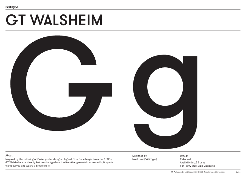
Very thorough type specimen from Grilli Type (see full PDF here ) to show off their updated version of GT Walsheim, now with Cyrillic support and renamed GT Walsheim Pro. I particularly like the tittle (or dot) on the lowercase i, j and accents in the lighter weights.
They describe it as:
“Inspired by the lettering of Swiss poster designer legend Otto Baumberger from the 1930s, GT Walsheim is a friendly but precise typeface. Unlike other geometric sans-serifs, it sports warm curves and wears a broad smile.”
Design:
Latin by Noël Leu (Grilli Type)
Cyrillic by Noël Leu with Mirco Schiavone
Take a look here –
grillitype.com/typefaces/gt-walsheim
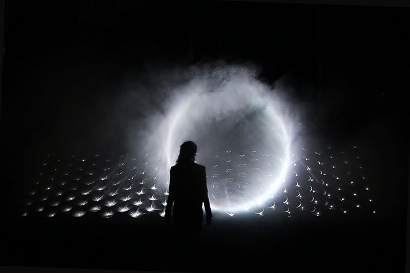
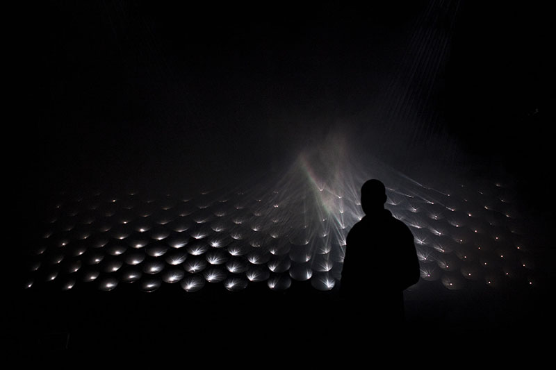
Stunning new light installation by Seoul based Kimchi & Chips (AKA Elliot Woods and Mimi Son), which creates three dimensional ‘phantoms of light’ in the air by crossing millions of calibrated light beams in smoke.
You can see more of their work here –
Nice promo for Font Font’s new Open Type features by Stark Films. Based on the pangram ‘The Quick Brown Fox Jumps Over the Lazy Dog the film playfully highlights each of the new features introduced by Font Font through various contrasting mediums.
For more information on the new features introduced you can take a look here –
fontfont.com/ot-feature-sample/
Directors: Rob Blake and Zu Kalinowska
Producer: Brian Papish
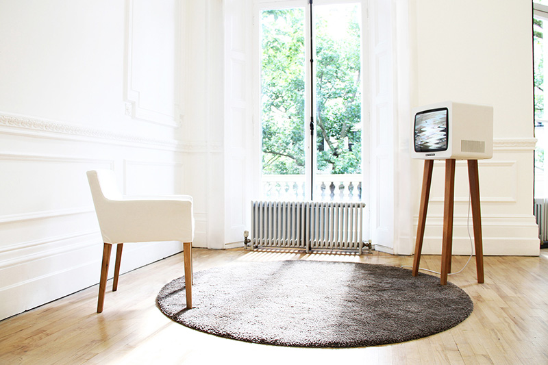
Lovely idea from RCA graduate David Hedberg. ‘Smile TV’ displays a scrambled ‘no signal’ message (remember those, before the digital switch?), unless the person in front of the screen smiles. The longer the viewer smiles, the longer they have a fuzz-free signal.
Here he explains the thinking behind the project to CreativeApplications.net:
“I thought about content and how we, in the old days, used to get it delivered into our household via antennas installed on our individual rooftops. When the reception failed, somebody had to climb up there and fix the antenna to pick up the signal again. Today, with information widely accessible, often at the palm of our hands, the question is no longer if we can receive, but whether we are receptive. In the economy of ‘liking’ things we have very much taken on the role of antennas ourselves – transmitting content on to each other.”
You can read the full article on Creative Applications here
creativeapplications.net
And you can see more of David Hedberg’s work on his site here
davidhedberg.info
Nice social media campaign for Swedish homecare brand Åhléns by agency Forsman & Bodenfors
Agency: Forsman & Bodenfors
Copywriter: Pontus Levahn
Art director: Silla Levin
Designer: Ellinor Bjarnolf
Production company: Snask
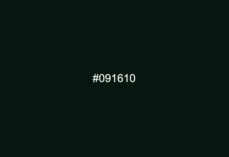
Nice project by Jacopo Colo. Hex Clock is a precise hexadecimal color clock which goes the whole 24 hours color range, from #000000 to #235959. Generally it’s pretty dark, but at least its accurate! The only improvement I would make would be to have a dynamic favicon which updates alongside the screen background, but maybe simple is better…
Take a look here –
