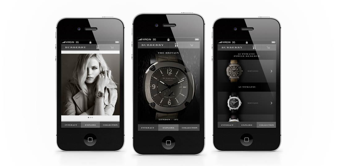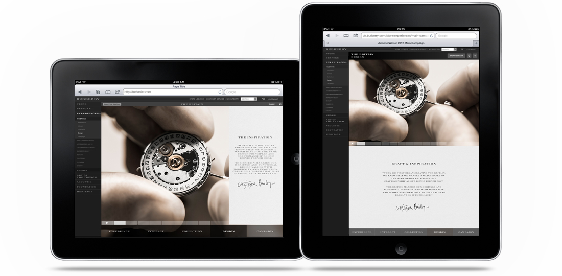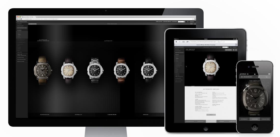


Introducing The Britain (to quote the campaign..), the first multi-platform ‘experience’ I’ve designed while freelancing at Burberry! Designed as a form of micro-site within the main Burberry.com site, it’s purpose is to promote their new range of watches. With mobile and tablet visitors to the site increasing daily it was a necessity for it to work across all devices, and I think the result does that pretty well! It has a separate mobile version, with a crystallisation of content (as well as some nice mobile specific features), and a responsive version for desktop and both tablet aspects. Some nifty (or “whizzy”, as The Guardian called them…) features include a real time and real weather watch on mobile, and 360 rotatable and exploding 3D versions of the hero watch on desktop/tablet.
You can take a look and have a play here – uk.burberry.com
Designed while working for: Burberry
Creative direction: Marga Arrom Bibiloni & Chester Chipperfield

Some nice UX from the BBC with their new BBC iPlayer Radio App. Using the dial at the base of the page you can now scroll through stations with your thumb and tap to choose. Simple, but very nice and smooth to use. There are some other handy features too, like setting an alarm so your favourite show wakes you up, on demand shows from the past seven days and the ability to stream through AirPlay. It’s a pity they didn’t carry the design through to their iPad counterpart, but still a good addition on mobile.
You can download it from iTunes here – https://itunes.apple.com/gb/app/iplayer-radio/id560458506?mt=8

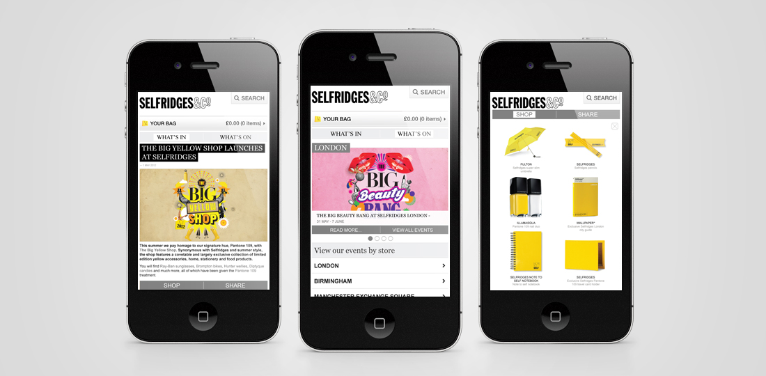
I’m pleased to say my first project for Selfridges has gone live! With the brief of finding a way to integrate their growing editorial and events based content into their mobile experience it was an interesting one too. Designed to proxy the content from their ‘What’s On’ and ‘What’s In’ sections on the main Selfridges site it takes a live feed from each section and re-styles it to be a little more mobile friendly. With a simple second level navigation separating the two sections, full width imagery as a preview for the articles and a handy filtering system it makes the process of finding an event or article much less frustrating. As additional features I also added in a geo-locate to find events near you and a nifty Shop/Share footer, just in case the user quite likes anything featured.
You can check it out on the Selfridges mobile site here (if you’re on a mobile that is…) –

