What a simple solution to something I’m pretty sure annoys most users of both iPhones and iPads… It gets my vote to be included in the next iOS release.
It was only a matter of time before print started to ‘go digital’, and I’m not talking QR codes… With Layar’s offering of augmented reality you can use an app with your printed material (I know, still a bit clumsy, but you need a screen somewhere) and various triggers within the print allow you to interact with it. Whether its additional content, like clicking the ‘red button’ with tv, or just the ability to ‘Like’ something it does pull up some interesting questions about the future of print. Will the only way we read something be if we can interact with it? Maybe, but in contrast to Kindles and the like, at least this is trying to combine the two, rather than wipe the other out…
If you want to know a bit more about what they’re doing with print & AR have a read on their site here
Lovely little story by Pentagram London partner Naresh Ramchandani covering their 40 years since first opening their doors. Up to their usual standards and well worth a watch.
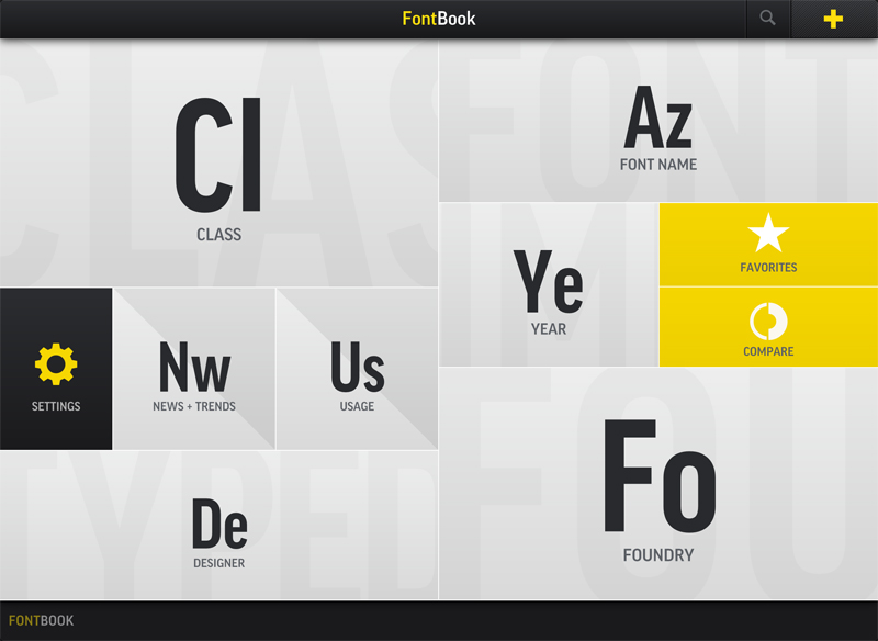
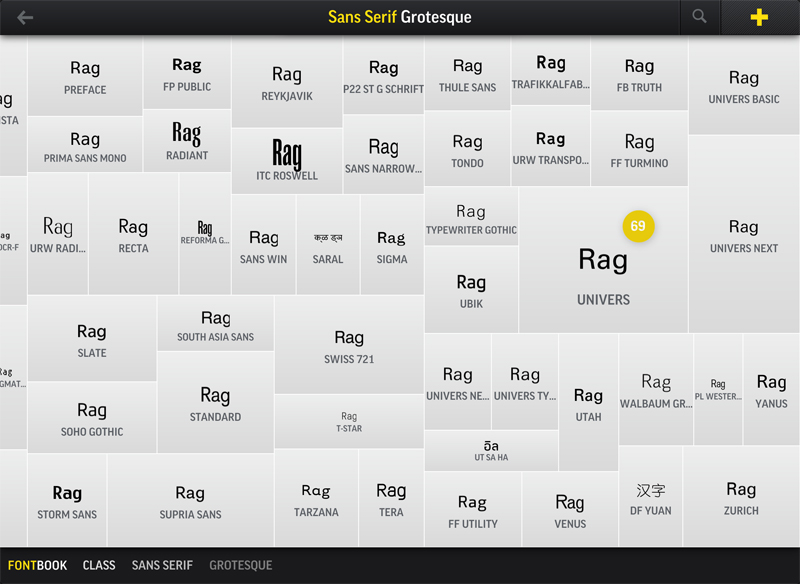
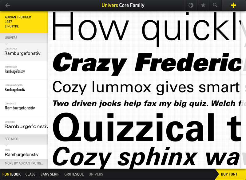
Described by Fontbook as –
“If typography were a religion, this would be the Bible. FontBook is the world’s most comprehensive typographic reference tool, containing 110 type foundries and featuring over 620,000 typeface specimens.”
A bold statement, but one their iPad app doesn’t fall short on. Its a great (and lovely looking) app that delivers on design, usability and content. If you’re just looking for inspiration you can browse by style, alphabetically, foundry, year and more. Meaning however vague an idea you may have of the font you’re looking for you’ve got plenty of angles to approach from to narrow it down. The most useful tool I’ve found, however, is the ‘Compare’ function. Perfect for when you (or a client) can’t decide between a selection of fonts. You can test them out using different copy, and glide between them to make your decision. Much easier than running up a comparison sheet in Illustrator, and a bit more fun too…
You can read more reviews, and download the app from the iTunes store here
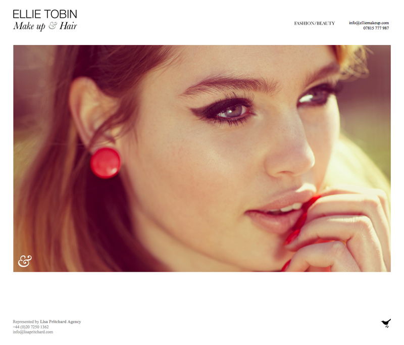
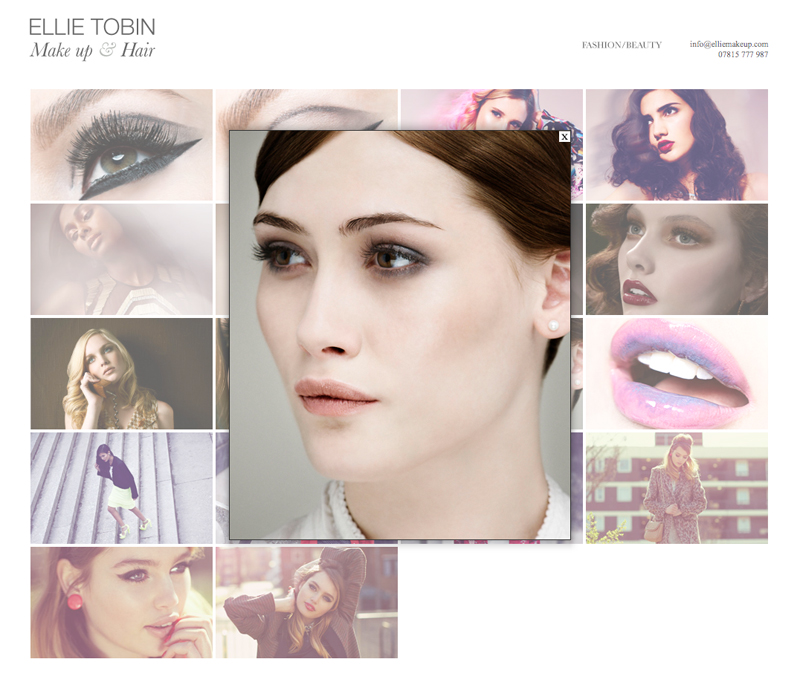
A quick update to the Ellie Make up site I designed and built last year, including a new home page and an edit to the navigation. All brought together with the lovely photography from Ellie Tobin.
Take a look at the site here
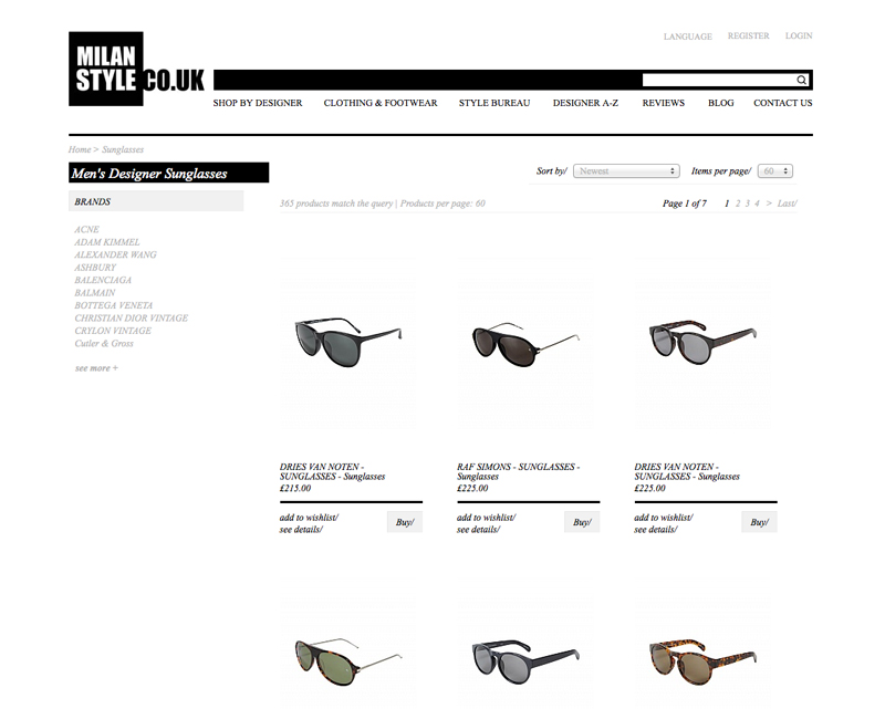 Following the launch of the new Milan Style home page, the remaining pages from my re-design of the Milan Style fashion site are now live! Take a look, and maybe even treat yourself to something in the Sale here.
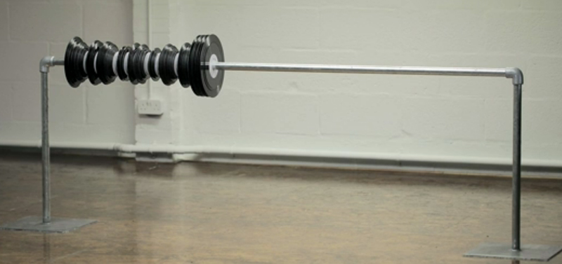
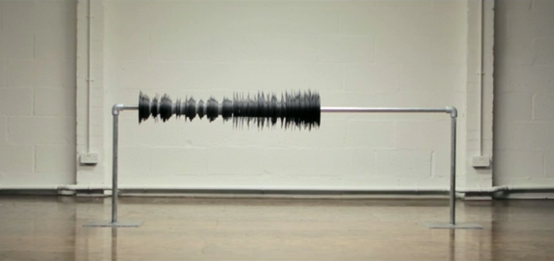
For Benga’s new video for I Will Never Change, 960 separate pieces of vinyl were carefully measured, cut, and then finally animated. The result is a real-life waveform. Directed by Christopher Barrett and Luke Taylor of Us they describe the process in an interview on Creative Review like this –
“To animate the wave form, we built it and then carefully removed each individual record. This had to be done very gently as any shift in the position of the sculpture would result in the failure of the animation and as we had to literally destroy each piece of vinyl to get it off, there was only one chance to get it right. Once the sculpture was finally built, the animation process took about 30 hours.”
The final result is well worth the effort!
You can see more of their work on their site – www.weareus.co.uk
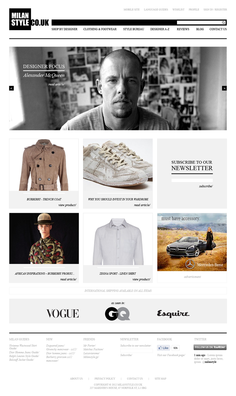 Possibly one of the smoothest running projects I’ve worked on for a long time, my Milan Style home page re-design has now gone live! An up and coming luxury menswear site covering brands such as McQueen and Rick Owens, Milan Style needed a home page that reflected the quality of its product. With plenty of white space, and a clean gridded structure the new home page design allows the product to shine, while keeping information clear. As a side project I also provided guides for a soft re-design of the remaining areas of the site, so check back for updates on when those go live too!
To see more of this project have a look on my site here
or to see the home page online you can take a look here
Beautiful animation created by Globaïa for the short film ‘Welcome to the Anthropocene’, a commission for the Planet Under Pressure conference. Showing every road, flight path and shipping route in the world you know from the start its going to be pretty spectacular. Watching the rotating globe is strangely hypnotic, but my favourite part of the video is when they remove the earth to show an ‘elastic band ball’ of our travel paths. Although I do find it very similar to the BBC’s ‘Every Death On Every Road’ project (which you can see here), as it’s gone a step further I can overlook that…
You can read more about this project here, and see more of Globaïa’s work here
Following on from Microsoft’s ‘Productivity Future Vision‘ video late last year (which you can see in my post here) this is Google’s version of how the future will play out with their ‘Project Glass‘. Here’s how The Guardian described it –
“The video, ominously titled “One Day …” depicts what a day in the life of a Google glasses-wearer would be like. Shown literally through the eyes of a hip downtown New Yorker, the video starts with the glasses booting up. A series of icons flash into his field of vision, Terminator-style. He checks his calendar and the weather, chats and shares photos with friends in his circles (remember that week we were all active on Google+?) and listens to music.”
Personally the guy in the video annoys me a little, and the idea of that being the future scares me a little more, but all in all an interesting concept and a nicely made video to promote it. I can’t help but think it’ll be a bit like most of the products they used to show on ‘Tomorrow’s World’ though, that never actually made it into public consumption…

