
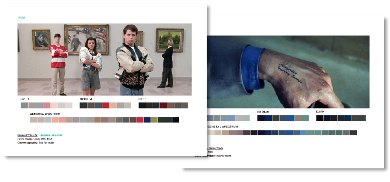
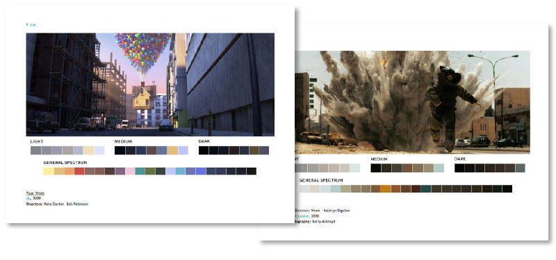
I stumbled upon Movies In Colour recently and keep finding myself wanting to re-visit it. Not only is it a lovely concept, but it also looks pretty good too (header aside…). The basic premise of the site is to take films, usually themed over each week (so one week may be Pixar, another Female Directors), and then break up the colour spectrum used within the film into ‘Light’, ‘Medium’, ‘Dark’ and ‘General Spectrum’. The process seems fairly manual, but personally I think the result is worth it.
This is how they explain it on their site –
“The idea started when I was watching Skyfall. I was taken with the cinematography and use of color more-so than the story itself. I wanted to find out what colors made up certain stills and after making a few color palettes for Skyfall, took it a step further by extending it to all films and starting a blog.
So far, the blog has not only been an aesthetic pursuit but also an educational pursuit that showcases the relationship between color, cinematography, set design, and production design. Overall, it is a study of color in films, but has other uses and applications. One of the goals is to give artists color palettes they can use in paintings, films, videos, graphic design, and other pursuits.
The Process
Research is first. I search for stills that are compositionally interesting as well as rich in color. I use the help of a color generator to get a very basic range of swatches. Then I piece together the general palette from that and other colors I think are prominent or worth including from the still. It’s all done in Photoshop to keep layout and swatch sizes consistent and to facilitate color sampling from the image.”
If you’d like to see more you can take a look at the full site here
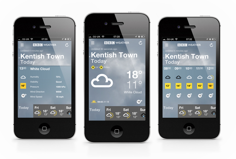
Another nice, well thought out app from the BBC. Their new offering is one that a lot of people have been expecting to appear for a little while now, since the re-design of their desktop weather experience (if you haven’t seen it, you can read more about that in my previous post here), and it doesn’t disappoint. As usual their UX and interface keeps it intuitive and pretty nice to use, while presenting everything in a clean and easy to digest format.
For those who have been pointing out the similarities to the upcoming iOS7 weather app, I’ve had a play with both, and I know which one I’ll be sticking with…
If you haven’t already, download it and have a play here.
It’s free after all (unless you count your TV license as payment…)!
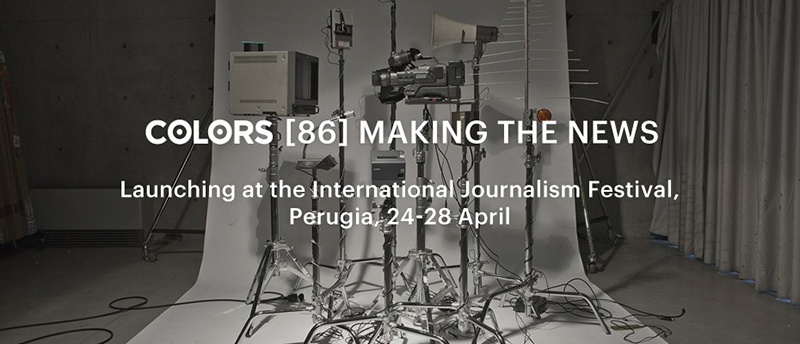
To launch issue #86 ‘Making the News’ COLORS magazine have created a ‘News Machine’, which you tweet your headline to and it replicates the modern media’s mangling of information and spits out its own interpretation. COLORS explain the process on their site as –
“Twitter is the largest and least verifiable wire agency in the world. Tweet your story to @colorsmachine and watch the message change as it echoes through different media and into print.
A megaphone will read your tweet out loud. Its tape recorder listens, converting what it hears into text so that the television can show it onscreen. A camera watching the television converts what it sees into a signal to the radio antenna, which broadcasts the tweet. And the waiting microphone interprets this radio address as text again for printing.
Pick up your receipt. Compare the original tweet with the final report. Accuracy of reproduction varies according to the clarity of your writing and to chance.”
Unfortunately, as I’m writing this post the machine is offline (I think it’s being re-located) so I can’t send a test tweet to it, but I’ll keep my eye out for when it’s back up and add the results!
If you’d like to read more, or have a play with the News Machine you can visit COLORS’ website here
Nice, if sometimes a little nauseating to watch, tool by Teehan+Lax Labs which allows you to create instant timelapse (or ‘hyperlapse’) films from Google Street View. To use it you just drop a pin for your start, ‘A’, and finish, ‘B’ points and then create your very own Hyperlapse video! Here’s how the studio explain it –
“Hyper-lapse photography – a technique combining time-lapse and sweeping camera movements typically focused on a point-of-interest – has been a growing trend on video sites. Creating them requires precision and many hours stitching together photos taken from carefully mapped locations. We aimed at making the process simpler by using Google Street View as an aid, but quickly discovered that it could be used as the source material.”
To really see what it’s like you need to go and have a play yourself though (best viewed in Chrome) – http://hyperlapse.tllabs.io/
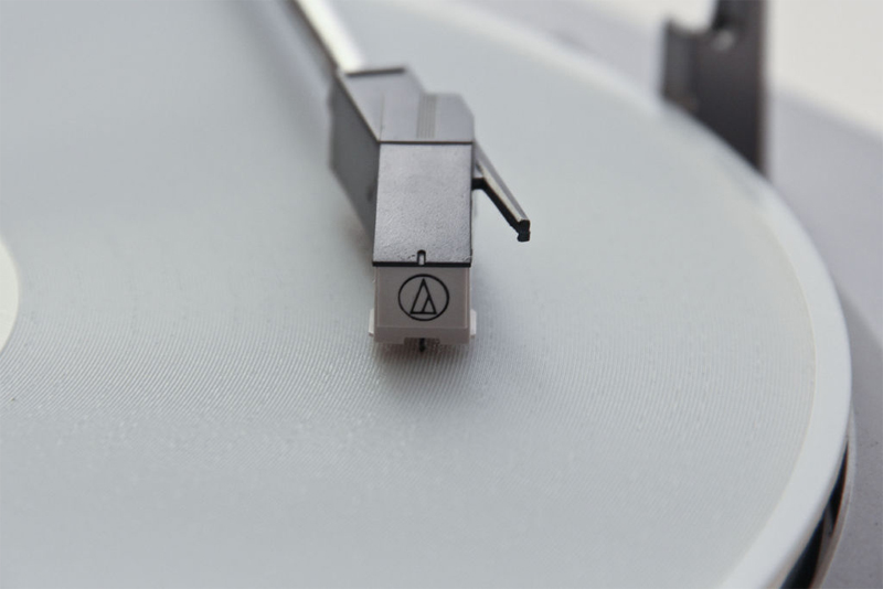
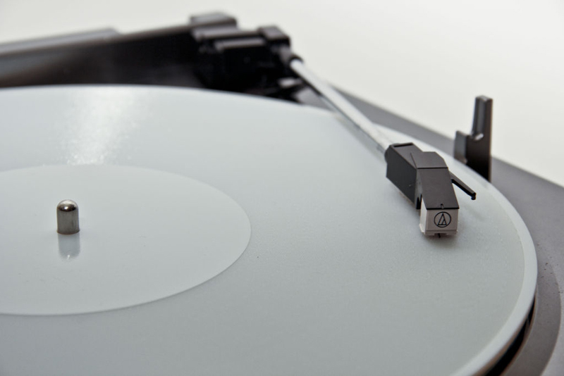
Just as we were ready to throw out our old record players and submit to a life of MP3, Amanda Ghassaei at instructables has found a way to print a 3D record from your digital copy! Although most vinyl lovers probably won’t see this as being quite the same (and have most likely already invested in turning their vinyls into MP3s for future proofing…), also the quality isn’t quite up there, but I do really like the idea of it. In fact, I would say the inaccuracy of the sound is probably what I like most. With these new weaknesses in the reproduction technique you could inspire a whole new sound and genre of music. Like Instagram is now the ‘look’ of the current era’s photography (whether that’s a good thing or not I’m undecided on), this could be the ‘sound’.
For a bit on the technical side, here’s what Amanda says about the project on indestructables.com –
“In order to explore the current limits of 3D printing technology, I’ve created a technique for converting digital audio files into 3D-printable, 33rpm records and printed a few functional prototypes that play on ordinary record players. Though the audio quality is low -the records have a sampling rate of 11kHz (a quarter of typical mp3 audio) and 5-6 bit resolution (less than one thousandth of typical 16 bit resolution)- the songs are still easily recognisable,”
You can read the full article here
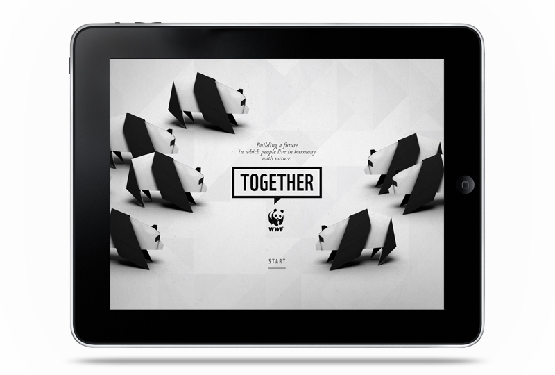
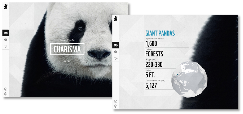
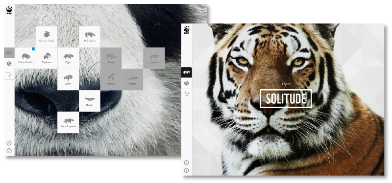
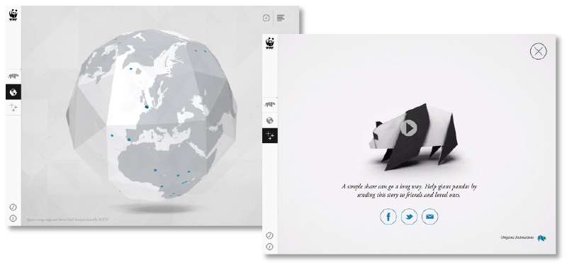
Lovely new iPad app by Studio AKQA for the WWF (That’s World Wildlife Fund, not the wrestling…). Through the app you can explore information, videos and images on some of the worlds rarest animals. It’s launched with Giant Pandas, Marine Turtles, Elephants, Tigers, Bison, Polar Bears, Snow Leopards and Whales. With Rhinos, Gorillas, Sharks and Jaguars to come in future updates.
The element I really like about the app is the theme of Origami that runs through it. From the opening Panda through to globes, the background and even downloadable instructions on how to make each featured animal. It holds all the species together in a familiar structure while keeping a personal, friendly aesthetic for what is, essentially, a very serious subject.
As far as the usability goes it feels nice and intuitive, has clear calls to action and even embraces iPad’s inbuilt features (in the Polar Bear area there’s a section to tilt the screen and keep a ball balanced to reveal a fact). It’s not groundbreaking in the feature front, but the app is about information and clarity, which it does exceptionally.
You can download it from the iTunes store here
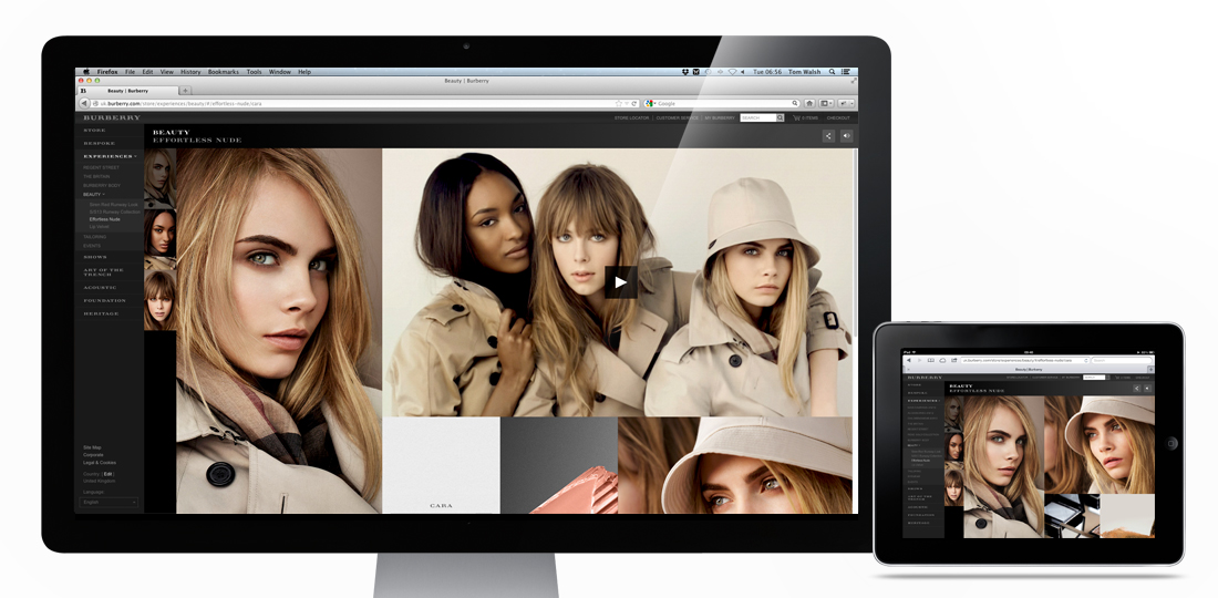
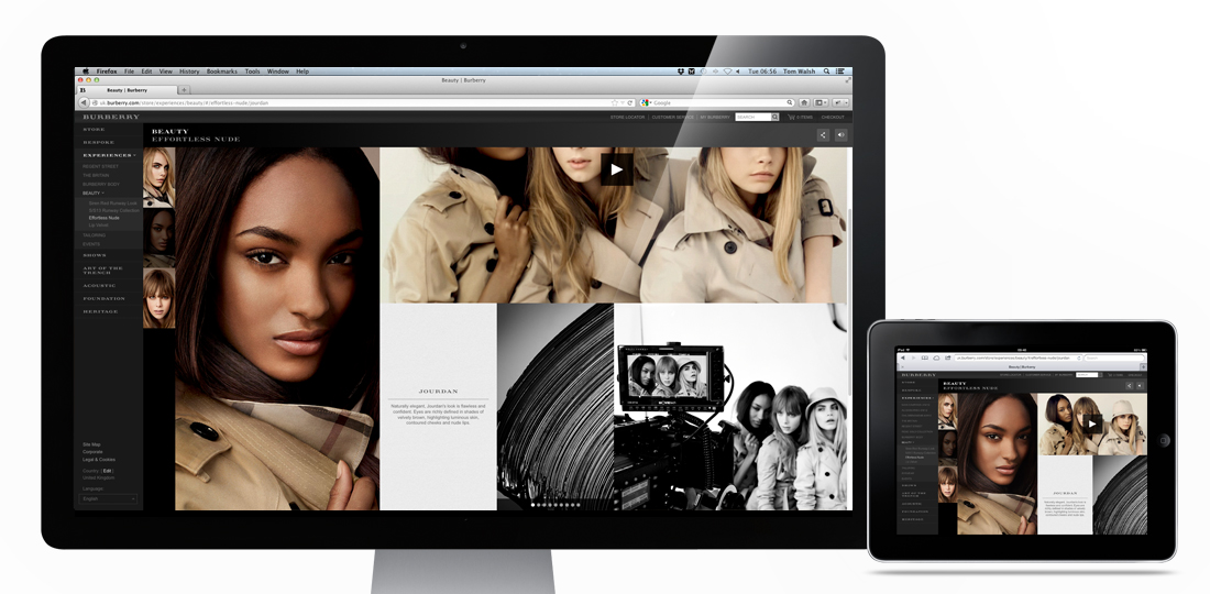
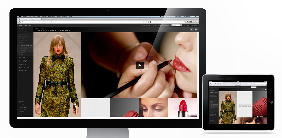
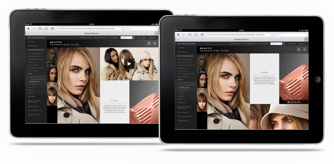
The Burberry Beauty experiences I designed while freelancing for them have gone live! Designed to showcase the hero image on the left hand side by keeping it fixed to the device height, while allowing different amounts of supporting content through the scrollable, flexible grid on the right it caters for product, stills and video. The flexible grid section makes it adaptable for iPad to super-wide screen, while also giving the content a structured but editorial feel.
Take a look here if you want to have a play – Burberry’s SS13 Beauty campaigns
Designed while working for: Burberry
Creative direction: Marga Arrom Bibiloni & Chester Chipperfield
Charming animation promoting safety on Melbourne’s railways. Dumb Ways to Die by Metro Trains delivers exactly as you’d expect, a selection of idiotic ways to die, all related to (and probably backed up with statistics from both the train services and researchers for The Darwin Awards…) deaths on and around trains.
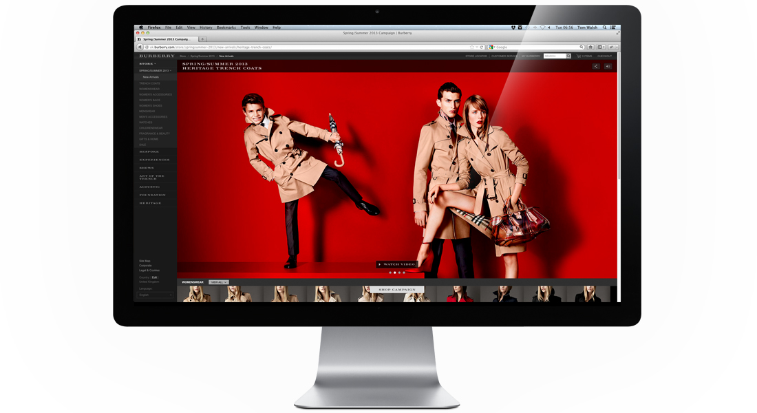
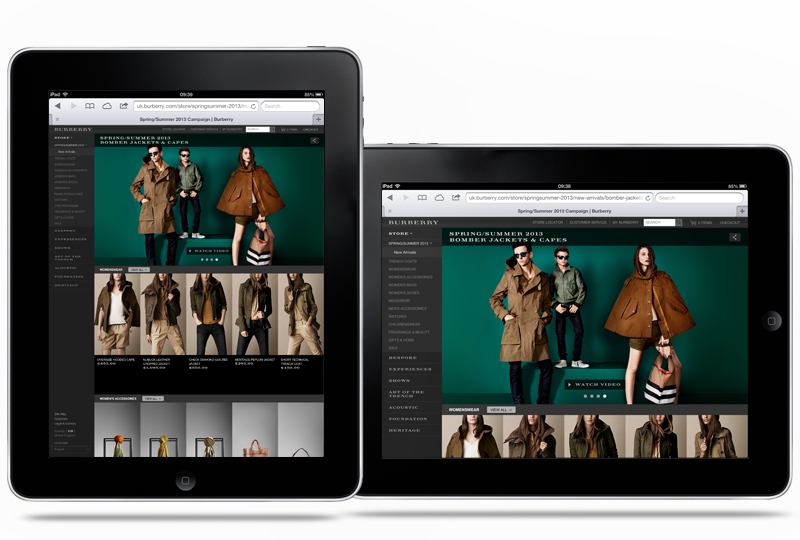
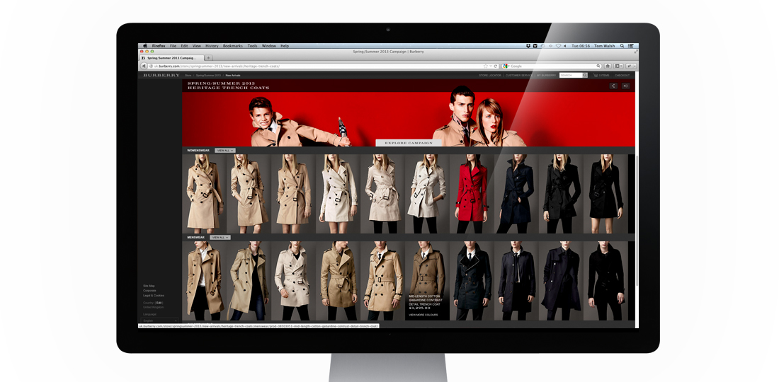
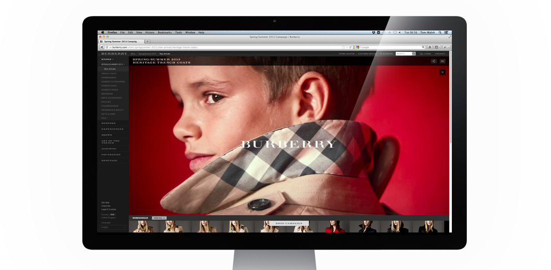
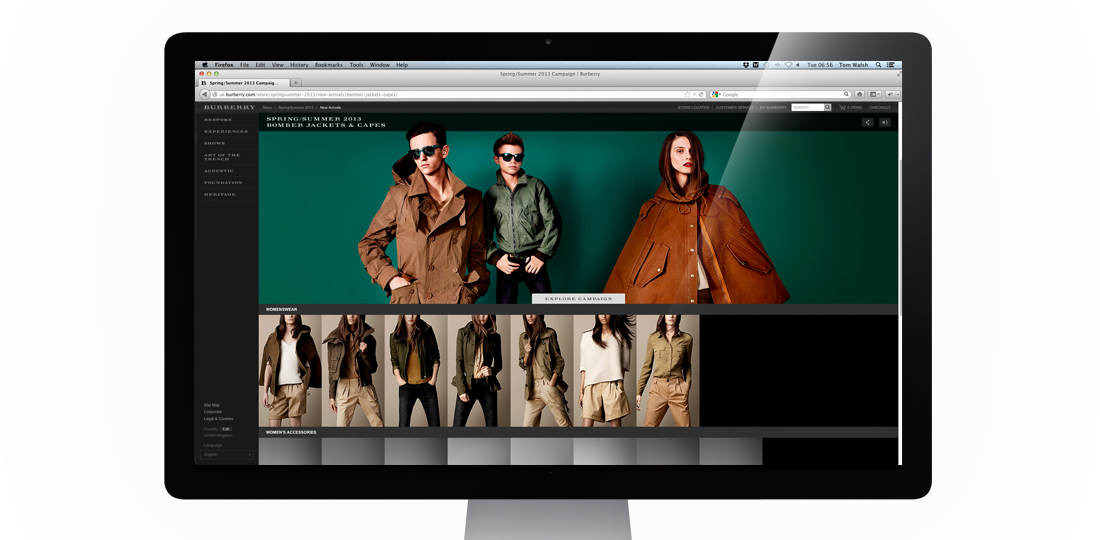
The first Main Campaign I’ve worked on while freelancing for Burberry, their Spring Summer 2013 campaign is now live! Shot by Mario Testino, and featuring Romeo Beckham in his ad campaign debut, alongside Burberry staples Edie Campbell and Cara Delevingne, it’s a much brighter campaign than they’ve opted for in recent years. Because of this we wanted to keep the design of how the campaign would sit within Burberry.com as clean as possible, while including the necessary functionality.
The two main areas that needed to be considered were how to make this campaign more overtly shoppable, and how to display the videos that accompany some of the still shots. Following on from the Festive campaign it was decided that this would also sit inside a store page. The main addition here was adding in a sliding ‘Shop Campaign’/’Explore Campaign’ button which allows you to switch the pages focus from browsing the campaign stills and videos or browsing related product. For the video display options, to avoid duplicating content within the carousel (as each video supports an image), we decided to have a ‘watch video’ button instead which fades the image down to its accompanying video, and returns to the carousel at the end. Resulting in a much cleaner experience than an overlay or other similar options.
Overall I think the experience does what it set out to pretty well, which is allow the imagery to take precedence over the interface.
Take a look for yourself here – burberry.com
Designed while working for: Burberry
Creative direction: Marga Arrom Bibiloni & Chester Chipperfield
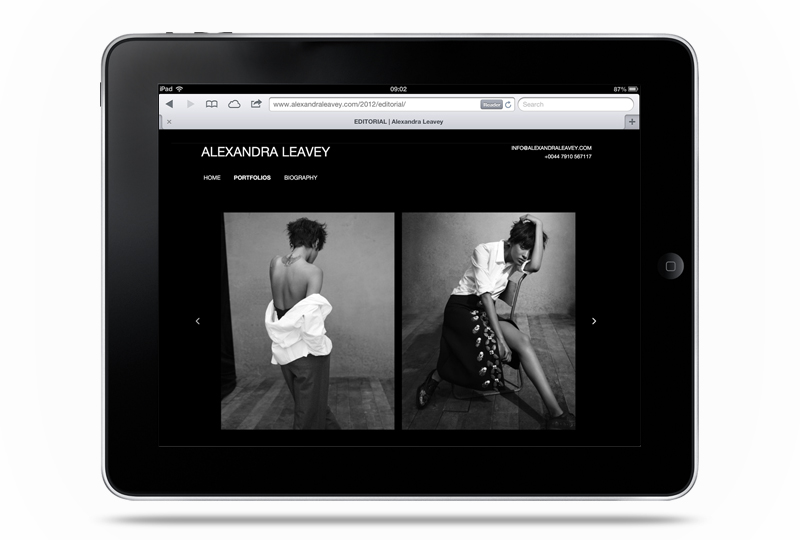
The updated (and much upgraded) version of fashion, advertising and editorial prop/set designer Alexandra Leavey’s site is now live. Built to work perfectly on desktop, tablet and mobile it can now be viewed wherever her clients are, and on their device of choice. Comprising of swipe, keyboard and mouse controlled navigation I built it to be as accessible as possible, while keeping the design and interface minimal so her images are the focus.
If you’re curious, you can take a look here – www.alexandraleavey.com
