
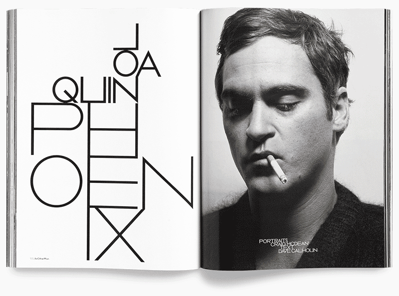
To celebrate ten years of his work as creative director of AnOther magazine Creative Director David James has launched www.everythingthatmatters.com, a digital exhibition celebrating his time there. Displayed as a chronological timeline it’s interesting to carousel through and see how trends have affected the layouts. A lot of the changes feel quite graded as you progress, so wouldn’t be noticeable to the average reader, but when laid out in this format of editorial snapshots you can see photographic and typographic styles coming and going, sometimes with a gradual introduction period of overlaps.
As a magazine known for being at the forefront of trends its quite striking to see, in particular in the typography, how they were pushing their layouts over the years. For instance, if you scroll through the slides from the early years circa 2005, and jump to 2014/15 the difference makes it look like two separate magazines. Some of the early typographic styles have even been around long enough to have had a resurgence since first appearing in their magazines.
My personal preference is the latest type style, 8.5pt throughout, but maybe that’s because it’s ‘current’. I still wouldn’t turn my nose up at a lot of the older styles though.
Have a scroll through here and make up your own mind:
www.everythingthatmatters.com
