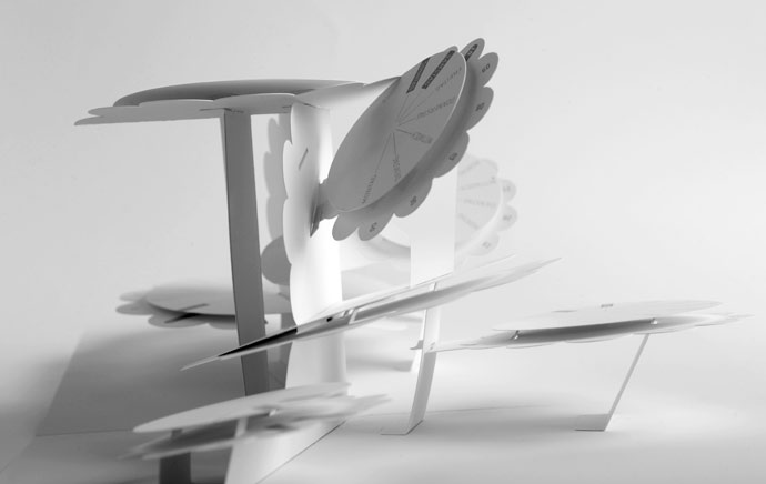
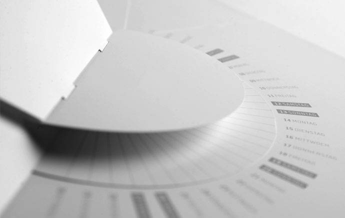
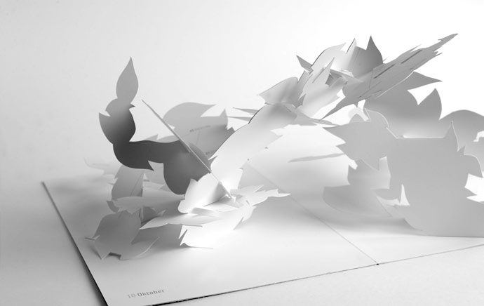
Beautifully intricate pop-up calendar by Johann Volkmer. Unfortunately all of the information I’ve managed to find on this project is in German (which I don’t speak) so I can’t tell you much as far as the concept goes, but just in case anyone reading this does, here’s his description of the project –
“Faltjahr 2010, kein Jahresplaner und auch kein Kalender im üblichen Sinne, vielmehr zwölf DIN-A4-formatige, im aufgeklappten Zustand DIN-A3-große, aufwändig als Wandskulpturen gefertigte, Pop-up-Objekte.
Jedes Monatsmotiv -als Einzelstück aufgehängt- ein ungewöhnlicher Hingucker zur anspruchs-
vollen Raumgestaltung.
Monochrom weißes Papier in schlichter Eleganz bringt Monatsthemen in reduzierter Form zum Ausdruck. Das Faltjahr 2010 zeigt, wozu Papier fähig ist.”
You can view the full project’s website here (also in German…) – faltjahr2010.de
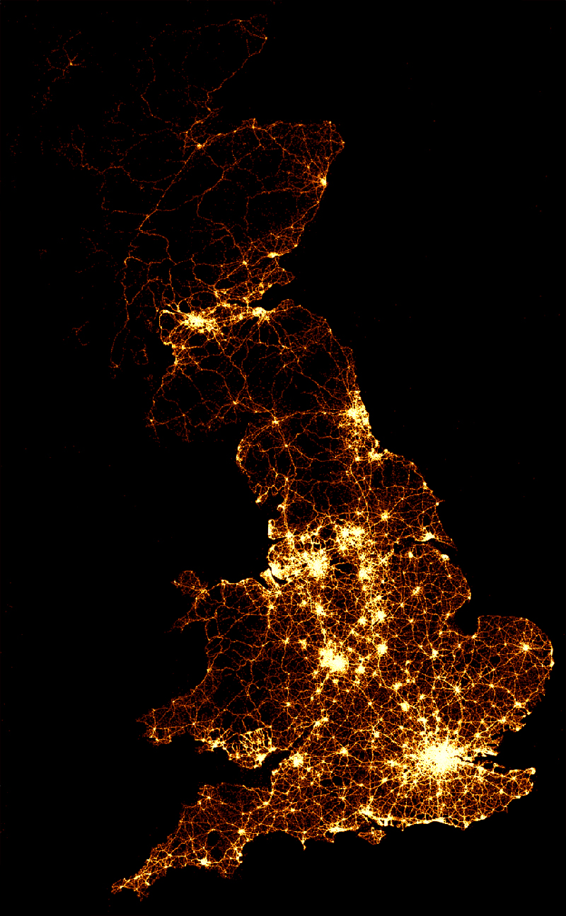
A visually impacting way to display road accident casualty data by the BBC. Although over a long period of time, it’s still quite shocking (especially watching the video) to see just how many road traffic accident deaths there are. It’s also quite easy to forget what each light represents as you watch them scattered across the maps.
They described the static image (shown above) as –
“The image below (above) shows the location of 2,396,750 road crashes in Great Britain from 1999 to 2010. Each light point is an individual collision which resulted in a casualty. The intensity of brightness shows where collisions are more frequent.”
You can watch the videos here – bbc.co.uk/news/uk-15975724
A lovely little creation by BERG, the ‘Little Printer’ will effectively be your very own personal PA. By scouring the web, and other sources available from your phone, it then gives you a bite-size summation each day that they describe as a ‘mini newspaper’. Conveniently this ‘mini newspaper’ is the perfect size to use as a bookmark, slip into your wallet or stick on the fridge, so each morning you can take it with you to enjoy whenever and wherever you fancy!
In Berg’s own words – “Little Printer lives in your front room and scours the Web on your behalf, assembling the content you care about into designed deliveries a couple of times a day.”
It’s a pity its not available until next year, otherwise it would definitely be on my Christmas list!
You can read more about the ‘Little Printer’ as well as their other projects on their site – bergcloud.com/
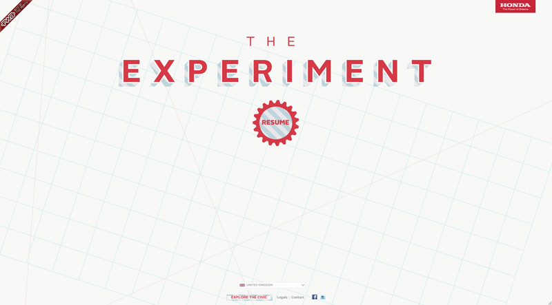
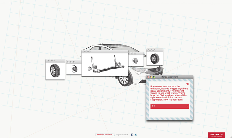
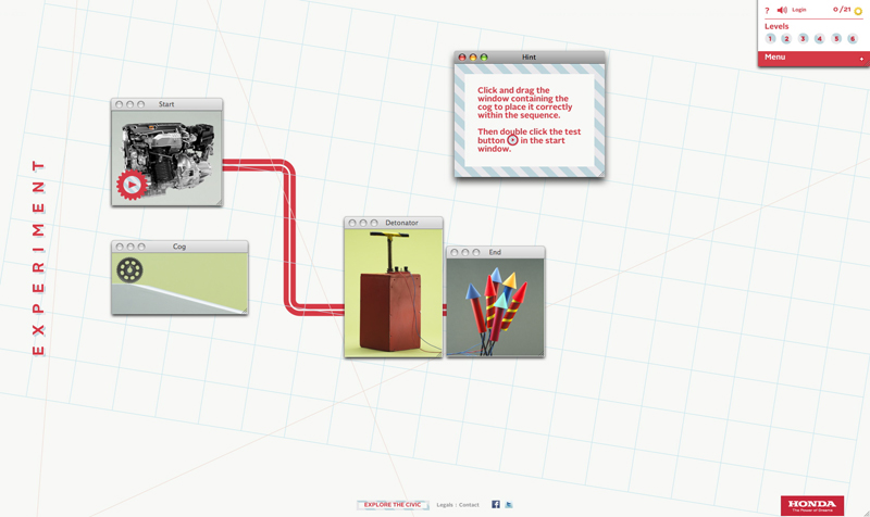
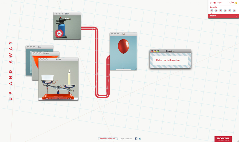
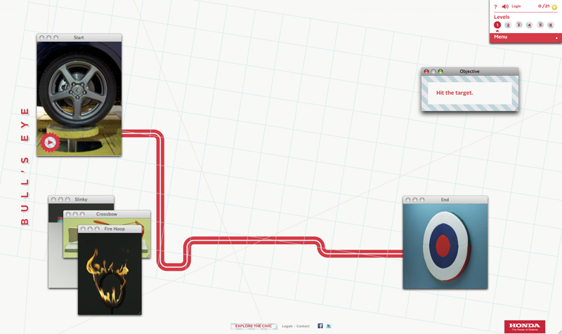
As an online follow up to their ‘Cog’ advert Wieden + Kennedy have created Honda’s ‘The Experiment’. A fun six level game where you place pop up windows in sequence to create a chain reaction. Not especially difficult, but a good way to wind down on a Friday afternoon! Although I still haven’t worked out how to use the egg timer in level 3…
Have a play at www.experimentgame.com
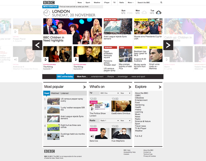
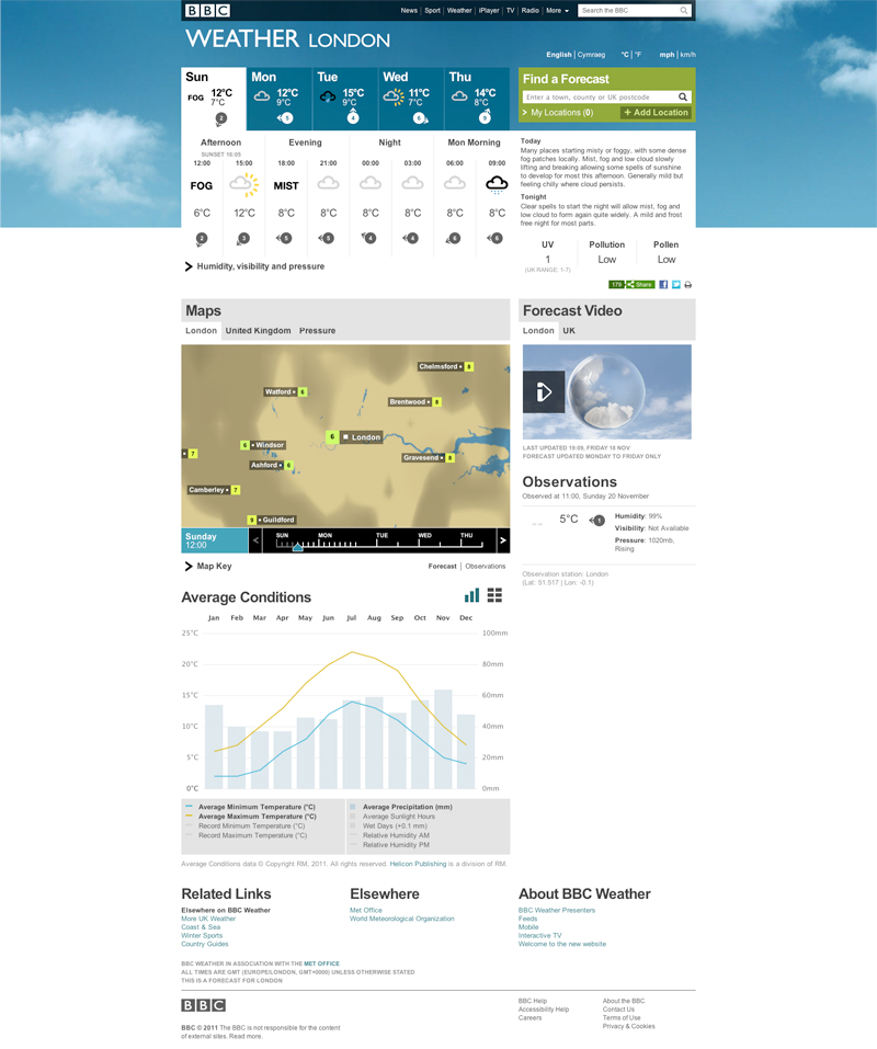
Lovely new BETA home page designs for the BBC and BBC Weather. Compared to the old layout (which you can still see up at www.bbc.co.uk/) all of the information is still there, just cleaned up, tidied away and so much easier to digest. Little touches like the weather tabs in the top right make it a joy to use, and it all works just as smoothly on both the iPhone and iPad (as you’d hope!).
Check them out here –
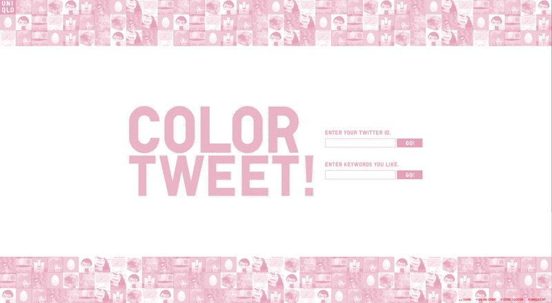
Nice, fun little project by Uniqlo. Enter either your Twitter ID, or keywords of your choice, and it takes the tweets and images related to what you entered and animates them. Although slightly psychedelic at times, it’s a good way to amuse yourself for a little while!
Have a play at www.uniqlo.com/colortweet
It seems like every step of the way Burberry have been way ahead of the rest of the fashion industry when it comes to using technologies, and more importantly, using them well. This London Fashion week they had their ‘Tweetwalk’ show, where they tweeted preview photos of every outfit before it hit the catwalk, bringing ‘Burberry’ up to the second most trended term worldwide (impressive eh!), but last April they did something a lot more visually inspiring. Their Holographic catwalk show. With models exploding into each other and randomly appearing/disappearing it was more like a fireworks display than a catwalk show.
If you’d like to see more of their events and other videos check out their YouTube channel here
Or if you’d like to read more on the thinking behind their campaigns there’s an interesting overview up on Mashable here
The first of a collection of HTML5 & Javascript animated experiments produced by Exposure Studio for the Bulmers Cider Summer campaign. I had the luck of being the freelancer given this project to work on, and although it’s been hard work, and due to the 3D rendered assets provided by Taylor James has involved a lot of very large files, it’s going to be worth it. The other experiments will be rolled out over the coming weeks, so make sure you check back here, or on the Bulmers Facebook page, to catch them all!
Visit their page here Facebook/BulmersUK
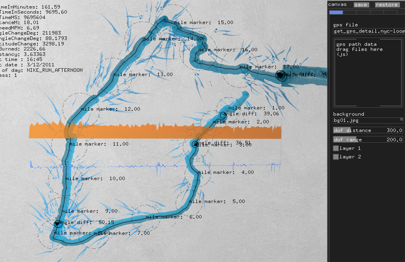
For the launch of the Nike Free Run+ 2 City Pack series Nike invited YesYesNo to develop software to enable runners to ‘dynamically paint’ using their GPS run data, and as you can see from the example above, got some pretty interesting results. Here’s how YesYesNo explain it on their website –
“During the two day workshop at Nike headquarters, we invited the participants to record their runs and then using our custom software we imported the metrics from their run, to create visuals based on the speed, consistency and unique style of each person’s run.
Using the software the participants were able to play with the mapping and adjust the composition of their run which was then outputted as a high resolution print for them to take home.”
Clever stuff..
You can see more of their projects on their website yesyesno.com , well worth a look if this is your sort of thing.
A great little tool for generating your very own guilloche patterns. What would usually be a painstaking afternoon in Illustrator has been made simple (and quite fun to play with) by this, and with the ability to customise every variable you have total control. The only thing I’d say it was missing is the option to output your creation as vectors..
Have a play here

