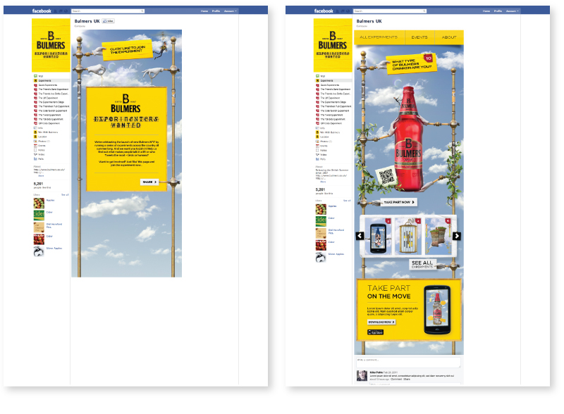
A series of Facebook Apps I worked on while at Exposure as part of the Bulmers ‘Experimenters Wanted’ Summer campaign. They describe the campaign as –
“…celebrating the launch of new Bulmers Nº17 by running a series of experiments across the country all summer long…”
Experiments vary from Quick Polls to tweet powered robot races, you can check them all out here
Or read similar posts about my work on this campaign here
Made over 3 Days using Illustrator and After Effects this typographic short by Ira Glass has
a quaint storybook style that makes it a little easier on the eye than some of it’s blockier counterparts.
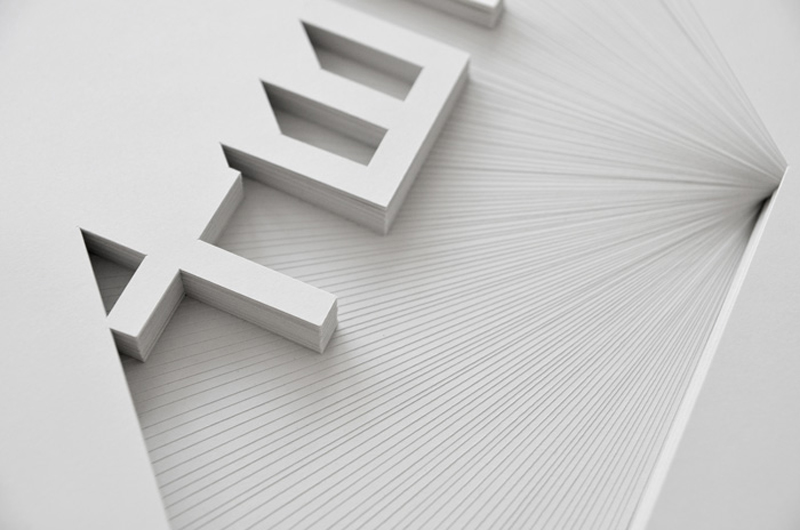
Simple, but beautiful paper sculptures by Bianca Chang, Sydney based designer and paper artist. She describes her work as being –
“Inspired by the subtlety of tone on tone signage and the shadow-play of 3 dimensional letterforms. Recreating this effect with paper – a material so beautifully tactile and simple yet often mindlessly discarded.”
As part of the Paper Convention it’s not just about pretty shapes though. She explains it best on her website as –
“minimizing the impact of paper consumption and consciously transforming a typically disposable medium into a long term piece of art. “
However green (or not..) you are, I think it’s the best use for a piece of paper I’ve seen in a while..
See more of her work here www.biancachang.com
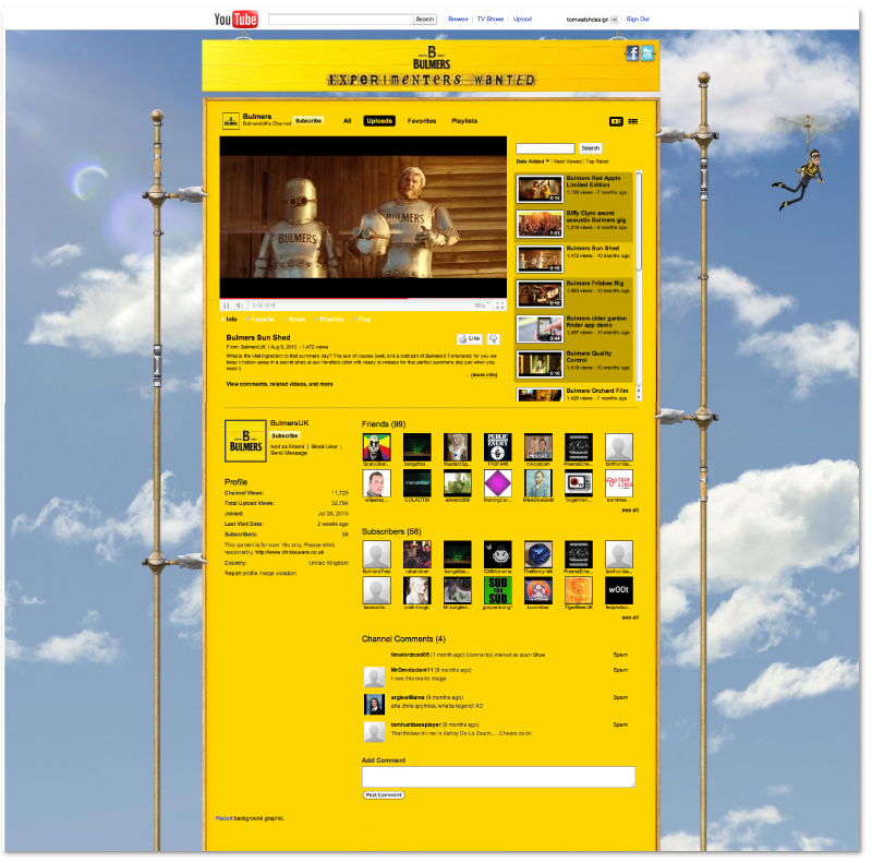
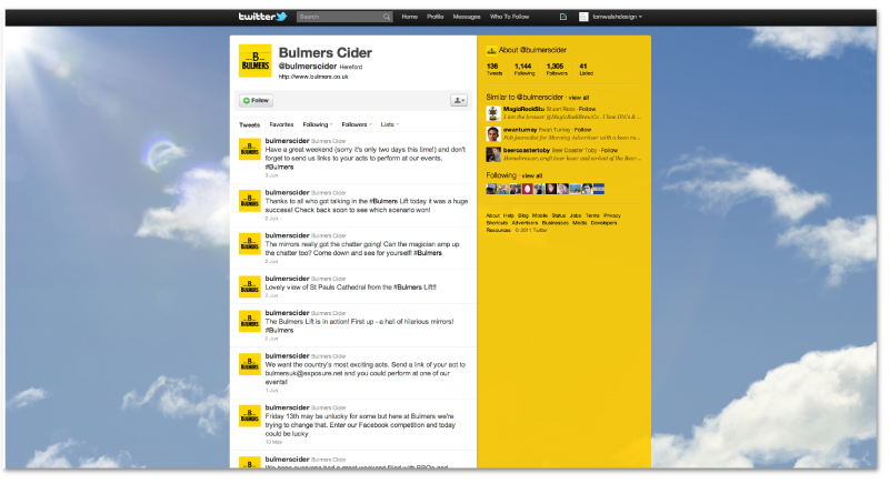
For the past few months I’ve been freelancing at Exposure Studio working on all of the digital projects for Bulmers cider’s Summer campaign. It’s been a long slog as there’s a LOT of design work involved (and a lot of non-design work too, as anyone else working on the project will tell you..) but finally little pieces are starting to appear online. First came a taster of the Facebook App, with a fully degradable HTML5/JQuery animation (click here to see my post on that, including a video of the animation) but as for fully branded online spaces it’s Twitter and YouTube that are leading the rest into their new homes. By far the simplest sections of the whole project they’re more intended as a suggestion of what’s to come, but it’s always a nice feeling to see a project finally coming into fruition..
You can view the full pages here –
Bulmers YouTube Channel
Bulmers Twitter page
And check back over the next few weeks to see updates on what else has gone live!
A nice looking music video for Dubstep duo Matta by Kim Holm. I always think it must be hard to visualise this genre of music, but
this one certainly does the track justice. With his trademark use of colour he makes something quite dark pretty nice to look at.
You can see more of Director Kim Holm’s work on his Vimeo page here
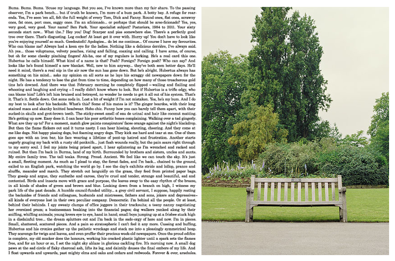
Tongue in cheek campaign for Photographer Paul Thompson. With each promotional piece consisting of exactly 1,000 words describing a different work from his portfolio it’s a bit of light play, and also doesn’t look too bad. Written by by Ben Casey and Lionel Hatch of The Chase, alongside guest writers Nick Asbury of Asbury & Asbury and Jim Davies of Total Content each gives a little personality to the pieces, with my favourite being Jim Davies’ description of a photo of a “slightly forlorn-looking” park bench.
Here he explains his choice on Creative Review
“… It struck me that this park bench must have witnessed all kinds of things, if only it could articulate them. “So I gave it a slightly curmudgeonly voice and set about telling a kind of first-person day in the life, which gradually spirals out of control. The Chase then set the words beautifully to the shape of the picture. The results not only look rather fine, but gently subvert the idea of a photographer’s mailer.”
You can see the pieces from this exhibition, along with other projects on his website here –www.paulthompsonstudio.com
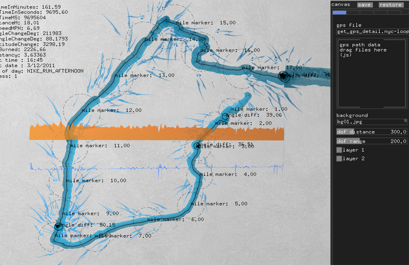
For the launch of the Nike Free Run+ 2 City Pack series Nike invited YesYesNo to develop software to enable runners to ‘dynamically paint’ using their GPS run data, and as you can see from the example above, got some pretty interesting results. Here’s how YesYesNo explain it on their website –
“During the two day workshop at Nike headquarters, we invited the participants to record their runs and then using our custom software we imported the metrics from their run, to create visuals based on the speed, consistency and unique style of each person’s run.
Using the software the participants were able to play with the mapping and adjust the composition of their run which was then outputted as a high resolution print for them to take home.”
Clever stuff..
You can see more of their projects on their website yesyesno.com , well worth a look if this is your sort of thing.
A cute animation by Aardman Studio for W+K about ‘Dot’, a tiny 9mm girl who wakes up in a magical, magnified world to discover her surroundings are caving in around her.
Shot entirely on a Nokia N8 handset fitted with ‘CellScope’ (technology developed to help diagnose fatal diseases in remote areas of third world countries), ‘Dot’ was so small they had to create her with a 3D printer, producing 50 models in all to capture all the different movements she made. On their site they explain the project saying they
“..used innovative Rapid Prototyping 3D printing technology that uses a computer-generated model of an object or character and then prints it in full 3D using a plastic resin material. The entire set was no more than a metre and a half long, all elements of which were used to help sell the scale of the project to the viewer. The film was painted under a microscope by expert modelmakers and animated using tweezers; “It became a real test of working at such a small scale, and in having the patience to push on through ’til the end'” said Aardman director Ed Patterson. “The final film has come out better than we could have hoped for. It was great collaborating with Wieden + Kennedy and to gel so well creatively. The Nokia N8 stood up to the challenge and produced some outstanding images”.
You can read about it in more detail on their site here
A lovely example of HTML5 that I’ve recently come across is the Nike ‘Better World’ micro-site. As one long stack of imagery
it glides down through various blocks of messaging with HTML layered images, and as an extra touch it also uses Fontdeck to
ensure the correct font is displayed.
The site, as the name suggests, is about Nike’s green side and promoting sport to help make the world a better place. With facts
and information like this –
If you have a torso, you’re an athlete.
In 2007, South African sprinter Oscar Pistorius ran the 100 meters in 10.91 seconds. Without any legs. The first amputee to break
the sub-11-seconds barrier. Some critics claim that the carbon fiber blades he ran on gave him an unfair advantage. Those critics
had legs.
it takes you though its various efforts to give a little back to the world, along with stories of how sport (well, mainly football) has
helped bring peace in various global situations. Finishing rather nicely with the message –You’ve scrolled 13,980 pixels toward a
Better World. (with the number changing depending on how far down you’ve scrolled).
You can view it here
Having freelanced on and off in ecommerce throughout my career I’ve been made very aware of the importance some people/companies put on the fold. For their purposes I can half appreciate why, as if someone can’t see product, they can’t buy it. However, I’m a firm believer in the users understanding of web environments. If there’s a scroll bar, people will generally scroll (assuming they’ve chosen to visit the page in question), which is why I love this simple page. Three messages, with around 300+ horizontal pixels separating them, I think it gets the message across quite succinctly (even if it’s typographically pretty poor..).
Have a scroll here

