A dark, but very engaging video piece by Mischa Rozema and British graphic designer, Si Scott for OFFF Barcelona 2011. The film guides you through their vision of the future with the artists involved in this years OFFF festival’s names embedded throughout in a range of interesting ways. Varying from neon signs looming down from oppressive cityscapes to black letter tattoos being filled in they thread all of the artists names into their story seamlessly. Below is how they describe the piece on their Vimeo –
“The idea was to trick the audience into thinking they’re watching some kind of documentary. We basically follow a guy going home. Bit by bit his environment gets stranger and more uncomfortable to watch. Is he living in a war zone? Slowly the background takes over and the piece changes into an urban nightmare. And like a nightmare, the story/edit doesn’t always make sense but makes you feel really uncomfortable. I also wanted the viewer to experience the nightmare. That’s where the dark matter comes in. Dark matter is what I call the macro shot bits. Flashes that derail your train of thought like there’s something eating away at your brain as you try to make sense of the nightmare. I wanted the viewer to go nuts, alongside with the cast. Erase the line between nightmare and reality. The end result is something you won’t come across easily on your tv. And is also just another fun way to do titles.”
You can read about the video in full here
and visit the OFFF website here
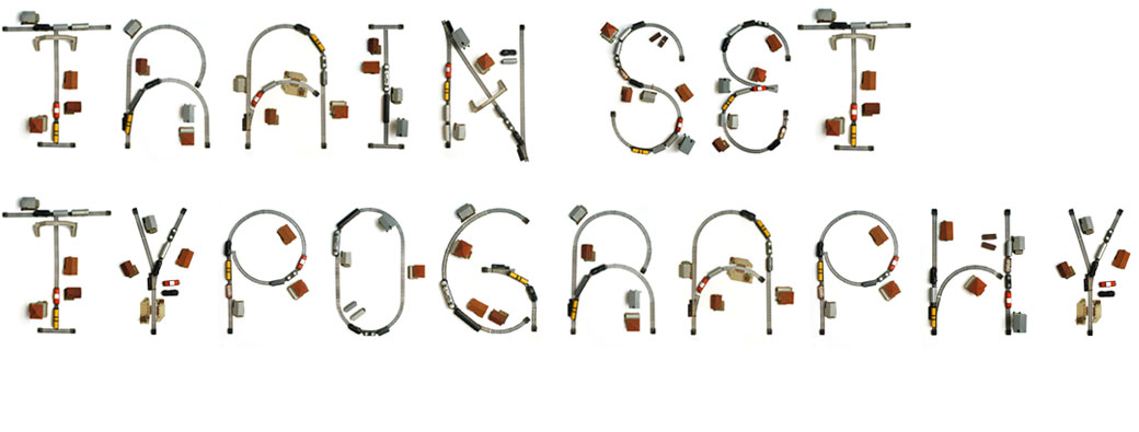

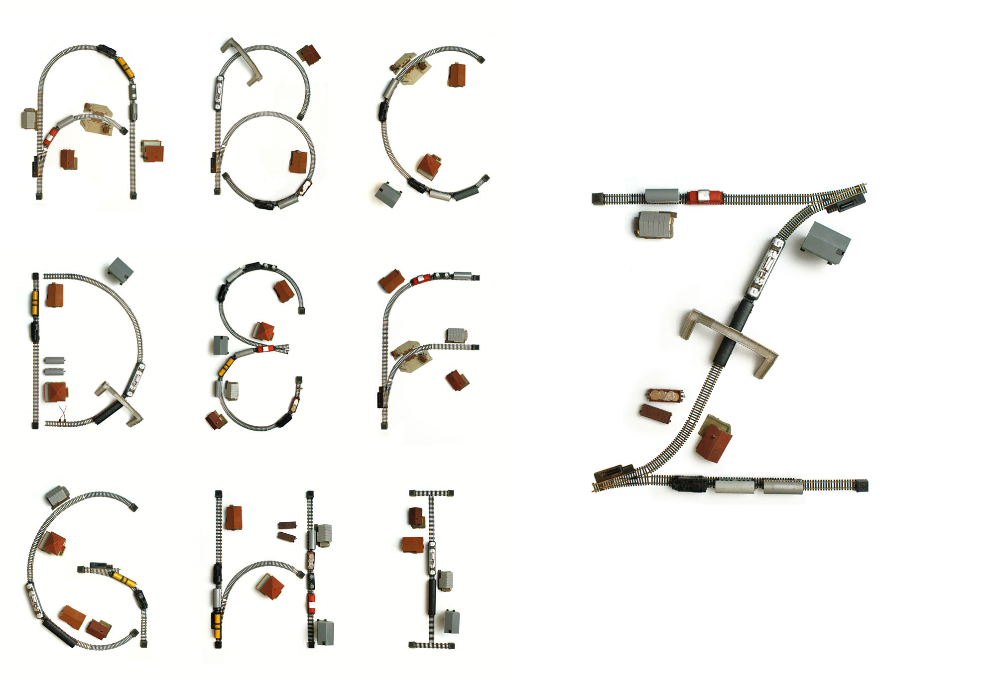
Lovely personal project by Ludvig Bruneau Rossow ( Bureau Bruneau ) a graphic designer from Oslo, Norway. A lot of ‘hand made’ and object based fonts manage to lose the craftsmanship of the characters, but every glyph has been beautifully formed into what could be quite a nice font even if the shapes were extracted from the tracks.
He describes it simply as a –
“Self-initiated typography experiment where I used an old train set, found in my grandmother’s basement as the basis for creating letters.”
Visit www.bureaubruneau.com to see more of his work.
Wim Crouwel alarm clock app by Spin and Large Blue. It even has three Crouwel themed alarm messages!
“have a nice and well designed day”, “keep your grid straight today”, and “a grid today keeps the doctor away”.
It costs 59p and can be downloaded from the app store here
Made over 3 Days using Illustrator and After Effects this typographic short by Ira Glass has
a quaint storybook style that makes it a little easier on the eye than some of it’s blockier counterparts.
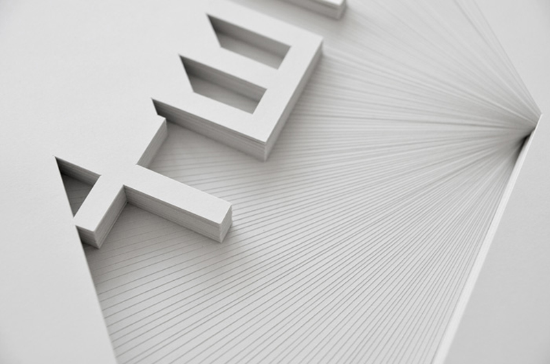
Simple, but beautiful paper sculptures by Bianca Chang, Sydney based designer and paper artist. She describes her work as being –
“Inspired by the subtlety of tone on tone signage and the shadow-play of 3 dimensional letterforms. Recreating this effect with paper – a material so beautifully tactile and simple yet often mindlessly discarded.”
As part of the Paper Convention it’s not just about pretty shapes though. She explains it best on her website as –
“minimizing the impact of paper consumption and consciously transforming a typically disposable medium into a long term piece of art. “
However green (or not..) you are, I think it’s the best use for a piece of paper I’ve seen in a while..
See more of her work here www.biancachang.com
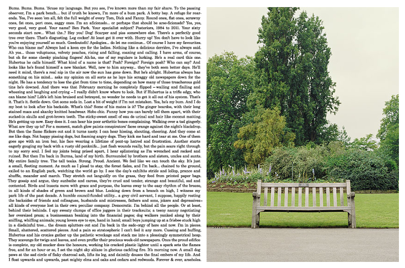
Tongue in cheek campaign for Photographer Paul Thompson. With each promotional piece consisting of exactly 1,000 words describing a different work from his portfolio it’s a bit of light play, and also doesn’t look too bad. Written by by Ben Casey and Lionel Hatch of The Chase, alongside guest writers Nick Asbury of Asbury & Asbury and Jim Davies of Total Content each gives a little personality to the pieces, with my favourite being Jim Davies’ description of a photo of a “slightly forlorn-looking” park bench.
Here he explains his choice on Creative Review
“… It struck me that this park bench must have witnessed all kinds of things, if only it could articulate them. “So I gave it a slightly curmudgeonly voice and set about telling a kind of first-person day in the life, which gradually spirals out of control. The Chase then set the words beautifully to the shape of the picture. The results not only look rather fine, but gently subvert the idea of a photographer’s mailer.”
You can see the pieces from this exhibition, along with other projects on his website here -www.paulthompsonstudio.com
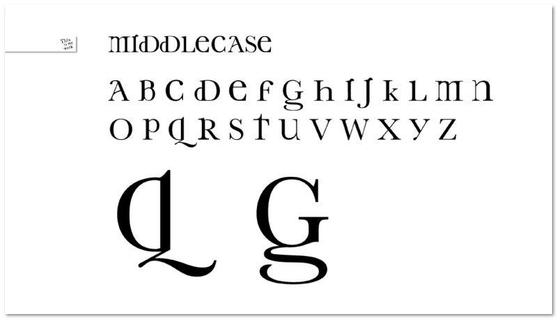
As is usually the way, personal sites tend to get a little left behind in priority lists.. However, I’ve finally got round to updating my This Is My Work site again with a selection of photography and other non-commercial projects. The project shown above is a work in progress typeface called Middlecase. It attempts to bring some of the character and personality often found in lower case characters into their upper case counterparts. The version shown above is complete and fully functional, so if you’d like to have a play with it you can test it out on my main website here.
You can click here to visit www.thisismywork.co.uk.
Also, if you’d like a copy of Middlecase leave a comment below including your email in the appropriate box (it won’t show up in the comment, but I’ll see it) and make sure to mention if you need it for Mac or PC.


Designed in keeping with her printed material (the name in Helvetica Neue 45 Light) I wanted to counter balance that rigidity with something a little softer. Using italicised Baskerville MT the identity aims to reflect the industry, who have a tradition of using established serif fonts, and to draw focus to the ampersand, which was used to highlight her initials (as & is a ligature of the latin et). This mark can also be carried through into places where a full logo isn’t practical (favicons, image watermarks etc) to maintain consistency.
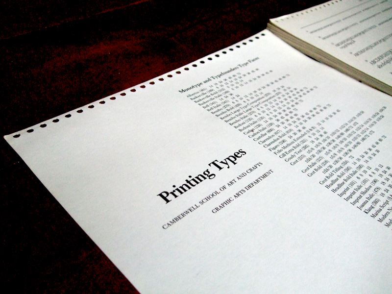
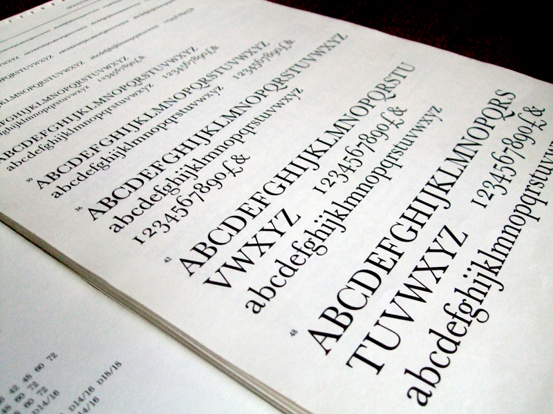
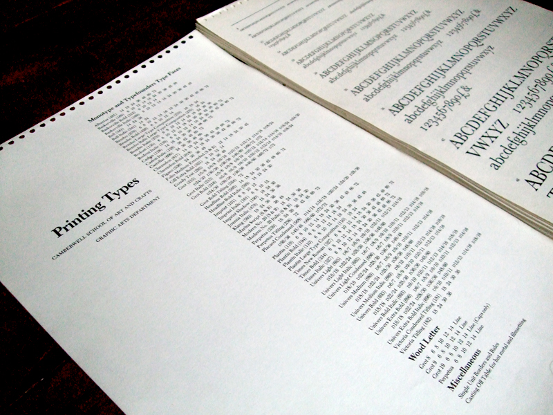
For my sixth ‘Type I Like’ I decided to opt for a choice a little closer to home, the ‘Printing Types’ manual I inherited from an old tutor at Camberwell. Although without a cover, and by now pretty tatty, whenever I want to remind myself of all of the classic typefaces I appreciate (or have forgotten to appreciate for a while..) I flick through the pages. Its a compendium of beautifully laid out type. No images, no context or usage, just the typefaces in various weights and sizes. I’d recommend anyone with an appreciation for typography gets hold of one of these.
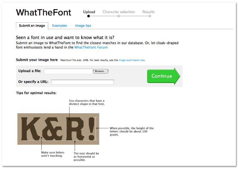
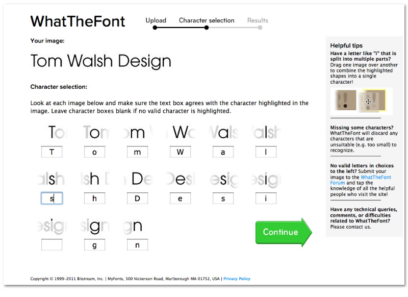
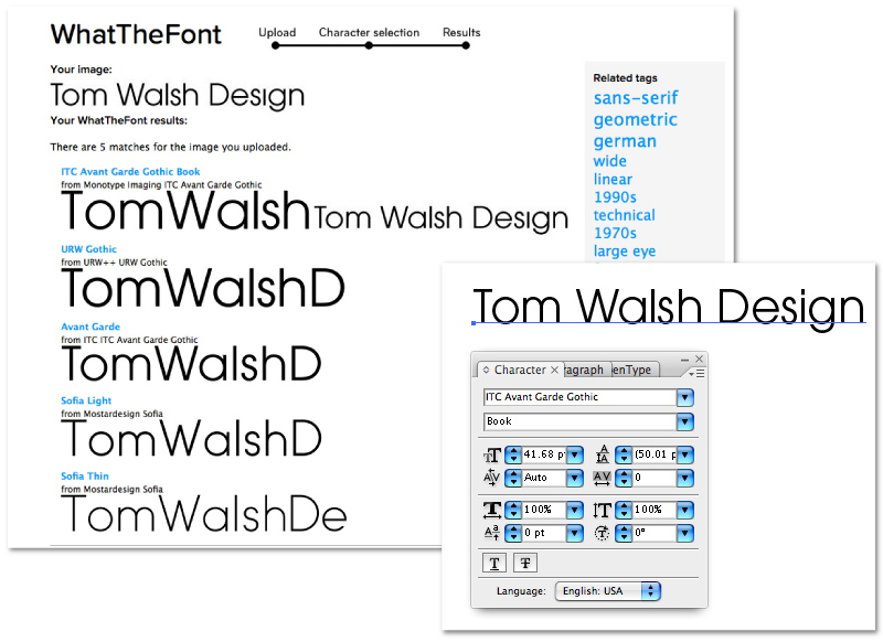
Some of you may already be aware of this handy little tool (as its been around for a while) but I decided to write a post on it as it never ceases to surprise me with its accuracy. Recently I was working on a project where I was sent an existing design that needed a quick edit, but with only a jpeg to work from I couldn’t be totally sure what font had been used for the titles, which is where What The Font! comes in. You just crop out a section of the text you need to identify the font from, upload it (see above) and voila! It returns a selection of options based on analysis of each character. In the example here I’ve used my logo, and as you can see from the final image it returned the perfect match straight away! Also, if you’re not happy with any of the matches it offers, there’s a well maintained forum full of type-geeks to offer their suggestions, and not forgetting the iPhone App for those font queries when you’re out and about…
If you have a font you can’t identify, or just fancy testing it out, you can visit the site here.

