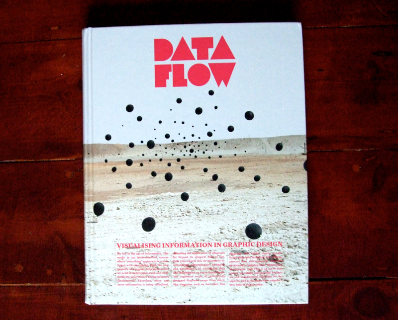
Although the book itself is more focused on visual, rather than typographic, representations of information, I couldn’t help but appreciate the cover. The block fluorescent characters, which remind me a little of non-formats work, stand out perfectly against the background landscape.
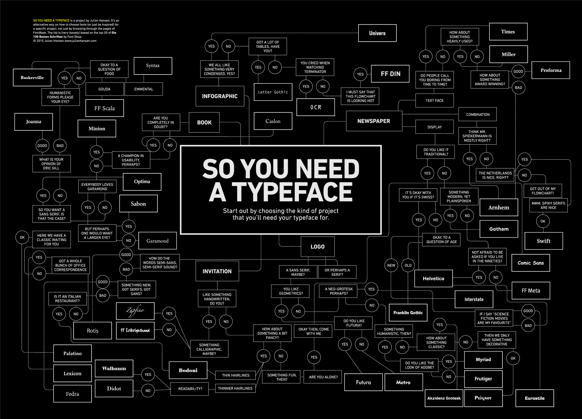 This project by Julian Hansen is a nice little guide on how to choose the right font for the right project. Loosely based on the top 50 of Die 100 Besten Schriften by Font Shop it takes the pain out of picking that perfect typeface and looks quite nice at the same time!
Click here to view it in full size, or here to visit his site.
My first moving image ‘Type I Like’ entry had to go to the Alien title sequence. The simplicity and balance as each line appears before gradually forming into the films title makes it as nice to look at as it is timeless.
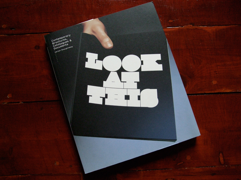
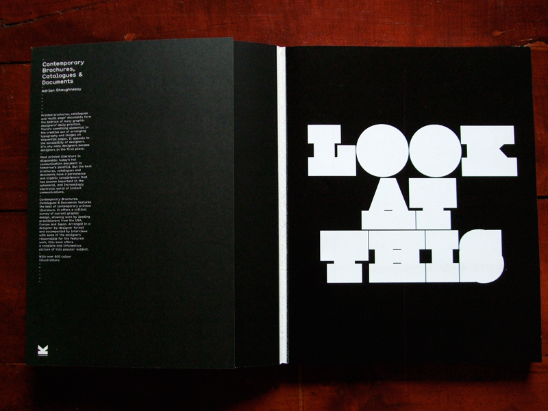
For ‘Type I Like #3′ I chose the cover of ‘Look At This’, unmistakably the work of Non-Format it’s blocky, heavy but perfectly formed.
You can see more examples of their work here – www.non-format.com
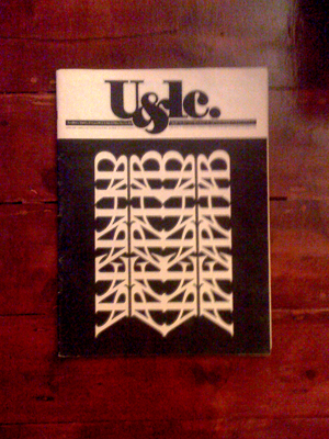 Here’s a lovely cover for ITC’s U&LC journal, March 1983. One of my all time type favourites. Designed by Bob Farber using reflected characters of ITC Benguiat it may not be legible, but it is nice to look at!
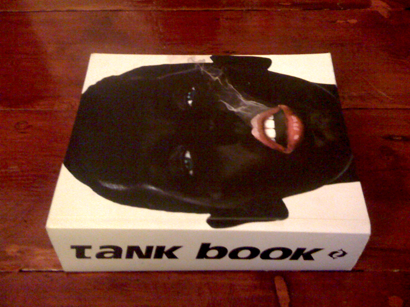
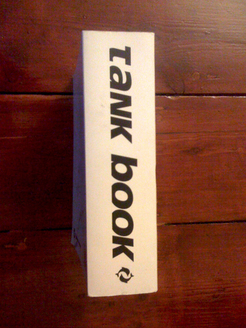
Fairly old, but still good. The Tank Book’s cut off titles give each character a different feel, which I think makes it worth a mention!
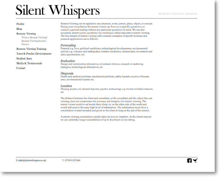
If you saw my post on the identity I designed for Silent Whispers you’ll already know a little on the background of this project. The website was quite a challenge as a majority of the pages were text heavy, with generally no real hierarchy between blocks of information. To avoid the pages blurring into each other I opted for a flexible grid of nine blocks, where depending on the amount of text on each page the columns could be adapted. The result is a slightly different, but still cohesive, feel to each page. The in-built blog followed suit, and was stripped back to a clean, typographic design where information takes precedence over image.
You can see the site here
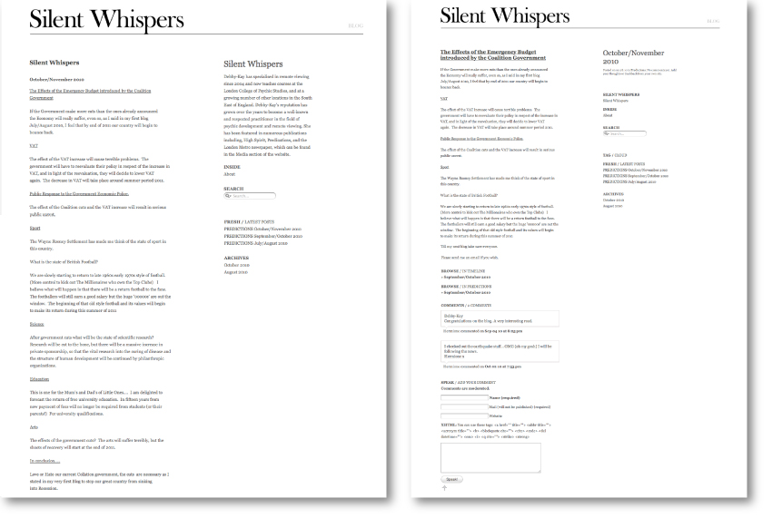
Or click here to see all of my work for Silent Whispers

We’ve just started work on the L.K.Bennett iPhone App, and as the existing logo is quite wide I thought I’d design a slimmer version that would be better suited to the screens aspect. It started with efforts at slimming characters and kerning, but after a while of playing I realised that wasn’t going to work. So I decided to cut it down to just the L.K.B, but as far as App branding goes it was a little too obscure.. Following a few chats it was agreed that ‘fashion’ would be added, and after a bit of thinking/playing with it I realised that positioned correctly, and with a few tweaks, the top curl of the ‘f’ and the dot of the ‘i’ could make up the dots from L.K.B, and the logo (which in the end wasn’t used, but I still like..) turned out quite well.
You can also see it being used in earlier versions of the intro animation in my post on the ones that didn’t make the cut here.

