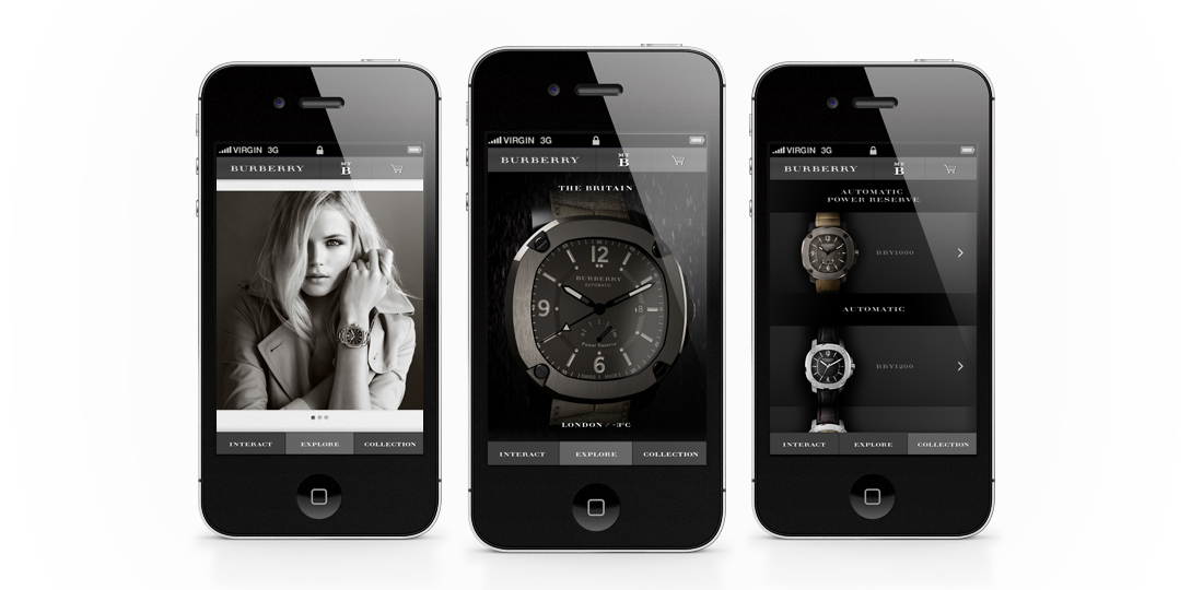
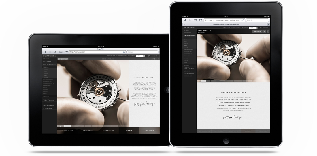
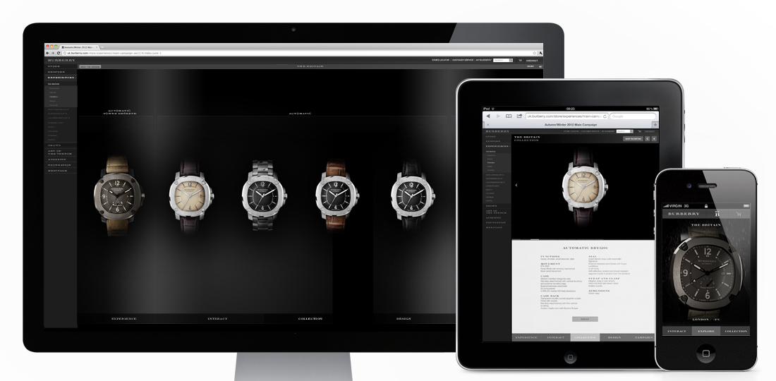
Introducing The Britain (to quote the campaign..), the first multi-platform ‘experience’ I’ve designed while freelancing at Burberry! Designed as a form of micro-site within the main Burberry.com site, it’s purpose is to promote their new range of watches. With mobile and tablet visitors to the site increasing daily it was a necessity for it to work across all devices, and I think the result does that pretty well! It has a separate mobile version, with a crystallisation of content (as well as some nice mobile specific features), and a responsive version for desktop and both tablet aspects. Some nifty (or “whizzy”, as The Guardian called them…) features include a real time and real weather watch on mobile, and 360 rotatable and exploding 3D versions of the hero watch on desktop/tablet.
You can take a look and have a play here – uk.burberry.com
Designed while working for: Burberry
Creative direction: Marga Arrom Bibiloni & Chester Chipperfield
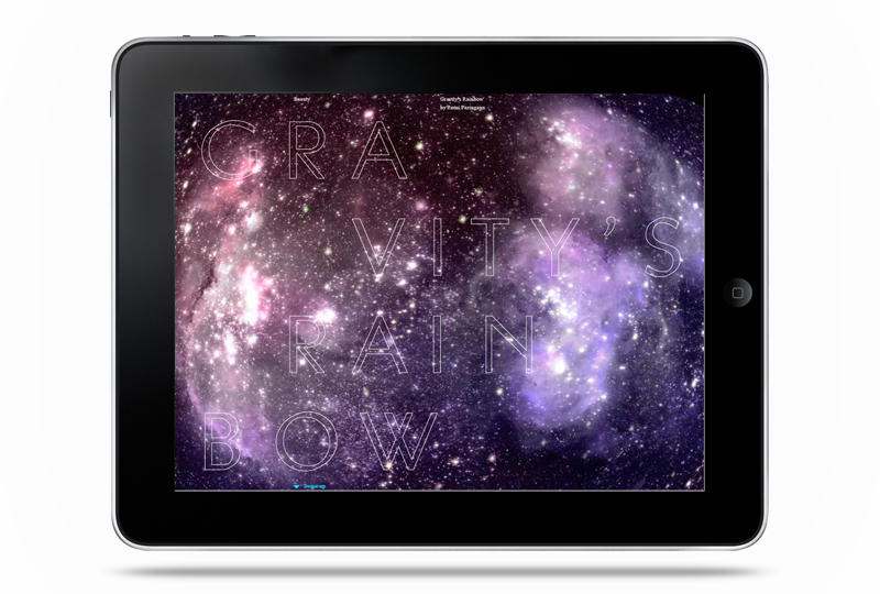
Interesting second issue of POST’s iPad magazine. I’m not totally sold on the design of the copy sections, but some nice ideas throughout. They describe it on iTunes as –
“…an extra-terrestrial exploration of the ways in which humanity has sought to transcend this invisible force that binds all of life. Pushing the boundaries of what can be achieved on the iPad, POST Gravity opens with a groundbreaking, interactive 3D fashion story powered by infra-red technology in which users can distort, bend and flip the dimensions of model Iselin Steiro.”
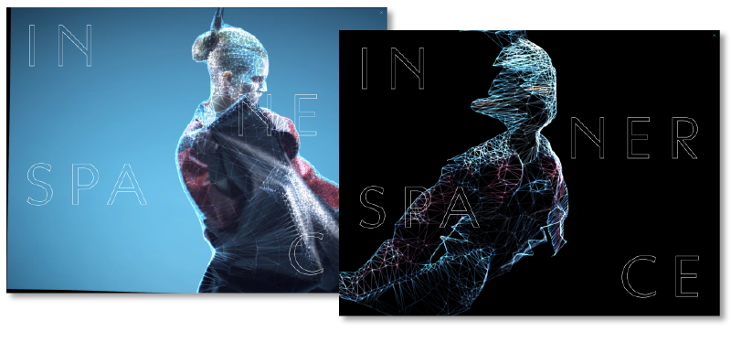
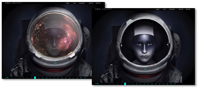
I especially like the interactive beauty shoot, with the twinkling galaxy reflecting off the visors, which through hiding the product from initial view built a nice intrigue before the user unveils them. Other nice features are the interactive 3D models in the ‘Inner Space’ Shoot, as well as the skydiving models in the ‘The Man Who Fell To Earth’ shoot. Overall some really nice concepts, and all pretty slickly executed. I look forward to seeing what they come up with in their next edition!
You can download it on iTunes here – itunes.apple.com/app/post-gravity/

Some nice UX from the BBC with their new BBC iPlayer Radio App. Using the dial at the base of the page you can now scroll through stations with your thumb and tap to choose. Simple, but very nice and smooth to use. There are some other handy features too, like setting an alarm so your favourite show wakes you up, on demand shows from the past seven days and the ability to stream through AirPlay. It’s a pity they didn’t carry the design through to their iPad counterpart, but still a good addition on mobile.
You can download it from iTunes here – https://itunes.apple.com/gb/app/iplayer-radio/id560458506?mt=8
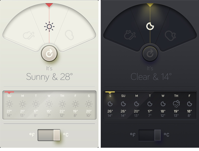
When it comes to iPhone apps ones for weather reporting must be up there with transport apps. My main issue with most of them, however, is the amount of information they try to pack in often makes them confusing and cluttered. This is where WTHR by David Elgena steps in. Designed and inspired using Dieter Rams’ ten principles of “good design” it tells you what you need to know, and in the simplest way. It’s clean, tactile feel supported by simple iconography make it a pleasure to use, and they’ve even thrown a nice ‘night’ version to boot.
You can download the App here
Or see more of David Elgena’s work on his site here – www.DavidElgena.com
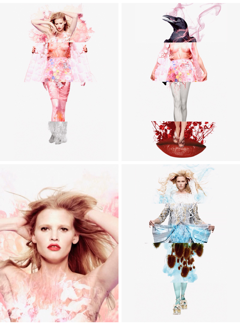
Beautiful iPad app by Spring Creative for fashion photographer Sølve Sundsbø. Conceived by Sundsbø and styled by Marie Chaix, it plays on the old mix and match body parts concept. As you swipe through you can create your own combination of the video assets as well as moving and expanding each element, which in itself is a lot of fun to play with, but you can also tilt and the accelerometer angles the image depending on your tilt. The first time I played with it I had my sound turned off and I still enjoyed it, just for the pure aesthetic of the app, but with sound on it transforms into a different experience. The two bespoke tracks mixed by James Lavelle also react to tilt, so as you tilt it the ethereal track slows down and warps with your movement.
For the purists who think all apps need to serve a purpose I’m not sure how useful it is, I don’t think it was ever intended to be, but for something to enjoy looking at and playing with I’d recommend it to anyone. Also, it’s free. So you’ve got nothing to lose!
If you’d like to have a play you can download the app from the iTunes store here
And you can see more of Spring Creative or Sølve Sundsbø’s work here:
www.springstudios.com/springcreative
www.solvesundsbo.info
It was only a matter of time before print started to ‘go digital’, and I’m not talking QR codes… With Layar’s offering of augmented reality you can use an app with your printed material (I know, still a bit clumsy, but you need a screen somewhere) and various triggers within the print allow you to interact with it. Whether its additional content, like clicking the ‘red button’ with tv, or just the ability to ‘Like’ something it does pull up some interesting questions about the future of print. Will the only way we read something be if we can interact with it? Maybe, but in contrast to Kindles and the like, at least this is trying to combine the two, rather than wipe the other out…
If you want to know a bit more about what they’re doing with print & AR have a read on their site here
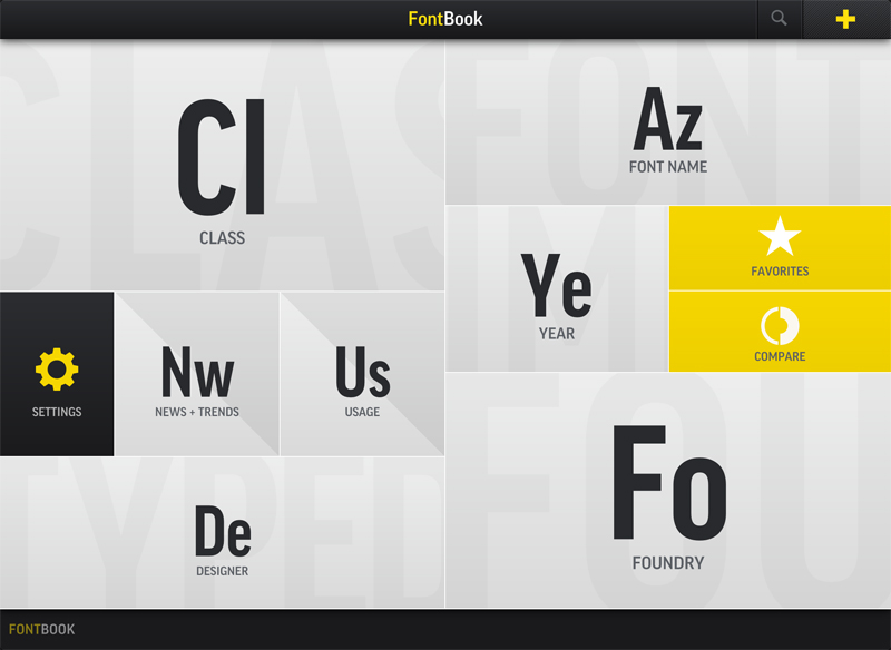
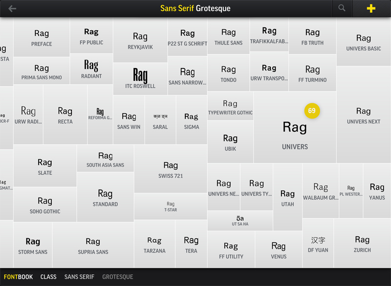
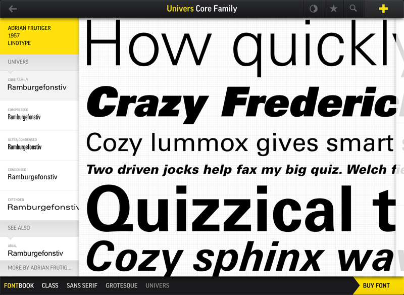
Described by Fontbook as –
“If typography were a religion, this would be the Bible. FontBook is the world’s most comprehensive typographic reference tool, containing 110 type foundries and featuring over 620,000 typeface specimens.”
A bold statement, but one their iPad app doesn’t fall short on. Its a great (and lovely looking) app that delivers on design, usability and content. If you’re just looking for inspiration you can browse by style, alphabetically, foundry, year and more. Meaning however vague an idea you may have of the font you’re looking for you’ve got plenty of angles to approach from to narrow it down. The most useful tool I’ve found, however, is the ‘Compare’ function. Perfect for when you (or a client) can’t decide between a selection of fonts. You can test them out using different copy, and glide between them to make your decision. Much easier than running up a comparison sheet in Illustrator, and a bit more fun too…
You can read more reviews, and download the app from the iTunes store here
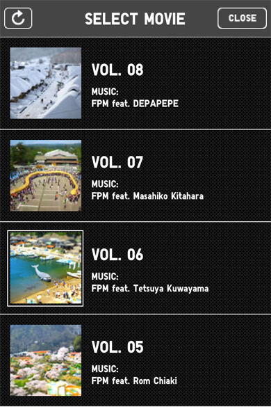
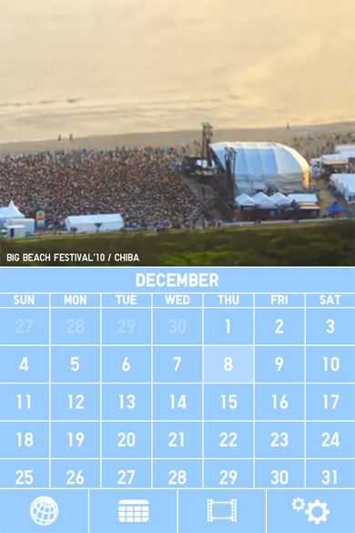
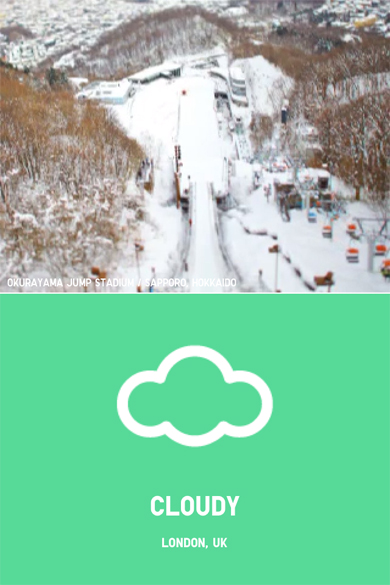
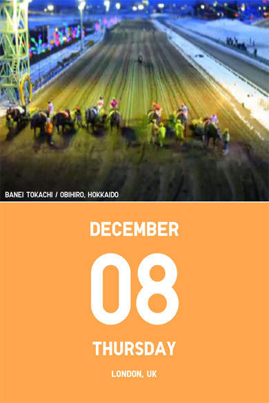
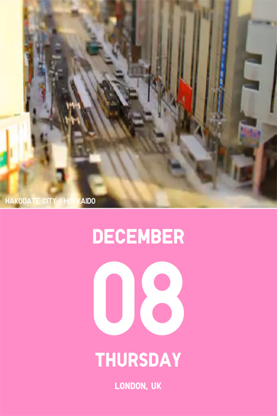
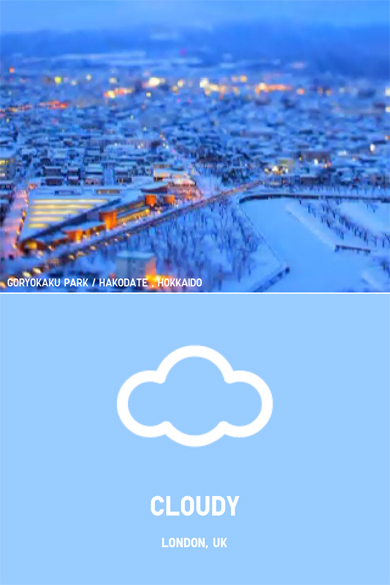
I’ve had this App for a little while now, but it was only the other morning when someone asked me what the best looking App I had was that I really thought about it. Although it’s a simple weather and calendar App, by using a selection of time-lapse, tilt-shift videos it manages to keep me engaged long after I’ve found out the days forecast. You can sync it to your Google calendars and store your location so it keeps itself up to date, and with simple iconography and Uniqlo’s trademark colour usage (see their ‘Color Tweet’ project here) I think for what may not be the most useful App you could own, it will always be a staple on my home screen.
You can download it here


