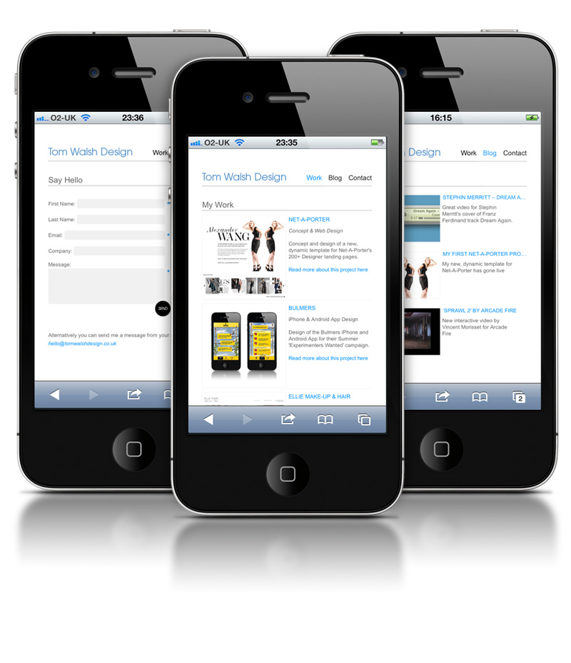
 So, I finally got round to making a Mobile optimised version of my site, and it’s now live! It features recent projects, blog posts, tweets and a handy contact form. If you’re reading this on your phone you can take a look here.
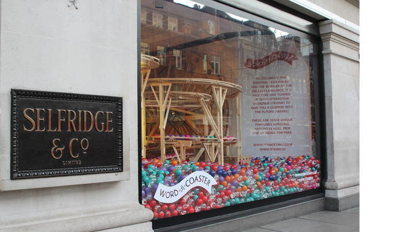
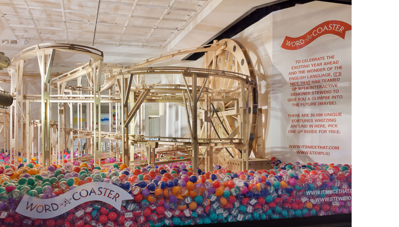 Selfridges new store wide initiative is an homage to Words! With the likes of Faber Publishing and The Idler Academy providing talks and poetry readings, as well as handwriting analysis (which I’m especially interested in, as mines terrible) it looks like they’ve got it pretty well covered. As always though, what I’m most interested in is the window displays, this time provided by the clever people at It’s Nice That. I have to say that I’m not as keen on the supporting windows, but I think the main display is a really nice idea. Shown above, it brings a playfulness to what could otherwise be seen as quite a boring subject by many. It’s Nice That explain it like this:
“For the showpiece corner window of Oxford Street and Orchard Street, we have collaborated with interactive designer Stewdio to create ‘The Word-A-Coaster’ a playful fortune telling machine. The 14 foot high hand-built wooden rollercoaster (constructed by model makers Atom) is surrounded by a sea of 30,000 brightly coloured balls filled with 30,000 unique fortunes that can be picked up in store for free.
Inside the balls, shoppers will find a small card emblazoned with a uniquely numbered adjective, generated by a clever computer programme that leaves each individual with their own personal, playful prediction for 2012.”
For a full itinerary of talks and events take a look on the Selfridges site here
Great little video for Stephin Merritt’s cover of Franz Ferdinand track Dream Again. Directed by Russell Weekes it sees various audio related objects and controls become faces singing the track. Nice idea, really nicely done.
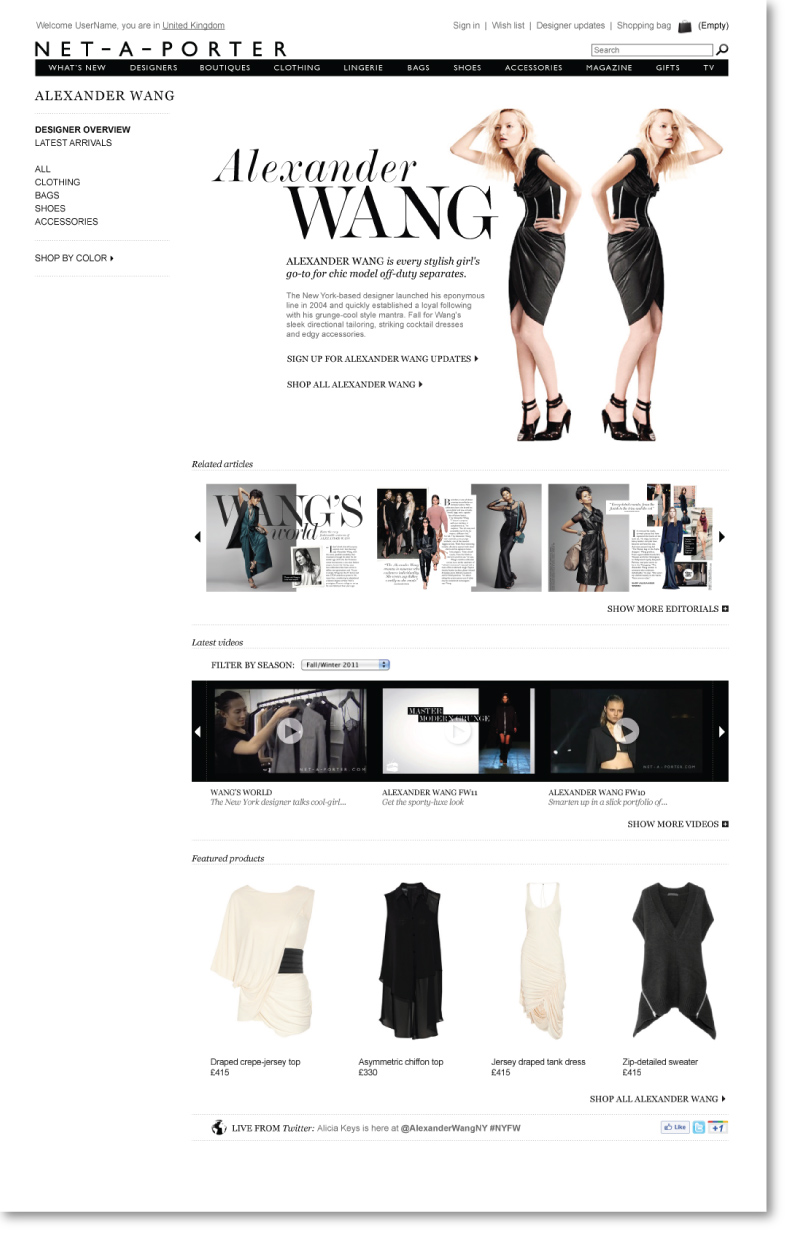
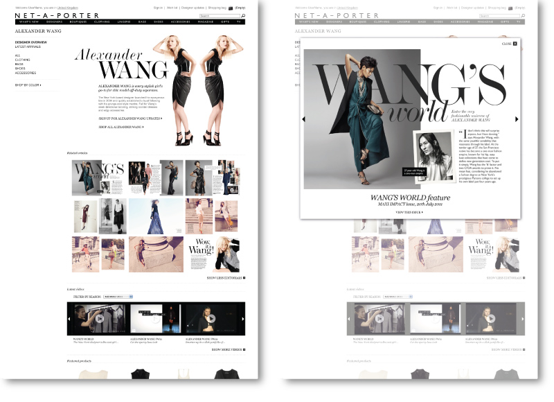 With over 200 brands on their site one of the first projects I was given at Net-A-Porter was to design a new template to be used on all of their designer’s landing pages. With the old process of updating these pages taking around two weeks each season I decided on a more dynamic approach. The template I designed starts with a header section, which only needs to contain the most basic information (the brands name and a couple of lines about them), which if that’s all that’s available is what the user would see. As the brand grows within Net-A-Porter the page then becomes more populated. Initially this would mean as product appears on the site the product carousel would display, then as videos on Net-A-Porter TV are uploaded with the brand tagged in them they would begin to show, and like-wise with editorial content. With this system the pages are constantly updating themselves with relevant content from around the site, meaning for a larger brand their landing page may look different from one day (or even hour) to the next, and for smaller/newer brands nobody needs to worry about adding content in, when the contents available the relevant module will appear displaying it.
To see more of my work while I was there keep checking back, as my other projects go live I’ll be writing posts on those too.
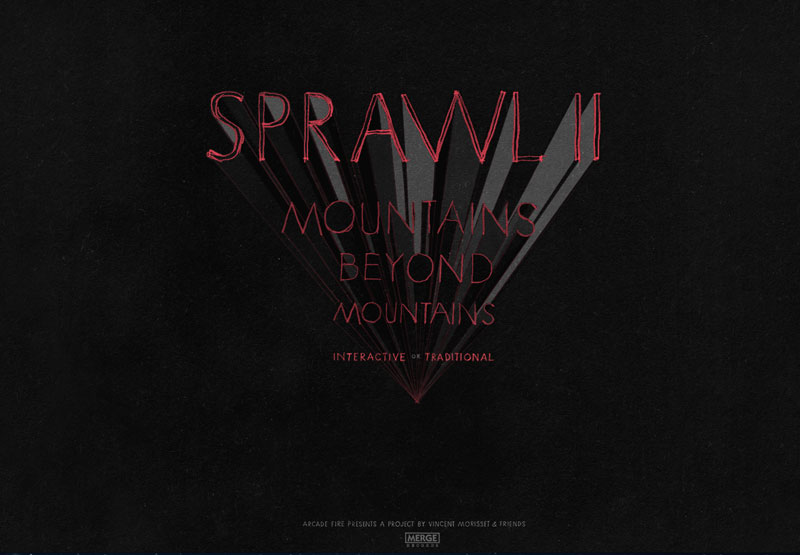
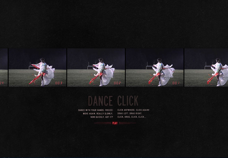
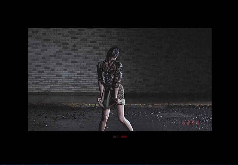 Following on from the success of their ‘The Wilderness Downtown’ interactive video Arcade Fire have teamed up with Vincent Morisset to create a new site promoting their track Sprawl II (Mountains Beyond Mountains). As the video plays the user can either interact with it by dancing in front of their webcam (well, waving at least…) or by clicking and dragging with their mouse. With some dancing perfectly choreographed for the project you can have a lot of fun dragging the video around and clicking the dancers into a jolting stand still.
Have a play here
And be sure to check out more of Vincent Morisset’s projects on his site here (I especially like ‘Neon Bible’, also for Arcade Fire)
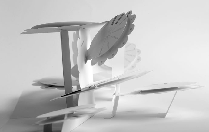
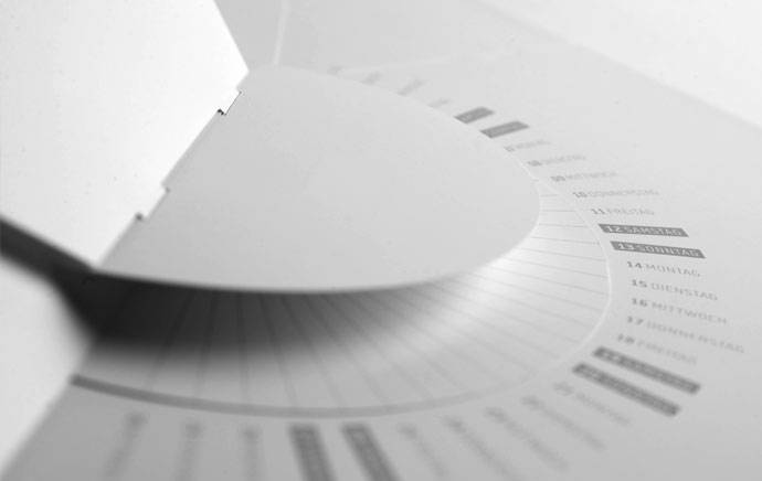
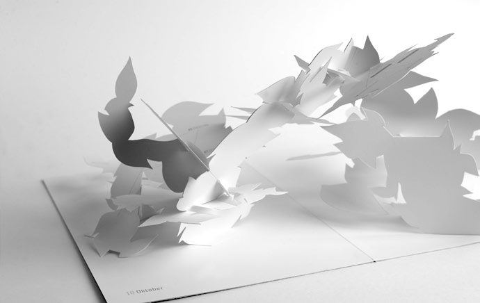
Beautifully intricate pop-up calendar by Johann Volkmer. Unfortunately all of the information I’ve managed to find on this project is in German (which I don’t speak) so I can’t tell you much as far as the concept goes, but just in case anyone reading this does, here’s his description of the project –
“Faltjahr 2010, kein Jahresplaner und auch kein Kalender im üblichen Sinne, vielmehr zwölf DIN-A4-formatige, im aufgeklappten Zustand DIN-A3-große, aufwändig als Wandskulpturen gefertigte, Pop-up-Objekte.
Jedes Monatsmotiv -als Einzelstück aufgehängt- ein ungewöhnlicher Hingucker zur anspruchs-
vollen Raumgestaltung.
Monochrom weißes Papier in schlichter Eleganz bringt Monatsthemen in reduzierter Form zum Ausdruck. Das Faltjahr 2010 zeigt, wozu Papier fähig ist.”
You can view the full project’s website here (also in German…) – faltjahr2010.de
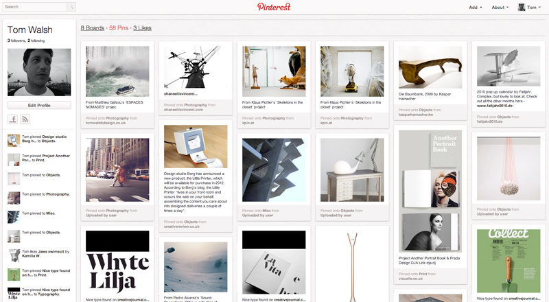
I’ve been on here for a little while, but only just got round to giving it a mention… Pinterest is a kind of online scrapbook, where if you see something you like you click on their ‘Pin it’ button in your bookmark bar (a little like an add on in Firefox or an extension in Chrome) and it saves the image into the chosen folder on your pinboard. It’s pretty simple, but a handy idea when it comes to storing imagery. I’m sure different people use it different ways, but for me it’s just an easy way to store inspiration from the web, which I can access anywhere either online or through the app.
In their words (a little more American than my description…) – “Pinterest lets you organize and share all the things you find on the web… Best of all, you can browse pinboards created by other people. Browsing pinboards is a fun way to discover new things and get inspiration from people who share your interests. “
Take a look for yourself here – pinterest.com
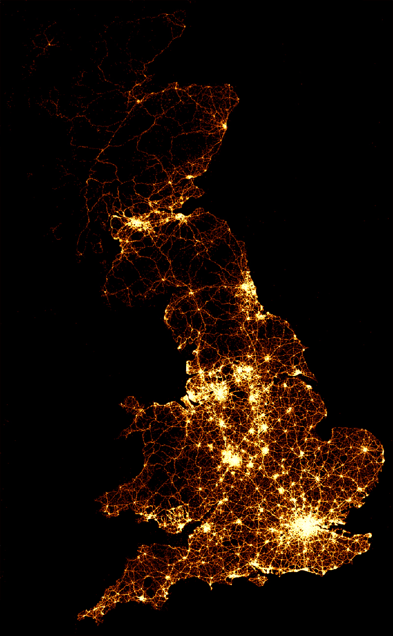
A visually impacting way to display road accident casualty data by the BBC. Although over a long period of time, it’s still quite shocking (especially watching the video) to see just how many road traffic accident deaths there are. It’s also quite easy to forget what each light represents as you watch them scattered across the maps.
They described the static image (shown above) as –
“The image below (above) shows the location of 2,396,750 road crashes in Great Britain from 1999 to 2010. Each light point is an individual collision which resulted in a casualty. The intensity of brightness shows where collisions are more frequent.”
You can watch the videos here – bbc.co.uk/news/uk-15975724
A lovely little creation by BERG, the ‘Little Printer’ will effectively be your very own personal PA. By scouring the web, and other sources available from your phone, it then gives you a bite-size summation each day that they describe as a ‘mini newspaper’. Conveniently this ‘mini newspaper’ is the perfect size to use as a bookmark, slip into your wallet or stick on the fridge, so each morning you can take it with you to enjoy whenever and wherever you fancy!
In Berg’s own words – “Little Printer lives in your front room and scours the Web on your behalf, assembling the content you care about into designed deliveries a couple of times a day.”
It’s a pity its not available until next year, otherwise it would definitely be on my Christmas list!
You can read more about the ‘Little Printer’ as well as their other projects on their site – bergcloud.com/
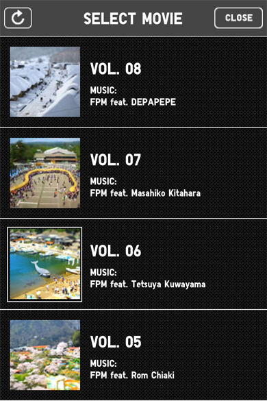
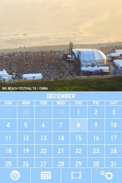
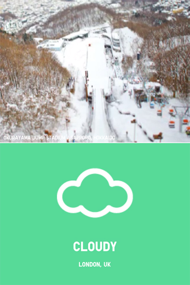
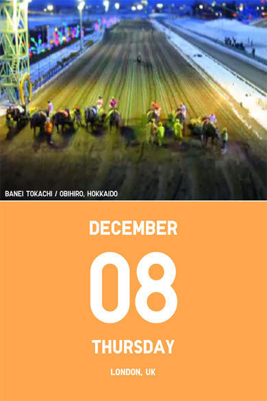
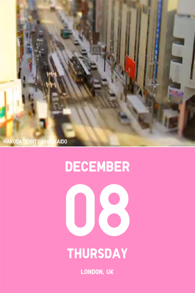
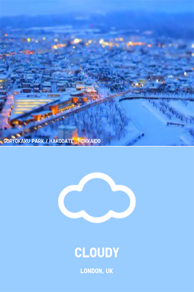
I’ve had this App for a little while now, but it was only the other morning when someone asked me what the best looking App I had was that I really thought about it. Although it’s a simple weather and calendar App, by using a selection of time-lapse, tilt-shift videos it manages to keep me engaged long after I’ve found out the days forecast. You can sync it to your Google calendars and store your location so it keeps itself up to date, and with simple iconography and Uniqlo’s trademark colour usage (see their ‘Color Tweet’ project here) I think for what may not be the most useful App you could own, it will always be a staple on my home screen.
You can download it here

