A lovely example of HTML5 that I’ve recently come across is the Nike ‘Better World’ micro-site. As one long stack of imagery
it glides down through various blocks of messaging with HTML layered images, and as an extra touch it also uses Fontdeck to
ensure the correct font is displayed.
The site, as the name suggests, is about Nike’s green side and promoting sport to help make the world a better place. With facts
and information like this –
If you have a torso, you’re an athlete.
In 2007, South African sprinter Oscar Pistorius ran the 100 meters in 10.91 seconds. Without any legs. The first amputee to break
the sub-11-seconds barrier. Some critics claim that the carbon fiber blades he ran on gave him an unfair advantage. Those critics
had legs.
it takes you though its various efforts to give a little back to the world, along with stories of how sport (well, mainly football) has
helped bring peace in various global situations. Finishing rather nicely with the message -You’ve scrolled 13,980 pixels toward a
Better World. (with the number changing depending on how far down you’ve scrolled).
You can view it here
Having freelanced on and off in ecommerce throughout my career I’ve been made very aware of the importance some people/companies put on the fold. For their purposes I can half appreciate why, as if someone can’t see product, they can’t buy it. However, I’m a firm believer in the users understanding of web environments. If there’s a scroll bar, people will generally scroll (assuming they’ve chosen to visit the page in question), which is why I love this simple page. Three messages, with around 300+ horizontal pixels separating them, I think it gets the message across quite succinctly (even if it’s typographically pretty poor..).
Have a scroll here
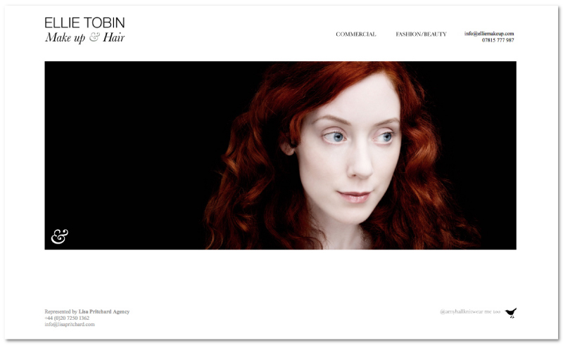
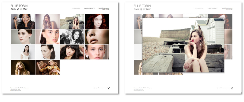
I’ve just uploaded the new site for Ellie Tobin Make Up & Hair. Built with a PHP back end to make it easy for her to update, and a Javascript front end using jquery fancybox it’s gallery based and focuses on what’s most important for this site, the imagery. The brief was to keep it clean and simple, and with the help of her imagery I think it turned out quite nice.
Watch the video below to see what you think, or click here to visit the website.
You can also click here to view the full project in my main site.
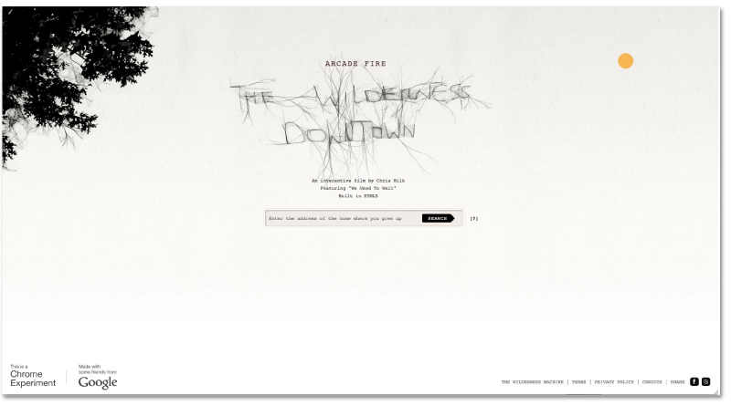
With HTML5 quickly becoming the build language of choice it wasn’t going to be long before we saw it cropping up used in a music video. Although this has been around for a while I still love to go back and have a play with it, always using different address’ though for a bit of variety. Using Google Street View it takes familiar scenes from your childhood and puts them into the video, creating a personalised experience for everyone that views it. It looks quite nice too.
Have a go yourself here – www.thewildernessdowntown.com
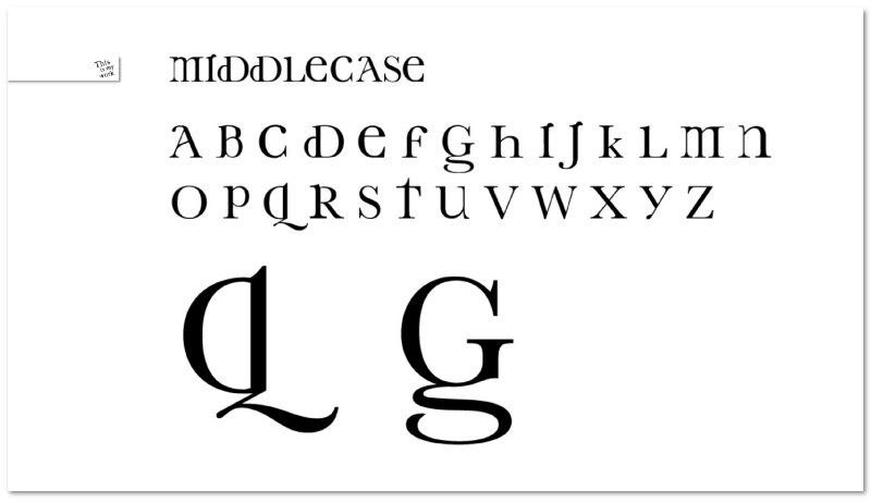
As is usually the way, personal sites tend to get a little left behind in priority lists.. However, I’ve finally got round to updating my This Is My Work site again with a selection of photography and other non-commercial projects. The project shown above is a work in progress typeface called Middlecase. It attempts to bring some of the character and personality often found in lower case characters into their upper case counterparts. The version shown above is complete and fully functional, so if you’d like to have a play with it you can test it out on my main website here.
You can click here to visit www.thisismywork.co.uk.
Also, if you’d like a copy of Middlecase leave a comment below including your email in the appropriate box (it won’t show up in the comment, but I’ll see it) and make sure to mention if you need it for Mac or PC.

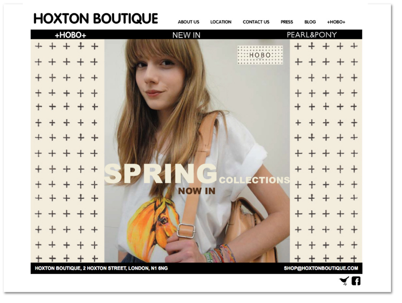
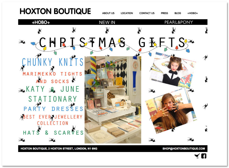
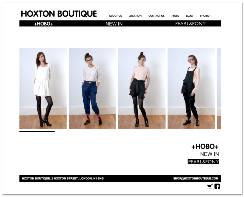
I’ve just finished adding some Spring/Summer touches to the Hoxton Boutique website, no drastic changes this time, but it certainly feels a bit lighter and brighter now.
Take a look here
Or click here to see all of my work for Hoxton Boutique
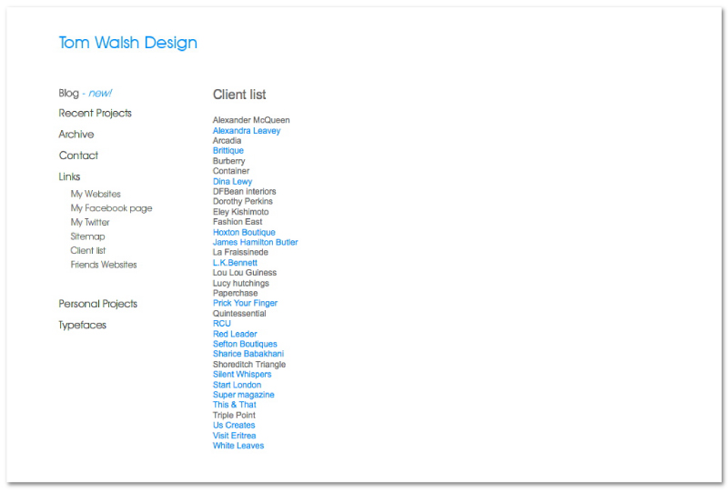
I’ve finally got round to adding a ‘Clients’ page to my site, so now older projects that may not necessarily be included in the navigation can still be found, and people can have a quick browse through the sort of people I’ve previously worked for. A quick addition, but hopefully of some use. Next up my new ‘Photography’ gallery…
As part of the launch of their SS11 campaign I was asked to produce a Flash brochure to go in L.K.Bennett’s new micro-site. Its a simple addition that uses XML to pull in the individual pages and reflects the usability of the printed version.
You can see the full micro-site here
Or click here to see all of my work for L.K.Bennett
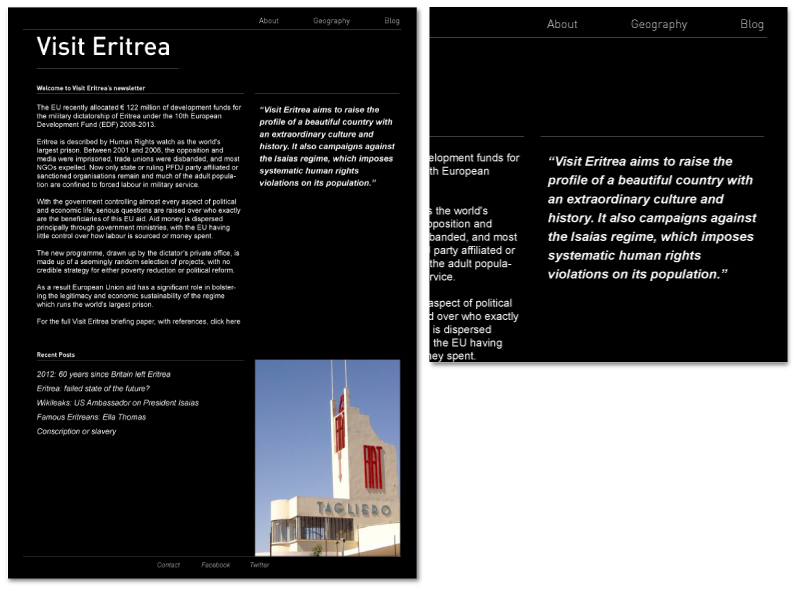
I’ve just had sign off on the design of the new Visit Eritrea HTML email template. Simple and easy for them to work with it’s designed to promote the key stories from their blog while maintaining the branding of the website. If you’d like to receive updates from them you can go here to sign up!
Or click here to see all of my work for Visit Eritrea

