Whiling away an hour or so on Youtube over the weekend Nike’s ‘Tag’ ad came up in the side bar and reminded me how much I liked it. I’m not sure I ever saw it on TV, I think it came on one of Creative Reviews annual round up DVDs (?), but it’s still one of my favourite adverts of all time. When I was looking for a decent quality version to add into the post I also came across a version with alternate music, which made me appreciate how well suited the final soundtrack was…
For good measure I’ve also added in their ‘What if we treated all atheletes like skateboarders’ advert. Not as memorable as Tag, but well worth a mention.
Emilio Gomariz’s experiments with the Adobe Illustrator professional work space. Looks great, but I bet it took a while to set up!
You can see all of his other experiments on his site here
No matter how much the sceptics go on about BA jumping on the Olympic bandwagon (despite them being sponsors), Terminal 5 losing luggage or Jim Rosenthal being a football/F1 commentator, I like this ad. It’s fun, engaging and the next time it comes on I’ll happily watch it again. I can’t say the same for most of the ads out there…
Beautiful project by Bartholomäus Traubeck. Using a modified turntable he’s converted the data from the rings found in slices of trees into piano music. It sounds pretty nice too!
I’ll leave explaining the technical side to him-
“A tree’s year rings are analysed for their strength, thickness and rate of growth. This data serves as basis for a generative process that outputs piano music. It is mapped to a scale which is again defined by the overall appearance of the wood (ranging from dark to light and from strong texture to light texture). The foundation for the music is certainly found in the defined ruleset of programming and hardware setup, but the data acquired from every tree interprets this ruleset very differently.”
You can see more of his projects on his site here
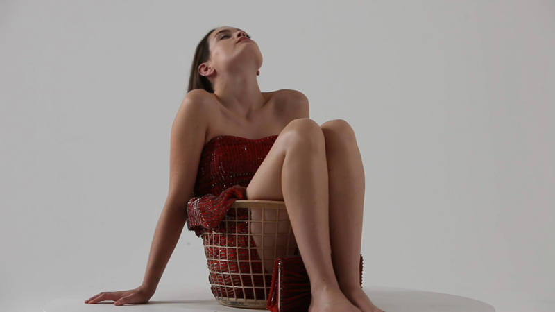
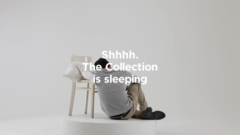
Surreal new campaign by 101 London for French Connections SS12 collection. Following on from last Summer’s ‘I Am The Blouse/Trousers/Coat/Suit’ campaign the latest offerings are equally well shot, with a floaty, dream like feel to them. In total there are going to be 20 released online, but out of the five I’ve seen so far the above is definitely my favourite.
You can see all of the videos on 101 London’s Vimeo here
Great little video for Stephin Merritt’s cover of Franz Ferdinand track Dream Again. Directed by Russell Weekes it sees various audio related objects and controls become faces singing the track. Nice idea, really nicely done.
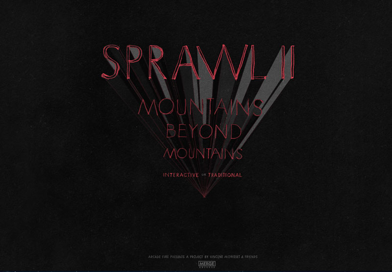
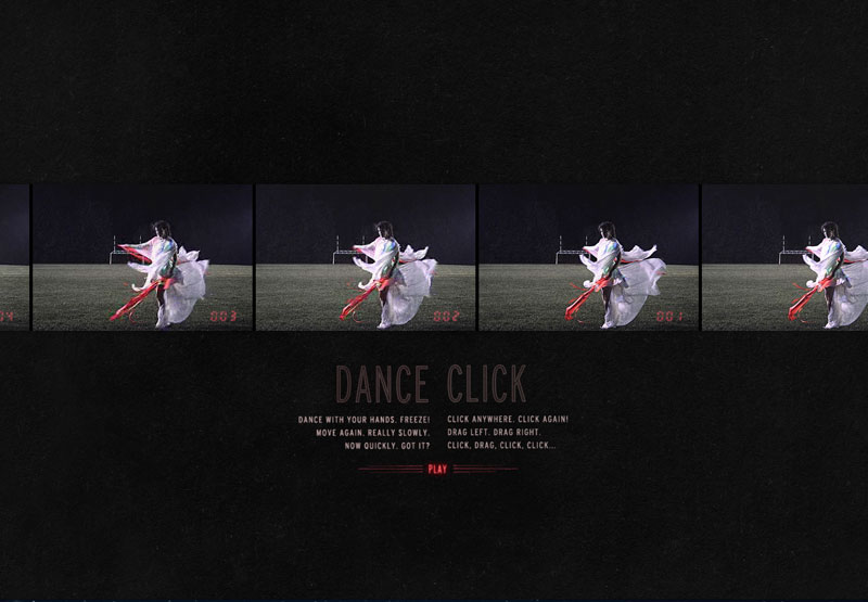
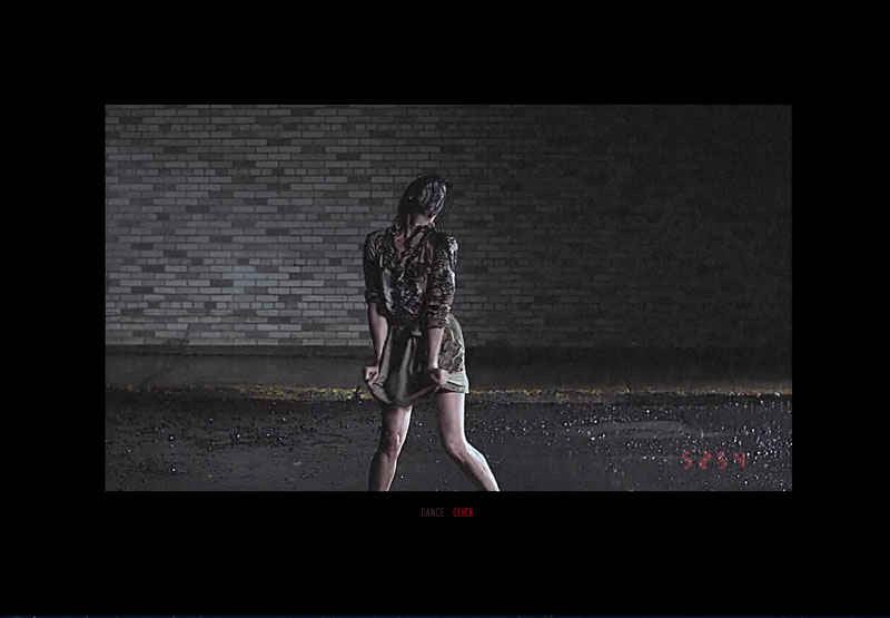 Following on from the success of their ‘The Wilderness Downtown’ interactive video Arcade Fire have teamed up with Vincent Morisset to create a new site promoting their track Sprawl II (Mountains Beyond Mountains). As the video plays the user can either interact with it by dancing in front of their webcam (well, waving at least…) or by clicking and dragging with their mouse. With some dancing perfectly choreographed for the project you can have a lot of fun dragging the video around and clicking the dancers into a jolting stand still.
Have a play here
And be sure to check out more of Vincent Morisset’s projects on his site here (I especially like ‘Neon Bible’, also for Arcade Fire)
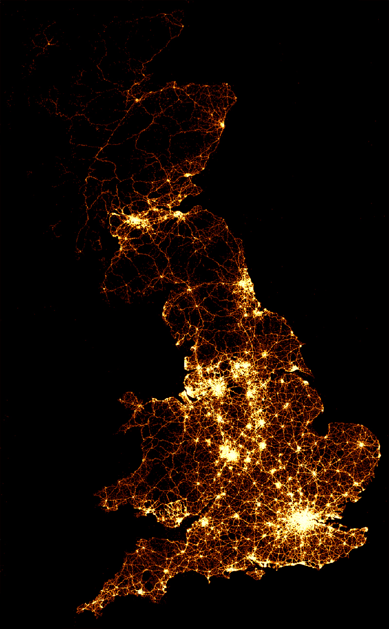
A visually impacting way to display road accident casualty data by the BBC. Although over a long period of time, it’s still quite shocking (especially watching the video) to see just how many road traffic accident deaths there are. It’s also quite easy to forget what each light represents as you watch them scattered across the maps.
They described the static image (shown above) as –
“The image below (above) shows the location of 2,396,750 road crashes in Great Britain from 1999 to 2010. Each light point is an individual collision which resulted in a casualty. The intensity of brightness shows where collisions are more frequent.”
You can watch the videos here – bbc.co.uk/news/uk-15975724
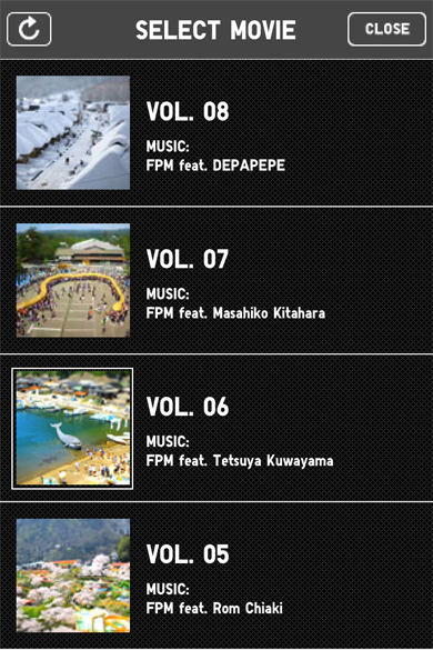
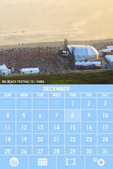
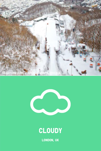
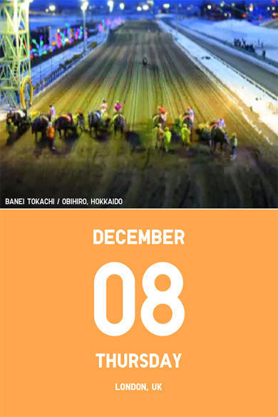
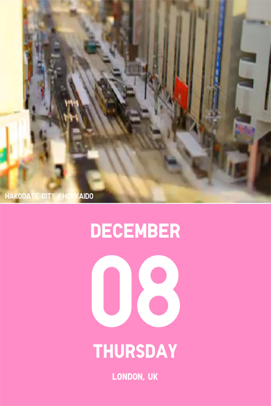
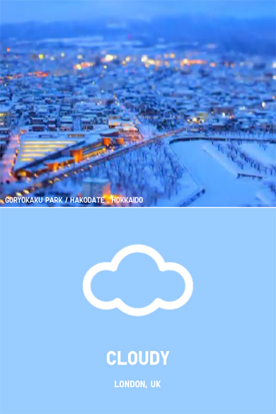
I’ve had this App for a little while now, but it was only the other morning when someone asked me what the best looking App I had was that I really thought about it. Although it’s a simple weather and calendar App, by using a selection of time-lapse, tilt-shift videos it manages to keep me engaged long after I’ve found out the days forecast. You can sync it to your Google calendars and store your location so it keeps itself up to date, and with simple iconography and Uniqlo’s trademark colour usage (see their ‘Color Tweet’ project here) I think for what may not be the most useful App you could own, it will always be a staple on my home screen.
You can download it here
Microsoft’s Productivity Future Vision concept video is possibly the first thing they’ve produced that I’ve genuinely liked. Engadget.com describe it as
“…a mostly seamless world where all of our interactions are made to be mobile, virtual, efficient and white-washed”
It makes Minority Report almost look realistic…

