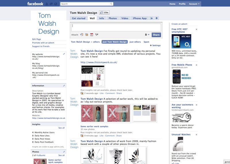
I’ve updated my ‘Tom Walsh Design’ Facebook page so it’s now no longer an empty space but is brimming with images and videos, take a look here and click the ‘like’ button if you like it!
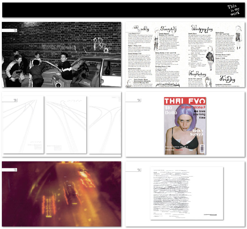
I’ve finally had a bit of time to update my personal micro-site ‘This is my work’. It now shows selected pieces of work as scaled backgrounds chosen at random (more to be added as the week goes on, once I’ve dug the files out…). It’s nice and simple, with updates etc controlled by the one XML file so from now on I’ve got no excuse for neglecting it..
You can view it here – www.thisismywork.co.uk
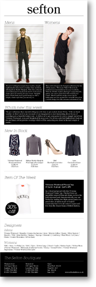 I’ve just been asked to re-work the Islington based fashion boutique Sefton’s HTML email design and template. With the design I produced for them last year (pictured) being quite image led, I think it’s time to move to a ‘lighter’ version. Check back here in around a week or so to see the results!
Or click here to see all of my work for Sefton Fashion Boutiques
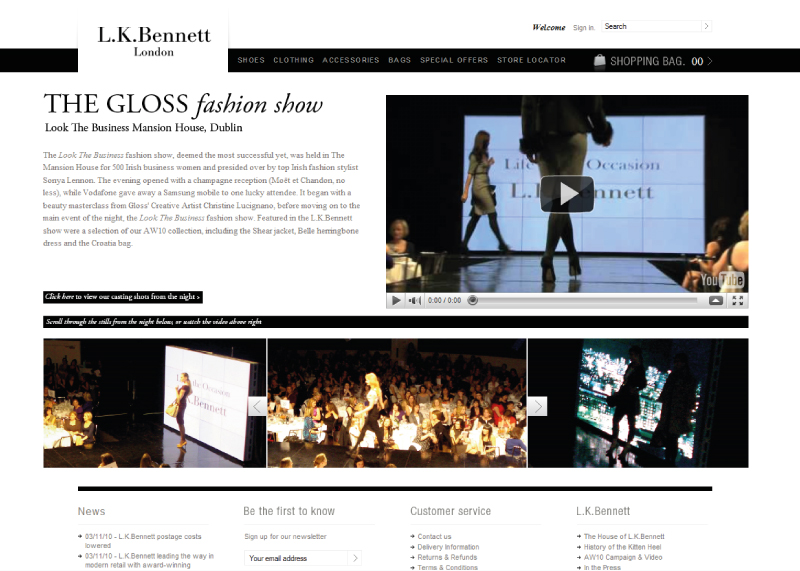
I built this page on the L.K.Bennett website as a tool for press to promote their events. Combining video and a Javascript gallery it provides an engaging interactive experience that allows the press department to show their previous events off to possible future collaborators. You can view the page here
Or click here to see all of my work for L.K.Bennett
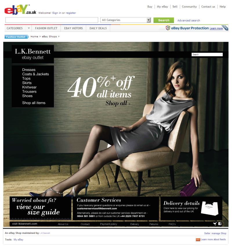
I’ve just finished working on the L.K.Bennett Ebay Outlet pages! It was a challenge to maintain brand identity while also having it made clear that it was separate from the main brand, but I think the end product achieved that quite well. With the reversed version of the logo, and black overlaid navigation it has a slightly less airy feel than the usual designs I produce for them, but still feels clean and in keeping with other elements of the brand. With limits on which photography I could use (they didn’t want to show products that weren’t being sold on Ebay as it could be misleading, and some ex campaign usage rights issues) we decided to instead use tight crops of the L.K.Bennett logo as it appears on the products. Some of the most pleasing results came from cutting in extra close to the logo embossed on the hardware of handbags or zips on boots, but all have a certain quality I think.
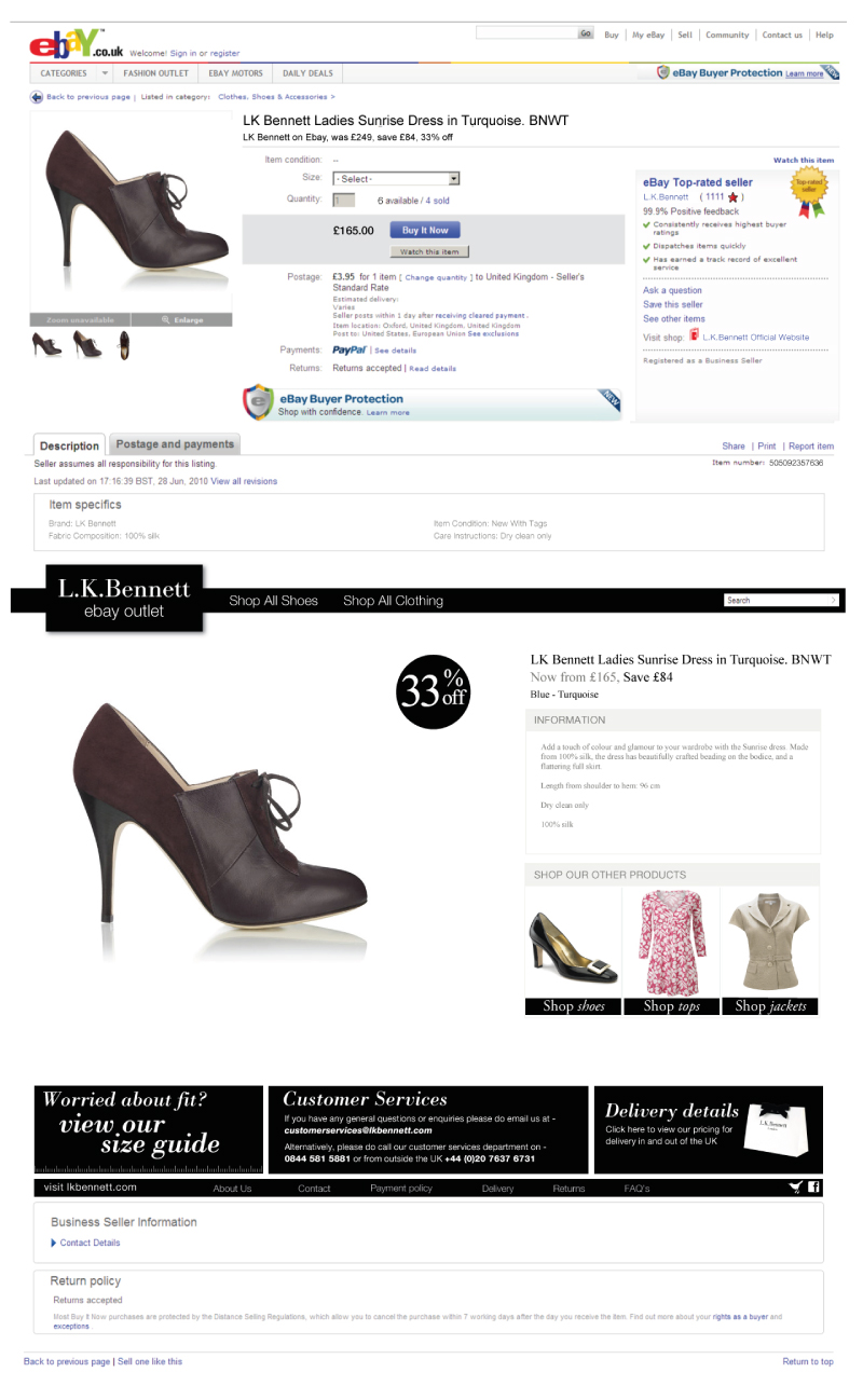
You can click here to see all of my work for L.K.Bennett
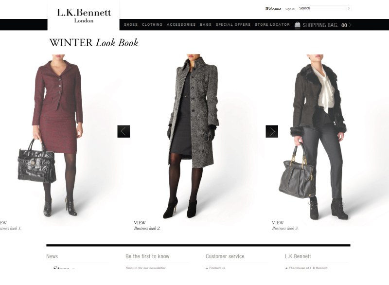
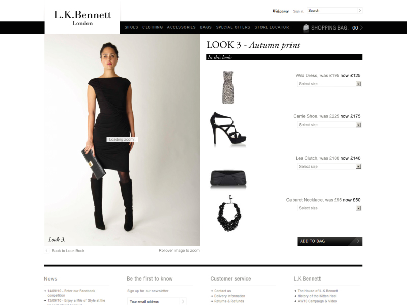
The L.K.Bennett Look Book has just gone live, another simple yet functional addition to the site! Designed to be clean and fit with the brand, it’s JavaScript built with infinity functionality, and I quite like it (even if I do say so myself)! A fair bit of tweaking was involved in both getting the images as we wanted and getting it to work perfectly across all browsers, but I think it paid off, see what you think-
You can click here to see all of my work for L.K.Bennett
I built the L.K.Bennett ‘Anna’ bag Flash teaser as both a bit of fun, and to promote the upcoming release of the ‘Anna’ collection of bags. With a dynamic countdown to the release time & date and a ‘spotlight’ style mask to give a sneak peek it brought a little intrigue to the launch!
You can see a non live version here, if you’re curious…
Or click here to see all of my work for L.K.Bennett
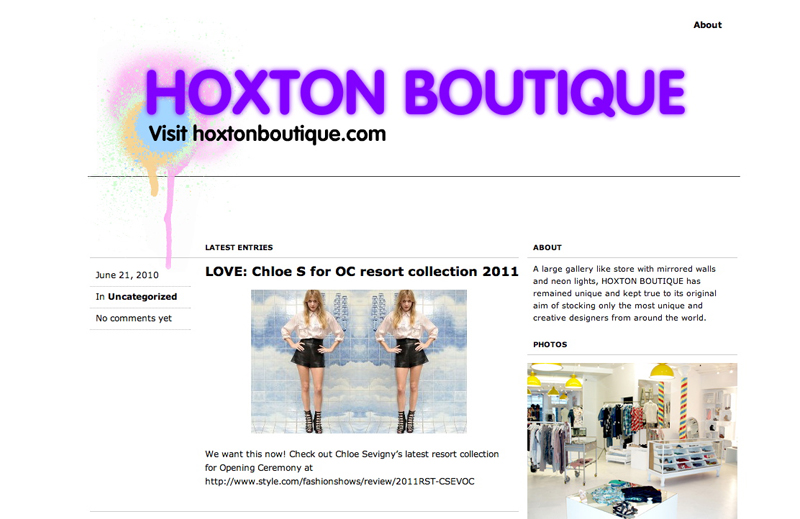
Having designed for Hoxton Boutique for quite a few years now it’s always nice when they get in touch, and this time it was a blog that they were looking for. They had a pretty fixed idea of what they wanted it to look like so this time it was less of a design project and more of a front end development job. I installed WordPress on their server and adjusted the CSS accordingly, ending with a characteristically quirky whilst functional blog.
You can click here to see all of my work for Hoxton Boutique
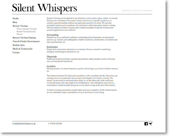
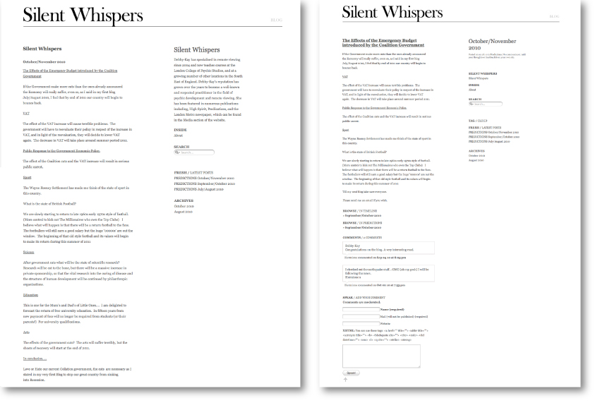
If you saw my post on the identity I designed for Silent Whispers you’ll already know a little on the background of this project. The website was quite a challenge as a majority of the pages were text heavy, with generally no real hierarchy between blocks of information. To avoid the pages blurring into each other I opted for a flexible grid of nine blocks, where depending on the amount of text on each page the columns could be adapted. The result is a slightly different, but still cohesive, feel to each page. The in-built blog followed suit, and was stripped back to a clean, typographic design where information takes precedence over image.
You can see the site here
Or click here to see all of my work for Silent Whispers

