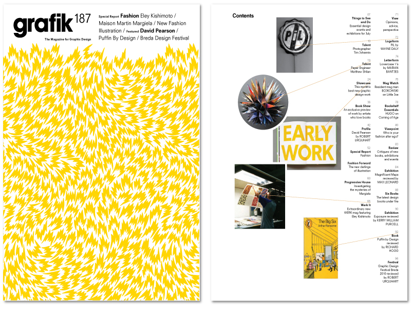
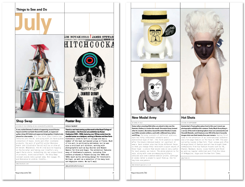
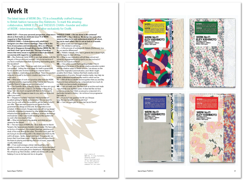
After Grafik magazines untimely disappearance in 2010 I’d just started deciding what my new subscription for 2011 was going to be, and what should come through my door? A nicely printed (of course) letter from it’s owners containing a URL to download the last, unpublished issue. Full to the brim with the usual old favourites, as well as being a quite apt (considering my recent contracts) fashion special!
Above is the cover, and below are a few of my favourite spreads from the issue. If you’d like a link to the full PDF leave your email in a comment and I’ll forward it on.
Fingers crossed the relaunch I’ve heard whispers about will happen later this year!
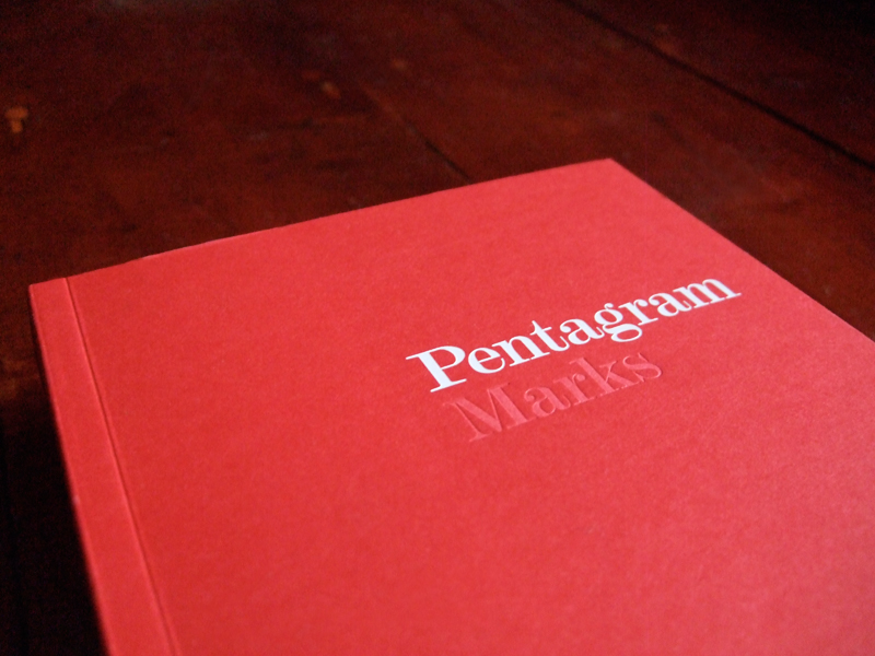
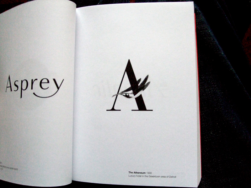
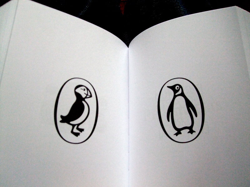
One of my New Years resolutions for 2011 (and probably the only one I’ll stick to…) is to buy, and read, a new design book each month. Not just anything that’s been published though, I’ve written up a list of twelve books I’ve always thought about buying but never committed to. The first in my list is the classic ‘Marks’ by Pentagram (pictured). A 400+ page catalogue of Pentagrams many marks from over the years. From their identities for Penguin (and their children’s editions Puffin) books, the V&A and D&AD to more obscure work, like their simple piece for The Athenium hotel (shown below) it’s essential reading for any designer.
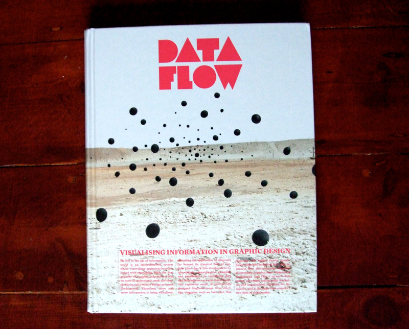
Although the book itself is more focused on visual, rather than typographic, representations of information, I couldn’t help but appreciate the cover. The block fluorescent characters, which remind me a little of non-formats work, stand out perfectly against the background landscape.
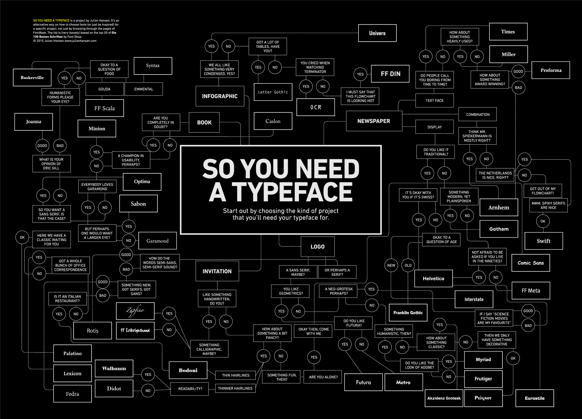 This project by Julian Hansen is a nice little guide on how to choose the right font for the right project. Loosely based on the top 50 of Die 100 Besten Schriften by Font Shop it takes the pain out of picking that perfect typeface and looks quite nice at the same time!
Click here to view it in full size, or here to visit his site.
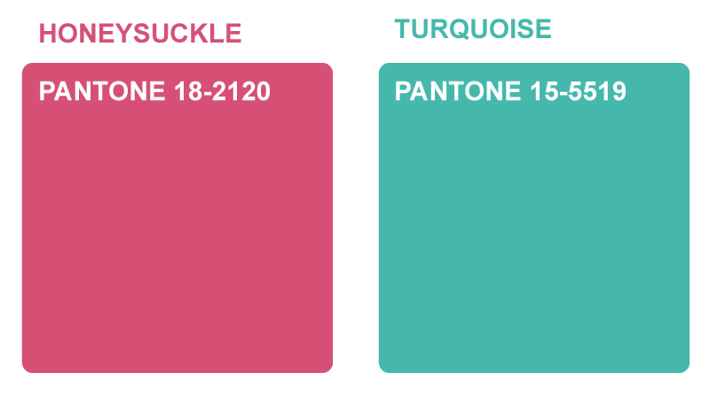 In contrast to last years ‘Mimosa’ (or Turquoise), of which Pantone said “evokes thoughts of soothing, tropical waters and a languorous, effective escape from the everyday troubles of the world, while at the same time restoring our sense of well-being.” this year they’ve gone for an altogether warmer Pantone. Honeysuckle is said to “embolden us to face everyday troubles with verve and vigor”, a slightly more serious choice then, but it will still be interesting to see if their prediction comes true. Maybe I’ll consider it in my next set of designs to get the ball rolling..

I was approached by Silent Whispers to design their identity and web site. I have to admit I don’t really know much about Remote Viewing, but its always quite refreshing to design for a different style of client! The identity, set in an adapted version of Baskerville, aims to give both space and a feeling of openness, as well as a solid grounding from the expanded foot on the ‘p’. It was also designed with consideration for how it could be used both across all printed material and for web.
You can click here to see all of my work for Silent Whispers

