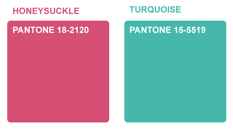
 In contrast to last years ‘Mimosa’ (or Turquoise), of which Pantone said “evokes thoughts of soothing, tropical waters and a languorous, effective escape from the everyday troubles of the world, while at the same time restoring our sense of well-being.” this year they’ve gone for an altogether warmer Pantone. Honeysuckle is said to “embolden us to face everyday troubles with verve and vigor”, a slightly more serious choice then, but it will still be interesting to see if their prediction comes true. Maybe I’ll consider it in my next set of designs to get the ball rolling..

