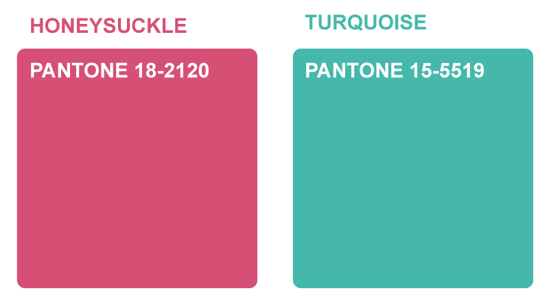
 In contrast to last years ‘Mimosa’ (or Turquoise), of which Pantone said “evokes thoughts of soothing, tropical waters and a languorous, effective escape from the everyday troubles of the world, while at the same time restoring our sense of well-being.” this year they’ve gone for an altogether warmer Pantone. Honeysuckle is said to “embolden us to face everyday troubles with verve and vigor”, a slightly more serious choice then, but it will still be interesting to see if their prediction comes true. Maybe I’ll consider it in my next set of designs to get the ball rolling..
I’ve just had sign off on the new HTML email template I’ve designed & built for Sefton Fashion! The new template is much lighter on the inbox with as few images used as possible, and now has three versions so they can send much more targeted campaigns.
I don’t want to spoil their surprise, so images will be coming after they send their first mail out with the new designs later this week. Alternatively you can go to www.seftonfashion.com and sign up for their newsletter to get it direct to your inbox!
Or click here to see all of my work for Sefton Fashion Boutiques
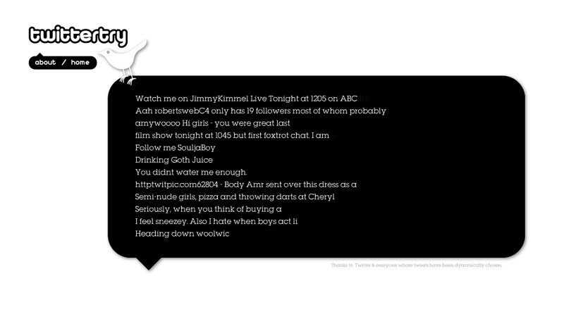
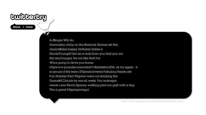
Twittertry was set up both as a bit of fun and as part of my ongoing experiments with feeds. The idea was to pull random Twitter feeds and put them next to each other in a familiar format and see if an occasional relationship formed between the lines of text. As Twitter runs an instant commentary on day to day occurances from a world wide perspective it’s sometimes nice to see what someone might want to share from one side of the world, placed immediately next to what someone else might be thinking on the other.
Take a look here www.twittertry.co.uk
(If you refresh your browser it searches for a new feed for each line out of a set file of 100 or so)
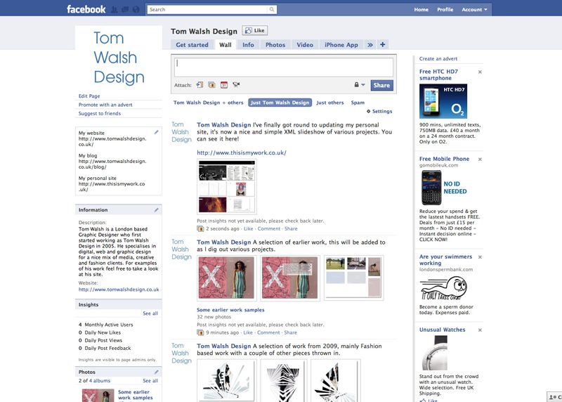
I’ve updated my ‘Tom Walsh Design’ Facebook page so it’s now no longer an empty space but is brimming with images and videos, take a look here and click the ‘like’ button if you like it!
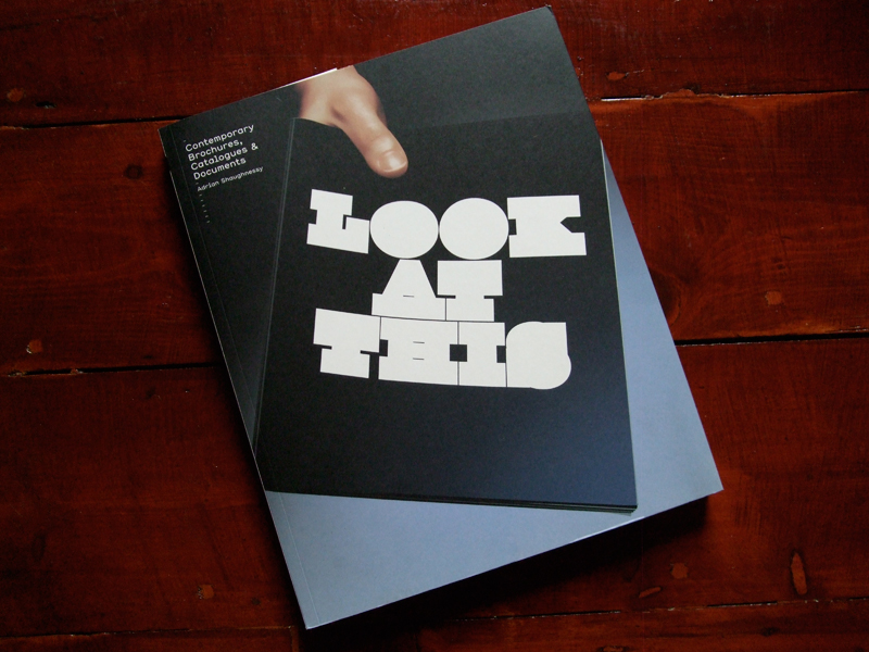
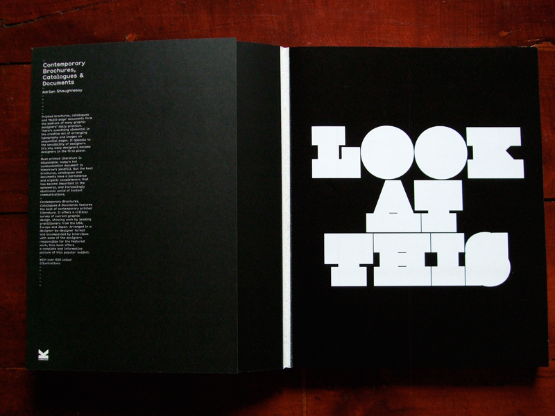
For ‘Type I Like #3’ I chose the cover of ‘Look At This’, unmistakably the work of Non-Format it’s blocky, heavy but perfectly formed.
You can see more examples of their work here – www.non-format.com
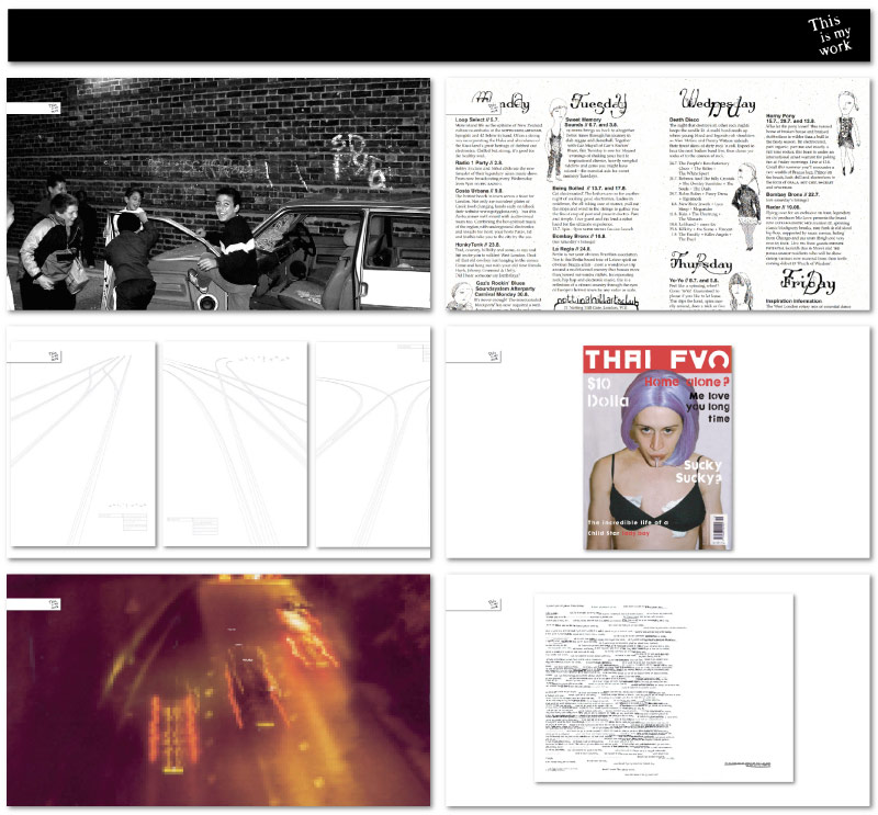
I’ve finally had a bit of time to update my personal micro-site ‘This is my work’. It now shows selected pieces of work as scaled backgrounds chosen at random (more to be added as the week goes on, once I’ve dug the files out…). It’s nice and simple, with updates etc controlled by the one XML file so from now on I’ve got no excuse for neglecting it..
You can view it here – www.thisismywork.co.uk
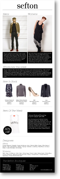 I’ve just been asked to re-work the Islington based fashion boutique Sefton’s HTML email design and template. With the design I produced for them last year (pictured) being quite image led, I think it’s time to move to a ‘lighter’ version. Check back here in around a week or so to see the results!
Or click here to see all of my work for Sefton Fashion Boutiques
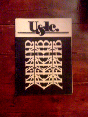 Here’s a lovely cover for ITC’s U&LC journal, March 1983. One of my all time type favourites. Designed by Bob Farber using reflected characters of ITC Benguiat it may not be legible, but it is nice to look at!
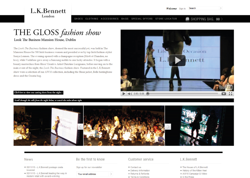
I built this page on the L.K.Bennett website as a tool for press to promote their events. Combining video and a Javascript gallery it provides an engaging interactive experience that allows the press department to show their previous events off to possible future collaborators. You can view the page here
Or click here to see all of my work for L.K.Bennett

