As I missed this exhibition (by nearly a year…) it’s nice that they took the time to film themselves flicking through the work shown. I think it’ll be a while before I come across a showcase of such intricate print work, and it’s especially nice to see some of it being constructed & deconstructed. So here you have it, a permanent digital version you can peruse whenever you have a spare 30mins, lovely!
Transfixing fashion short by Callum Cooper for Klezinski. With some clever apparatus & camera work you’re taken 360 around the rope jumping models. No idea how he did it, but it looks good!
You can see more of his work on his website here
Combining the latest in 3-dimensional prototyping technology with sublime typographic art, johnson banks have created Arkitypo: 26 letters, or 26 typographic sculptures, each exploring the character and history of an individual font.
The Arkitypo project developed as a collaboration with digital media and design college Ravensbourne, and acts as a showcase for the college’s prototyping skills and technology. The result is sheer visual delirium, from the “fractalised” Akzidenz Grotesk via the lace-like pipework of Johnston to the Vorticist collision of Zig Zag. Arkitypo took over six months to complete, and was the product of considerable research and practical experiment. And when examined in complete rotation, the results are all the more surprising and inspiring.
You can read more about this project on the johnson banks website here
Whiling away an hour or so on Youtube over the weekend Nike’s ‘Tag’ ad came up in the side bar and reminded me how much I liked it. I’m not sure I ever saw it on TV, I think it came on one of Creative Reviews annual round up DVDs (?), but it’s still one of my favourite adverts of all time. When I was looking for a decent quality version to add into the post I also came across a version with alternate music, which made me appreciate how well suited the final soundtrack was…
For good measure I’ve also added in their ‘What if we treated all atheletes like skateboarders’ advert. Not as memorable as Tag, but well worth a mention.
Emilio Gomariz’s experiments with the Adobe Illustrator professional work space. Looks great, but I bet it took a while to set up!
You can see all of his other experiments on his site here

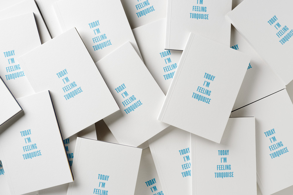
Nice project by Pentagram matching colours to moods. The booklet contains various coloured pages, with the mood they represent displayed typographically. Skim down the closed book to the colour you’re feeling and open it to find out what mood you’re in!
Here’s their description –
“Today I’m Feeling Turquoise” is an attempt to do something that should have been done a long time ago: pairing up colours with their respective moods.
Because everyone knows that red means anger, green envy, and blue misery. But who knew that olive was the colour of deja-vu, brown the colour of indifference, or pink of laughing on the outside, crying on the inside?
You can read more about this project on Pentagram’s website here
No matter how much the sceptics go on about BA jumping on the Olympic bandwagon (despite them being sponsors), Terminal 5 losing luggage or Jim Rosenthal being a football/F1 commentator, I like this ad. It’s fun, engaging and the next time it comes on I’ll happily watch it again. I can’t say the same for most of the ads out there…
Beautiful project by Bartholomäus Traubeck. Using a modified turntable he’s converted the data from the rings found in slices of trees into piano music. It sounds pretty nice too!
I’ll leave explaining the technical side to him-
“A tree’s year rings are analysed for their strength, thickness and rate of growth. This data serves as basis for a generative process that outputs piano music. It is mapped to a scale which is again defined by the overall appearance of the wood (ranging from dark to light and from strong texture to light texture). The foundation for the music is certainly found in the defined ruleset of programming and hardware setup, but the data acquired from every tree interprets this ruleset very differently.”
You can see more of his projects on his site here
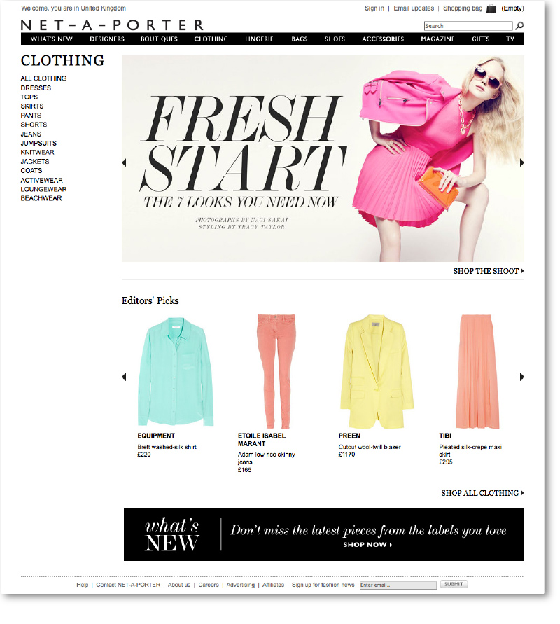
 The category landing page template I designed for Net-A-Porter has gone live! The second of my projects I worked on while there, it’s a fairly flexible template that can hold video, editorial or pretty much any suitable media in the main area, with supporting products being merchandisable underneath. Using this system it means that each category maintains an individual feel, based on the content chosen, while keeping a consistency across all five.
You can take a look in more detail on the Net-A-Porter site here


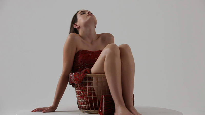
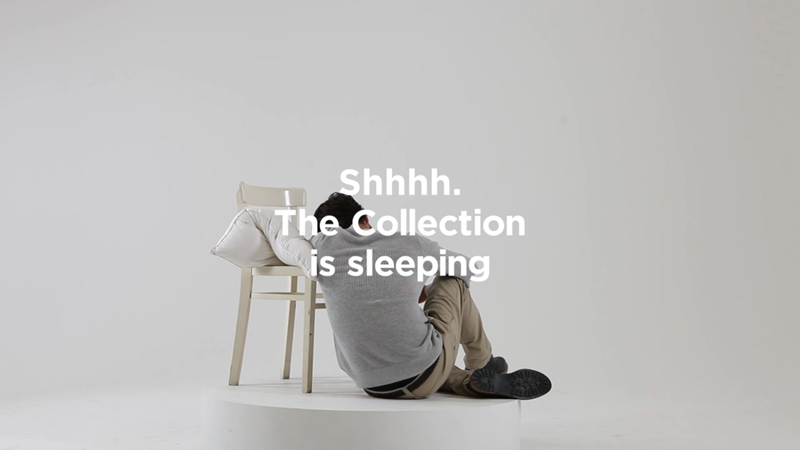
Surreal new campaign by 101 London for French Connections SS12 collection. Following on from last Summer’s ‘I Am The Blouse/Trousers/Coat/Suit’ campaign the latest offerings are equally well shot, with a floaty, dream like feel to them. In total there are going to be 20 released online, but out of the five I’ve seen so far the above is definitely my favourite.
You can see all of the videos on 101 London’s Vimeo here

