Project Credits
Design & UX
Tom Walsh (while at Usablenet)
Development
Usablenet
Project Details
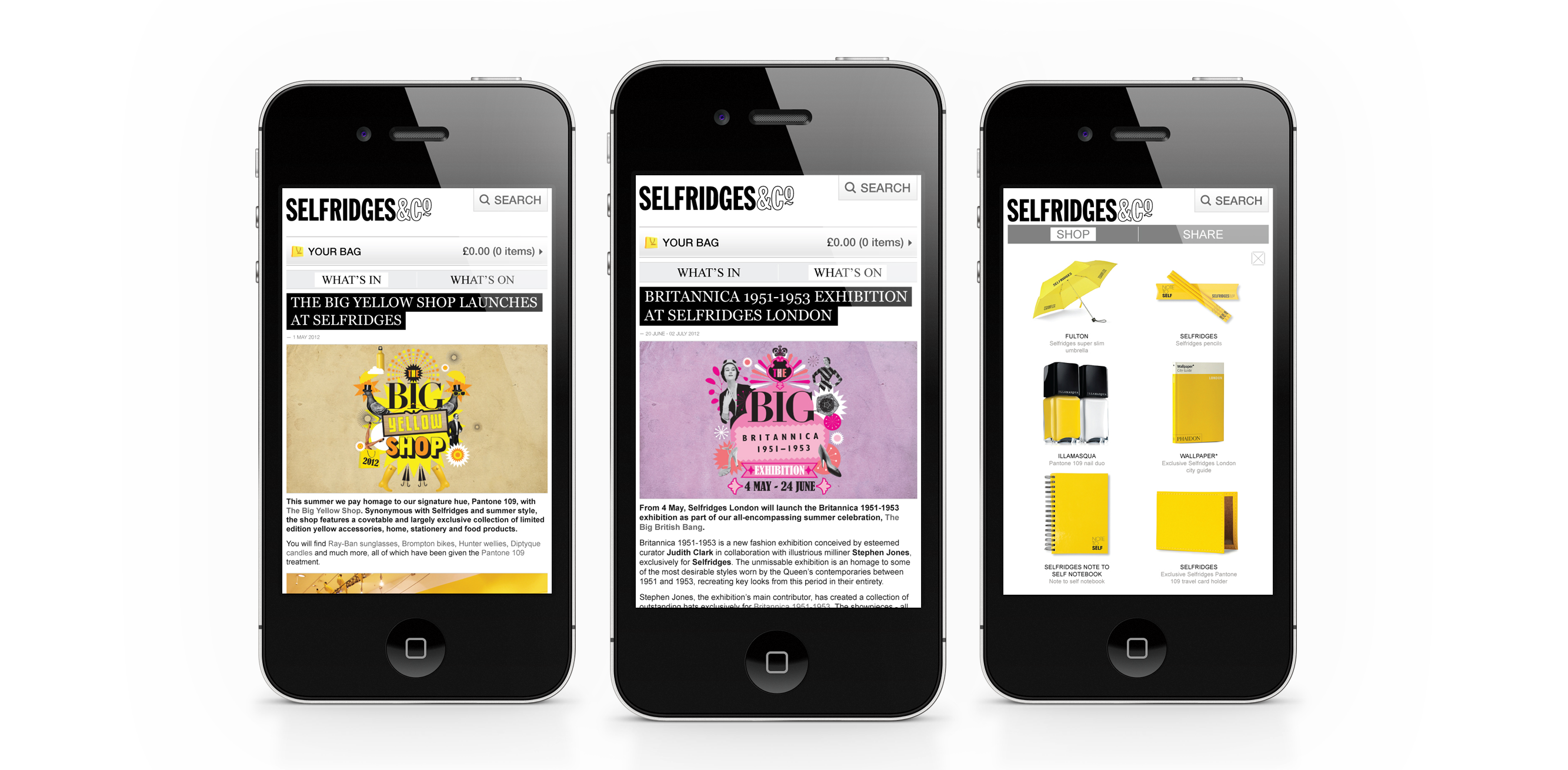
With the brief of finding a way to integrate their growing editorial and events based content into their mobile experience it was an interesting brief. Designed to proxy the content from their ‘What’s On’ and ‘What’s In’ sections on the main Selfridges site it takes a live feed from each section and re-styles it to be a little more mobile friendly. With a simple second level navigation separating the two sections, full width imagery as a preview for the articles and a handy filtering system it makes the process of finding an event or article much less frustrating. As additional features I also added in a geo-locate to find events near you and a nifty Shop/Share footer, just in case the user quite likes anything featured.