Project Credits
Creative Direction & Design
Tom Walsh
Packaging Production
Propak
Project Details
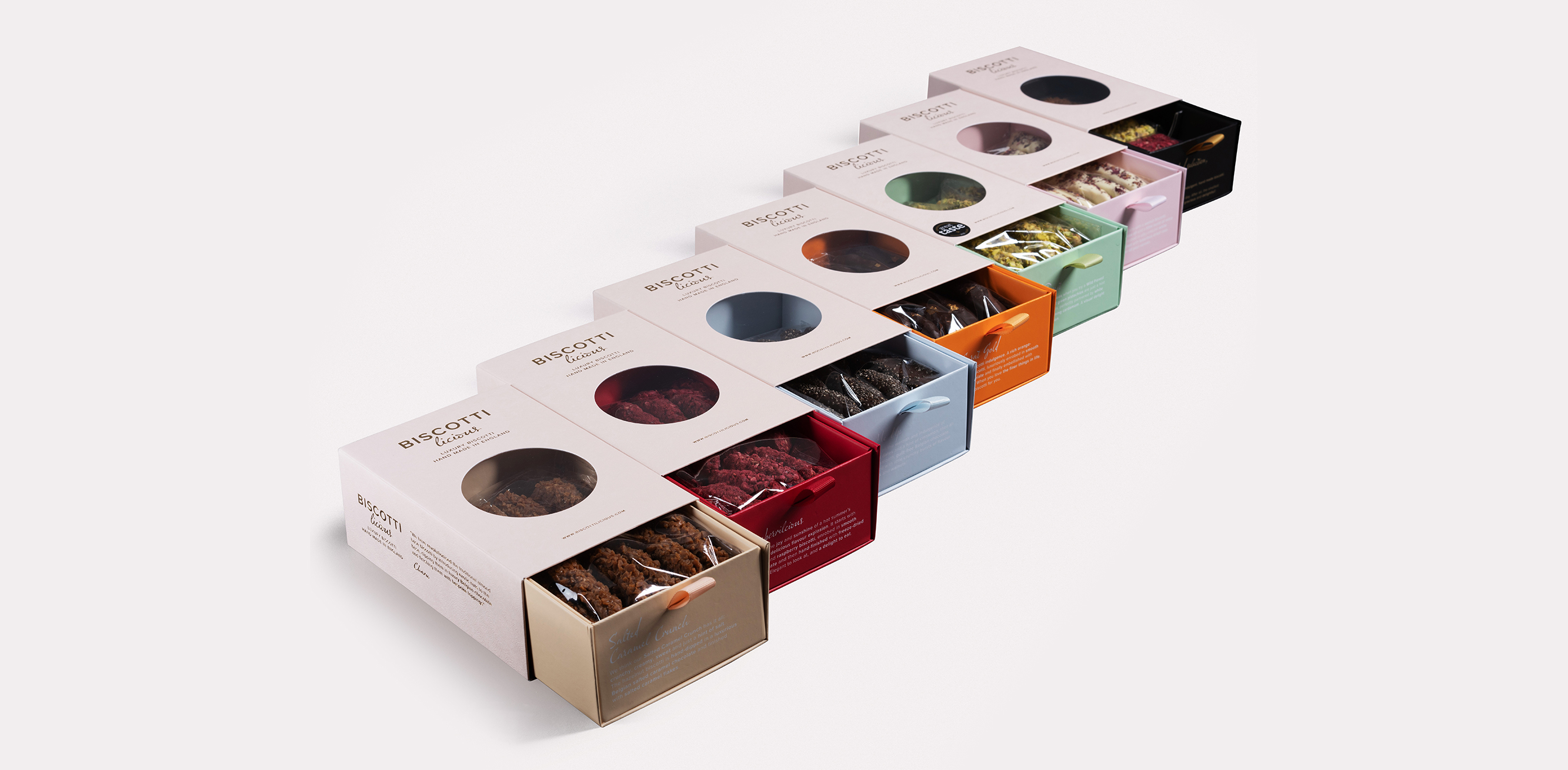
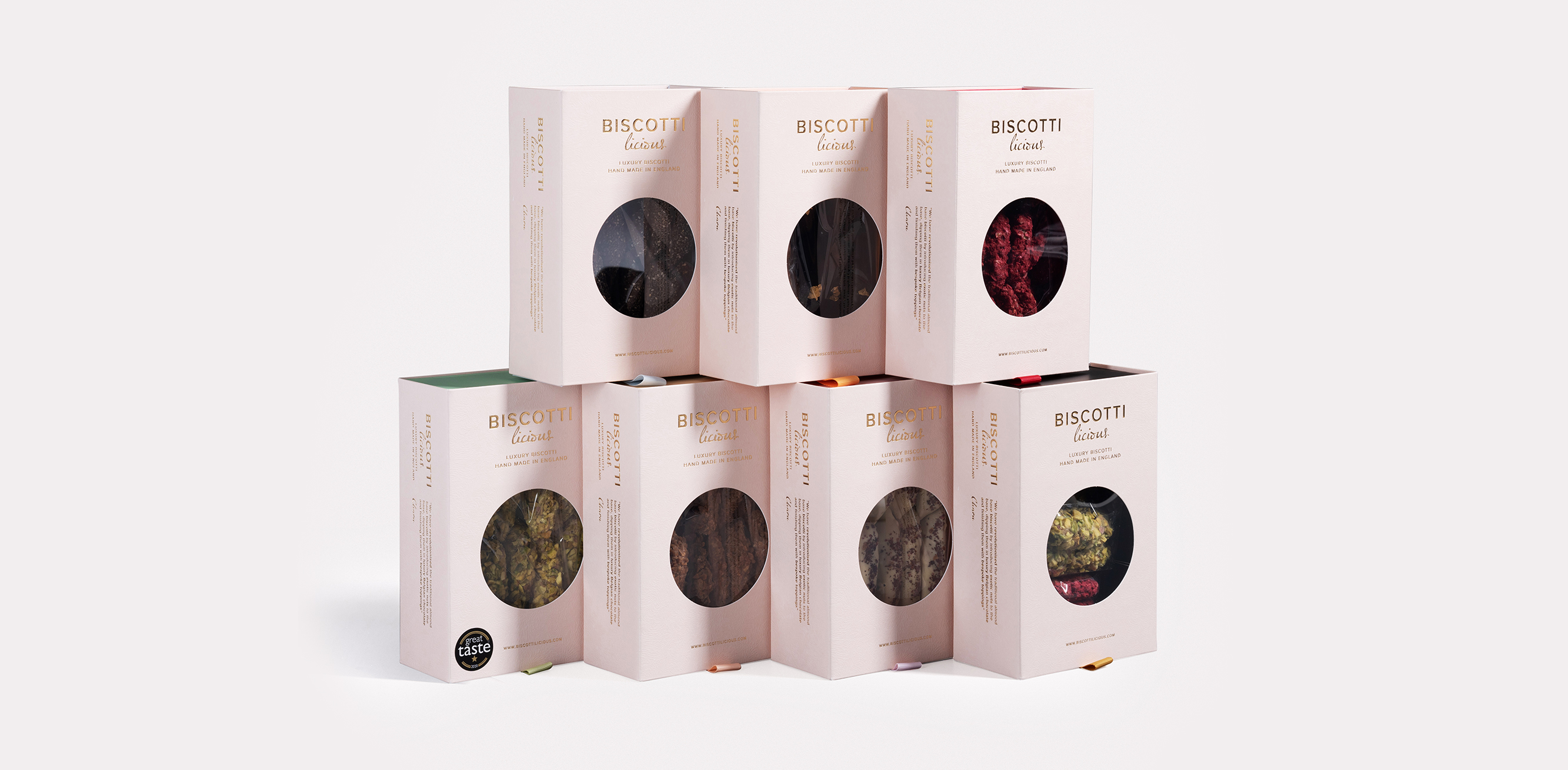
I was approached by Biscottilicious to re-design their logo, branding, packaging and print assets. As they sell in Harrods, Fortnum & Mason and other high end retailers they needed to bring their image in line with the quality of both their product (delicious, award winning, hand crafted biscotti) and their stockists.
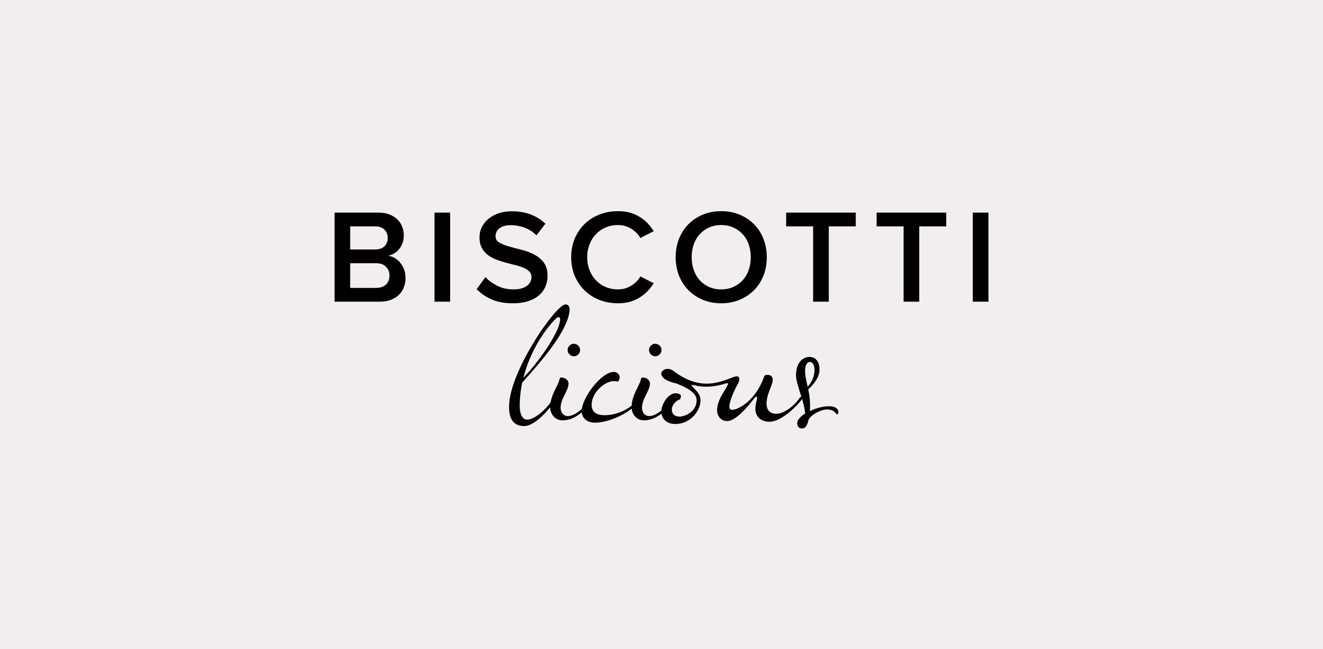
For the logo it was important to highlight both the essence of the product (Biscotti) and the hand made quality. The solution was to break the word into two sections and stack them, with the ‘licious’ element representing the artisan nature of the biscotti. This was continued in the typography used throughout, where we use the handwritten font to highlight personal notes and more emotive messaging across all packaging, digital and print brand assets.
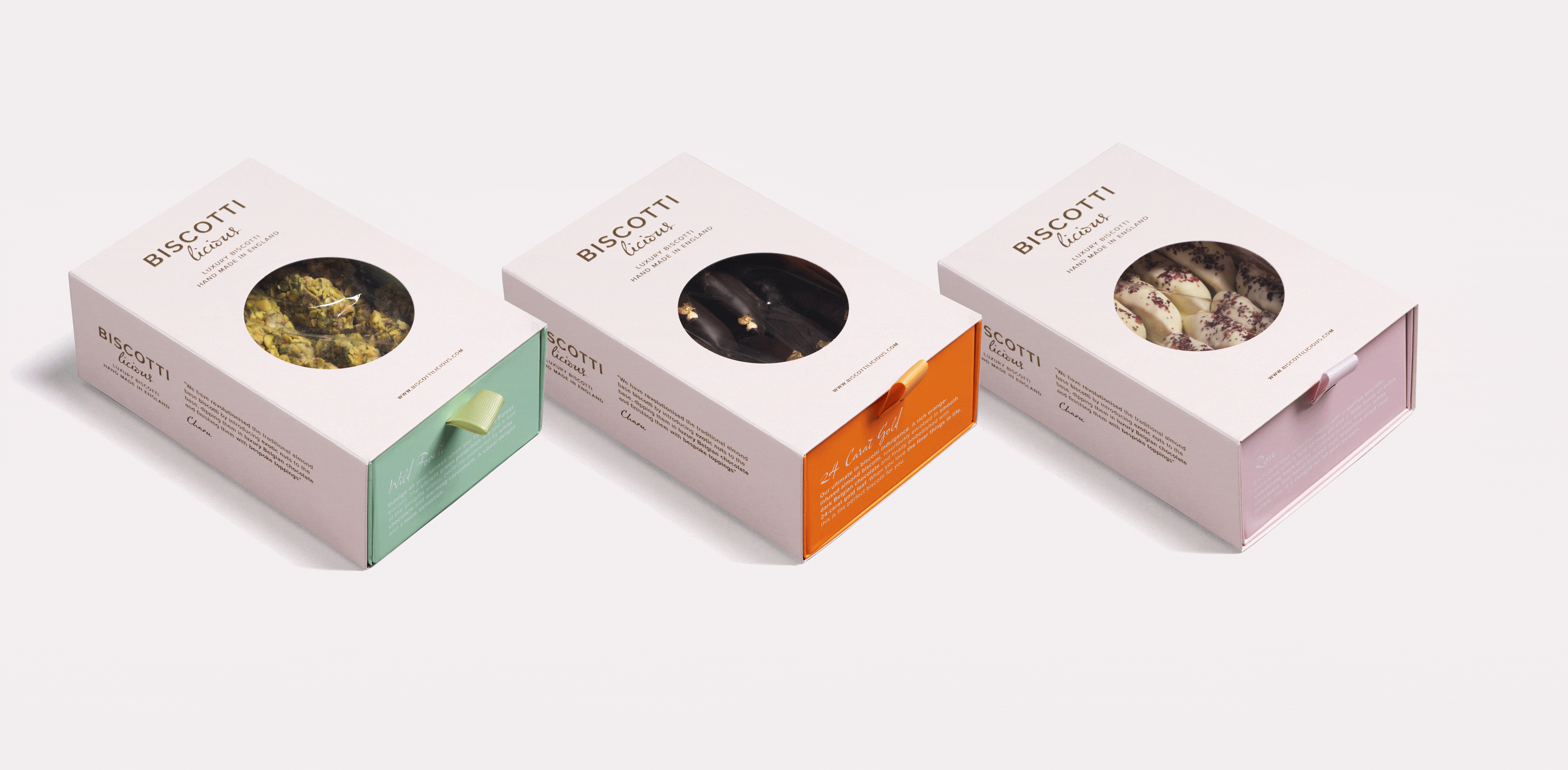
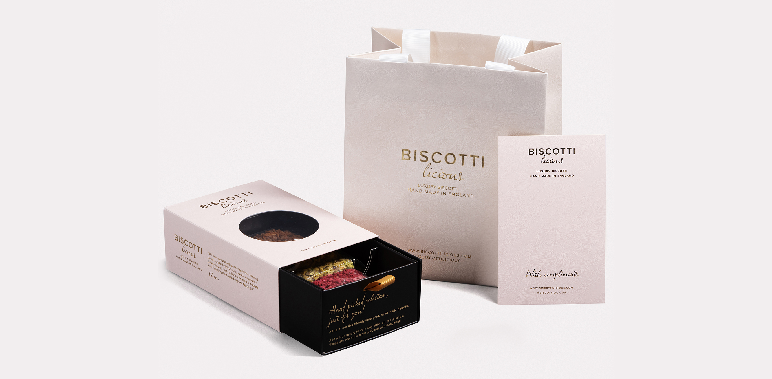
Part of the packaging challenge was to create a higher end outer box which would be flexible enough to used for each different flavour, while still clearly differentiating them from one another. The solution was a GF Smith Coltskin outer sleeve with Gold foiled branding and brand information, with interchangeable colour coded insert trays for each flavour. A central ‘porthole’ style window was included in the outer sleeve so the biscotti could be viewed without sliding the tray out, and each tray was given a flavour representative colour with its name and description foiled in white on the tray end.