
The first of a series of audio-reactive experiments I’m working on. Beat created in Ableton, audio-reactive visuals created in TouchDesigner. More to come, watch this space!
I’ve been experimenting a little with 3D recently – using one of my own typefaces FF Privé as the starting point. It’s interesting to see how it changes the feel of each glyph when you add depth, texture and motion to them.
Looking forward to sharing more of these soon – watch this space.
A time-lapse mushroom video loop I created to be used as a projection for the DIRTEA pop-up at Selfridges – ‘SUPERMARKET’. A four-week retail experiment that imagined an earth-conscious shop of the future
Experiments in sound and animation, coming soon…
Hypnotic animations by kinetic type foundry Dia to promote the launch of Klim foundries latest typeface collection Söhne.
You can view all four families on Klim’s site here:
klim.co.nz/soehne/
and read an in depth interview with Klim Foundry on It’s Nice That here:
itsnicethat.com/klim-dia-sohne
Beautiful work from studio ManvsMachine for Castello. Having 3D scanned the three flagship cheeses they went on to create what must be the most seductive videos ever created to sell Cheddar and Brie…
You can see the full series on their Vimeo here: https://vimeo.com/mvsm
A great new tool from Swiss Type Design agency Dinamo, designed to “test drive the truth of variable fonts”. The perfect way to find any flaws in existing or WIP variable font projects.
They describe it as:
“First practiced in Ancient Greece, the military punishment known as “running the gauntlet” forced the convicted to pass between a double row of comrades who strike out and attack them. Not always easy.
Fast forward to a digital 2018, and type designers can make their fonts run through our Gauntlet to quickly uncover their weaknesses. It provides a selection of features for testing and analysing typefaces during the design process and was specifically built with variable fonts in mind, allowing for an animated preview of all their axes combined.”
I haven’t had a chance to test it out on any of my projects, but its fun to play with all the same, and definitely one to bookmark for proper use later.
You can check it out at dinamodarkroom.com/


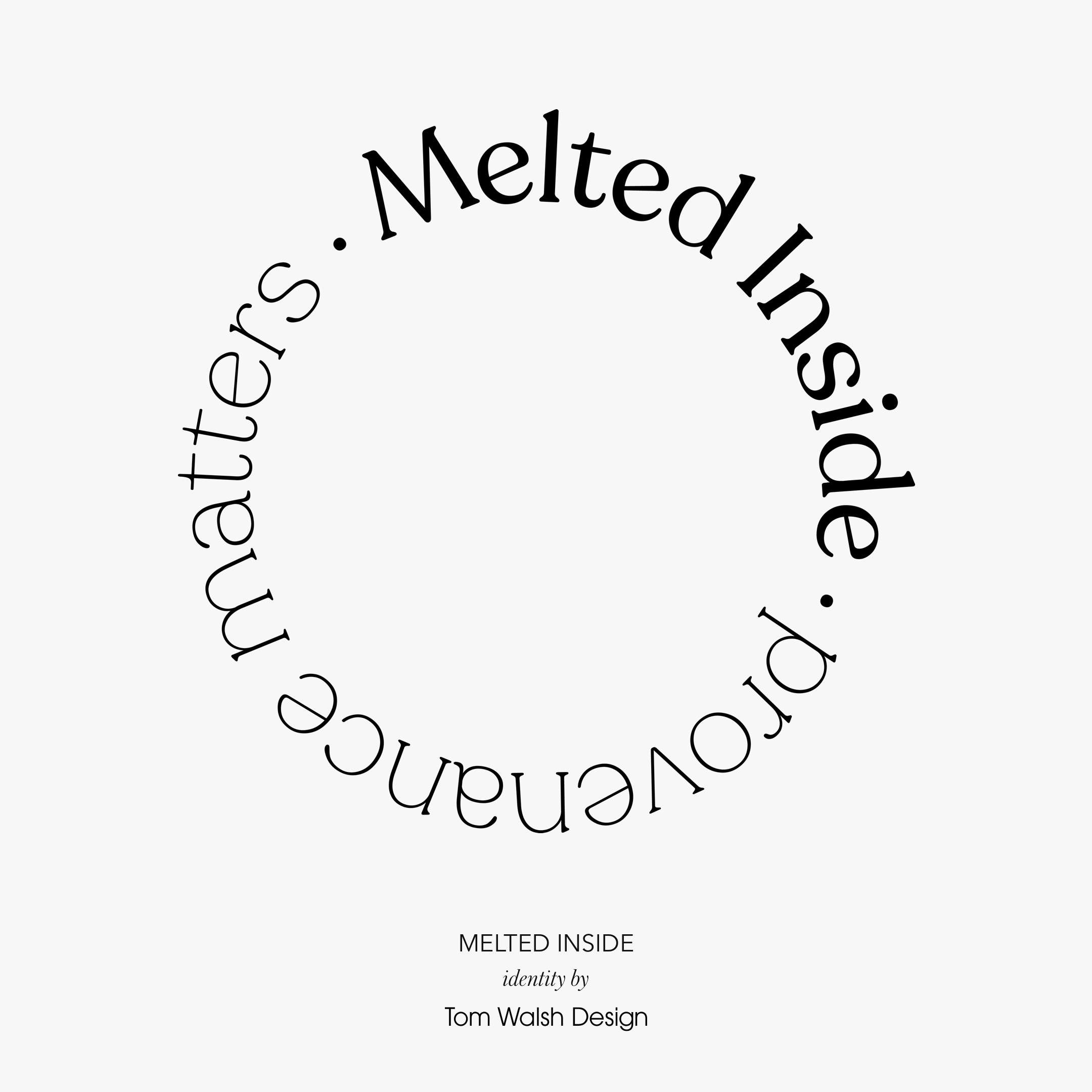
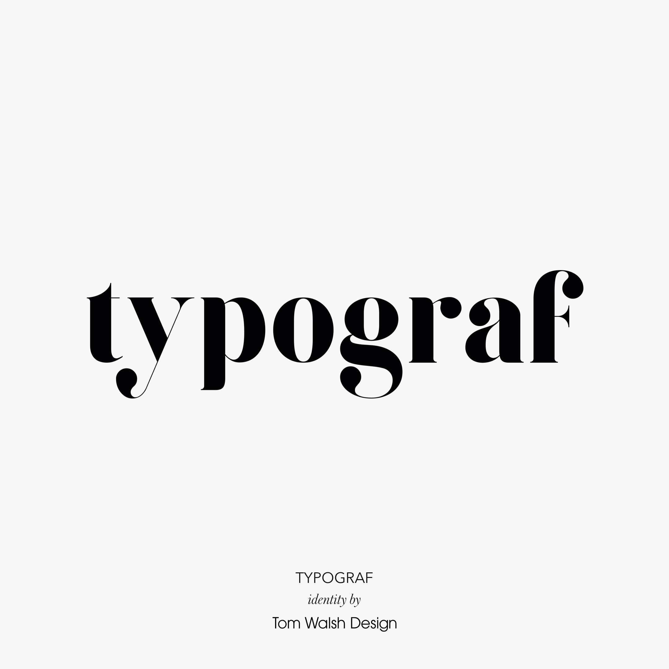
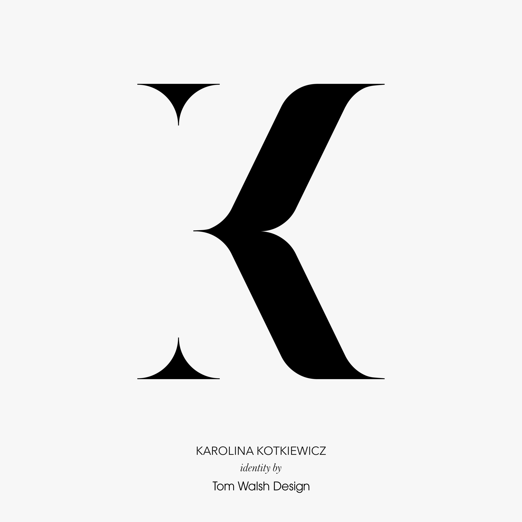
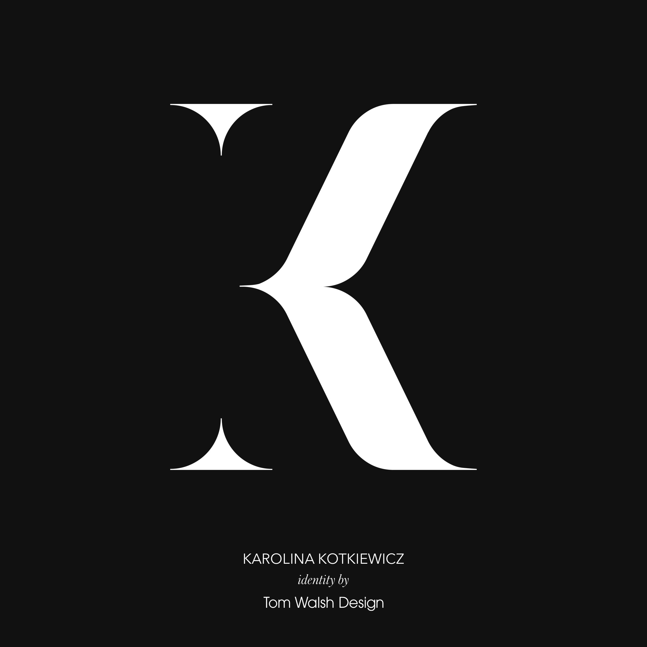
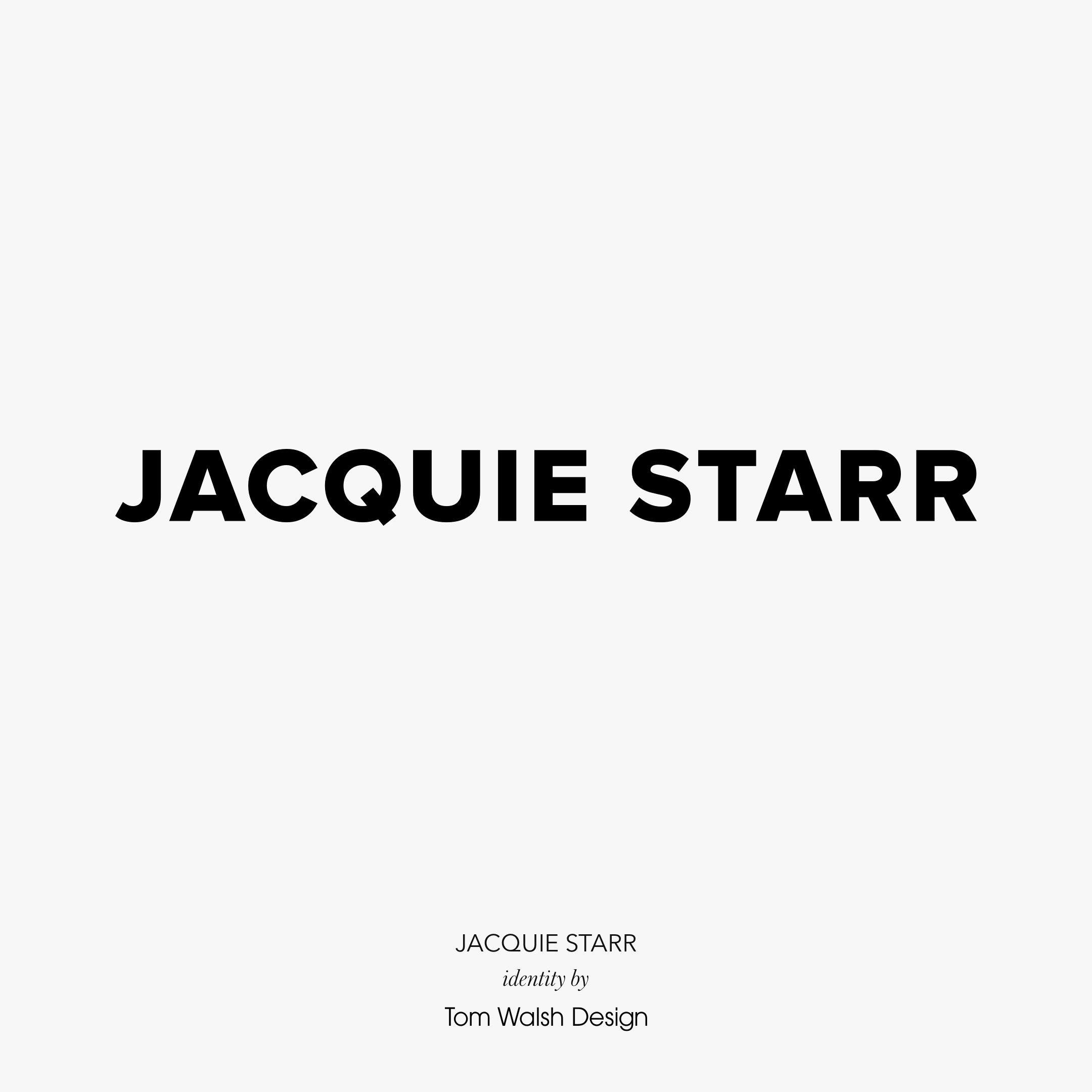
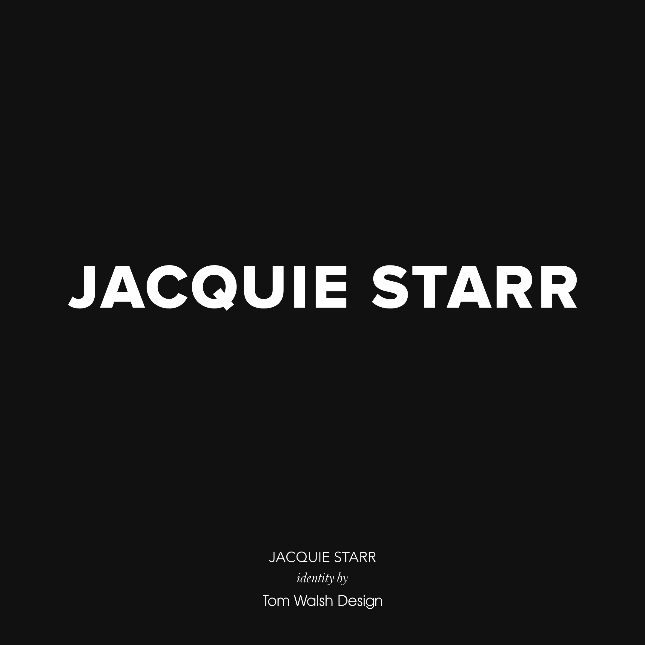
A selection of brand identities I’ve designed over the years, either as part of wider projects or as independent briefs.
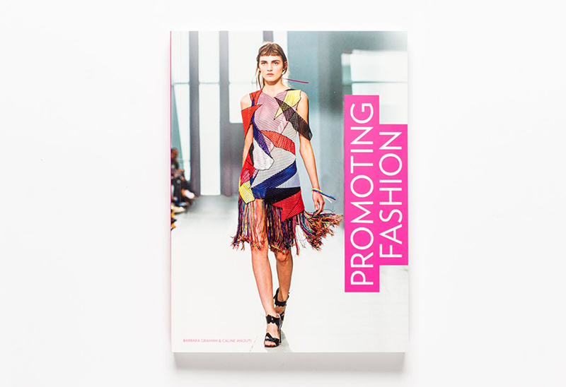
The new book ‘Promoting Fashion’, published by Laurence King, has used my work as an example in their section discussing the importance of best practise design for responsive fashion e-commerce sites. And to top that, they also used my work on their back cover!
You can read more on the book here
Screens of the Future is Universal Everything’s ongoing series of visionary prototypes, based on the emerging technologies of flexible displays, shape-shifting materials and context-aware functionality.
These moving image artworks highlight humanity’s increasingly integrated relationship with technology, serving as product demos of our near future.
You can see more of their project here
